It's been a long ass time since I started writing to this post. At one point I was tempted to bin it - but I really wanted to highlight the difference between the 'eh' and the 'great' episodes of Kaguya. Therefore, please find my (severely delayed) thoughts below:
[Kaguya-sama: Love is War] – 8
This one ended up a miss for me. It wasn't bad, but the visuals weren't up to the standards set by earlier episodes. Tetsuhito Saito headed up the storyboarding of this episode and his style is a watered-down version of the one used by series director, Mamoru Hatakeyama. To explain why I'm going to discuss what these two creators have done previously and then examine some scenes from this episode alongside Hatakeyama's episode 6.
Hatakeyama has had an interesting career. He started in 1999 and from then till 2001 he worked on no less than 12 porn OVAs before moving over to SHAFT where he toiled for several years as an episode storyboarder. He got his big break in 2013 when he became the series director of Studio Deen's Rozen Maiden: Rewind. Studio Deen's name up to that point had become synonymous with shoddy anime. Hatakeyama's work broke free of that legacy and became the start of a new chapter for the studio, which he continued with his Sankarea: Undying Love. Neither Rozen Maiden nor Sankarea proved to be strong shows but it was clear that Hatakeyama was a talented director and that given the right material and staff he'd be able to make a great series. This promise was realised in 2016 when he directed the sublime Shōwa Genroku Rakugo Shinjū, which is one of the best anime of the decade.
For Kaguya, Hatakeyama personally storyboarded episodes 1, 3, 6,7 & 12. He's a versatile visual storyteller with a talent for eliciting an emotional response from the viewer. In a single scene he can paint a tender picture of young love, then drag you through a horror movie before depositing you in absurdist comedy and it all just works. Beyond this, he also a font of creative and weird imagery which he's used to great effect in this series.
Saito started working in the late 80's as an animator and he didn't start storyboarding until the early 2000's. Since then he's worked on several projects sometimes doing a substantial amount of work such as on Twelve Kingdoms (8 episodes) and Getbackers (11 episodes). I don't have any familiarity with his style as I haven't gone back to consult these episodes, so I'm just working based on what I see here. Speaking of which, lets examine some of that work in more detail.
We'll begin, strangely enough, at the beginning. The first moment of the episode is the introduction of a new character – Kei Shirogane. Here's how it's depicted:
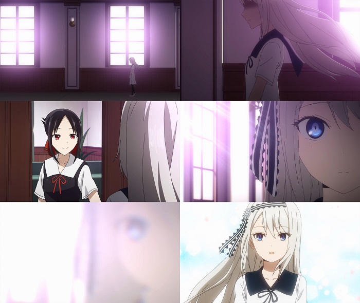
The purpose of this sequence is to introduce us to this character through Kaguya's eyes. The shot of Rei walking with her long hair flowing behind her communicates a notion of grace and femininity when coupled with pink light bathing the corridor. The reveal shot of Kei's face is unusual in only revealing half her features which means the focus is on be on her striking blue eye. Finally, the image dissolves into a 'full' reveal of Kei, who has been transported momentarily into a realm of stunning white light. From this we can do that for Kaguya, Kei is a strikingly attractive figure, to the point where she even says it aloud which is a rare slip for someone as controlled as Kaguya. This sequence is totally adequate – it conveys the information it needs to but it's not particularly impressive or creative, it just does the job. Like many scenes from this episode it's mostly a straight shot-by-shot lift from the manga with almost nothing changed despite the switch in mediums. To give an idea of how Saito's work here compares to Hatakeyama, we can move look at episode 6.
Episode 6 also starts with a character introduction – this one if for Ishigami. Let's look at it here:
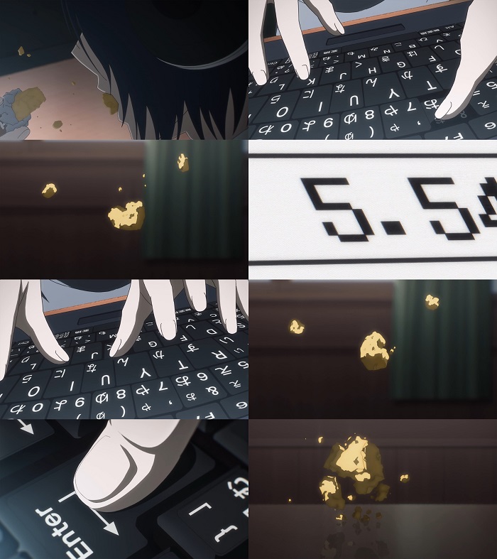
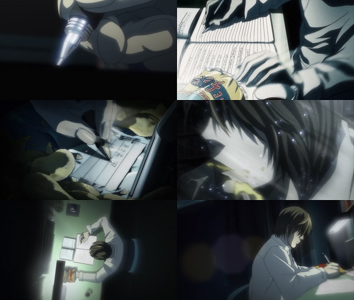
I've excised a few shots, but you get the idea. This sequence depicts Ishigami taking a messy bite out of his snack which results in crumbs falling onto a table. While the crumb is tumbling through the air Ishigami manages to make all the required changes to his accounting document. This sequence is dynamic, and ridiculous and playful. The unusual angles and close zoom onto Ishigami's hands as he's typing, especially the extreme closeup on 'Enter', gives the sequence a dynamic feel, like we're in a spy movie witnessing some incredibly crucial bit of computer hacking. The repeated shots of the tumbling crumb serve as our ticking clown counting down to the end of the sequence. This character introduction both serves to communicate that Isghiami is a someone very skilled at his job, but at the same time is gently ridicules due to the inherent ridiculousness of the scene. I think this does a great job of establishing how the series will be treating Ishigami going forward. What's notable about this scene is that Hatakeyama essentially created it himself. In the manga, this scene is only 3 images, and the notion of Ishigami typing faster than the falling crumb is completely invented by Hatakeyema. Of course, he may have been inspired by scenes where ridiculous, over the top camerawork is used to depict a relatively mundane task:
Let's return to Saito's depiction of the meeting between Kaguya and Kei. One shot dominates the first half of the scene:
This image is on screen for about 30 seconds which is a shame because it conveys almost nothing about the characters or their emotions. It's flat, dull and detached. We know that Kaguya is trying hard to impress Kei, and that Kei is intimated and flustered by Kaguya. But this image doesn't give us any of that. There are lots of potential ways to convey the tension between these two characters meeting for the first time – you could consider placing characters on either side of the frame to imply emotional distance, or achieve a similar effect by use of body language etc. Saito replicated the manga panel, but he fails to enhance or develop like it, unlike Hatakeyama. There are several shots like this that are lacking in craft: some of them are dull, some fail to create a believable sense of place or space and some are poorly constructed. Starting at the top: dull shots.
To define what I mean by a 'dull shot' I mean a shot that fails to tell us any information about the story or characters and is aesthetically lacklustre. The below is a perfect example:
This is about as run-of-the mill as you can get. Two characters are plopped down in the centre of the frame and they're equidistant from each other, leading the image to be roughly symmetrical. Because the camera is shooting them front on, it's like they're sitting on a stage before us and there's no sense for an interesting world beyond them. The background is nearly blank and there's no other characters in the image. Shooting the characters directly from the front flattens them completely, which robs them of presence. The arrangement of the bookcases, chairs and tables at least gives the room some depth, but they're all symmetrical and a symmetrical image is often dull because if you look at one part of it you've seen all of it. It's hard to think of a more boring way to view these people – but the director finds one:
It's all the benefits of the previous image, except that we can't even see the characters faces! Here's another example:
Notice how Shirogane is shot from the side which, again, makes it feel like he's up there on a stage and we're observing as member of an audience in a theatre. There's no sense that the camera could turn and reveal a believable space. This silhouette feels flat and lifeless – which is the same problem we experience when shooting people straight on. If the camera, or characters, aren't turned we don't get to feel the roundness of the character and they leave less of an impression. The background of the classroom itself is largely identical and the outside world is so washed out that it might not exist. It doesn't feel like we're in that room with Shirogane and Fujiwara – we feel detached and separate. There are certainly other shots that fail to create a sense of space, see below:
Now we certainly understand that Ishigami plays videogames, but we also expect his room to have err things it. Apparently, he only has a chair, a glowing towel that he plays games on and some posters on his single wall. This might be one the laziest bedrooms I've seen depicted in an anime. Bedrooms are rich sources of information that can tell us lots of information about a character. Zero thought was paid on how to depict this location and it comes off as lazy, even though care WAS clearly put into the actual images on the posters which I can tell some nerd enjoyed designing way more than portraying a functioning bedroom. Speaking of weird rooms:
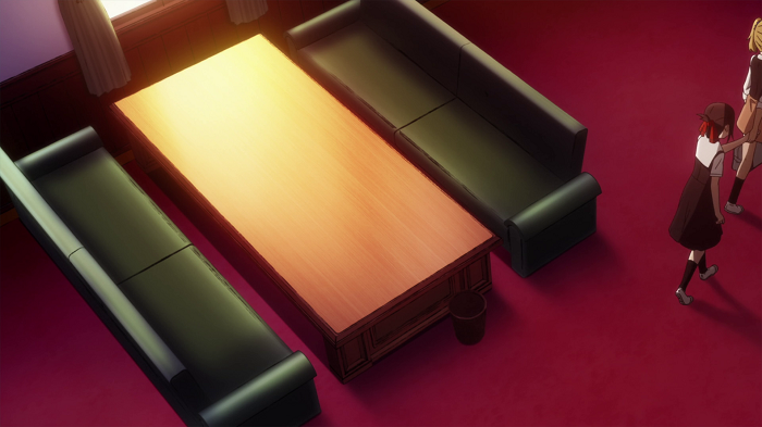
It's hard to put my finger on it, but the perspective in this shot is clearly off based on the position of the camera. Kaguya looks too tall vs the seated figures. She's shot from the side perfectly flat, but we're also supposed to be at slight angle looking down which is why we can see the seats of the couch. But Shirogane doesn't look he's sitting on the couch, it's like he's standing up but he's suddenly the size of a child. It just feels like every character and object in the shot is from a separate scene shot at a different angle and distance from the camera and they've all been jammed together. You might not be consciously processing all this when you see the above, but your brain will. To compare, lets pull a shot from episode 6:
Here we're viewing a character sitting down from the side, but everything looks correct. The camera is at an angle but so is the character and couch – they aren't flat, they're turned slightly and have correct depth. The couch looks solid and real and the character actually looks like they're sitting down. No shortcuts have been taken here. Let's return to episode 8:
On the surface, this might feel like a normal shot, but something is off here as well. Ignoring how shiny and weird the President's phone is, the real offender is the backgrounds. There's a slight blur to make them look like they're just out of focus which I assume is to give the focus of the image some visual pop, but it just makes the whole thing appear peculiar. The blur doesn't really resemble that distance being out of focus, instead it makes the room like slightly unreal. It's as if they character are standing in front of a film screen that's projecting a flat background image behind them that isn't quite real. The same oddness can be seen here:
Shirogane and Kagua are clearly inside vs the other characters being outside, but the effect is still odd. There is no attempt to add visual cues suggesting depth to background art (beyond the frame) and when coupled with the blur and weird light it really doesn't look the characters outside are even from the same scene. Again, it feels like they're being projected onto a screen rather than existing in a real, physical space that has depth.
Pulling back to episode 6, we can see how to create a sense of real depth and space. Consider the below examples:
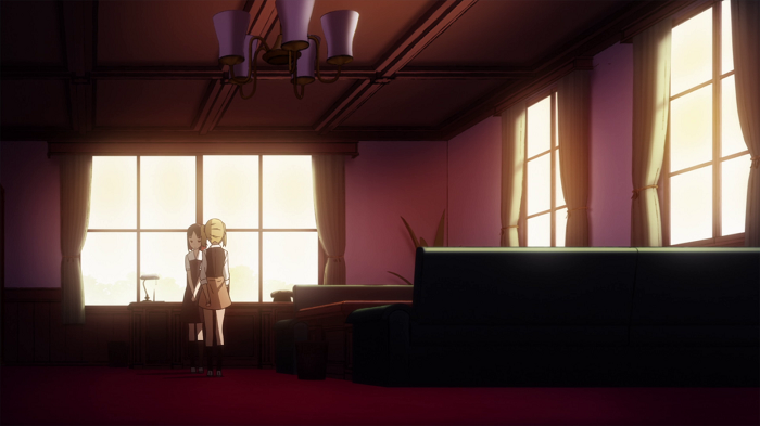
With just a couple of shots the director has used a couple of techniques to make the Student Council's room feel like a real 'space' in a way that it never is in episode 8. The high angle in the 1st shot allows us to view the depth of the objects and characters, making them feel solid. The mise-en-scene (pardon my French) in the 2nd uses lines (in the ceiling and furniture) to draw your eyes to the back of the image, drawing you in and creating the illusion of depth. It's a little easier to see with some markings:
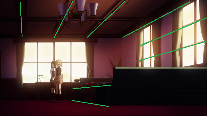
What's neat here is that the effect is subtle. The lines don't stand out (like some crazy German Expressionist movie) but they work. Speaking of creating an impression, I'll end this discussion by briefly looking at the different ways that the directors handle depicting the 'flights of fancy' that the series takes.
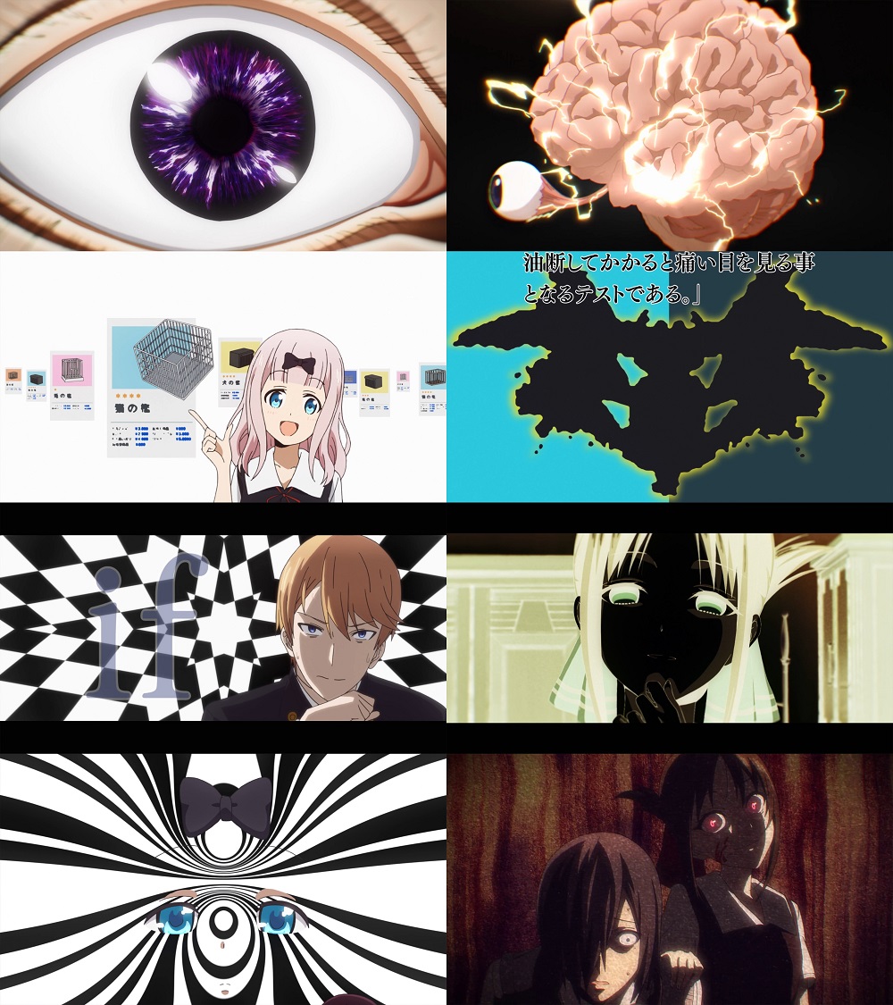
It's fairly common for the series to depict some idea, or discussion, or emotional character state in a stylized, fantastical manner. You can get away with this kind of bizarre or unusual imagery in a comedy series because in a comedy, the audience naturally accepts that rules and traditions can be broken for the sake of a gag. It's unlikely that the same kind of stylisation would be so readily accepted in a drama. This is just a really long way of saying that the director gets a lot of creative freedom to do almost anything they want. Here's a selection of those from episode 8:
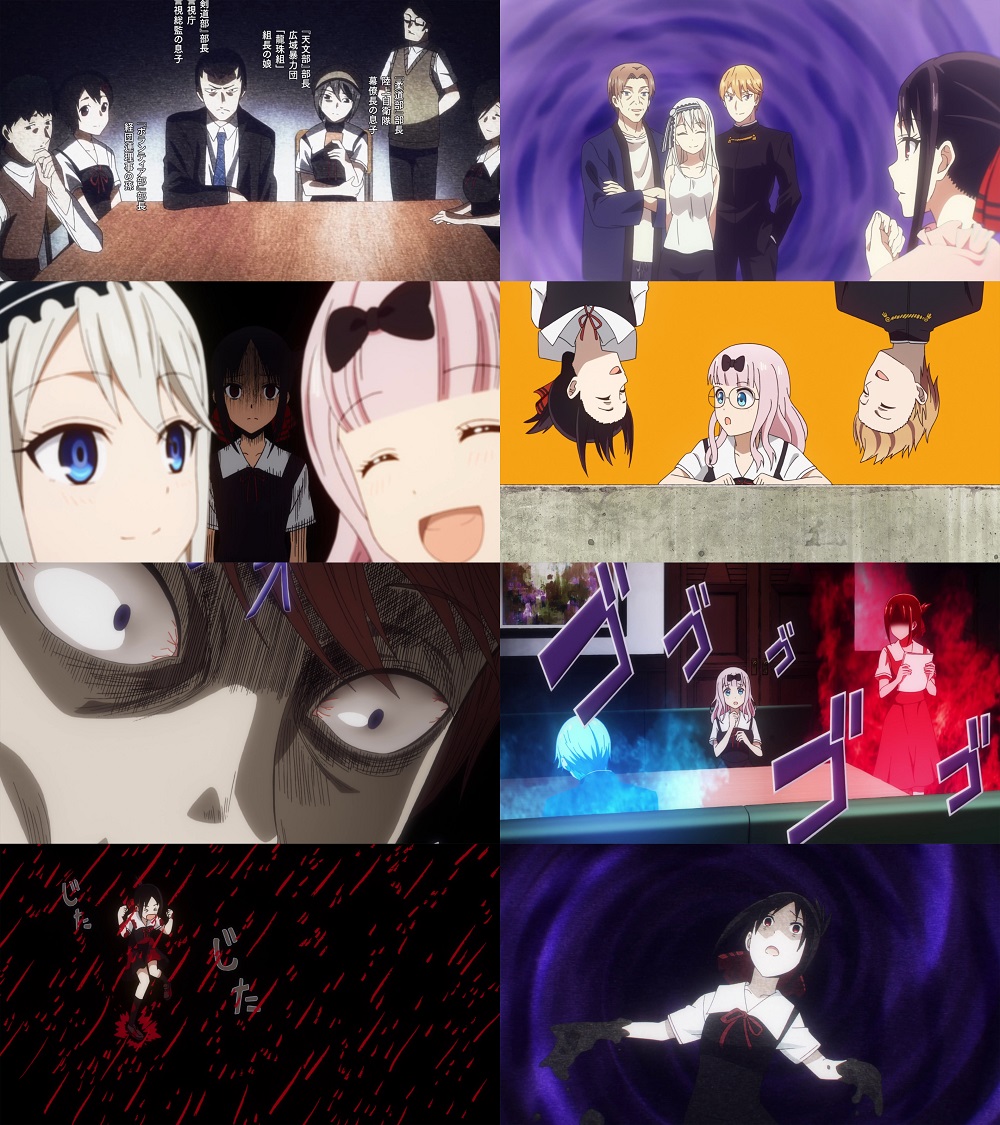
Now I think some of these are pretty fun - I particularly like inverted Kaguya+President and Kaguya dancing in the rain of blood. Those two sequences in particular great job communicating ideas to the viewer - both poor Fujikawa's confusion and Kaguya's frustration. Some of the rest are okay, but a few of them (the use of big purple spirals) just feel uninspired and route, perhaps because some of them are just lifted from the manga. Which is to say - I'm seeing things that I've seen before and done better elsewhere. Lets turn our attention to the same kind of scenes in episode 6:
Here we see can that when Hatakeyama wants to get creative he can pull from an extremely deep bench of ideas and influences. Moreover, it feels like he's constantly trying to challenge himself to show us something new and different. What's more, while Hatakeyama uses the manga as a 'starting point', a surprising amount of the imagery he depicts is original. So rather than just animating the manga frames, he's combining it with his own ideas to create something richer than what he started with. He's really enhancing the material as he adapts it. This is the most surprising and successful part of this adaptation as a whole - the willingness of the director to freely reshape and re-arrange the material to make it a better series. I believe this boldness and vision is what takes the series from "good" to "great".
[Kaguya-sama: Love is War] – 8
This one ended up a miss for me. It wasn't bad, but the visuals weren't up to the standards set by earlier episodes. Tetsuhito Saito headed up the storyboarding of this episode and his style is a watered-down version of the one used by series director, Mamoru Hatakeyama. To explain why I'm going to discuss what these two creators have done previously and then examine some scenes from this episode alongside Hatakeyama's episode 6.
Hatakeyama has had an interesting career. He started in 1999 and from then till 2001 he worked on no less than 12 porn OVAs before moving over to SHAFT where he toiled for several years as an episode storyboarder. He got his big break in 2013 when he became the series director of Studio Deen's Rozen Maiden: Rewind. Studio Deen's name up to that point had become synonymous with shoddy anime. Hatakeyama's work broke free of that legacy and became the start of a new chapter for the studio, which he continued with his Sankarea: Undying Love. Neither Rozen Maiden nor Sankarea proved to be strong shows but it was clear that Hatakeyama was a talented director and that given the right material and staff he'd be able to make a great series. This promise was realised in 2016 when he directed the sublime Shōwa Genroku Rakugo Shinjū, which is one of the best anime of the decade.
For Kaguya, Hatakeyama personally storyboarded episodes 1, 3, 6,7 & 12. He's a versatile visual storyteller with a talent for eliciting an emotional response from the viewer. In a single scene he can paint a tender picture of young love, then drag you through a horror movie before depositing you in absurdist comedy and it all just works. Beyond this, he also a font of creative and weird imagery which he's used to great effect in this series.
Saito started working in the late 80's as an animator and he didn't start storyboarding until the early 2000's. Since then he's worked on several projects sometimes doing a substantial amount of work such as on Twelve Kingdoms (8 episodes) and Getbackers (11 episodes). I don't have any familiarity with his style as I haven't gone back to consult these episodes, so I'm just working based on what I see here. Speaking of which, lets examine some of that work in more detail.
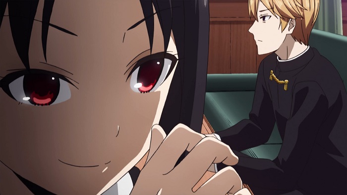
We'll begin, strangely enough, at the beginning. The first moment of the episode is the introduction of a new character – Kei Shirogane. Here's how it's depicted:
The purpose of this sequence is to introduce us to this character through Kaguya's eyes. The shot of Rei walking with her long hair flowing behind her communicates a notion of grace and femininity when coupled with pink light bathing the corridor. The reveal shot of Kei's face is unusual in only revealing half her features which means the focus is on be on her striking blue eye. Finally, the image dissolves into a 'full' reveal of Kei, who has been transported momentarily into a realm of stunning white light. From this we can do that for Kaguya, Kei is a strikingly attractive figure, to the point where she even says it aloud which is a rare slip for someone as controlled as Kaguya. This sequence is totally adequate – it conveys the information it needs to but it's not particularly impressive or creative, it just does the job. Like many scenes from this episode it's mostly a straight shot-by-shot lift from the manga with almost nothing changed despite the switch in mediums. To give an idea of how Saito's work here compares to Hatakeyama, we can move look at episode 6.
Episode 6 also starts with a character introduction – this one if for Ishigami. Let's look at it here:
I've excised a few shots, but you get the idea. This sequence depicts Ishigami taking a messy bite out of his snack which results in crumbs falling onto a table. While the crumb is tumbling through the air Ishigami manages to make all the required changes to his accounting document. This sequence is dynamic, and ridiculous and playful. The unusual angles and close zoom onto Ishigami's hands as he's typing, especially the extreme closeup on 'Enter', gives the sequence a dynamic feel, like we're in a spy movie witnessing some incredibly crucial bit of computer hacking. The repeated shots of the tumbling crumb serve as our ticking clown counting down to the end of the sequence. This character introduction both serves to communicate that Isghiami is a someone very skilled at his job, but at the same time is gently ridicules due to the inherent ridiculousness of the scene. I think this does a great job of establishing how the series will be treating Ishigami going forward. What's notable about this scene is that Hatakeyama essentially created it himself. In the manga, this scene is only 3 images, and the notion of Ishigami typing faster than the falling crumb is completely invented by Hatakeyema. Of course, he may have been inspired by scenes where ridiculous, over the top camerawork is used to depict a relatively mundane task:
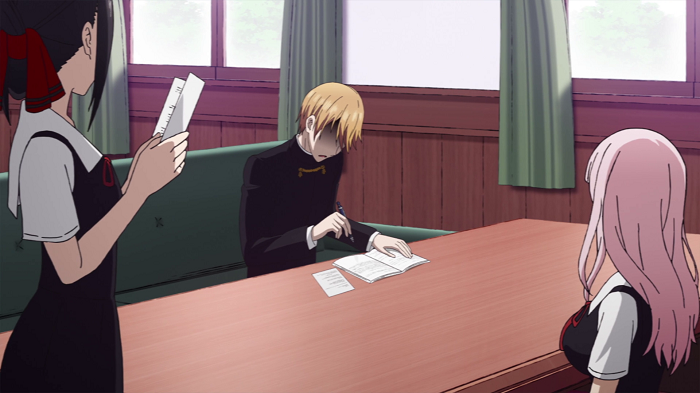
Let's return to Saito's depiction of the meeting between Kaguya and Kei. One shot dominates the first half of the scene:
This image is on screen for about 30 seconds which is a shame because it conveys almost nothing about the characters or their emotions. It's flat, dull and detached. We know that Kaguya is trying hard to impress Kei, and that Kei is intimated and flustered by Kaguya. But this image doesn't give us any of that. There are lots of potential ways to convey the tension between these two characters meeting for the first time – you could consider placing characters on either side of the frame to imply emotional distance, or achieve a similar effect by use of body language etc. Saito replicated the manga panel, but he fails to enhance or develop like it, unlike Hatakeyama. There are several shots like this that are lacking in craft: some of them are dull, some fail to create a believable sense of place or space and some are poorly constructed. Starting at the top: dull shots.
To define what I mean by a 'dull shot' I mean a shot that fails to tell us any information about the story or characters and is aesthetically lacklustre. The below is a perfect example:
This is about as run-of-the mill as you can get. Two characters are plopped down in the centre of the frame and they're equidistant from each other, leading the image to be roughly symmetrical. Because the camera is shooting them front on, it's like they're sitting on a stage before us and there's no sense for an interesting world beyond them. The background is nearly blank and there's no other characters in the image. Shooting the characters directly from the front flattens them completely, which robs them of presence. The arrangement of the bookcases, chairs and tables at least gives the room some depth, but they're all symmetrical and a symmetrical image is often dull because if you look at one part of it you've seen all of it. It's hard to think of a more boring way to view these people – but the director finds one:
It's all the benefits of the previous image, except that we can't even see the characters faces! Here's another example:
Notice how Shirogane is shot from the side which, again, makes it feel like he's up there on a stage and we're observing as member of an audience in a theatre. There's no sense that the camera could turn and reveal a believable space. This silhouette feels flat and lifeless – which is the same problem we experience when shooting people straight on. If the camera, or characters, aren't turned we don't get to feel the roundness of the character and they leave less of an impression. The background of the classroom itself is largely identical and the outside world is so washed out that it might not exist. It doesn't feel like we're in that room with Shirogane and Fujiwara – we feel detached and separate. There are certainly other shots that fail to create a sense of space, see below:
Now we certainly understand that Ishigami plays videogames, but we also expect his room to have err things it. Apparently, he only has a chair, a glowing towel that he plays games on and some posters on his single wall. This might be one the laziest bedrooms I've seen depicted in an anime. Bedrooms are rich sources of information that can tell us lots of information about a character. Zero thought was paid on how to depict this location and it comes off as lazy, even though care WAS clearly put into the actual images on the posters which I can tell some nerd enjoyed designing way more than portraying a functioning bedroom. Speaking of weird rooms:
It's hard to put my finger on it, but the perspective in this shot is clearly off based on the position of the camera. Kaguya looks too tall vs the seated figures. She's shot from the side perfectly flat, but we're also supposed to be at slight angle looking down which is why we can see the seats of the couch. But Shirogane doesn't look he's sitting on the couch, it's like he's standing up but he's suddenly the size of a child. It just feels like every character and object in the shot is from a separate scene shot at a different angle and distance from the camera and they've all been jammed together. You might not be consciously processing all this when you see the above, but your brain will. To compare, lets pull a shot from episode 6:
Here we're viewing a character sitting down from the side, but everything looks correct. The camera is at an angle but so is the character and couch – they aren't flat, they're turned slightly and have correct depth. The couch looks solid and real and the character actually looks like they're sitting down. No shortcuts have been taken here. Let's return to episode 8:
On the surface, this might feel like a normal shot, but something is off here as well. Ignoring how shiny and weird the President's phone is, the real offender is the backgrounds. There's a slight blur to make them look like they're just out of focus which I assume is to give the focus of the image some visual pop, but it just makes the whole thing appear peculiar. The blur doesn't really resemble that distance being out of focus, instead it makes the room like slightly unreal. It's as if they character are standing in front of a film screen that's projecting a flat background image behind them that isn't quite real. The same oddness can be seen here:
Shirogane and Kagua are clearly inside vs the other characters being outside, but the effect is still odd. There is no attempt to add visual cues suggesting depth to background art (beyond the frame) and when coupled with the blur and weird light it really doesn't look the characters outside are even from the same scene. Again, it feels like they're being projected onto a screen rather than existing in a real, physical space that has depth.
Pulling back to episode 6, we can see how to create a sense of real depth and space. Consider the below examples:
With just a couple of shots the director has used a couple of techniques to make the Student Council's room feel like a real 'space' in a way that it never is in episode 8. The high angle in the 1st shot allows us to view the depth of the objects and characters, making them feel solid. The mise-en-scene (pardon my French) in the 2nd uses lines (in the ceiling and furniture) to draw your eyes to the back of the image, drawing you in and creating the illusion of depth. It's a little easier to see with some markings:
What's neat here is that the effect is subtle. The lines don't stand out (like some crazy German Expressionist movie) but they work. Speaking of creating an impression, I'll end this discussion by briefly looking at the different ways that the directors handle depicting the 'flights of fancy' that the series takes.
It's fairly common for the series to depict some idea, or discussion, or emotional character state in a stylized, fantastical manner. You can get away with this kind of bizarre or unusual imagery in a comedy series because in a comedy, the audience naturally accepts that rules and traditions can be broken for the sake of a gag. It's unlikely that the same kind of stylisation would be so readily accepted in a drama. This is just a really long way of saying that the director gets a lot of creative freedom to do almost anything they want. Here's a selection of those from episode 8:
Now I think some of these are pretty fun - I particularly like inverted Kaguya+President and Kaguya dancing in the rain of blood. Those two sequences in particular great job communicating ideas to the viewer - both poor Fujikawa's confusion and Kaguya's frustration. Some of the rest are okay, but a few of them (the use of big purple spirals) just feel uninspired and route, perhaps because some of them are just lifted from the manga. Which is to say - I'm seeing things that I've seen before and done better elsewhere. Lets turn our attention to the same kind of scenes in episode 6:
Here we see can that when Hatakeyama wants to get creative he can pull from an extremely deep bench of ideas and influences. Moreover, it feels like he's constantly trying to challenge himself to show us something new and different. What's more, while Hatakeyama uses the manga as a 'starting point', a surprising amount of the imagery he depicts is original. So rather than just animating the manga frames, he's combining it with his own ideas to create something richer than what he started with. He's really enhancing the material as he adapts it. This is the most surprising and successful part of this adaptation as a whole - the willingness of the director to freely reshape and re-arrange the material to make it a better series. I believe this boldness and vision is what takes the series from "good" to "great".