Kinda weird imo, but I'm looking forward to the game anyway since it feels like you play as Mobile Infantry-lite.
-
Ever wanted an RSS feed of all your favorite gaming news sites? Go check out our new Gaming Headlines feed! Read more about it here.
Anthem at E3 detailed: Gameplay, combat showcase, dev insights, boxart revealed
- Thread starter shinobi602
- Start date
You are using an out of date browser. It may not display this or other websites correctly.
You should upgrade or use an alternative browser.
You should upgrade or use an alternative browser.
Yeah, sucks that all the logos and stuff will have to be crammed at the bottom
I think i would prefer it if they removed the helmet dominating the top and shifted the camera up on an angle so that the freefall was towards the middle of the image in a fish eye type shot that emphesises the land that this "Anthem" belongs to just as much as the flying.
Then move the Title to being vertical along the left border. Logo's can go bottom left (EA) and bottom Right. (Ratings board)
I think that emphesis on the idea of land, the sense of place/home/country that this "Anthem" and these characters/people belong to would help lean more into the "space western" concept that it looks like being and draw people in a bit better
Interesting that everyone is loving it. It feels so unbalanced with a huge uninteresting mask at the top, and an overly pronounced picture fade to the bottom part.
Edit: I think their intention it to crop the top of the image with the console banner which will perhaps help with the unbalance. Still not very excited about a robot face though, but definitely looking forward to seeing more about this game.
Edit: I think their intention it to crop the top of the image with the console banner which will perhaps help with the unbalance. Still not very excited about a robot face though, but definitely looking forward to seeing more about this game.
Last edited:

I really like it, tbh. The vertical title gives it some real distinction, and of course I still really like the look of the armor.
Could you please link me the contact info of these amateur peeps? I might have some work for them.

It might look better in Xbox green
Photoshop an Xbox one it would look sick
Not interested in the game, but I like the box art.
Also, E3 leaks are getting, shall I say, out of hand. I didn't realize it was this hard to keep things under wraps.
Also, E3 leaks are getting, shall I say, out of hand. I didn't realize it was this hard to keep things under wraps.
strangely it looks better as a mock up. the PS4 logo at the top does a good job demphasizing the head and the bottom freefall part looks like it was taken right out of an F16 or any other fighter plane with a bubble cockpit
Nah.Any chance it might drop earlier than next year? Seems like a lot of noise for a game little less than a year out
Logical, we know very little about it.
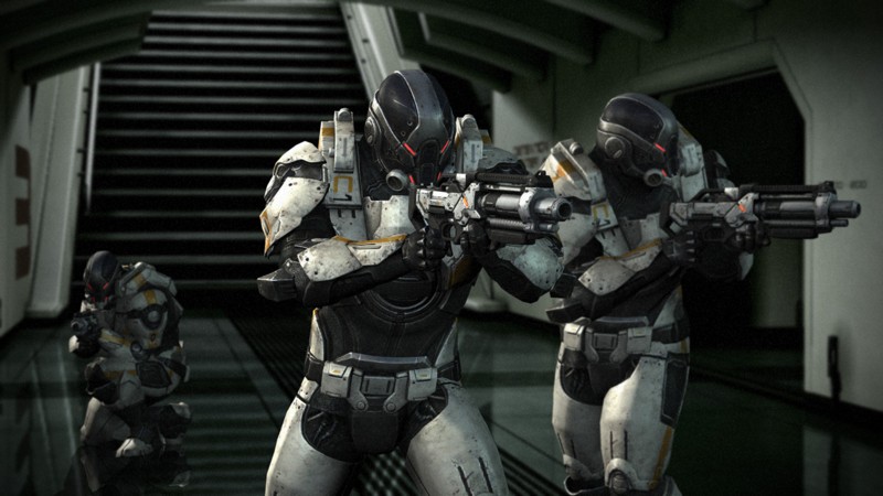
I really hope the mecha designs are unique. I'm getting a Destiny aesthetic vibe from this and the character loot drops in that looked pretty bland.
EA never ceases to amaze me how dedicated they are to focus grouping everything. This is basically just the Assasins Creed Origins cover with an inverted colour palate and Doom Guy instead of a pyramid
Edit: At least put the name in the distracting whitespace in the top left corner
boop

drives me nuts that Anthem and the helmet image aren't exactly symmetrical though