-
Ever wanted an RSS feed of all your favorite gaming news sites? Go check out our new Gaming Headlines feed! Read more about it here.
Do people really think the American SNES is ugly?
- Thread starter Lant_War
- Start date
You are using an out of date browser. It may not display this or other websites correctly.
You should upgrade or use an alternative browser.
You should upgrade or use an alternative browser.
It's not ugly, but I think you'd be crazy to put it before the Jap/Euro versions. It's just really muted color wise, and I'm not big on the boxy look of it; If I hadn't grown up with it I'd probably have a strong dislike of it. Even the fucking carts look worse, now that I think about it.
Last edited:
It's one of the ugliest consoles. They replaced the super famicom colorscheme too, if they didn't do that it'd be way better.
I've always liked the North American model more even though I'm from Europe. Purple face buttons for life.
Regardless of the visual appeal, changing 4 colors for 2 different purple tones is one of the worst ideas ever, especially if we think about kids playing games.
I prefer the JP/EU version of course, but this change alone has always felt a bad decision to me.
I prefer the JP/EU version of course, but this change alone has always felt a bad decision to me.
I mean, it objectively is ugly as fuck.
IT was the famicom in Europe?
American
European
/cdn.vox-cdn.com/uploads/chorus_image/image/63914403/00000703_02.0.0.jpg)
These pics should be in the OP for comparison.
IT was the famicom in Europe?
Were there any differences between the SFC and EU SNES?
Anyway, hated the NA one with a passion. Would have been heartbroken had I been old enough to play games at the time and followed any new console hype. Didn't snag an NA SNES until 97 as an SNS-101, and while that version was better it was still a far cry from the SFC
Anyway, hated the NA one with a passion. Would have been heartbroken had I been old enough to play games at the time and followed any new console hype. Didn't snag an NA SNES until 97 as an SNS-101, and while that version was better it was still a far cry from the SFC
And the US SNES looks like it should have been aborted.
Never understood the hate the American version gets. I grew up with that one and so it will always be the "true" SNES model to me. :p
American one looks the best. People here are fucking weird and prefer stuff like Perfect Dark's japanese box art BECAUSE IT LOOKS SO COOOL but doesn't actually depict the game in anyway.


??? How exactly is that poorly rendered face depicting the game any better than an actual cool, eye catching piece of art?
Nah, it was Super Nintendo but other than that branding it looked identical to the SFC.
Can we at least agree that the European SNES/Japanese Super Famicom logo with the four colors is the best console logo Nintendo has ever had?

Now THIS is truly the worst take.ugly and it's music was bad by comparison to the Superior sega genesis.
This. I can practically taste those nasty things just by looking at it.
Nah, it was Super Nintendo but other than that branding it looked identical to the SFC
Ahh I see, I thought SNES may have been a UK only thing
??? How exactly is that poorly rendered face depicting the game any better than an actual cool, eye catching piece of art?
It has 0 to do with the game vs actually showing Joanna
Please change to "DarkERA".Don't worry OP, for posterity here's the first and right vote

But yeah, NA has more character
EU btw :P
The US one is actually pretty ugly. And the European one is one of the best looking consoles ever. Why is the american model like that?
No.
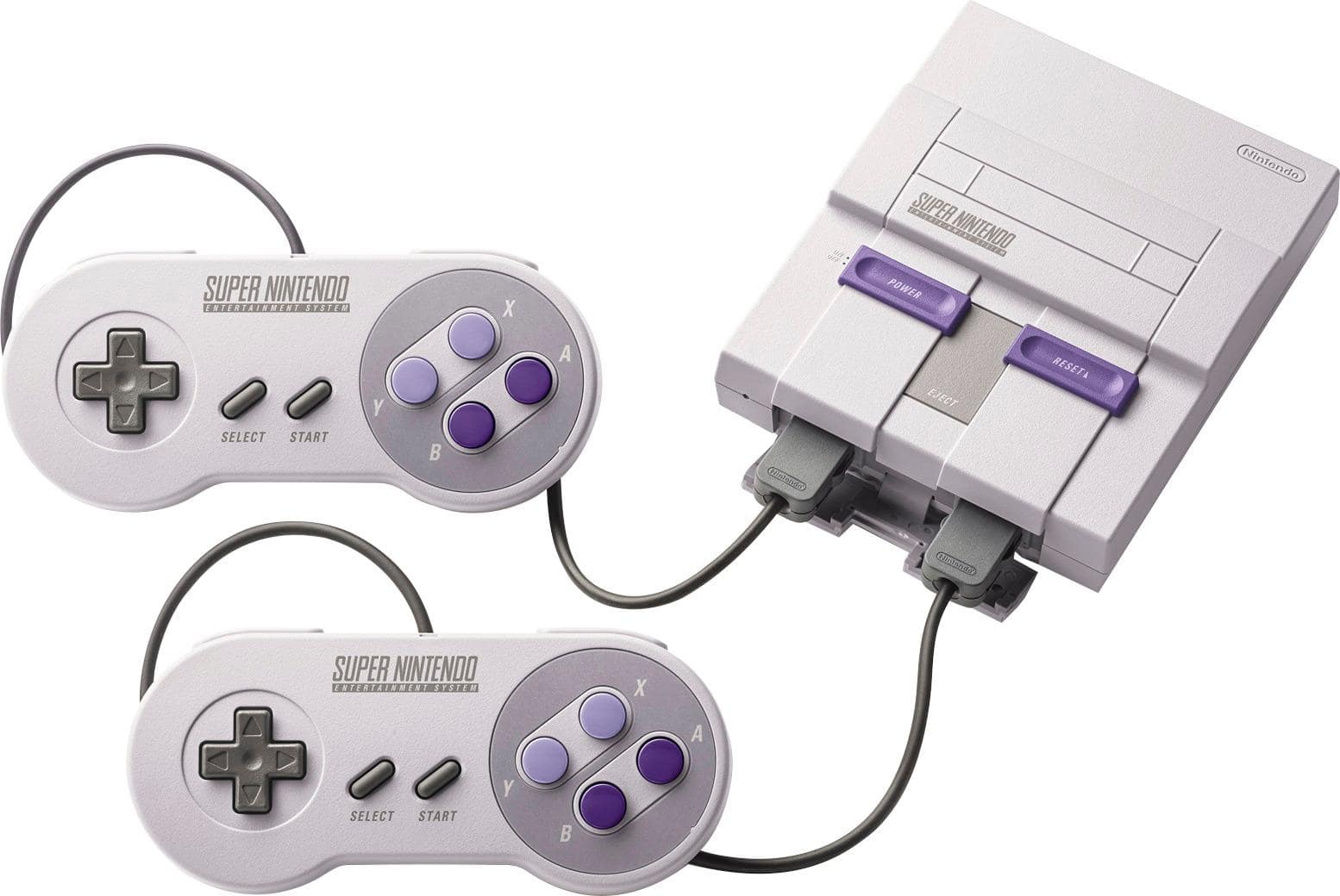
American:

European:

Japanese:

Always hated the purple. Even the grey has a tinge of purple too.
I would have thought Red buttons would have been the way to go since the NES had red buttons + the red Nintendo logo.
I think there were prototypes that had red buttons

I want the name of the person responsible for the NA SNES. They should be ashamed
I can't wrap my head around the rationale—it doesn't really look anymore "kid-friendly" nor more sophisticated. It's just busted
I can't wrap my head around the rationale—it doesn't really look anymore "kid-friendly" nor more sophisticated. It's just busted
The NA SNES looks terrible and has always looked ba. At the time the sleekness of the Genesis made the SNES look goofy, but after learning of how good the PAL/JP SNES looks it made things even worse. The ugliness poisons my nostalgia for it. The lack of distinct colouring on the buttons is likely why I still fumble internalizing the Nintendo button layout. The concave buttons are awful and there's a reason why consoles after did not use them. I'd buy a SNES pad for my Switch but given that I'm locked to the terrible NA pad that's a pass. I even imported a European SNES mini just trying to retcon my childhood as best I could.
I think any preference for it comes from childhood brainwashing that hasn't been shaken.
I think any preference for it comes from childhood brainwashing that hasn't been shaken.
I'm indifferent-to-"it's fine" but I don't agree with "ugliest console ever" when the US Turbo Grafx 16 is right there or any of the 90s black boxes that crashed and burned out there.
I always thought it looked bad, and after seeing the Japan/Europe version, that made it even worse. Like why, why did we get such a crappy, boxy, transformer type shape compared to the more elegant model? Just ugh.
The TG16 wasn't nearly as much of an eyesore, especially since it was black. You could just turn off the lights and forget about it.
Oh, this argument again. Even if you believe the Genesis had the superior sound chip for music, the SNES had far better compositions overall.
I'm indifferent-to-"it's fine" but I don't agree with "ugliest console ever" when the US Turbo Grafx 16 is right there or any of the 90s black boxes that crashed and burned out there.
The TG16 wasn't nearly as much of an eyesore, especially since it was black. You could just turn off the lights and forget about it.
ugly and it's music was bad by comparison to the Superior sega genesis.
Oh, this argument again. Even if you believe the Genesis had the superior sound chip for music, the SNES had far better compositions overall.
Last edited: