-
Ever wanted an RSS feed of all your favorite gaming news sites? Go check out our new Gaming Headlines feed! Read more about it here.
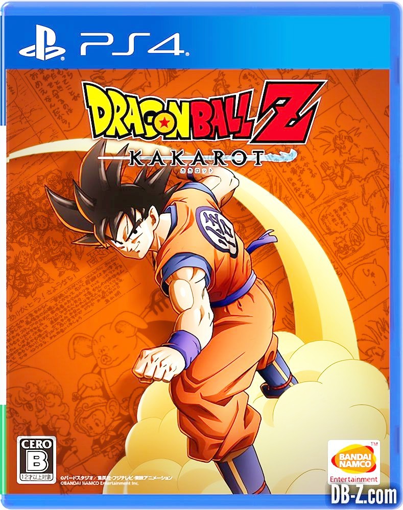
Dragon Ball Z: Kakarot launches on January 16th, 2020, cover art looks pretty bad as expected
- Thread starter vestan
- Start date
You are using an out of date browser. It may not display this or other websites correctly.
You should upgrade or use an alternative browser.
You should upgrade or use an alternative browser.
Its not horrible. The simplicity of Goku and Nimbus perfectly shows you what the game is all about. The orange background could be replaced by something like this:

I was thinking the same, or maybe have that blue-sky with clouds below and Shenron style background that was often used for DBZ posters and such.
It's amazing how a little detail can improve the boxart so much. I like this one!It looks like a fake, but it's on a legit site... o.O look at the tip of the cloud's tail... it's badly edited...
i would have at least put some drafts in the background... like that:
It's amazing how a little detail can improve the boxart so much. I like this one!
Yeah the background detail improved it A LOT!
Surprised Toriyama wasn't commissioned to create an illustration for the game's box-art.

Even something like this would've been cool.
Even something like this would've been cool.
i may be the odd man out but this cover look dope AF with the orange..it goes extremely well with the blue PS4 case highlights, its just like goku's orange and blue gi
What a lame box art. Artwork by the bad promo artist aside the plain background with that shitty looking shadow makes the whole thing look unprofessional.
Also January is a bit earlier than I expected.
Also January is a bit earlier than I expected.
Spider-Man has a reversable sleeve to show something good. This one probably doesn't.This is better than the Spider-Man one at least. Spidey's cover art is the one blemish on an otherwise phenomenal product.
Looks good to me. Then again I never know what to expect with db as some people seem to like all the stuff that I think is bad. Haha
Reminds me of the European box art for Budokai (1). It's not flashy but I don't hate it! As long as the game is fun... Looks like it will be!
Anyone else read the thread title as
"Dragon Ball Z: Kakarot launches on January 16th, 2020, cover art looks pretty bad ass"
😂
"Dragon Ball Z: Kakarot launches on January 16th, 2020, cover art looks pretty bad ass"
😂
I don't think it's terrible, just boring and lazy, should have used key art from the game instead of an old drawing of Goku.
But ffs! The cloud has perspective to it since he's swooshing in an arc, but he's still casting a shadow as if he's standing a half meter in front of a red screen. That just looks extremely poorly thought out. Either remove the shadow or make something he can actually swoosh through.
Surprised Toriyama wasn't commissioned to create an illustration for the game's box-art.
Even something like this would've been cool.
Toriyama never does boxarts for DB games for some reason, despite doing a new one for all DQ games.
He flies himself in the opening of the show so it's iconic. Also DragonBall reminder I guess? It's iconic imagery for him to ride Nimbus in general.
I'm cool with the boxart.
The cover looks great.
You guys are only saying it looks bad because the OP said so in the title, so you all had to follow like sheep. You guys are crazy.
You guys are only saying it looks bad because the OP said so in the title, so you all had to follow like sheep. You guys are crazy.
The cover looks very nice imo.
I'm looking forward to it.
I'm looking forward to it.
please make xeno 3 with this art style next
It looks like a fake, but it's on a legit site... o.O look at the tip of the cloud's tail... it's badly edited...
i would have at least put some drafts in the background... like that:
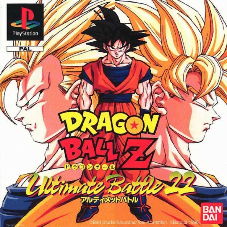
I knew this motif looked familiar.
