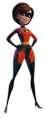
I prefef it to her being super skinny, which one might expect from elastic supertypes.
...I get people's reactions, but geez. Guys calm down a little.
The GBA game? Rise of the Underminer? I remember reading about that shit in Disney Adventures magazine lmaooooo
I prefef it to her being super skinny, which one might expect from elastic supertypes.
...I get people's reactions, but geez. Guys calm down a little.

I'm a girl bro!I'm pointing out the objective truth in her character design. She's thick bro.
I don't know what it's called but I think the original Incredibles was going for this artstyle in 3D
Man is this film gonna look gorgeous. I'm loving how much more pronounced the shape design is. We are almost to the point where the film on screen has the same type of energy that the concept art has.


Man is this film gonna look gorgeous. I'm loving how much more pronounced the shape design is. We are almost to the point where the film on screen has the same type of energy that the concept art has.

Really need to see it in motion. between this and the teaser it's hard to gauge how nice the animation will look. Watching the original nowadays can be...rough
Yeah, it's definitely bold, but I preferred the original designs having some more texture. Like look how many colors are in Bob's face and in their gloves/boots. That looks great! Then the red cloth is really blown out by comparison.I don't know if I'm the biggest fan of the colors in the costumes. Looks great otherwise!
It's funny because when I looked at the shot of the new movie, I was just like, yeah, that's The Incredibles alright. But then looking at them side by side like this, damn. I don't remember the first one looking bad, but it looks really bad next to the new one.Found a better snap.
We're seeing more dynamic and true-to-concept models in both film and videogames and it's wonderful.
I haven't watched it in so long so these stills are a bit of a shock.
Let that hope die.
Things that should never have to be said for 500.
Yeah, it's definitely bold, but I preferred the original designs having some more texture. Like look how many colors are in Bob's face and in their gloves/boots. That looks great! Then the red cloth is really blown out by comparison.
I have to imagine the setting plays a huge part of this too, with the bright daylight not leaving much wiggle room.
I shall comment about the article:
One thing I don't understand about the article is the why they make it seem like (elastigirl) was somehow under used or not in the forefront of the first movie. It said she'll be the center of this movie (like she wasn't in the first?!?!) The first Incredibles is just as much about her as it is about Mr Incredible. Maybe I'm missing something but she wasn't nobody's 2nd fiddle.
I have commented about the article:
Does this mean the Rise of the Underminer video game is non-canon?
:(
So the incredible sequel game with Mr. And Frozone is no longer canon?
I remember this being sooo terrible.I don't know what it's called but I think the original Incredibles was going for this artstyle in 3D
I shall comment about the article:
One thing I don't understand about the article is the why they make it seem like (elastigirl) was somehow under used or not in the forefront of the first movie. It said she'll be the center of this movie (like she wasn't in the first?!?!) The first Incredibles is just as much about her as it is about Mr Incredible. Maybe I'm missing something but she wasn't nobody's 2nd fiddle.
its still 2004 in incredibles THEY LIVING IN THE GOLDEN BUSH ERA MANHave obama and frozone meet.
Ive always pictured the Wheres my supersuit skit with Obama and Michelle
Where is this from? Surely it's some sort of mockumentary and not actual courtroom footage. The timing of the perp waiting for the camera to pan over is too perfect.