I found it extremely redundant and confusing, with screenshots and icons placed everywhere, which create an absurd visual noise.
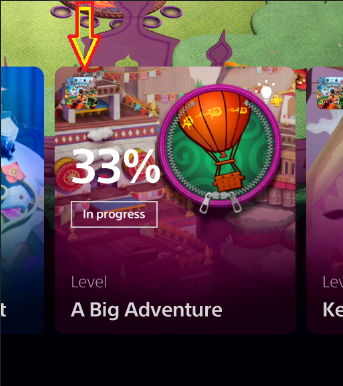
First of all the "cards" of Sackboy with a screenshot as background, then the classic circle with the hinge to symbolize the level and at the top left the game logo, all of that with multiple white writings (of various formats and sizes) without outline or shadows to make them more readable:
The one indicated with the arrow should be the game logo, good luck to understand something from that, it is a splash of colors on a screenshot.
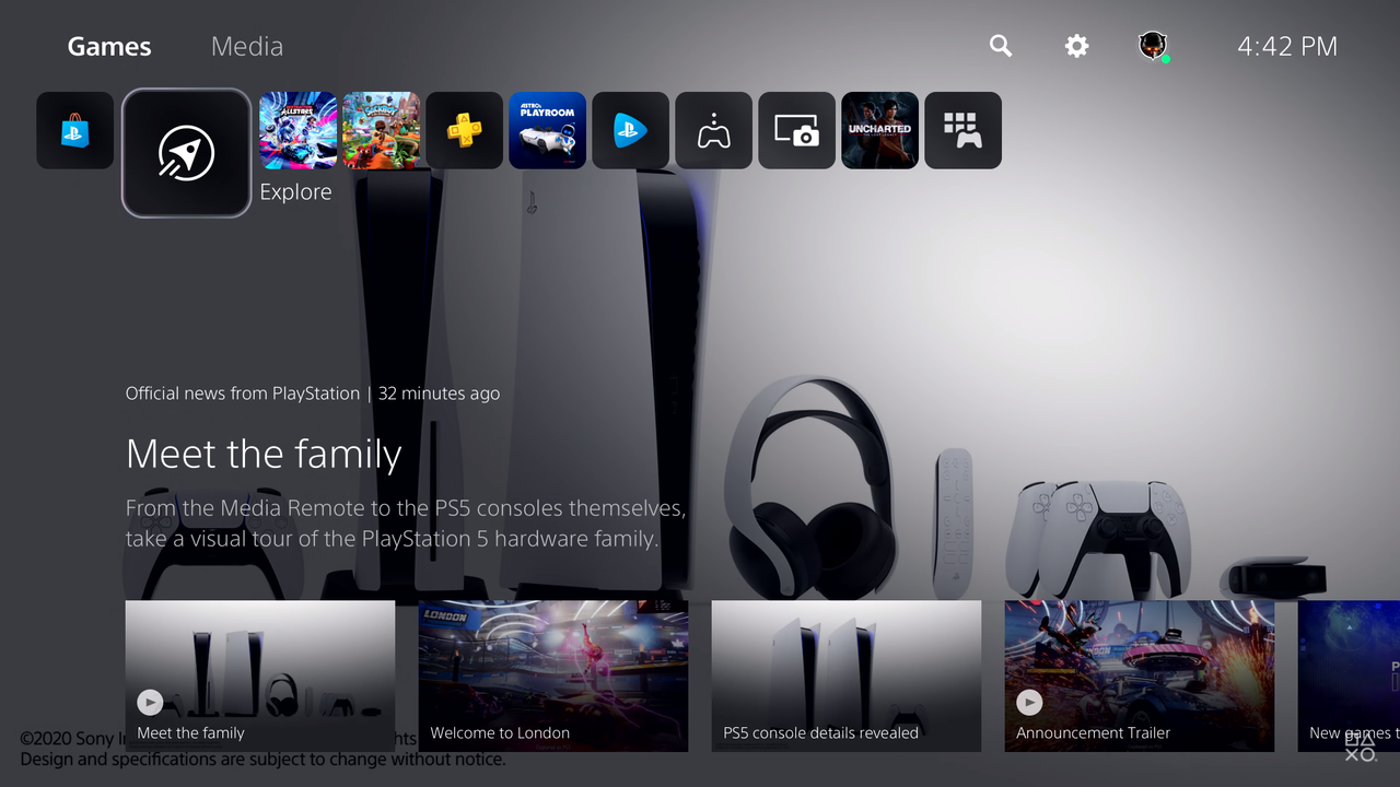
The main menu is no exception:
Destruction AllStar selected with giant screenshot in the background, another game logo on the bottom left and again the game logo on the right with a the price tag (why if I'm already playing it? Are they showing demos? I don't understand ...).
How many times do you want to tell us that we're on Destruction AllStar?
And then, again, these screenshots placed everywhere are ugly:
Random image of PS5 taken by Google with other screens and writing scattered everywhere, it seems to be on one of those sites that want to be cool with screens and transparencies placed everywhere but then they are a pain to browse.
I find it really ugly, I'll rather get the PS4 interface all day with a theme of your choice and the big squares, a lot cleaner.