-
Ever wanted an RSS feed of all your favorite gaming news sites? Go check out our new Gaming Headlines feed! Read more about it here.
Forum Requests/Suggestions
- Thread starter Specific Power Ranger
- Start date
You are using an out of date browser. It may not display this or other websites correctly.
You should upgrade or use an alternative browser.
You should upgrade or use an alternative browser.
- Status
- Not open for further replies.
Noticed that URLs have an extra space in front and after them. Cant check on mobile but im guessing itsputt between paragraph tags or something? When you select the wholesentencre theres a gap in front and after any urls, so the browser is treating it as a separate section. Links should just be flush with the rest of the text.
I say keep animated avatars. Thats my vote.
Or have users the option to have gifs be stopped.
Or have users the option to have gifs be stopped.
Just look at this page where a few people have animated avatars. It looks like trash and it's super annoying to read.
https://www.resetera.com/threads/kotaku-thousands-of-neogaf-users-flock-to-new-website.1177/page-35
Agreed, one only needs to imagine a dreadful day where everyone has an animated avatar and is also just replying with gifs in a thread, it's making me feel queasy thinking of it.
Add my voice/vote to the following
- No animated avatars, or at least turn them off (make users upload a static/gif version)
- Forum tree at the bottom of the page
- Report button moving place (perhaps the top right of the post)
- Highlight our own posts
I'm going to echo this and add:Agreed, one only needs to imagine a dreadful day where everyone has an animated avatar and is also just replying with gifs in a thread, it's making me feel queasy thinking of it.
Add my voice/vote to the following
- No animated avatars, or at least turn them off (make users upload a static/gif version)
- Forum tree at the bottom of the page
- Report button moving place (perhaps the top right of the post)
- Highlight our own posts
- Highlight our quoted posts as well
- Make mods names a different color
This might've been mentioned already but I'm not sure if this could be something weird on my end. Anyway, when I click on a thread title in the discussion list for the first time, naturally it brings me to the first post. When I go back into the discussion list, that thread is now gray, indicating that I've visited it. Great! However, when someone replies in that thread, the thread title becomes a link to the first unread reply and goes back to looking like I never visited the thread.
Is this working as intended or something you guys are still playing around with? I would much prefer the thread title link to always take me to the OP and then have the purple dot to the left of the thread title take me to my first unread reply. This accomplishes two things. I'll quickly be able to see which threads I've already clicked on and, if I want to visit the very beginning of the thread again, I'm only a single click away.
I know you guys probably have way more pressing matters, but this would be a rather big QoL improvement for me. Thanks!
Edit: Choice is always good so I say users should have the choice to turn on and off animated avatars.
I want to be able to go to front page from the bottom of the page (similar to clicking GAF logo at bottom of the page). It's kinda frustrating that when I reach the bottom of the page and I want to get refreshed page, I need to scroll up to the top again or clicking back and refresh the page.
Keep the animated avatars or if it is possible give people the option to turn them off.
The report button is a bit distracting maybe put it to the right side with the other two.
Also a signature would be nice.
The report button is a bit distracting maybe put it to the right side with the other two.
Also a signature would be nice.
Is there any chance of a rss-feed only for the gaming section? Off-topic is good and all but it's getting a bit overwhelming in my rss-rreader.
I read through the OP but didn't see so:
Is there a way to quick jump to the bottom of the page? Manually scrolling down sucks so I miss that little arrow at the top that lets me jump straight down. Sorry if it's been requested already but it's such a great feature.
Is there a way to quick jump to the bottom of the page? Manually scrolling down sucks so I miss that little arrow at the top that lets me jump straight down. Sorry if it's been requested already but it's such a great feature.
Yeah the Report Button is way too in your face. I also hat how it's not always in the same place.
- Strikethrough text: super useful to add flavor to text. Can be used in a ton of situations.
- Link to all boards (Gaming / Gaming Hangouts / Etcetera / Etcetera Hangouts) in the shortcut bar. The path we currently have isn't that useful.
- Make the "Go to last unread post" button bigger. Maybe the site logo could be use for that? It's kinda hard to click on at the moment.
- The report button sticks out too much and is too easily accidentaly clicked on. Move it to the far right, and move the quote + reply + edit buttons to the left (preferably under the avatar) as they are more useful and should be closer to the center of the screen.
Visually the Report, Quote, and Reply buttons are too distracting. I'd make them little icons that go under the avatar area. Keep the post area as clean as possible.
Also, I'd add a hard line in between posts so there's a stronger delineation where one post ends and another begins, besides just having banded rows. It helps when quickly scrolling.
Font consistency is also important.
Also, I'd add a hard line in between posts so there's a stronger delineation where one post ends and another begins, besides just having banded rows. It helps when quickly scrolling.
Font consistency is also important.
Alerts should just show the name of the topic and the number of new posts. The sea of information we have now is confusing, and not really important. With this much information you might as well put the actual posts there.
use [/s]like this
- Strikethrough text: super useful to add flavor to text. Can be used in a ton of situations.
use [/s]
+1 Would love the navigation breadcrumbs at the bottom of the page.
Yup. It might also be nice to have a link at the bottom that goes back to the forum from the thread for quick nav purposes.
Sorry, this has probably been addressed but I can't figure it out-
In a lot of threads that have images posted. I only see "
They're probably hosted on imgur. Apparently there's an issue with them and resetera, but the REF team is working on sorting it out.
https://www.resetera.com/threads/important-message-regarding-image-link.2007/
Last edited:
I just noticed this user was banned: https://www.resetera.com/threads/wh...ow-in-murfreesboro-tn.1758/page-5#post-143998
I'm not seeing a reason for the ban or where I would go to get that information, though.
I'm not seeing a reason for the ban or where I would go to get that information, though.
This has hopefully been said many times already but some accessibility options - font size, contrast etc.
I just noticed this user was banned: https://www.resetera.com/threads/wh...ow-in-murfreesboro-tn.1758/page-5#post-143998
I'm not seeing a reason for the ban or where I would go to get that information, though.
Did you read the last post in that thread
I did, but I thought we'd be able to see specific offending posts and length of time on the users profile? Or am I misremembering what was said before? As it is, it's not very easy to get that information.
I just have a question, rather than a suggestion. What are the criteria for going from junior member to member? Is it 300 posts + 3 months like before, or is it different? And besides not being able to post threads, what else is entailed in the junior period? Are all bans permanent? Thanks.
Like others, my main requests would be some navigation QOL:
- Being able to return to the forum from the bottom of the page
- Being able to switch forums without going back to the forum list page
- Being able to jump into a topic on the last post from the forum
- Optimize the space by moving the report / quote / reply buttons somewhere else, where they are less intrusive
- A Dark theme
I did a mid scale test with Nodebb at work one time and the reaction when people saw live commenting for the first time was amazing. No refresh. Closer to chat. Only drawback on Nodebb is the moderation tools are lacking at this time, but I've spoke with the team and they are thinking about how to improve that.Your absolutely correct on all those points. NodeBB or Discourse are the only real options. I'd have gone with NodeBB. Real shame XenForo.
Discourse has become my #1 for any forum deployment at this point. Super super clean code. Great tools and features.
I read through the OP but didn't see so:
Is there a way to quick jump to the bottom of the page? Manually scrolling down sucks so I miss that little arrow at the top that lets me jump straight down. Sorry if it's been requested already but it's such a great feature.
Yes please quick jump go bottom and even better the quick jump to top that is needed badly please.
If you WANT to do animated avatars, okay, fine.
But I will say for the 80th time now, you NEEEEEEEEEEEEEEEEEEEEEED to monetize before you do all this stuff, the place is growing WAY too quickly. You need money and you need it ASAP or the costs are going to drive all of you into homelessness.
But I will say for the 80th time now, you NEEEEEEEEEEEEEEEEEEEEEED to monetize before you do all this stuff, the place is growing WAY too quickly. You need money and you need it ASAP or the costs are going to drive all of you into homelessness.
Add me too, can we ditch the animated avatars asap? They are distracting.Add me to the list of people that really don't want animated avatars.
Thanks!
It's actually in the xenForo core. You can like posts, the problem is, for whatever reason - the admins disabled it. There are even plugins that mimic the facebook design; choosing which reaction you want to make to a post.That's me.
Works well on the Discourse forums I am on. I'm not a fan of downvoting systems. If the forum has solid moderation and people CAN like a post to show it has some sense of value, it actually helps good posters continue to post and shows people actually care about quality content.
But it's disabled.
That's my complaint about the new design; you can make that page so that on the sidebar, there's user info, ads, "latest posts" and whatnot. You can see an example here: http://wweforums.net (NOT MY SITE. I wish.)There's a lot of dead space in the layout it would be nice to condense;
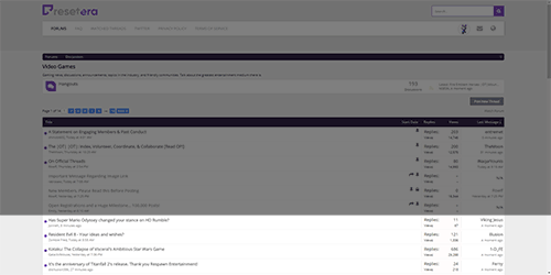
This is currently what the front page of gaming looks like, the darkened area is "not new content", the light area is "new content".
Ideally even where multiple stickies are present, there would be more 'new content' above the fold than not
I did, but I thought we'd be able to see specific offending posts and length of time on the users profile? Or am I misremembering what was said before? As it is, it's not very easy to get that information.
Yeah that's supposedly the policy. I've only seen a few bans but they've always had the offending post tagged with the reason and length of time. I think that thread was an exception because two people were banned for the same reason and length of time and the thread was locked. Maybe they preferred to add that message instead of going back to each individual post idk
Edit: Oh you meant on the profile info. Yeah that would be nice. Might be extra work though when you can just go through their post history
Very much this.
Now that it's the weekend I have to figure out mobile on this forum. Also, the font is way too small for my tired old man eyes
It's in the core, but it's disabled. Dunno why.Is there an option or list to see which users are currently online?
Other than the obvious dark theme, I have one request.
Having the option to go to the newest post rather than the OP when I click on a thread was my absolute favorite thing about GAF. It saves a ton of time, scrolling, and data.
Linear, newest first. Please put it on the list. Thank you!
Having the option to go to the newest post rather than the OP when I click on a thread was my absolute favorite thing about GAF. It saves a ton of time, scrolling, and data.
Linear, newest first. Please put it on the list. Thank you!
That's actually in the core under either "recent posts" or "latest activity" but again, it's been disabled.Other than the obvious dark theme, I have one request.
Having the option to go to the newest post rather than the OP when I click on a thread was my absolute favorite thing about GAF. It saves a ton of time, scrolling, and data.
Having the option to go to the newest post rather than the OP when I click on a thread was my absolute favorite thing about GAF. It saves a ton of time, scrolling, and data.
!
That's how it acts now. It completely breaks the mobile experience though, as both thread title and purple button go to first unread post. Clicking the date under the thread title will take you to post #1, but it is not available on mobile.
I'm sure this has been requested, but in addition to the common navigation requests I'd love the ability to refresh the thread from the bottom of the last page. I quite often leave a tab open with an ongoing discussion and I greatly appreciate being able to go back to the thread and simply reload the conversation while "in place" where I was.
I feel like there needs to be more padding on the sides, the center column is far too wide, especially when browsing topics. For right now though, I guess I'm okay browsing with this site at 125% zoom.
The font is really damn small on mobile. Also, dark lines separating the different threads and posts would be nice.
The only issue I've found with Discourse is that for the best experience you need a well optimised server setup.I did a mid scale test with Nodebb at work one time and the reaction when people saw live commenting for the first time was amazing. No refresh. Closer to chat. Only drawback on Nodebb is the moderation tools are lacking at this time, but I've spoke with the team and they are thinking about how to improve that.
Discourse has become my #1 for any forum deployment at this point. Super super clean code. Great tools and features.
That's how it acts now. It completely breaks the mobile experience though, as both thread title and purple button go to first unread post. Clicking the date under the thread title will take you to post #1, but it is not available on mobile.
That's not at all how it reacts for me on mobile. If I click the newest post, it takes me to the newest post, but anything else takes me to the OP.
And if there's a way to bookmark a thread so it always goes to the newest post, I haven't found it.
When I had the option for Linear Newest First set in my options on GAF, I could bookmark an OT, and any time I went there, the newest post was on top and I could scroll through in reverse order. It was super convenient and my favorite feature of the old forum.
Last edited:
- Status
- Not open for further replies.