Hair and clothing clipping is an interesting problem. One of the underappreciated aspects of the PC version of Deus Ex: Mankind Divided is that you could turn on a setting that did GPU accelerated hair/cloth, and what that did was fix Jensen's jacket collars clipping through his skin. It was a really important graphical advancement, I felt, but one a lot of people didn't care for because the performance hit was significant.
Posts like this make me scratch my head. I get flashbacks to people who claimed that the Crysis series had bad graphics because their focus on photorealism was "boring". The Metro series goes for a sort of desaturated photorealism. It's like you're looking at a faded photograph from 1980s Eastern Europe. The STALKER games are still very good looking games. They're basically photographs of the Ukraine slapped onto decent geometry and then a fairly ahead of its time lighting engine is used to provide that characteristic atmosphere. Each new game added a sweeping range of graphical improvements, and when you look at Metro, you see how each new Metro games has preserved that underlying style while moving closer and closer to photorealism.
I think there are some cultural differences between console gamers and PC gamers when it comes to what constitutes great graphics. You look at something like The Last of Us in 2013. A lot of people felt that game was graphically stunning, and it was a remarkable achievement, but it doesn't actually look like real life. Crysis 3 looks a lot closer to real life. Not close enough, sure, but you see where they're going. The art style is nowhere near realism. You'll notice that a lot of the graphically great games from Sony go for a kind of hyper-realism, with excessively vibrant colours. A lot of the graphically acclaimed PC-oriented or PC exclusive games are not concerned with "popping" visually.
Not everyone wants their games to look real. I think that's the root of the disagreement. Take these photographs. This is what reality looks like. Realism is often really, really, really grey. Particularly when it's overcast. That's why you end up with these circular arguments that would basically boil down to "I don't like this picture of the real world because I don't like the art style." This has been a dispute for a long time.
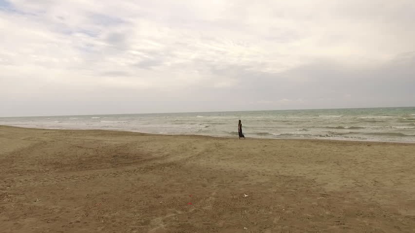
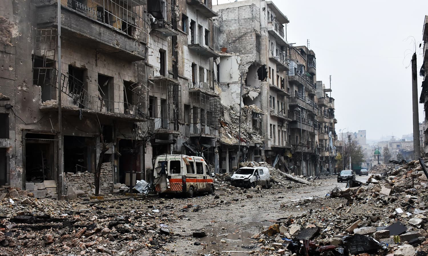
IMO, a game can have amazing graphics even if the game isn't "visually appealing" to us on a personal level.
metro just doesnt look that good because of poor materials and assets. the art direction is fine but the quality is the issue


