• Ever wanted an RSS feed of all your favorite gaming news sites? Go check out our new Gaming Headlines feed! Read more about it here.
Nov 2, 2017
2,982
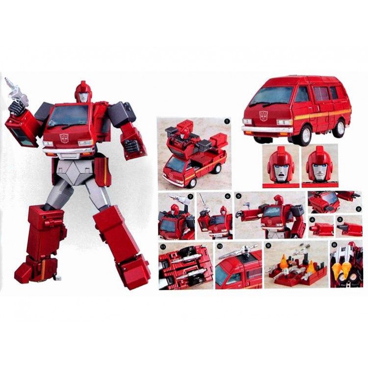
Soundwave grows in size. It's an ability he has. That's not really the same as all of Ironhide's van parts suddenly sliding into his back and disappearing.

Ultra Magnus' transformation was hilarious too. Just part way into turning into basically Optimus Prime, his whole trailer just becomes his parts. They never knew how to animate it, even when the animation was at it's best during the movie.
 

JaseMath

Member
Oct 27, 2017
9,354
Denver, CO
I like the Bumblebee versions 10x more, but it bothers me that they used Earth vehicles for their transformations while on Cybertron (a clearly superior place) before they even went to Earth. It made no sense. /rant
 

TyraZaurus

Member
Nov 6, 2017
4,439
I like the Bumblebee versions 10x more, but it bothers me that they used Earth vehicles for their transformations while on Cybertron (a clearly superior place) before they even went to Earth. It made no sense. /rant

That's... not true at all. Bumblebee turns into a Cybertronian car. The Seekers are all the pyramid shaped tetrajets from the G1 cartoon.
 

Forsaken82

Member
Oct 27, 2017
4,921
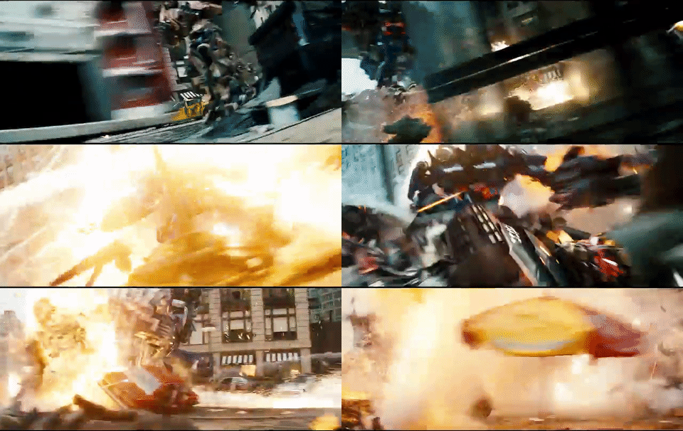
Like, this shot... it's very cool, and it has Optimus front and center. They used it in the trailers.
transformers__dark_of_the_moon__1___gif_code__by_dafominanimat-dapddwg.gif


Now... tell me every Transformer in that shot who ISN'T Optimus. Who is he fighting? Which one is he attacking at any given time? Which one did he stab? Which one did he grab? Which one is firing at him? I can "follow" Optimus, but everything else - including the OTHER Transformers - disappear in the chaos.

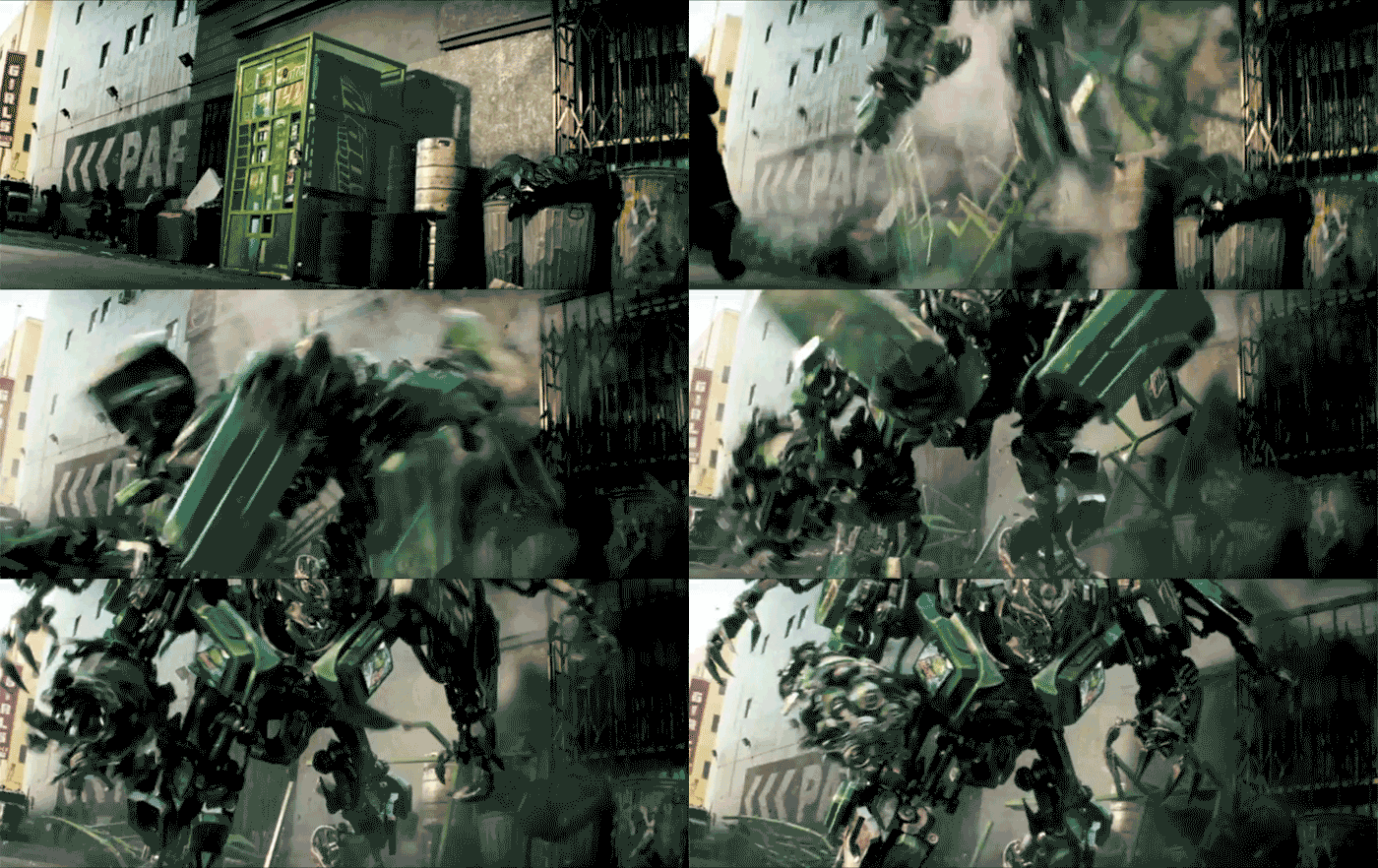
Didn't they turn a mountain dew vending machine into a killer decepticon? Pretty sure he's just fighting decepticon fodder, but maybe i'm wrong. It's been a while since I've seen that movie.

Just comes off like any action movie where random unnamed villians are there for our hero to mow down.
 
OP
OP
Garlador

Garlador

Banned
Oct 30, 2017
14,131
Didn't they turn a mountain dew vending machine into a killer decepticon? Pretty sure he's just fighting decepticon fodder, but maybe i'm wrong. It's been a while since I've seen that movie.

Just comes off like any action movie where random unnamed villians are there for our hero to mow down.
That was the first one...
giphy.gif

"So, in our movie, your product tries to MURDER its consumers..."
"We're IN."
 
Oct 27, 2017
2,255
The Bayformers are not characters. Their aesthetic was not created to make them memorable, it was made to display a bunch of flashy shit on screen. Their design is a physical manifestation of what Bay thinks of the franchise- only worth smashing them together and watching sparks fly.
 

TyraZaurus

Member
Nov 6, 2017
4,439
Sure, but they turn into Earth-like vehicles which is my point. They don't do that in the G1 canon (pretty sure).

I just said that the altmode the Seekers use on Cybertron is directly lifted from the original cartoon.

As for G1 canon, multiple versions of G1 depict the Autobot characters transforming into Cybertronian cars. Only in the cartoon does Bumblebee turn into a weird flying saucer thing.
 

Firmament1

Member
Aug 15, 2019
1,287
I never really even thought about it, but now that you pointed out how the combination of a colour scheme based around the grey and brown spectrum, and insanely chaotic action sequences... Welp, that bugs me to no end now. :|

It's like a 7th generation Modern Military FPS.
 

gutter_trash

Banned
Oct 26, 2017
17,124
Montreal
Not saying your opinion is invalid or wrong, but part of my frustrating was my inability to follow the action. There were legit scenes of Megatron and Starscream interacting and I couldn't tell which one was which.

It took me several seconds to figure out who was who in this scene, for instance. It has zero framing shots to establish who is talking, where the characters are, and the camera keeps breaking the shot so characters moving from left to right of camera so your eye is constantly trying to track them.

 
Oct 26, 2017
7,278
This isn't solely endemic to the Michael Bay movies

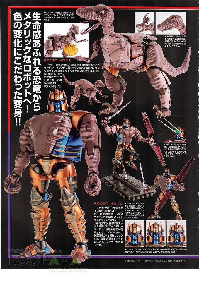
Watch Transformers: The Movie. Hot Rod transforms several different ways throughout the movie. In the G1 cartoon, Ironhide and Ratchet's transformations are categorically impossible and involve their vehicle mode parts dramatically changing in size to produce a robot mode that shows very little of the actual vehicle mode. Beast Wars Dinobot's transformation has his head swelling to the size of his very broad chest and whole portions of his vehicle mode disappearing behind him.

Partly because in the 80's they didn't have toys that could actually do this.

TAK12153-750x750.jpg


1511448735-masterpiece-dinobot-02.jpg


But I'm guessing that employing this level of design for every character in a movie would be pretty hard. Not to mention that these toys basically are explosions on hinges in mid-transformation.
 

Jie Li

Alt account
Banned
Dec 21, 2018
742
The worst is the tranforming part, its like looking a a garbage truck compressing the new garbage.
 

TyraZaurus

Member
Nov 6, 2017
4,439
Partly because in the 80's they didn't have toys that could actually do this.

TAK12153-750x750.jpg


1511448735-masterpiece-dinobot-02.jpg


But I'm guessing that employing this level of design for every character in a movie would be pretty hard. Not to mention that these toys basically are explosions on hinges in mid-transformation.

They also cost hundreds of dollars and employ a huge number of faux parts; Dinobot's chest in that toy is not actually his beast mode head.

And Jesus Christ I always forget how ugly his raptor mode is, even in the show. Ugh. It's like an ugly naked duck.
 

Neo0mj

Member
Oct 26, 2017
3,273
They also cost hundreds of dollars and employ a huge number of faux parts; Dinobot's chest in that toy is not actually his beast mode head.

And Jesus Christ I always forget how ugly his raptor mode is, even in the show. Ugh. It's like an ugly naked duck.

Probably one of the most disappointing things about modern transformers toys. A lot of them are starting to employ fake kibble to make it easier to make an accurate looking robot mode.
 

Psittacus

Member
Oct 27, 2017
5,926
Like, this shot... it's very cool, and it has Optimus front and center. They used it in the trailers.
transformers__dark_of_the_moon__1___gif_code__by_dafominanimat-dapddwg.gif


Now... tell me every Transformer in that shot who ISN'T Optimus. Who is he fighting? Which one is he attacking at any given time? Which one did he stab? Which one did he grab? Which one is firing at him? I can "follow" Optimus, but everything else - including the OTHER Transformers - disappear in the chaos.
I always thought this shot looks terrible. Optimus is just sliding along the road for no discernible reason.
 
Oct 25, 2017
20,202
Probably one of the most disappointing things about modern transformers toys. A lot of them are starting to employ fake kibble to make it easier to make an accurate looking robot mode.

The Siege line is really good for the price, and of course the Masterpice stuff is incredible. There's also a ton of 3rd party items that are phenomenal
 

Korigama

Member
Oct 25, 2017
20,470
I've always hated what overdesigned, incomprehensible garbage that the Bayformers were. As someone who loves giant robots, quite possibly the worst ones I've ever seen.

Still haven't seen Bumblebee for myself either, but the massive improvements in mechanical design and lack of Michael Bay give me plenty of incentive.
 

Metalmucil

Member
Aug 17, 2019
1,379
Yeah, I always thought that those designs looked like someone just took a box of spare car parts, threw it down a hill, and filmed it on the their phone.
 

Deleted member 17402

User requested account closure
Banned
Oct 27, 2017
7,125
Always felt the same way, OP, even as they were releasing.

Also can we PLEASE get a god damn Beast Wars movie. That's my favorite Transformers material.
 
OP
OP
Garlador

Garlador

Banned
Oct 30, 2017
14,131
Probably one of the most disappointing things about modern transformers toys. A lot of them are starting to employ fake kibble to make it easier to make an accurate looking robot mode.
The Siege line is really good for the price, and of course the Masterpice stuff is incredible. There's also a ton of 3rd party items that are phenomenal
Yeah, I'll vouch for the Siege line. For the price, they have some really excellent designs, possibility, and even the kibble can be pretty easily hidden or dealt with.

I snagged a Siege Optimus Prime and he's phenomenal.
46F5F2F7-B72B-49F6-B1F5-90C4B6021C53.jpeg.10e38f8e77975e1af9d13f815460fe2b.jpeg
 

whytemyke

The Fallen
Oct 28, 2017
3,783
I don't think Travis Knight gets enough credit for the work he did to try to turn around the Transformers franchise with Bumblebee.

I saw it at an advanced screening last year and was so damn impressed. I told my buddies that the first 5 minutes of the movie alone was the best Transformers movie made yet.

Here's the battle of Cybertron if anyone is so inclined to watch. Obviously spoilers there, but if you're not planning to see the movie, this clip in motion will help you see exactly what OP is talking about.
 

Hero

One Winged Slayer
Banned
Oct 25, 2017
6,728
Not all Bay designs were trash. Optimus, Bumblebee, and Ironhide were pretty good and they got better as the movies progressed, at least on the Autobots side. Sideswipe have dual blades and skating around on his tires was cool. I think Bay's aversion to color schemes hurt the designs the most.

Sentinel Prime always stuck out to me as being a very Gundam-esque design.

latest
 

Wildstrike

Member
Jan 18, 2018
80
Where's my More Than Meets Than Eye series adaptation

Seconded! Plus a series would hopefully mean the Lost Light back half got a little more time to breathe than it did in the book..

Yeah, I'll vouch for the Siege line. For the price, they have some really excellent designs, possibility, and even the kibble can be pretty easily hidden or dealt with.

I snagged a Siege Optimus Prime and he's phenomenal.

The whole line is really pretty great so far. Still can't believe we've an Impactor and a new Spinister on the way, never mind an actual Rung!!
Though Seige Optimus also 'cheats' (as nearly every Prime does) by having his torso truck grill being not the actual grill from the front of the truck.. Still a great figure though.. particularly like the neat way the front wheels get tucked in..
 

caliph95

Member
Oct 25, 2017
35,131
Seconded! Plus a series would hopefully mean the Lost Light back half got a little more time to breathe than it did in the book..
You can tell James Roberts was told about the reboot so he had to fast forward to the conclusion because he doesn't have the time

It's also why a lot important characters just die and you don't get time to even reflect that

At least the final issue was great
 
OP
OP
Garlador

Garlador

Banned
Oct 30, 2017
14,131
Not all Bay designs were trash. Optimus, Bumblebee, and Ironhide were pretty good and they got better as the movies progressed, at least on the Autobots side. Sideswipe have dual blades and skating around on his tires was cool. I think Bay's aversion to color schemes hurt the designs the most.

Sentinel Prime always stuck out to me as being a very Gundam-esque design.

latest
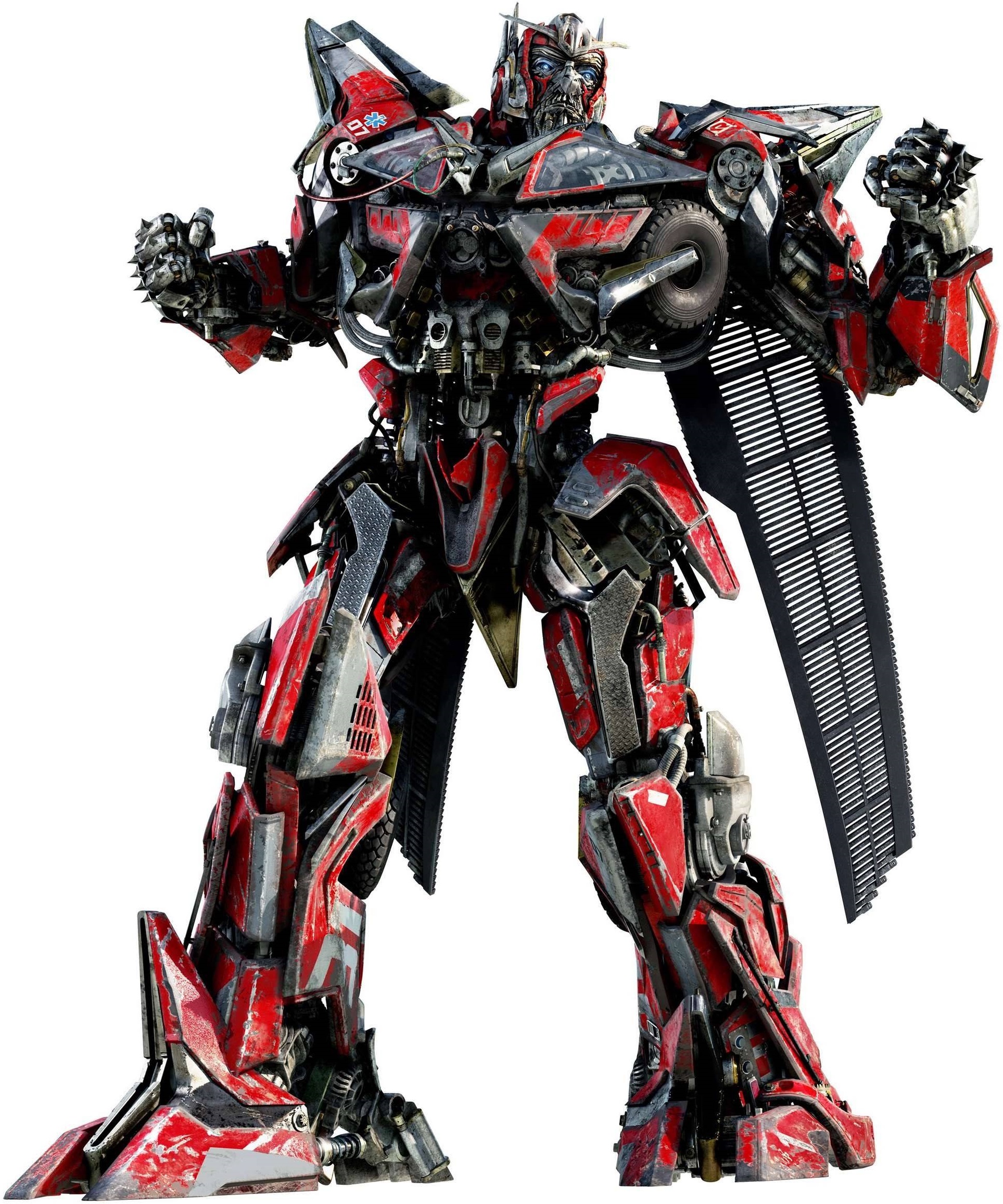
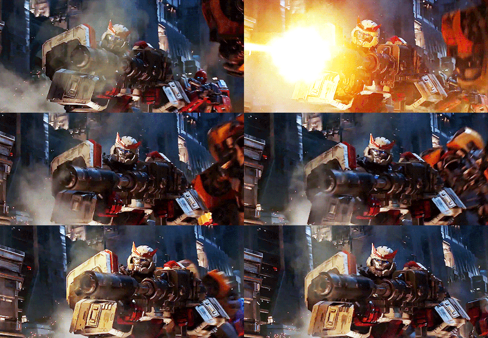
Some are better than others (mostly because they have color so you can tell who they are), but I'd still call every one of their designs inferior to every other incarnation. Like, this is Ironhide in the Bay films:
400px-Movie_Ironhide_promorender2.jpg

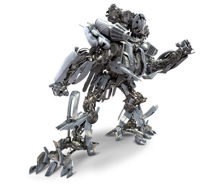
He's the same color and general junky shape of the DECEPTICONS. Like, now compare him to his enemy, Blackout.
transformers4.jpg


Have these two fight and you can't tell who is fighting who.

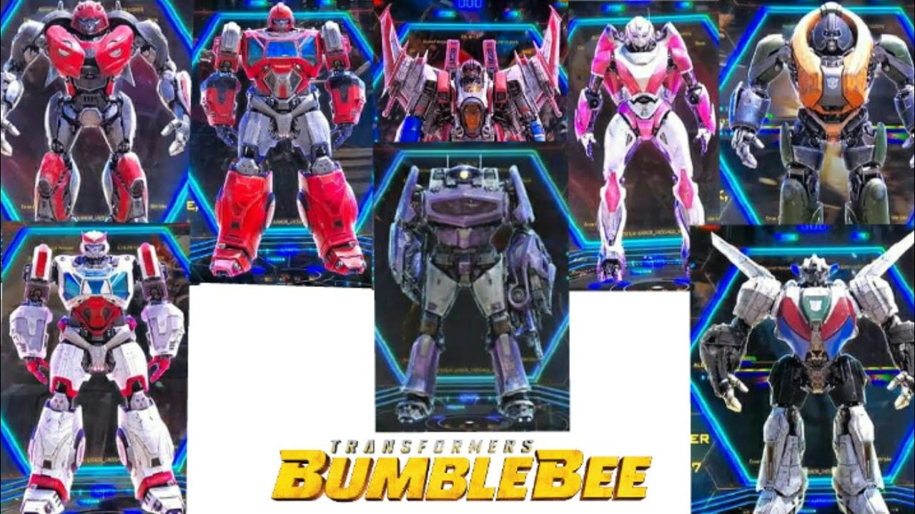
Now, compare that to how Ironhide looks in the Bumblebee movie.
913360a377377d962c8efe273741d393.jpg

His form is solid, he's got his iconic bold red color scheme that makes him stand out from a distance, his silhouette is one that's easy to pick from the others, and you don't even have to struggle to find out where his face is (seriously, it always takes me awhile in the Bay version). It's also a huge tribute to his G1 incarnation, the one most fans are familiar with, while still being alien and futuristic.
 

Neo0mj

Member
Oct 26, 2017
3,273
The Siege line is really good for the price, and of course the Masterpice stuff is incredible. There's also a ton of 3rd party items that are phenomenal
Yeah, I'll vouch for the Siege line. For the price, they have some really excellent designs, possibility, and even the kibble can be pretty easily hidden or dealt with.

I snagged a Siege Optimus Prime and he's phenomenal.
46F5F2F7-B72B-49F6-B1F5-90C4B6021C53.jpeg.10e38f8e77975e1af9d13f815460fe2b.jpeg

Like Wildstrike mentioned, it still uses fake grill and headlights in robot mode. Though in this case it's forgiven since it's not fully representative of G1 Optimus like the new MP is.

You can tell James Roberts was told about the reboot so he had to fast forward to the conclusion because he doesn't have the time

It's also why a lot important characters just die and you don't get time to even reflect that

At least the final issue was great

Star Saber was robbed.
 
OP
OP
Garlador

Garlador

Banned
Oct 30, 2017
14,131
Like Wildstrike mentioned, it still uses fake grill and headlights in robot mode. Though in this case it's forgiven since it's not fully representative of G1 Optimus like the new MP is.
Yeah, it's not MP, but it's significantly cheaper.

And there's a ton of mods out there to make him even more G1. I'm even surprised he has the fake grill, since you can just snap it off and it arguable works better. I don't mind it though, since it's cheating and it's his "Cybertronian" incarnation.
 

TyraZaurus

Member
Nov 6, 2017
4,439
Some are better than others (mostly because they have color so you can tell who they are), but I'd still call every one of their designs inferior to every other incarnation. Like, this is Ironhide in the Bay films:
400px-Movie_Ironhide_promorender2.jpg

He's the same color and general junky shape of the DECEPTICONS. Like, now compare him to his enemy, Blackout.
transformers4.jpg


Have these two fight and you can't tell who is fighting who.

Now, compare that to how Ironhide looks in the Bumblebee movie.
913360a377377d962c8efe273741d393.jpg

His form is solid, he's got his iconic bold red color scheme that makes him stand out from a distance, his silhouette is one that's easy to pick from the others, and you don't even have to struggle to find out where his face is (seriously, it always takes me awhile in the Bay version). It's also a huge tribute to his G1 incarnation, the one most fans are familiar with, while still being alien and futuristic.

Movie Ironhide's silhouette is larger and beefier than all the other Autobots, plus he has his distinctive bull horns. Even Optimus is taller and more svelte comparatively.

But I'm sorry, if we were going by silhouette, the Bumblebee movie's wouldn't tell me anything. He's the most nondescript and boring looking Autobot ever, with square shoulders and a generic looking head. There's no character evident in his profile, nothing that indicates any aspect of his personality; and you can tell this due to the fact he shares a body with Ratchet, who is a completely different character type. They kept the worst aspects of both characters' G1 character designs in these designs: the fact that they're uninteresting looking block men with no defined character going into their design but "robot".
 

rsfour

Member
Oct 26, 2017
16,716
The bay TF designs are complete shit, same with the movies.

The opening few mins of Bumblebee outclass anything the Bay movies did, and the movie itself is great.
 
Oct 27, 2017
5,761
I'm not a big fan of the movie designs, but I have been really loving a lot of the Studio Series toys. It's like someone decided that if they have to make toys of these stupid designs, then they're going to be the best dang stupid designs ever! They deluxe figures are a bit hit or miss, but voyager on up have been great. They feel fresh and inventive. They're ugly, but fun!

Conversely, Siege toys have better designs, but I find them so boring. I hate how slavish to G1 the franchise is becoming. I miss the days of characters getting completely new looks, or at the very least the early days of Classics and Generations where they modernized them. And then there's the leader class figures, don't even get me started on those. They are so overpriced for what you get.

All that said, I can't really ever defend those movie designs on a character design level. They're pretty bad.
 

Hero

One Winged Slayer
Banned
Oct 25, 2017
6,728
Some are better than others (mostly because they have color so you can tell who they are), but I'd still call every one of their designs inferior to every other incarnation. Like, this is Ironhide in the Bay films:
400px-Movie_Ironhide_promorender2.jpg

He's the same color and general junky shape of the DECEPTICONS. Like, now compare him to his enemy, Blackout.
transformers4.jpg


Have these two fight and you can't tell who is fighting who.

Now, compare that to how Ironhide looks in the Bumblebee movie.
913360a377377d962c8efe273741d393.jpg

His form is solid, he's got his iconic bold red color scheme that makes him stand out from a distance, his silhouette is one that's easy to pick from the others, and you don't even have to struggle to find out where his face is (seriously, it always takes me awhile in the Bay version). It's also a huge tribute to his G1 incarnation, the one most fans are familiar with, while still being alien and futuristic.

I can't agree with this about Ironhide. His Bumblebee incarnation is extremely generic and if you just showed me that without context I would just say it's a generic robot.

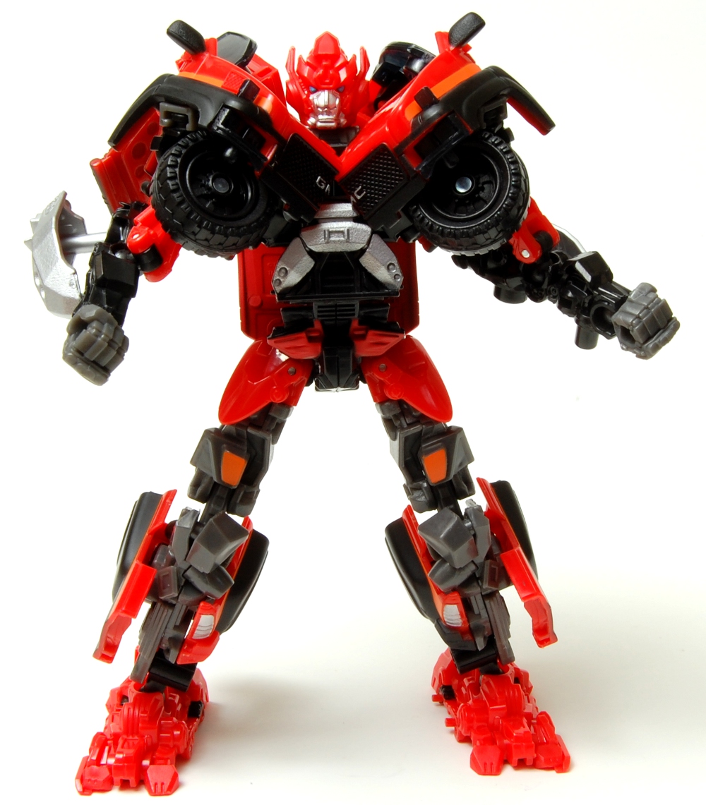
The only thing I can agree with about Bayformer Ironhide is his black/dark grey motif did not do his design any justice. Not 100% accurate but this Japanese re-color for a DotM toy I think would've been way better. Apparently Bay really hates the color red for filming as IIRC Hasbro even had to force him to put red on Optimus Prime because originally he wanted him to be all blue. Would also explain why Ironhide and Sideswipe were black/dark grey and silver.


dotm-ironhide-robot.jpg
 

TyraZaurus

Member
Nov 6, 2017
4,439
I can't agree with this about Ironhide. His Bumblebee incarnation is extremely generic and if you just showed me that without context I would just say it's a generic robot.

The only thing I can agree with about Bayformer Ironhide is his black/dark grey motif did not do his design any justice. Not 100% accurate but this Japanese re-color for a DotM toy I think would've been way better. Apparently Bay really hates the color red for filming as IIRC Hasbro even had to force him to put red on Optimus Prime because originally he wanted him to be all blue. Would also explain why Ironhide and Sideswipe were black/dark grey and silver.


dotm-ironhide-robot.jpg

The colorscheme of the smaller automobile characters really has more to do with the fact those are the colors the car manufacturer they're partnered with wants to advertise. I believe they had to insist that Bumblebee had to be yellow, even.
 
OP
OP
Garlador

Garlador

Banned
Oct 30, 2017
14,131
Movie Ironhide's silhouette is larger and beefier than all the other Autobots, plus he has his distinctive bull horns. Even Optimus is taller and more svelte comparatively.

But I'm sorry, if we were going by silhouette, the Bumblebee movie's wouldn't tell me anything. He's the most nondescript and boring looking Autobot ever, with square shoulders and a generic looking head. There's no character evident in his profile, nothing that indicates any aspect of his personality; and you can tell this due to the fact he shares a body with Ratchet, who is a completely different character type. They kept the worst aspects of both characters' G1 character designs in these designs: the fact that they're uninteresting looking block men with no defined character going into their design but "robot".
Hence why good designs are a combination of silhouette and COLOR (I mentioned that in the OP).
Like, superheroes OFTEN have the same silhouette, but are differentiated by COLOR.
31uz-n-5GDL._SX425_.jpg

Is this Superman? Supreme? Shazam? Hyperion? Sentry? Nomad? The answer depends on the color scheme of this character to help them stand out from other caped heroes. Is this a "nondescript, boring" hero design? Only if you remove every single other element that makes them unique - their colors, symbols, etc.

The same goes for Ironhide and Ratchet.
maxresdefault.jpg


You say them sharing elements makes them boring and interchangeable. Clearly they are capable of making different body shapes, so it's a conscious design choice. Why? Because they're created as the same "class" of Transformer in the original continuity (and also, yes, because their toys shared molds).
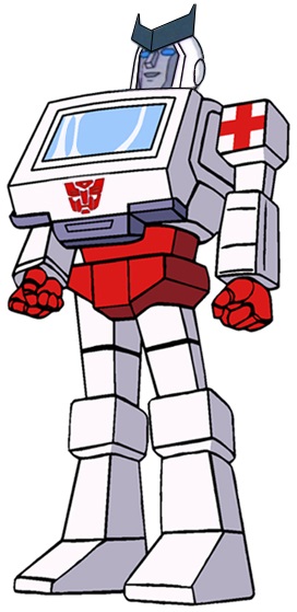
300px-Ratchetg1.jpg
W020110531291397262432.JPG

It's faithful to the original designs of the characters. You call it "generic robot", but Transformers is a huge reason we HAVE a mental short-hand for what a Transformer looks like. They look great, are easy to identify by color, and, yes, even shape (because the movie focuses on their faces so you can easily spot Ratchet's horns opposed to Ironhide's smoother dome).

I mean, they put the two of them literally side by side in the Bumblebee movie.

tumblr_plnayxA64t1txzbmgo1_500.gif


A combination of simple designs, striking colors, and good framing makes it easy to spot who is who, modernizing "boring" old designs (I NEVER felt they were boring, fwiw), and making sure they still stand out without being lost in the action, backgrounds, or among other Transformers.
 
Last edited:

TyraZaurus

Member
Nov 6, 2017
4,439
Hence why good designs are a combination of silhouette and COLOR (I mentioned that in the OP).
Like, superheroes OFTEN have the same silhouette, but are differentiated by COLOR.
31uz-n-5GDL._SX425_.jpg

Is this Superman? Supreme? Shazam? Hyperion? Sentry? Nomad? The answer depends on the color scheme of this character to help them stand out from other caped heroes. Is this a "nondescript, boring" hero design? Only if you remove every single other element that makes them unique - their colors, symbols, etc.

The same goes for Ironhide and Rachet.
maxresdefault.jpg


You say them sharing elements makes them boring and interchangeable. Clearly they are capable of making different body shapes, so it's a conscious design choice. Why? Because they're created as the same "class" of Transformer in the original continuity (and also, yes, because their toys shared molds).
300px-Ratchetg1.jpg
W020110531291397262432.JPG

It's faithful to the original designs of the characters. You call it "generic robot", but Transformers is a huge reason we HAVE a mental short-hand for what a Transformer looks like. They look great, are easy to identify by color, and, yes, even shape (because the movie focuses on their faces so you can easily spot Ratchet's horns opposed to Ironhide's smoother dome).

I mean, they put the two of them literally side by side in the Bumblebee movie.

tumblr_plnayxA64t1txzbmgo1_500.gif


A combination of simple designs, striking colors, and good framing makes it easy to spot who is who, modernizing "boring" old designs (I NEVER felt they were boring, fwiw), and making sure they still stand out without being lost in the action, backgrounds, or among other Transformers.

Yes, color is important. But here's the thing; these weren't decisions they made because of thoughtful character design. They shared the same toy because that was an easier way to get more characters out. Ratchet isn't even an ambulance - he's a vanette with a siren slapped on top of it. Then when Florida Dery got ahold of what was actually a very unconventional robot mode design, instead of getting creative with it, he tossed out anything that suggested it was a robot that transformed and just made a square robot man. Then he took that square robot man and put a chevron in the helmet and boom, you had Ratchet.

His priority wasn't character design. It was being machine like in how many he could crank out and simple, so they could cram as many characters into the show as possible.

Compare Ironhide and Ratchet in G1 and their movie counterparts to their Animated versions. Ratchet is given a slouch and a sagging gut to emphasize his age, plus one of his chevrons is broken. Meanwhile, Ironhide is the more buff looking Cybertronian model Ratchet had in flashbacks with a square jaw to emphasize his youth and status as a "good ole boy" type.

THAT is thoughtful character design. There's nothing about G1 Ironhide/Ratchet that suggests anything about either of them, and the movie versions are just as bad. Hell, I'm pretty sure that multiple characters have their exact shoulders and thighs.
 
OP
OP
Garlador

Garlador

Banned
Oct 30, 2017
14,131
Yes, color is important. But here's the thing; these weren't decisions they made because of thoughtful character design. They shared the same toy because that was an easier way to get more characters out. Ratchet isn't even an ambulance - he's a vanette with a siren slapped on top of it. Then when Florida Dery got ahold of what was actually a very unconventional robot mode design, instead of getting creative with it, he tossed out anything that suggested it was a robot that transformed and just made a square robot man. Then he took that square robot man and put a chevron in the helmet and boom, you had Ratchet.

His priority wasn't character design. It was being machine like in how many he could crank out and simple, so they could cram as many characters into the show as possible.

Compare Ironhide and Ratchet in G1 and their movie counterparts to their Animated versions. Ratchet is given a slouch and a sagging gut to emphasize his age, plus one of his chevrons is broken. Meanwhile, Ironhide is the more buff looking Cybertronian model Ratchet had in flashbacks with a square jaw to emphasize his youth and status as a "good ole boy" type.

THAT is thoughtful character design. There's nothing about G1 Ironhide/Ratchet that suggests anything about either of them, and the movie versions are just as bad. Hell, I'm pretty sure that multiple characters have their exact shoulders and thighs.
I feel like we're discussing two completely separate things.

To clarify, I think the Michael Bay versions of the character are GARBAGE, and they make the original versions look so much better by comparison due to combination of careful animated redesigns, color use, and proper framing - as presented by Bumblebee.

I'm not saying they are THE greatest. I honestly find more modern animated incarnations superior.
latest

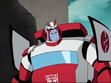
This is a brilliant, modernized design of the character, faithful to the original incarnation but updated with modern sensibilities - retaining his original color scheme, still streamlined in body and shape to be easy to identify in action scenes.
220px-RatchetTFAnimated.jpg

THIS is a better design than the Bay movies, exuding a world-weariness and age the Bay version can't remotely touch, again colored with his G1 design scheme but updated to a more dynamic, modern format.

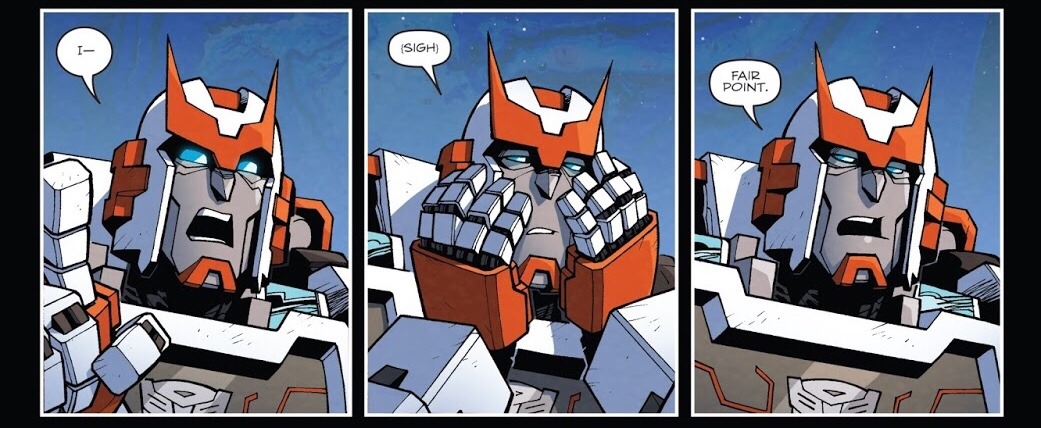
The comic version is great, AGAIN retaining all the elements that made him memorable while making him unique and his own character through well-drawned panels and an expressive design.
tumblr_p5nlqhRNS81tw7eelo1_1280.jpg


All are elements of good design that are built off a foundation that was, yes, a generic 80s toy that a show was made about.
44314_Ironhide_Robot_Head_Ratchet.JPG

(ha... ha ha ha)
 

Dream Machine

Member
Oct 25, 2017
13,085
If you ever find yourself positively comparing the bayformer designs to the G1 designs, it's time to think about your life decisions. If palette swap designs created because of 80's manufacturing realities are outdoing your billion dollar cgi clusterfuck, that speaks much more negatively about the latter than the former. G1 Transformers made good, simple, iconic designs even within strict manufacturing limitations. Design through limitation.

I'm not even a big transformers fan, but just on behalf of good design I won't let this "but this crinkled silver ball of garbage is bigger, so you know who it is" defense stand.
 

Hero

One Winged Slayer
Banned
Oct 25, 2017
6,728
You guys are losing me more and more with your arguments. The Ratchet one basically boils down to "he's his G1 colors in these animated cartoons so that's automatically better."

Mind you, again, Ratchet in G1 looked like a microwave with arms and legs sticking out.

latest


Like shit, if you're going to prop up some G1 designs then at pick some of the more visually interesting and iconic characters.
 

TyraZaurus

Member
Nov 6, 2017
4,439
I feel like we're discussing two completely separate things.

To clarify, I think the Michael Bay versions of the character are GARBAGE, and they make the original versions look so much better by comparison due to combination of careful animated redesigns, color use, and proper framing - as presented by Bumblebee.

I'm not saying they are THE greatest. I honestly find more modern animated incarnations superior.
latest

This is a brilliant, modernized design of the character, faithful to the original incarnation but updated with modern sensibilities - retaining his original color scheme, still streamlined in body and shape to be easy to identify in action scenes.
220px-RatchetTFAnimated.jpg

THIS is a better design than the Bay movies, exuding a world-weariness and age the Bay version can't remotely touch, again colored with his G1 design scheme but updated to a more dynamic, modern format.

The comic version is great, AGAIN retaining all the elements that made him memorable while making him unique and his own character through well-drawned panels and an expressive design.
tumblr_p5nlqhRNS81tw7eelo1_1280.jpg


All are elements of good design that are built off a foundation that was, yes, a generic 80s toy that a show was made about.
44314_Ironhide_Robot_Head_Ratchet.JPG

(ha... ha ha ha)

And we inherently disagree on that. The designs in the Bumblebee movie don't succeed at being character designs, they're successful at being nostalgia bait. Like. Bumblebee himself is a great design - his design emphasizes how cute, plucky, and determined he is. The stuff in the opening moments of the film? Hastily thrown together from existing resources to remind people of the 1980s.

And I'm sorry, but the previous movie designs do have thought into them. Where the movie fails is at using these designs as actual characters, but there's still an exceptional amount of work put into not only having them stand out but also how they could work in the real world. Look at my earlier posts about how Starscream is designed to still be a jet while also having a robot mode whose physical stature allows him to interact more believably with people who transform into smaller things.

There's also characters like the AOE Autobots who DO have distinct color and distinct silhouettes going for them. You can easily pick Crosshairs out of the group, and his car mode kibble working like a trench coat gives him a John Woo vibe that fits his role as a gunslinger.

Compare this to G1 Crosshairs, who is supposedly the Autobots' armory guy. You can totally tell this from the absolutely nothing about him.