OP
OP
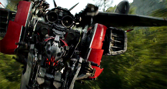
I'm not questioning that hard work and thought was put into the Bay movie designs. I'm saying they don't work in EXECUTION. My 3D instructor once told me - when I was OVER-designing a character - that I needed to work smarter, not harder. I was losing myself in pointless, eye-blurring detail because I was trying so hard to show off that any concept of a solid design vanished. Simplicity can be an artform, and going nuts in Zbrush to put detail on every single inch is a temptation many artists have. It's why graphics cards always show off some nondescript, over-designed robot.And we inherently disagree on that. The designs in the Bumblebee movie don't succeed at being character designs, they're successful at being nostalgia bait. Like. Bumblebee himself is a great design - his design emphasizes how cute, plucky, and determined he is. The stuff in the opening moments of the film? Hastily thrown together from existing resources to remind people of the 1980s.
And I'm sorry, but the previous movie designs do have thought into them. Where the movie fails is at using these designs as actual characters, but there's still an exceptional amount of work put into not only having them stand out but also how they could work in the real world. Look at my earlier posts about how Starscream is designed to still be a jet while also having a robot mode whose physical stature allows him to interact more believably with people who transform into smaller things.
There's also characters like the AOE Autobots who DO have distinct color and distinct silhouettes going for them. You can easily pick Crosshairs out of the group, and his car mode kibble working like a trench coat gives him a John Woo vibe that fits his role as a gunslinger.
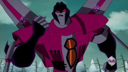
Compare this to G1 Crosshairs, who is supposedly the Autobots' armory guy. You can totally tell this from the absolutely nothing about him.

You brought up Starscream and I'm immediately reminded of a design 101 we were taught - "form over function". Yes, Starscream can work better as a generic gray jet thingie robot, but it's a giant robot fantasy movie that put function over form. It's the question of "why does Batman wear a cape?" when capes are logically impractical in 99% of all combat or movement situations. Why does Neo wear shades during a fight when it would hinder visibility? Why does Darth Vader have his suit control buttons out in the open on his chest? Why does Wolverine wear a mask in the comics when he has no secret identity? Etc.
Crosshairs, however, is actually closest to a good design. As I mentioned, I was only exposed to the first three movies, so I didn't see anything past those abominations. Crosshairs was one of the lesser original Transformers, so they had a lot of leeway to do something new with him. He's got a unique body shape, a striking color scheme, lot of solid surfaces that are not broken up by random junk, and a presence of personality that, yeah, his G1 version didn't have. I'd say he's all the steps in the right direction... but like all the others, veered so hard into "over-designed" that he's still garish to look at (just less so than most of the others). He's one of the most restrained designs in the franchise and could almost fit in with better Transformers aesthetics. A few artistic tweaks make a huge difference, but his foundation is strong.

He'd still look infinitely better if they just scaled it back. His movie incarnation still is painfully overdesigned when there was an obvious point they could have stopped.