• Ever wanted an RSS feed of all your favorite gaming news sites? Go check out our new Gaming Headlines feed! Read more about it here.
  • We have made minor adjustments to how the search bar works on ResetEra. You can read about the changes here.
OP
OP
Chittagong

Chittagong

Member
Oct 26, 2017
1,793
London, UK
More context

burberry-logo-peter-saville-_dezeen_2364_col_0.jpg


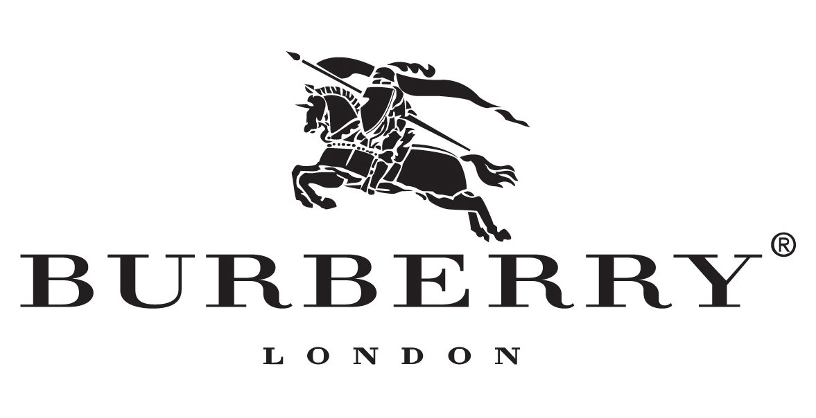
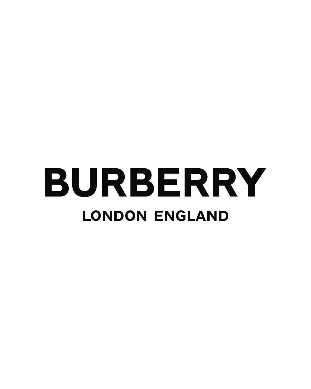
Along with the monogram the pair designed a new logo for the company in a sans serif font. It will replace the Burberry Equestrian Knight logo with its bespoke Bodoni font, which had been used by the clothing company since 1901.

"Historically, Burberry's logotype was appropriate to the trench coat's utilitarian nature," Saville added.

"Burberry needed an identity that is fluid and able to cross over into all the categories that are required of a big luxury clothing and accessories brand – something to transcend the company provenance without denying it."

https://www.dezeen.com/2018/08/02/p...-new-logo-for-burberrys-new-graphic-identity/
 

Advc

Member
Nov 3, 2017
2,632
New pattern looks like ass. Not iconic as the older one. New logo is just a font. The graphic designer must be rich now anyways.
 

DirtyLarry

Member
Oct 27, 2017
4,113
Damn. That new pattern is wak. Reminds me of the mid to late 90's. They took a timeless pattern and updated it to something that is already dated but are presenting it as new and hip I have to imagine. Boggles the mind.
Also there was no reason whatsoever they could not have kept the horse icon with the new font for the logo.
http:///BWRc.jpg
 

Vas

Banned
Oct 25, 2017
4,016
You know what? I bet they are doing this as a palate clenser. They will run with this for a few years, then re-release the old pattern at much higher prices once they've effectively got the Chavs off it.
 

Neutra

Member
Oct 27, 2017
988
NYC
guys... something can't be "iconic" 5 minutes after it is revealed.

this pattern will be iconic in 2 decades, probably. (don't quote me in 20 years plz)
 

Frozenprince

Banned
Oct 25, 2017
9,158
Why would you sacrifice your entire brand identity for yet another bland minimalist text "logo"? At least come up with a new logo concept instead of just "company name in subdued font".
 
Oct 27, 2017
683
Why do I have a strong feeling this is a tactic to boost sales by having people collect the new burberry stuff then releasing "vintage" lines with the old logo and patterns for double or triple the price.
 

Alucrid

Chicken Photographer
Member
Oct 25, 2017
11,433
are they going to now make grossly overpriced generic mid tier streetwear with that pattern for the rtw collection like every other brand now
 
OP
OP
Chittagong

Chittagong

Member
Oct 26, 2017
1,793
London, UK
How much was Peter Saville (unfortunate last name) paid for that redesign?

The London going rate for rebrand jobs like this is around a million pounds, give or take a quarter of a million

That would cover obviously more than the logo, it covers research, all the rejected versions that confirmed this is the right route, touchpoint visualisations to show how it works in context, and master assets and guidelines
 

Dyle

One Winged Slayer
The Fallen
Oct 25, 2017
29,944
The logo would be fine if they kept the horse, without the horse as a distinct anchor it feels indistinct. I think I like the pattern as a design, despite how gaudy it is, but I struggle to see it working well on any piece of clothing
 

Zhadgon

One Winged Slayer
Member
Oct 25, 2017
536
Ugh... I think the new logo lost a lot from its identity and the new pattern yikes... its so old that looks vintage and not in a good way.

For being a redesign from a premium brand I should have expected something better, the marketing department how was able to see this and think it was right (didn't they have some run tests with focus groups and polls in general within the company).

.n_n.
 

Kirblar

Banned
Oct 25, 2017
30,744
Damn. That new pattern is wak. Reminds me of the mid to late 90's. They took a timeless pattern and updated it to something that is already dated but are presenting it as new and hip I have to imagine. Boggles the mind.
Also there was no reason whatsoever they could not have kept the horse icon with the new font for the logo.
http:///BWRc.jpg
This actually looks really good with the logo intact.
 

Rand a. Thor

Banned
Oct 31, 2017
10,213
Greece
New logo? Oh okay let's see....
*Insert Text Here*
My mind has been blown, such artistry cannot be contained to a simple corporation. Contact the MoMA ASAP!
 

Panther2103

Member
Oct 27, 2017
2,914
Minimalist logos are becoming too common now. They looked nice on the first few companies doing it, but now it's everywhere.
 

Billfisto

Member
Oct 30, 2017
14,956
Canada
I really don't have an opinion worth having on fashion or Burberry, but the fact that the NE/SW directional strips don't actually follow through into anything behind the B is getting to me, like a phantom hand in a bad photoshop.

And the strips all overlap in some places, but the point of overlap is inexplicably only capped on one join, so it forms an inexplicable repeating "T" that's wedged into the "B". It seems like it's for a product with the initials "B.T." and the designers were trying to work them both in. Just aesthetically disgusting.

Thanks for letting me know which London it is.

Could be London, Ontario. I bet Doug Ford supporters would love this.

I don't know what I mean by that. They're idiots, so they like ugly things, I guess.
 

Plainswalker

Member
Apr 14, 2018
846
Canada
The logo would be fine if they kept the horse, without the horse as a distinct anchor it feels indistinct. I think I like the pattern as a design, despite how gaudy it is, but I struggle to see it working well on any piece of clothing
That's a pattern I feel could work well as the liner on a handbag or wallet, but I also have a difficult time imagining it for any other purpose. It's far too gaudy for even scarves.
 

Messofanego

Member
Oct 25, 2017
26,184
UK
The London going rate for rebrand jobs like this is around a million pounds, give or take a quarter of a million

That would cover obviously more than the logo, it covers research, all the rejected versions that confirmed this is the right route, touchpoint visualisations to show how it works in context, and master assets and guidelines
Yikes, thanks for the explanation lol
 

bmdubya

Member
Nov 1, 2017
6,502
Colorado
I like the new pattern better, but I like the old logo better. Like others have said, I'm tired of this minimalist design when it comes to logos. The worst is Juventus football club.
 

Deleted member 862

User requested account closure
Banned
Oct 25, 2017
8,646
So they replaced a classic 117 year old logo and brand with something that looks like a Walmart placeholder graphic.
 

Lulu

Saw the truth behind the copied door
Banned
Oct 25, 2017
26,680
I want to see it fight the Ralph Lauren logo now.
 

AlexMeloche

Member
Oct 27, 2017
2,744
I don't dislike the new pattern, but I feel like it's not as... easy to match? with other colors/patterns (a thing you kinda want with a purse, a bag, etc.). Will wait to see the applications.
 

Cocolina

Member
Oct 28, 2017
7,990
No self respecting charver would be seen dead in Burberry tartan these days but they could go for that new pattern. The B would stand for baller or badboy, or just a short version of Brian and would be a perfect item of identity for the fashion-conscious scally.

Burberry fucked up, again.