I just started playing a few weeks ago. Kamoshida just confessed for all the crap he put students through. I love Persona 3 and 4 but why did it take me over 3 weeks to get to this part? It's the damn UI. It bothers my eyes, it's too busy, it's flashy and also makes combat take even longer, well the splash screen after a victory. The contrast in the UI colors especially seem to really make my eyes tired looking at the game. I've had headaches too but I don't know if the game is to blame or coincidence since I never really experienced headaches from FPS games.
How many damn times does this need to happen? It makes exploring a dungeon more annoying. I enjoy the combat but this is just a long animation. Give me a static screen. After running around the first palace and exploring everything, finding every chest, trying to find as many monsters to capture and fuse, I grew very sick of this screen. Even if I do mash the X button it's just too long.
The constant movement too also bothers me.
Another thing that bothered me while in the first palace is this green...thing over the interface. Why is this here? Why does running have to make it harder to see? Also while is everything so damn huge? Almost the entire right side of the screen is covered in UI elements.
:format(webp):no_upscale()/cdn.vox-cdn.com/uploads/chorus_asset/file/8560849/Kamoshida_s_Castle_Screenshot_2017_05_21_20_31_40.png)
The menu itself seems very busy. The left side shows the current gameplay, overlaid with the game's thematic crimson. The right side features art of the main character, the health and magic points graphic we saw on battle screen. It's very pretty but also problematic for me.
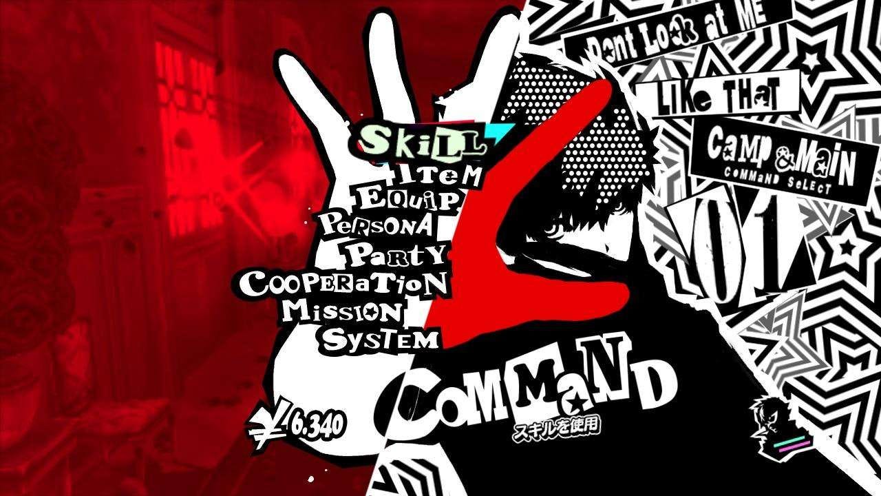
Down the middle, the actual list of action breaks several typographic rules. It's not easy to read (character size isn't consistent, characters in the same word can differ dramatically), and other than the fact the lists goes from top to bottom, there isn't a lot of hierarchy to show what's most important. The clutter on the screen, the legibility of the font, and the relatively simple color scheme seem problematic from a UX perspective.
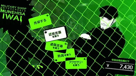
While out in the real world I can deal with it but I'm still annoyed by the shop interface. Takemi is the best and is worth the constant headache of this animation but it just seems needless to me. I go to a shop to get what I need and to get out. This just makes it take longer for me and makes it harder on my eyes.
TLDR: The UI is very stylish but really strains my eyes and ruins my overall enjoyment of the game.
Pretty but also too busy for me.
How many damn times does this need to happen? It makes exploring a dungeon more annoying. I enjoy the combat but this is just a long animation. Give me a static screen. After running around the first palace and exploring everything, finding every chest, trying to find as many monsters to capture and fuse, I grew very sick of this screen. Even if I do mash the X button it's just too long.
The constant movement too also bothers me.
Another thing that bothered me while in the first palace is this green...thing over the interface. Why is this here? Why does running have to make it harder to see? Also while is everything so damn huge? Almost the entire right side of the screen is covered in UI elements.
The menu itself seems very busy. The left side shows the current gameplay, overlaid with the game's thematic crimson. The right side features art of the main character, the health and magic points graphic we saw on battle screen. It's very pretty but also problematic for me.
Down the middle, the actual list of action breaks several typographic rules. It's not easy to read (character size isn't consistent, characters in the same word can differ dramatically), and other than the fact the lists goes from top to bottom, there isn't a lot of hierarchy to show what's most important. The clutter on the screen, the legibility of the font, and the relatively simple color scheme seem problematic from a UX perspective.
While out in the real world I can deal with it but I'm still annoyed by the shop interface. Takemi is the best and is worth the constant headache of this animation but it just seems needless to me. I go to a shop to get what I need and to get out. This just makes it take longer for me and makes it harder on my eyes.
TLDR: The UI is very stylish but really strains my eyes and ruins my overall enjoyment of the game.
Pretty but also too busy for me.


