LATEST UPDATE
Hi fam, it's been a while! Since last we spoke I changed jobs, moved to Spain, lost a dog, settled int Barcelona and I finally have found enough time after election dread to get this project going again.
I wont be able to do daily updates, so I'll see if I can get that topic edited, but I do intend to continually be working on the next thing
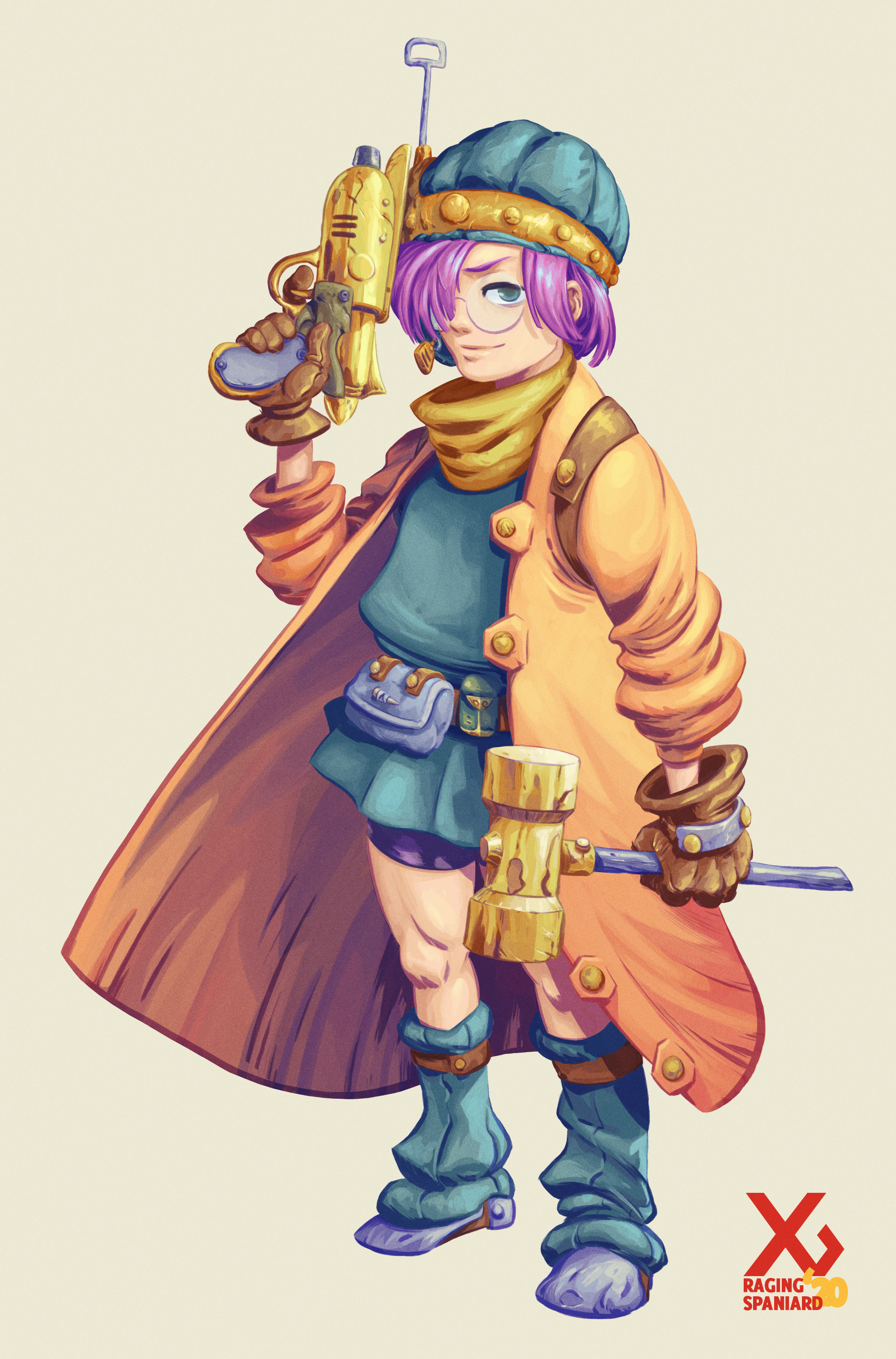
So lets start with a good one, I want to move on to more "official" work and Lucca was a character I wanted to render in the same capacity as Crono. Eventually every main cast member will get the same treatment
CT is my favorite game of all time, that's not novel or anything. I think it perfectly achieves everything it sets out to do and I've been drawing it for most of my life (example 1 2, 3) since its release in the mid 90's
In a vacuum I don't think the game needs to be reconcepted or redesigned but at the same time I'm such a fan that there's always the lingering "what if I got to work on my favorite game, how would I tackle it" It's a really fun exercise to go through, it's a great way for me to do some sketching in the mornings before work and it gets to celebrate an IP that its dear to me and to many others.
So anyways, these are rough character designs, about an hour each, more or less depending on the complexity. I've gone through the playable characters so far but they're not final designs either. What I would love for ERA to help or contribute to:
- feedback! what you hate, what you hate less, maybe you even like something
- suggestions of what to do next! I'm pretty well versed in this whole art thing so animation studies, environment designs, architecture studies, the rest of the cast, etc. I'll link to twitter polls and all that good stuff
- join in! Do your own redesigns! If you are an aspiring concept artists, projects like these can make for great portfolio showcases
PLAYABLE CAST
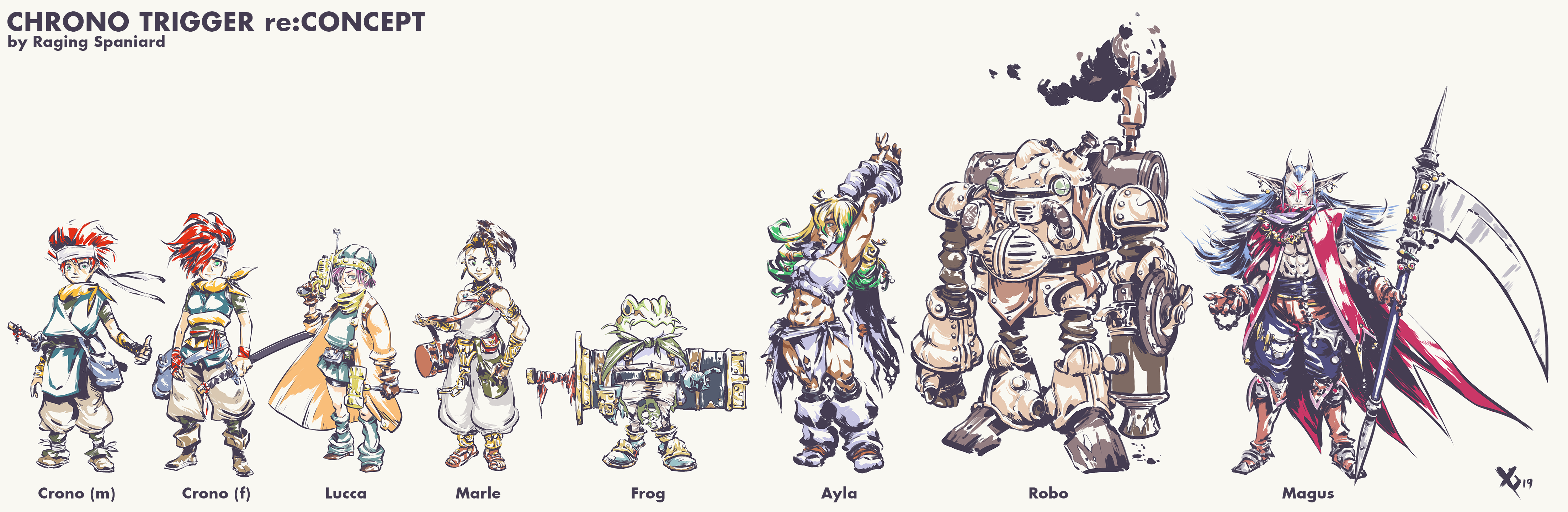
CRONO
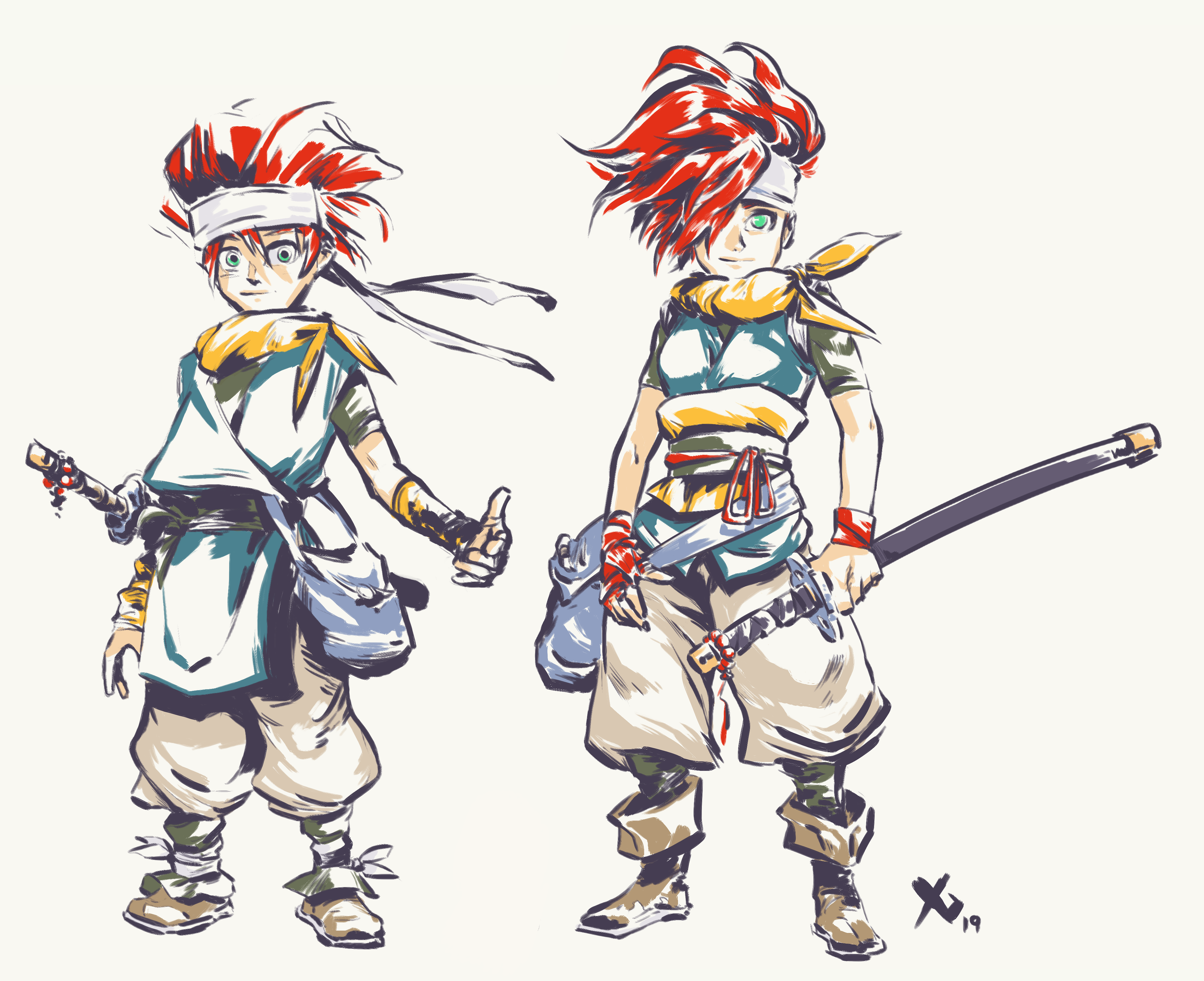
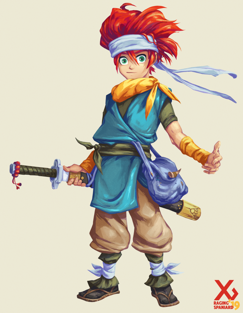
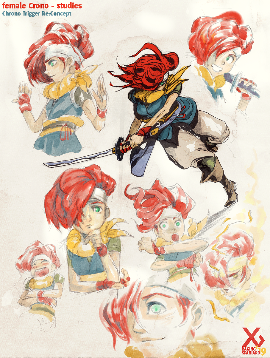
Crono needs to read as a samurai fanboy. Make the clothes a little oversized, make him look a little bit messy. He needs to pull off a look that works when hes a noob and a badass when hes going through fools with the rainbow sword
There no reason why female Crono shouldn't be an option in a potential remake. You could have the exact same design with a female body and it would work but I really like how games like Persona 3/4 give you a new design that still feels genuine but offers some alternatives. When it comes to samurai looks theres a ton out there so I looked at some Fire Emblem stuff and found some good inspiration there.
MARLE
Marle is running away from home, so I imagine her trying a little harder to pass of as a local but not doing a great job, that includes a rushed hair recolor and not realizing she shouldnt leave the castle with all that jewelry on.

LUCCA
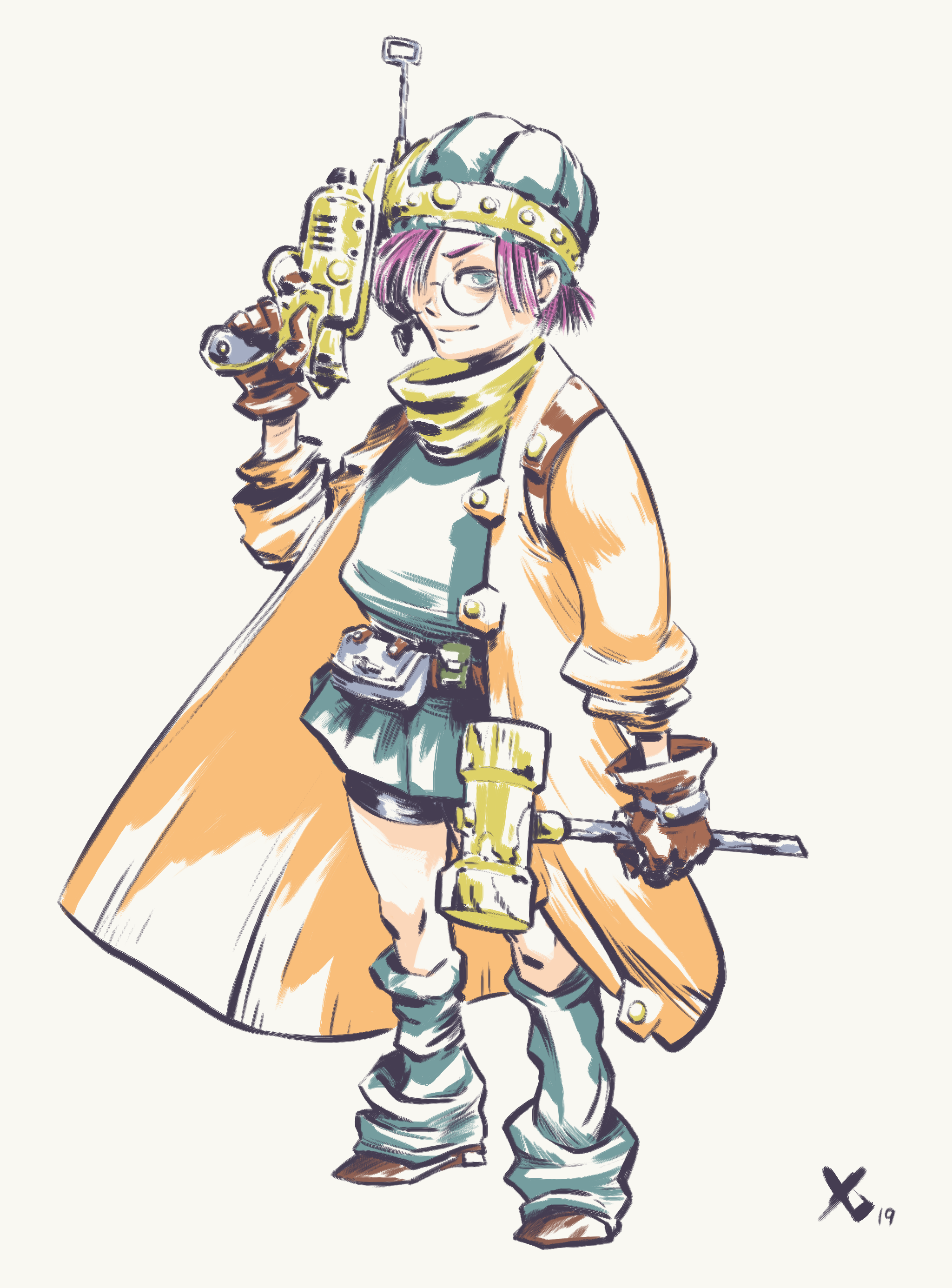
CT really overdoes it by giving everyone the same overall scarf fashion so I want to make the characters feel a bit more different. Lucca needs to feel a bit more sciency, maybe a bit sleep deprived and give you a sharp contrast from Marle. I imagine shes wearing her dads lab coat, hence why it looks a tad too big on her

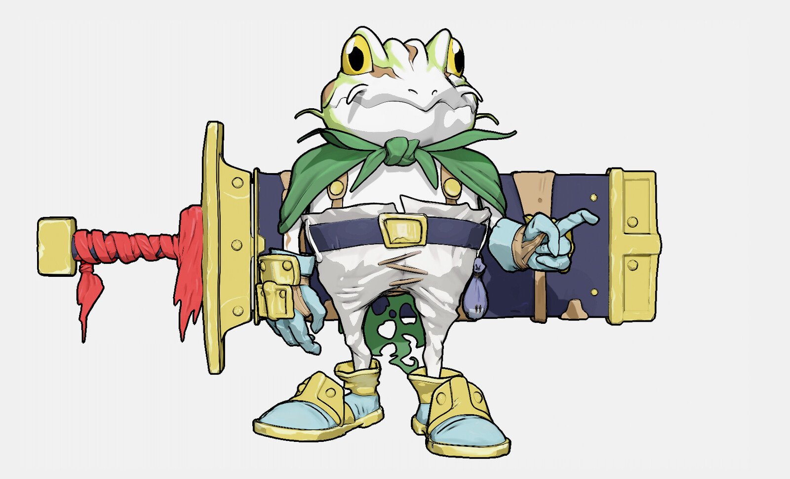
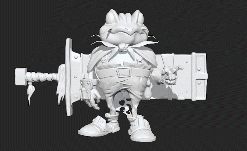
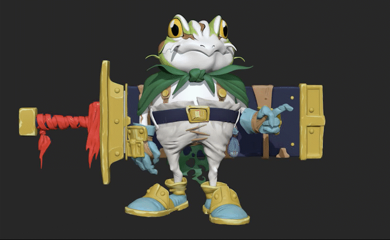
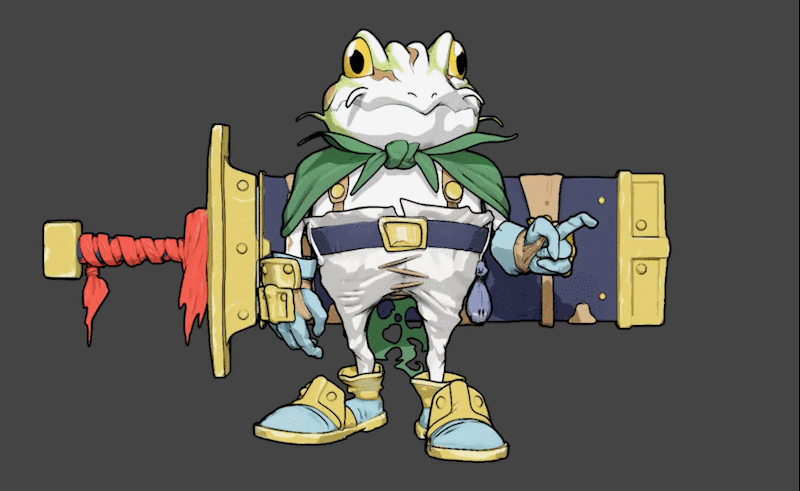
FROG
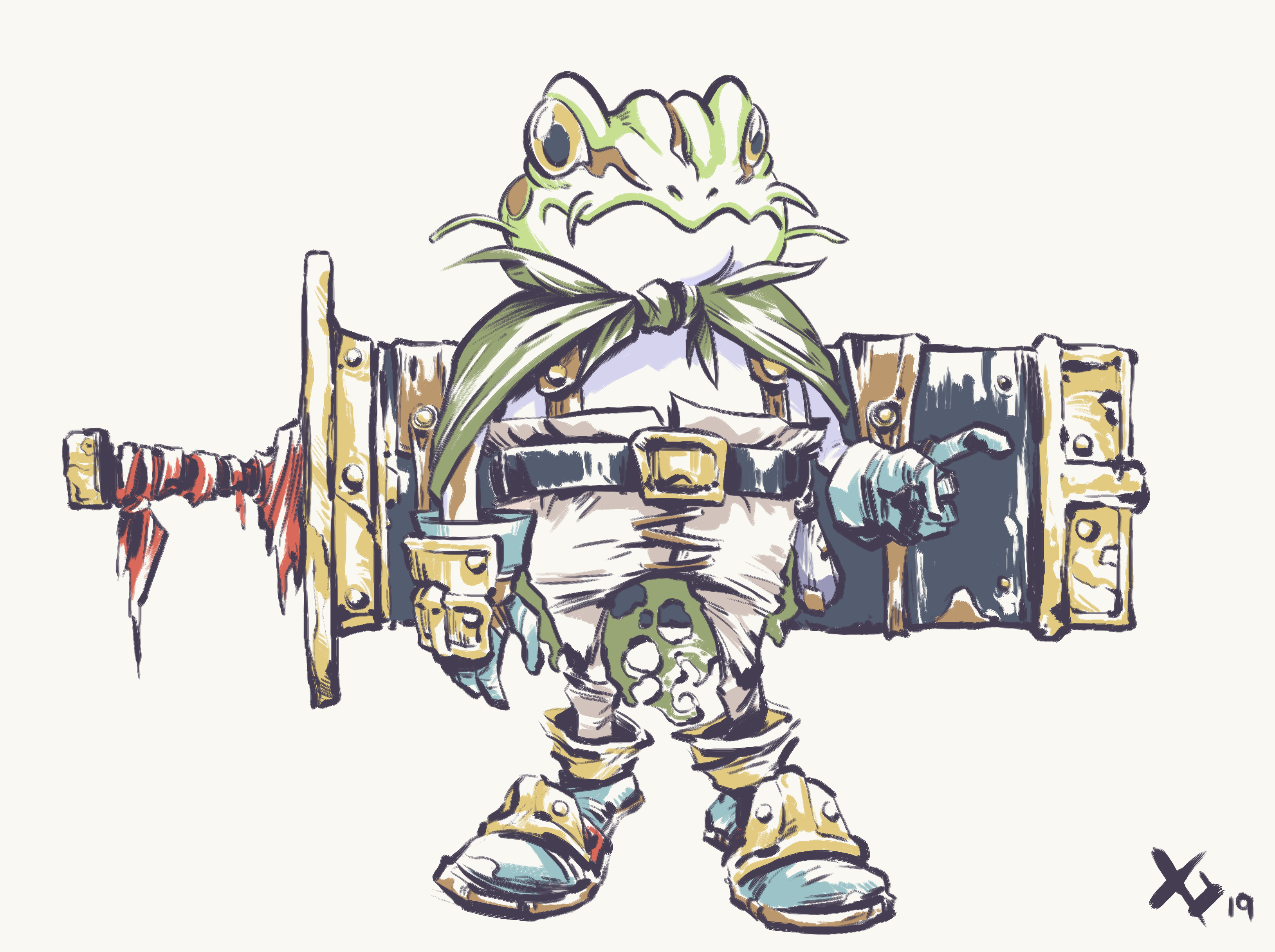
Frog is a master swordsman and kind of an aspirational character for Crono. Making him look more ragged and giving him a sword that, at least in the looks department, may in fact cut a mountain in two are two important factors I wanted to get across. Adding a bit more armor to really push the medieval time period and to show that hes not given up on being a human just yet
I love Frog, his demeanor, his reluctance to be a Hero yet hes constantly willing to fight on regardless of how tired he is or how hopeless he feels about himself

ROBO
Robo is a perfect design as it is, so less is more here. Just redrawing him in my style and making sure he looks like he can open up was enough for me. Drawing robots is hard, yo
I do think hes an all time great and I loved the scene in CT where you find his lifeless, empty husk
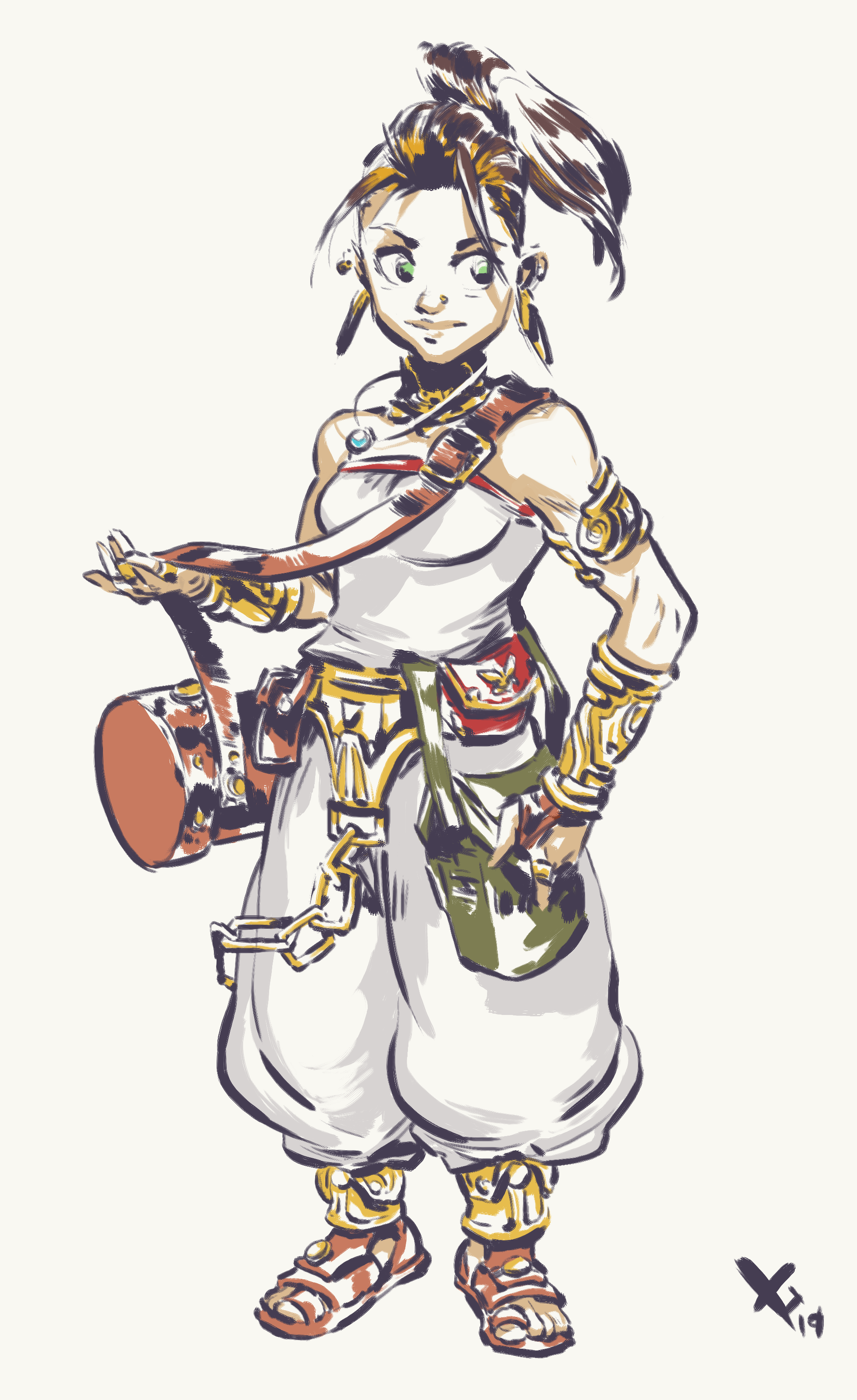
AYLA
For Ayla I knew I wanted darker skin, I also wanted darker hair but the blonde worked better in terms of contrast sooo I thought maybe some different colored streaks? Maybe as tribal leader she gets to do that, be more flamboyant and all that. Dropped the club, she doesnt need it, she needs to look like she can wreck house all by herself
I also really loved the eating contest she has with Crono, its one of those dumb, character building moments that can so easily establish a character and you dont even have to come up with a crazy gameplay mechanic to make it work
MAGUS
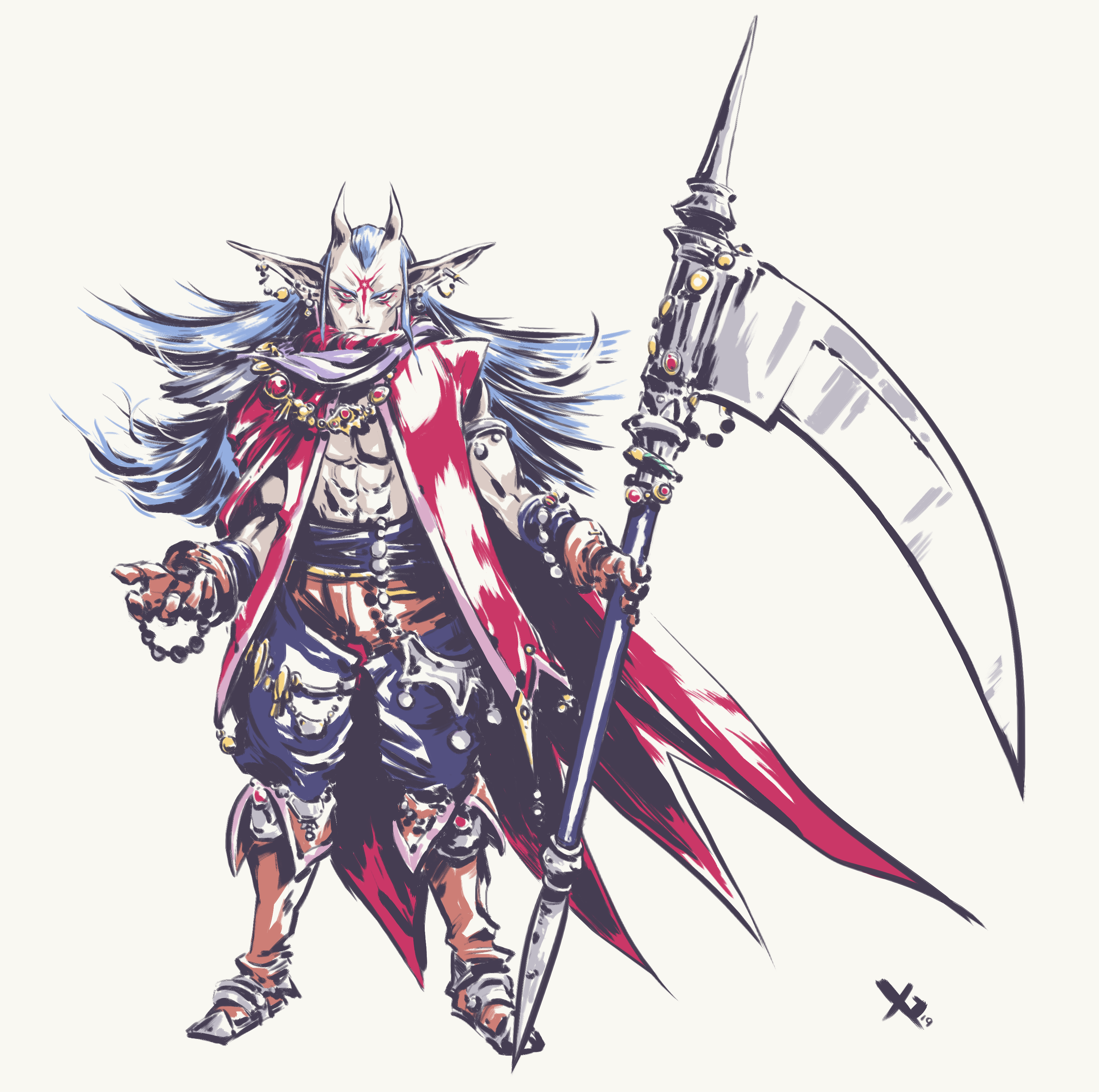
Magus v2. I took a close look at all the feedback and made some notable changes. Made him a bit more badass, more focused, added some Zeal elements so you can still see the connection to his past, still kept him provocative and alluring ... or at least I hope I did!
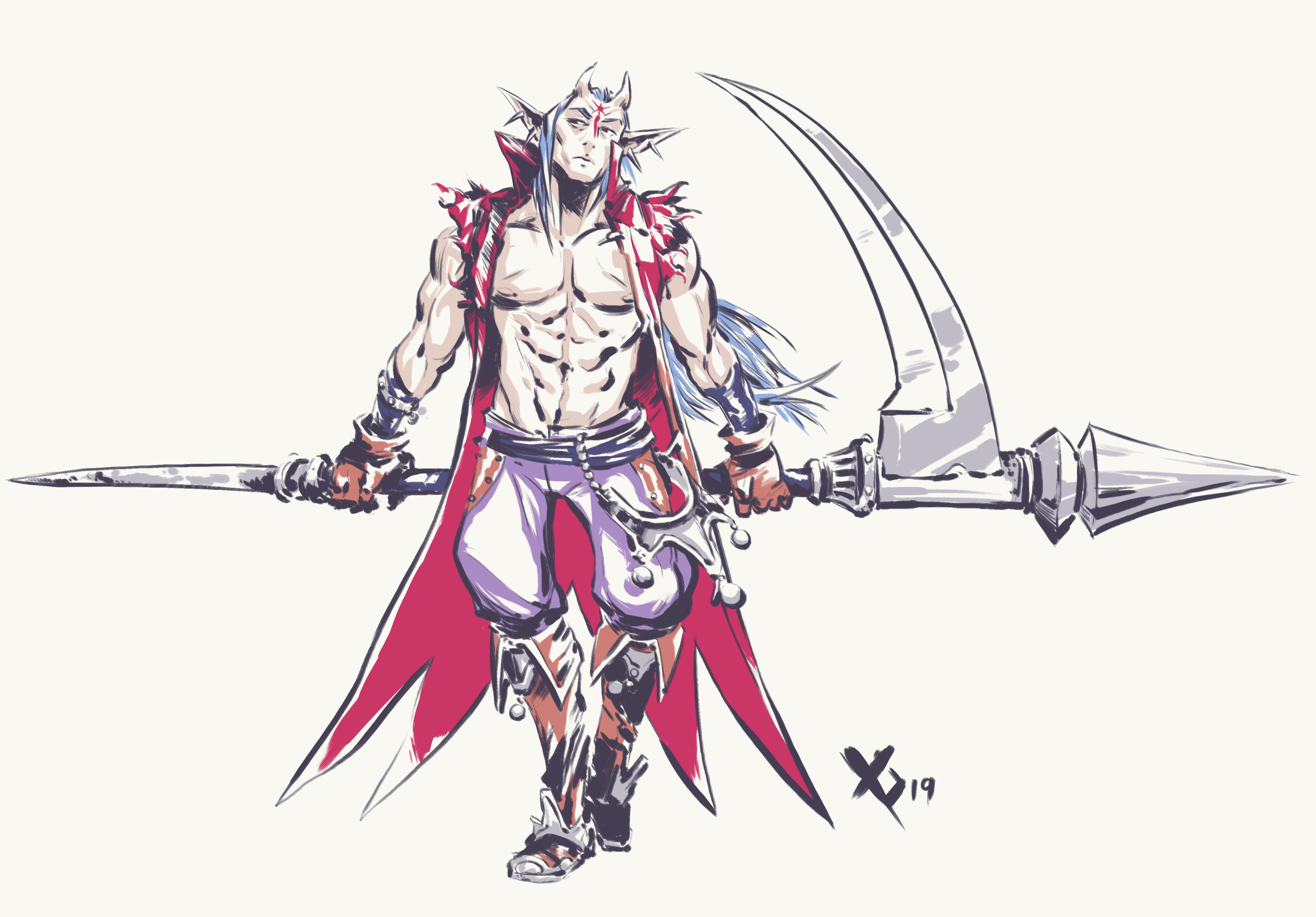
Magus v1 (for posterity)
Magus has the most drastic change, hes simply too cool a character so I couldn't resist. As the first major antagonist making him look more adult seem fitting, adding the demon horns seems like something he would do, its all a bit Marilyn Manson so this design is not gonna be for everybody but I think he contrasts really well with the rest of the cast. Nothing wrong with the original look either by the way, this was just a good chance to be less traditional
As for whats next I want to start doing some environment design stuff, like what does Crono's house look like from the outside but I could instead design the immediate secondary cast (Spekkio, Schala, etc). I could also do studies for their attacks and magic attacks. Let me know what ideas you have and if you think I should take a second pass at any of the starting cast :)
EXTENDED CAST
ZEAL KINGDOM
ZEAL KINGDOM
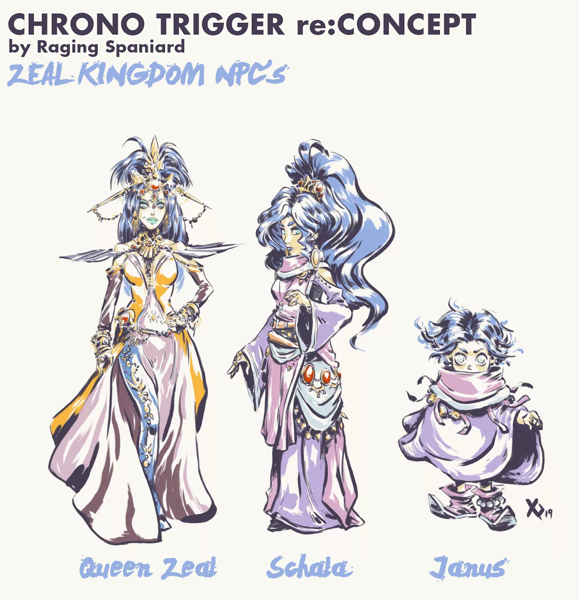
Schala, I like her overall look and feel but I saw an opportunity to add more detail and make her attire look a bit more put together. Mixed in some extra colors, added more jewelry but tried to keep things flowy and natural. As I make more Kingdom of Zeal characters I could see experimenting with more patterns and then revisiting this design a bit but for right now it strikes a good balance, I think
Janus. Not a drastic change, I think keeping him looking like a mysterious magical kid is the way to go, I added a few more details in order to make him look like a mini Schala, made his hair a bit wilder and if he looks like he may have more magical power than he needs, that's a good thing
Queen Zeal. Her original design worked fine in the sprite form but as far as her concept goes ... its not for me, so I wanted to make more changes. She should look like the evolved version of Schala with a bit of corruption in there. More jewelry, more complex silhouette, more colors, more magic and all the while she looks composed enough to make her look like a good ruler on the surface eventhough shes totes OKwith sacrificing anyone she holds dear in exchange for power.
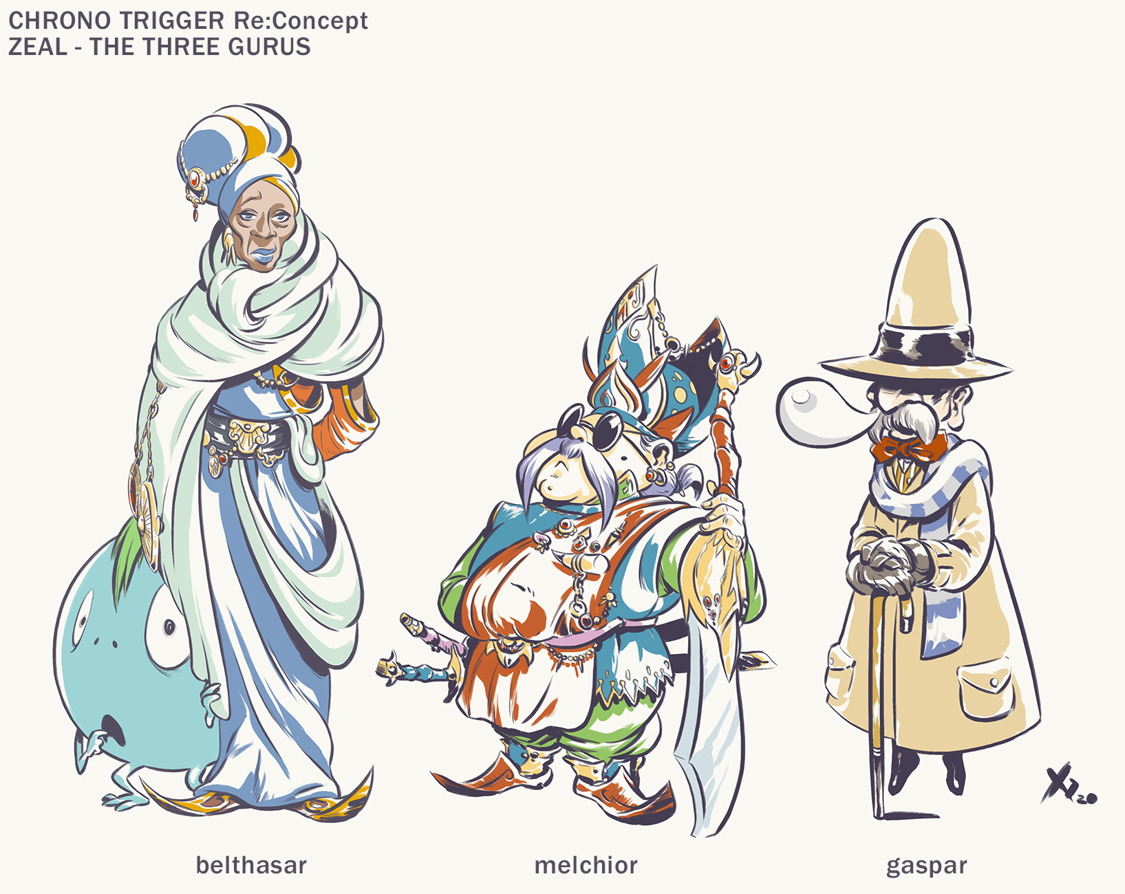
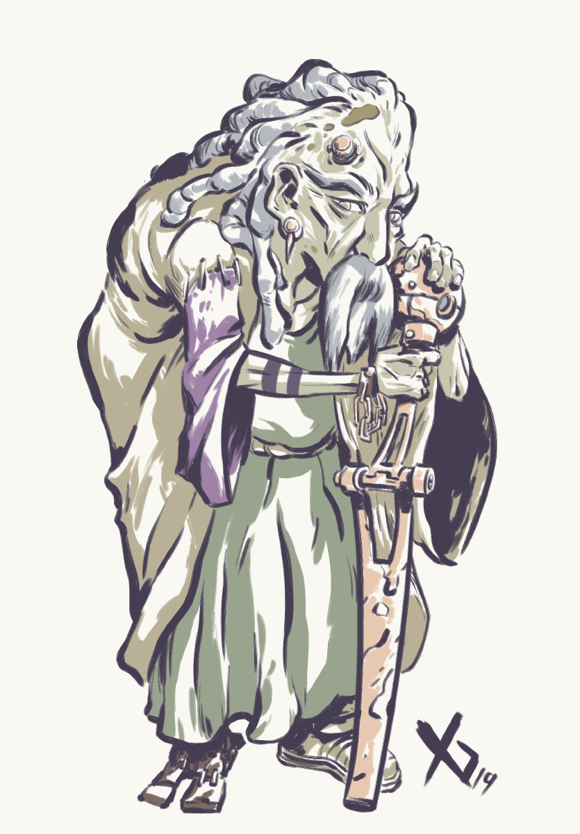
Belthasar. Great chance to make some changes and add some damn melanin into this game. I wanted her to look really sage and have some good contrast between her and Melchior. Still classy but more flowy, less harsh silhouette, somebody you could see work in isolation for a long time
Melchior, the Guru of Life! Good chance to make some changes. I always thought he had a very playful personality, I see him as more of a swordmaster, a war hero, a flamboyant old man, somebody who likes to laugh and tell stories, possibly blind. Affable, open and mysterious all at the same time He didn't even change his aesthetic when he time traveled, hinting at a deep love for his Kingdom of Origin so lets push that!
Gaspar. Not too much of a redesign, more of an updated! I like the classical look from the original, but I also see Gaspar as somebody who is a bit out of touch and not as good at disguising his magical nature as he thinks he is ... maybe he floats a bit by accident while he sleeps! I added some color accents reminiscent to his Zeal design and overall made him look a biiit more "magical gnome" like which I think fits him well
600 AD
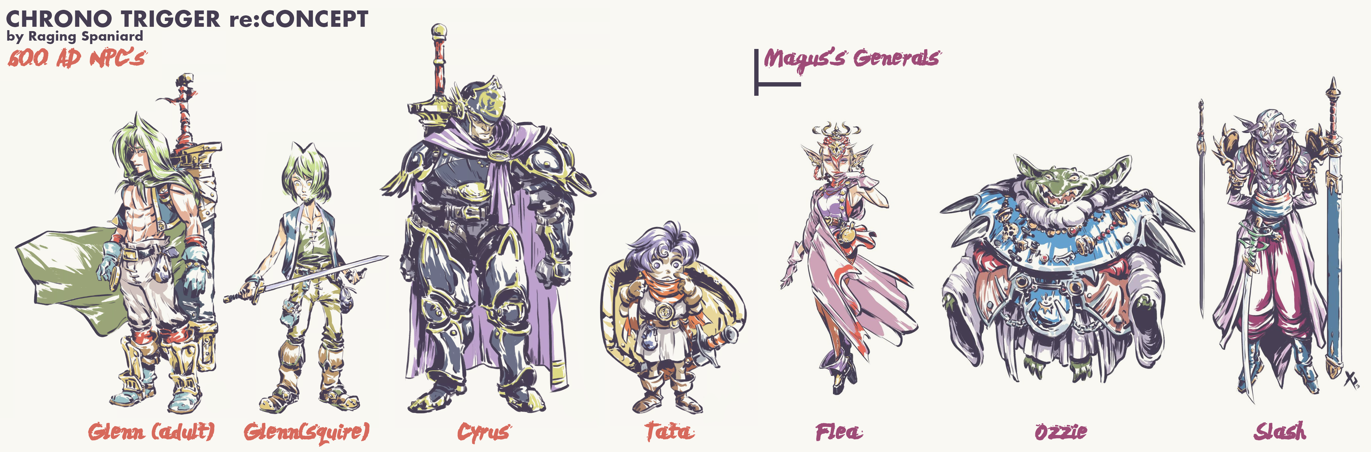
For the adult/human/badass version of Glenn I really liked his original sprite, I instantly wanted to play a whole game as that character so I moved in that direction rather than his Son Gohan esque makeover in the anime cutscenes. Squire Glenn needs to hint at his future in subtle ways and still be a design that reads NPC+. Being overshadowed by Cyrus is pretty important at this stage but you still need to see a fledgling swordsman in him.
Cyrus and Tata. Not a ton of changes for either but really trying to push the "stereotypical JRPG heroes" trope that the game itself does. The Heros Badge is prominent on both and it seems to be a heavy burden for both in different ways.
I think combining both aspects of the old Glenn with Frog, adding the Heros Badge as a visible thing, keeping the Masamune looking like a heavy burden on the character and making Glenn look confident but still somewhat damaged is the way to go here. Hes seen everything the world has to offer by this point and has been given another chance at living life in his own way
600 AD | MAGUS'S GENERALS
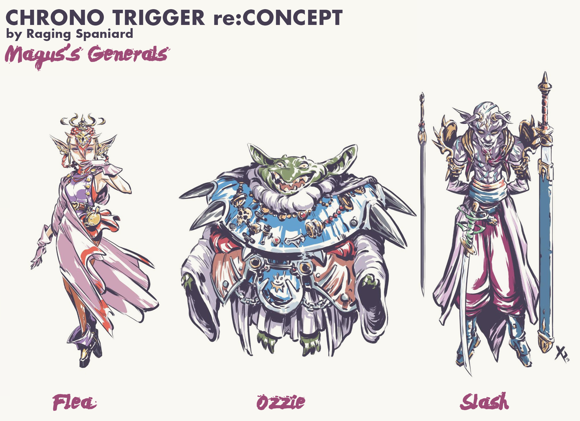
In terms of memorable bad guys, Ozzie does pretty well for himself. Toriyama has a very particular way of drawing this type of character so I tried to be respectful of that, specifically the silhouette and the fact that you get those giant metal underpants as a piece of armor (somehow) so I wanted to spend some time making that look important. Hes an opulent, full of himself character that is eager to fuck your shit and characters like that are always fun to design.
I wanted to keep Flea fun, alluring, magical and still change elements from his portrayal that just havent aged well. Hopefully this designg resonates well with the old fans and it's a fresh enough look to stand on its own.
Slash has a similar challenge. I don't think they gave him giant lips and dark skin as a malicious gesture but that's not something I will be partaking in so changes were needed. I liked the idea of making him a magical swordmaster because that gives us a bit more variety and fleshes out the world more. We already have Crono, Frog, Cyrus and other people fighting in more traditional means so lets come up with something that feels like a very different style for a character of this type.
1000 AD
Chrono's mother!
Her original design, not seen in the sprite, is actually kind of buff. I loved that. Single mom, lives far away from the city, raising a for sure rascal and she has to handle all of that shit on her own. I also LOVED presenting every party member to her whenever you return home, such a cool way to build character!
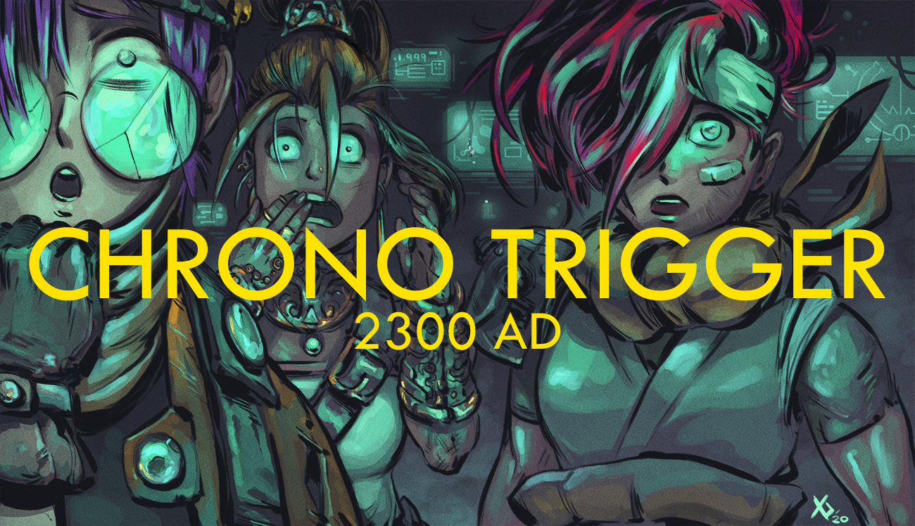
2300 AD
Not a ton of NPC's for this area, well, at least Id like more ... but its pretty damn memorable! Maybe most memorable of all is Johnny, I remember being REALLY excited for the race sequence in Mode 7 as it was used heavily to promote the game in magazine and TV ads, it looked amazing!
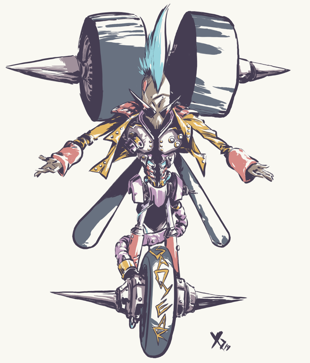
In the spirit of change, I wanted him to have the one legged look and, if that means he transforms into a 3 wheel vehicle, thats fine. I liked the Greaser look so I tried to push it a bit more, made the leather jacket orange for some better contrast, kept the BADYEAR of course and went a little extra Kamina on the sunglasses because how could I not.
Doan. I think his original design is ... fine but theres a lot of room to do something more significant here. 300 years after the apocalypse humans have become tribal again, with the lack of food, sunshine, probably excess radiation and whatever else, humans should look slightly different, especially as they age and deteriorate it shouldn't be shocking to see cybernetic implants and discolored skin. They would still look for trinkets, they would still adorn their leaders with ways to distinguish them, this kind of stuff is prevalent through human history and it would persist even in 2300
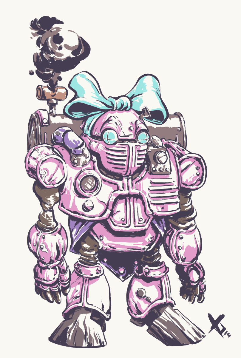
Atropos XR! Good chance to make some alterations to the factory model for a little extra personality. I considered changing the stereotypical pink but seeing how there are a lot of female character in this game, having one be a more "typical" girl and, even better, going the robot route did seem like a good thing to keep.
65,000,000 B.C.
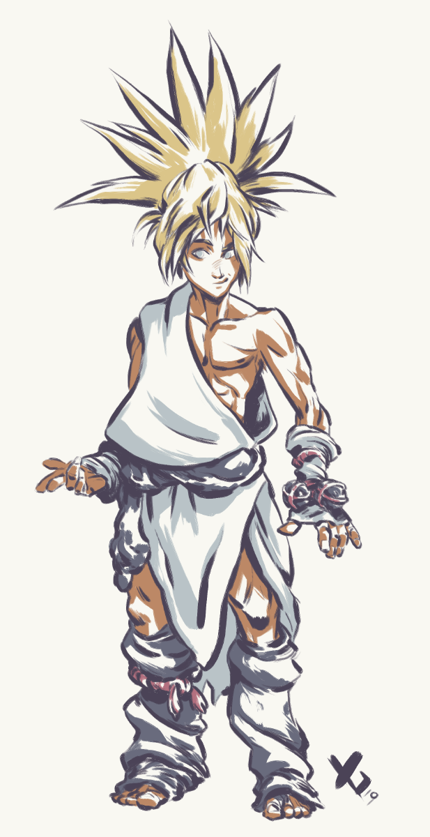
Kino is a pretty basic character, if he reads like a wannabe hero who doesnt have his shit together and may or may not fuck up at any moment then mission accomplished. You also need to get the impression that he can grow into not being a total loser, so I couldn't go too wild here.
Stone Age doesnt have much, but it has reptites! I wanted to set the look before getting to Azala who, ultimately will really embody the whole culture. I made some changes from the original, they had pink skin in places and instead I made that coral'ish armor. I want them to look smart, having tools, weapons and armor, I wanted them to look like the top of the food chain and establish humans as the obvious lower class citizens.
Azala! Queen of the Reptites! This was a fun update, wanted to make her look more royal, more complex and more fun. She already had a great, memorable silhouette that I wanted to develop more and it was a good way to keep adding layers to Reptite culture which is sorely needed. When you stop to think about it, CT has quite the memorable female cast!
BOSS RUSH
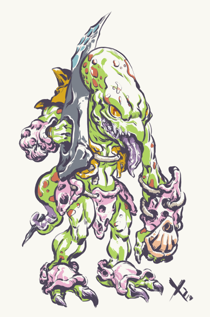
Lets start at the beginning, with the Chancellor/Yakra combo!
I made some changes so that I can tie him to his monster form in a bit. I also used the opportunity to add some extra flair, maybe his sense of fashion has Zeal hints to it? Maybe he makes some odd choices since hes just pretending to be human? At the end of the day you cant go all out since its the first boss so just introduce some concepts and leave room to level up later.
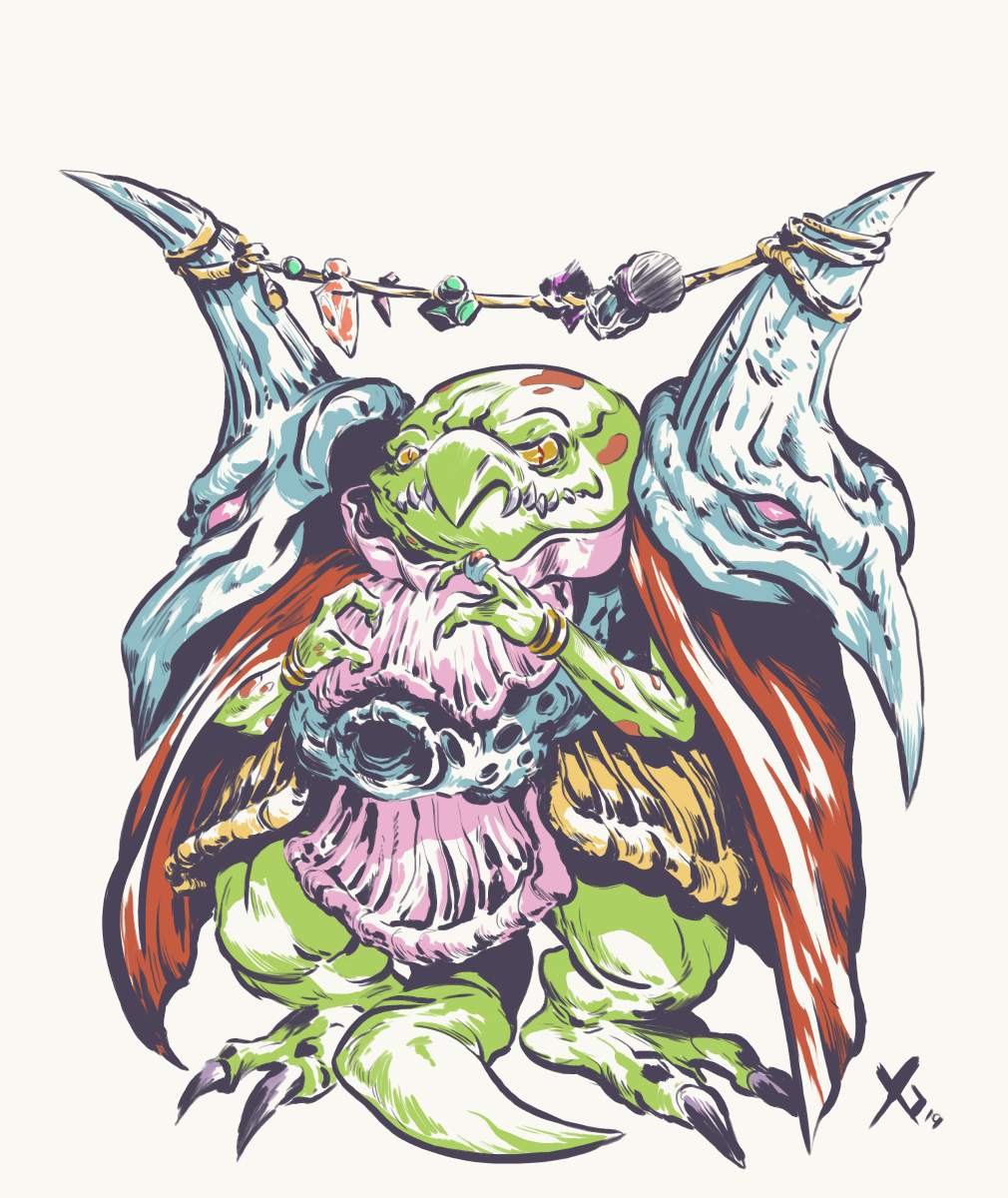
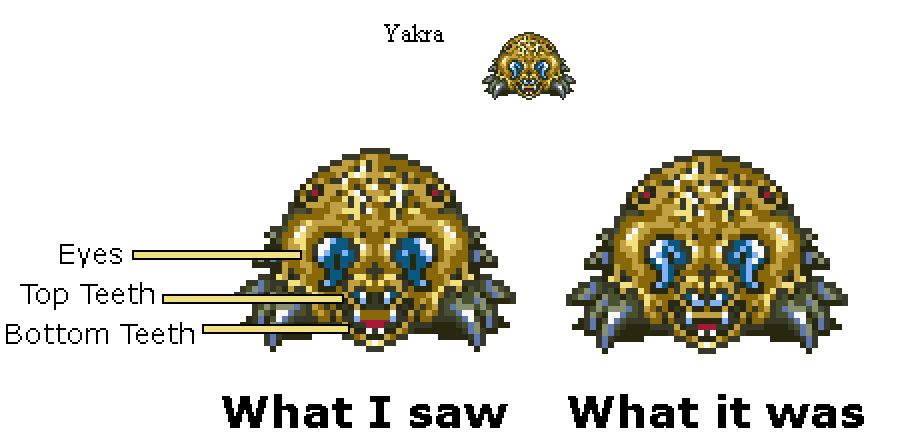
For Yakra proper, how many did this? I certainly did
So, really, the concepts only job was to clear that up and have fun with the shape. No need to reconcept a lot here, its a fun animal shape that has some extra shit going on. The fight itself is pretty good though, great choice for a first boss
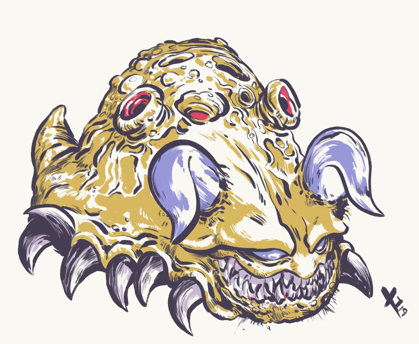
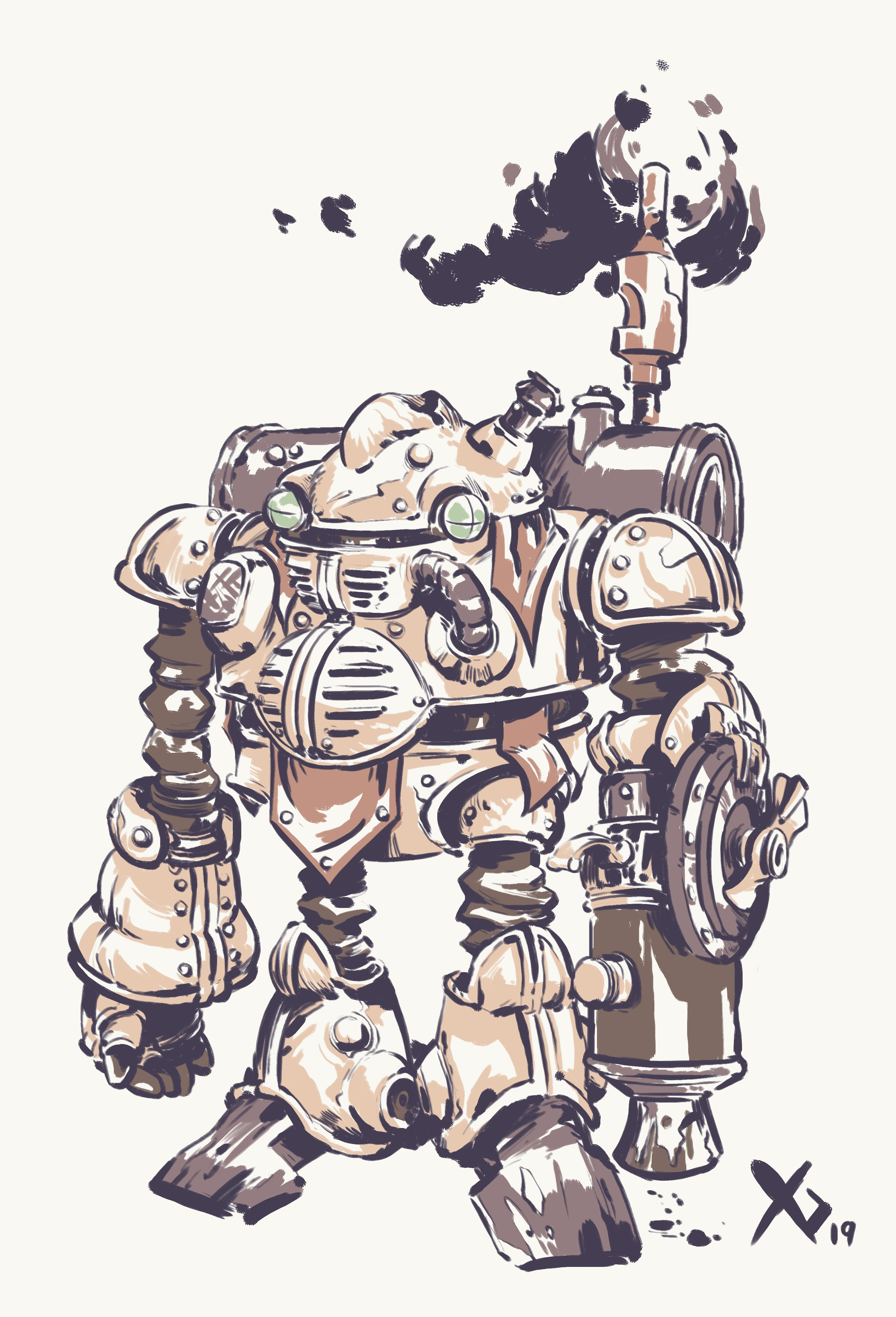
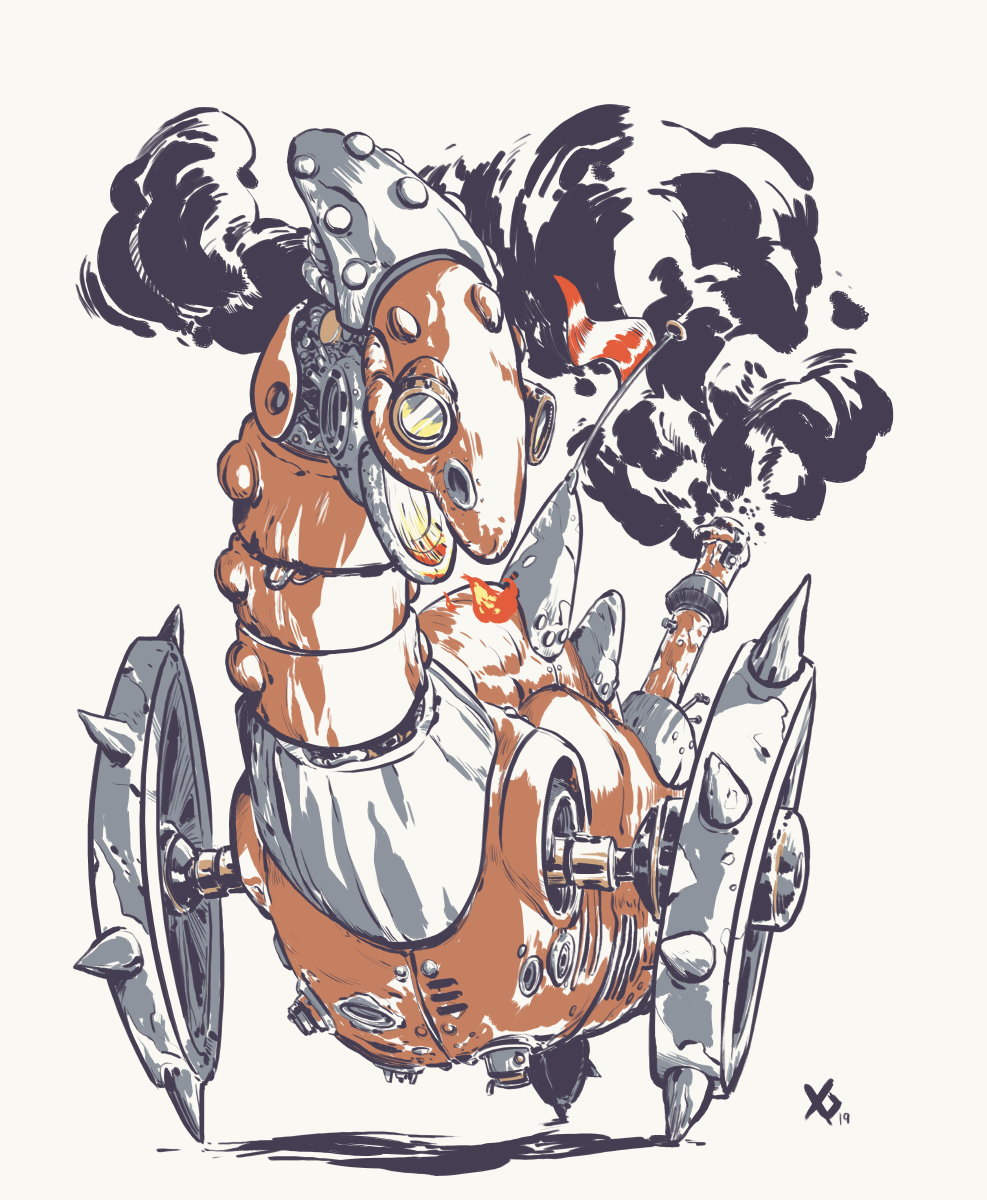
The Dragon Tank fight is a pivotal moment in the game, and I remember it being heavily advertised so it had to deliver! Mechanical designs are not really my thing and I really like Toriyamas approach to his vehicles so I tried to learn from him here
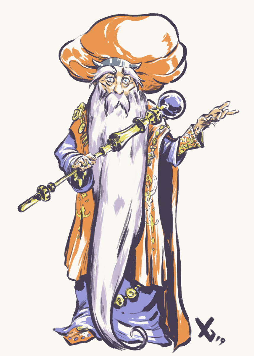
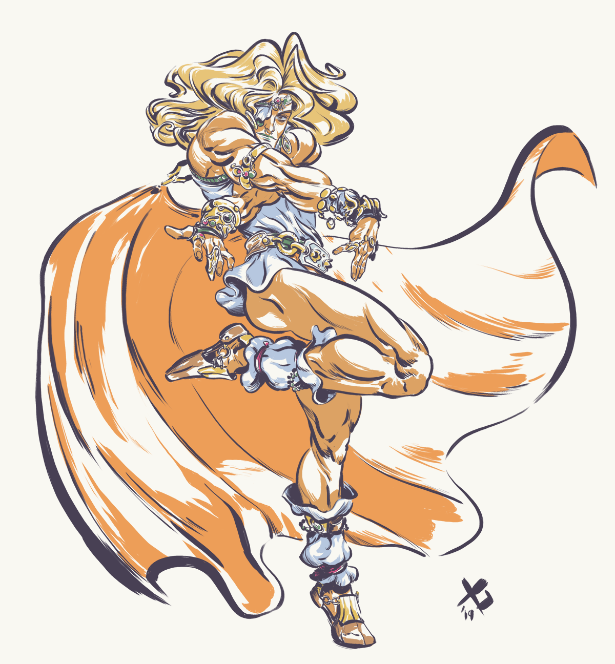
As for Dalton, I knew I wanted to lean HEAVY on the JoJo influences. He is an extravagant person WITHIN Zeal so he needed to be extra on top of extra ... and what better inspiration than Arakis work
Not too much of a redesign, more of an updated! I like the classical look from the original, but I also see Gaspar as somebody who is a bit out of touch and not as good at disguising his magical nature as he thinks he is ... maybe he floats a bit by accident while he sleeps! I added some color accents reminiscent to his Zeal design and overall made him look a biiit more "magical gnome" like which I think fits him well
ILLUSTRATIONS
When this group of teenagers found themselves 1300 years in the future, little did they know they would come across a recording that would change not just their lives, but the fate of the world itself
Also recorded the drawing session for this, will be doing more of that in the future as well
Timelapse:
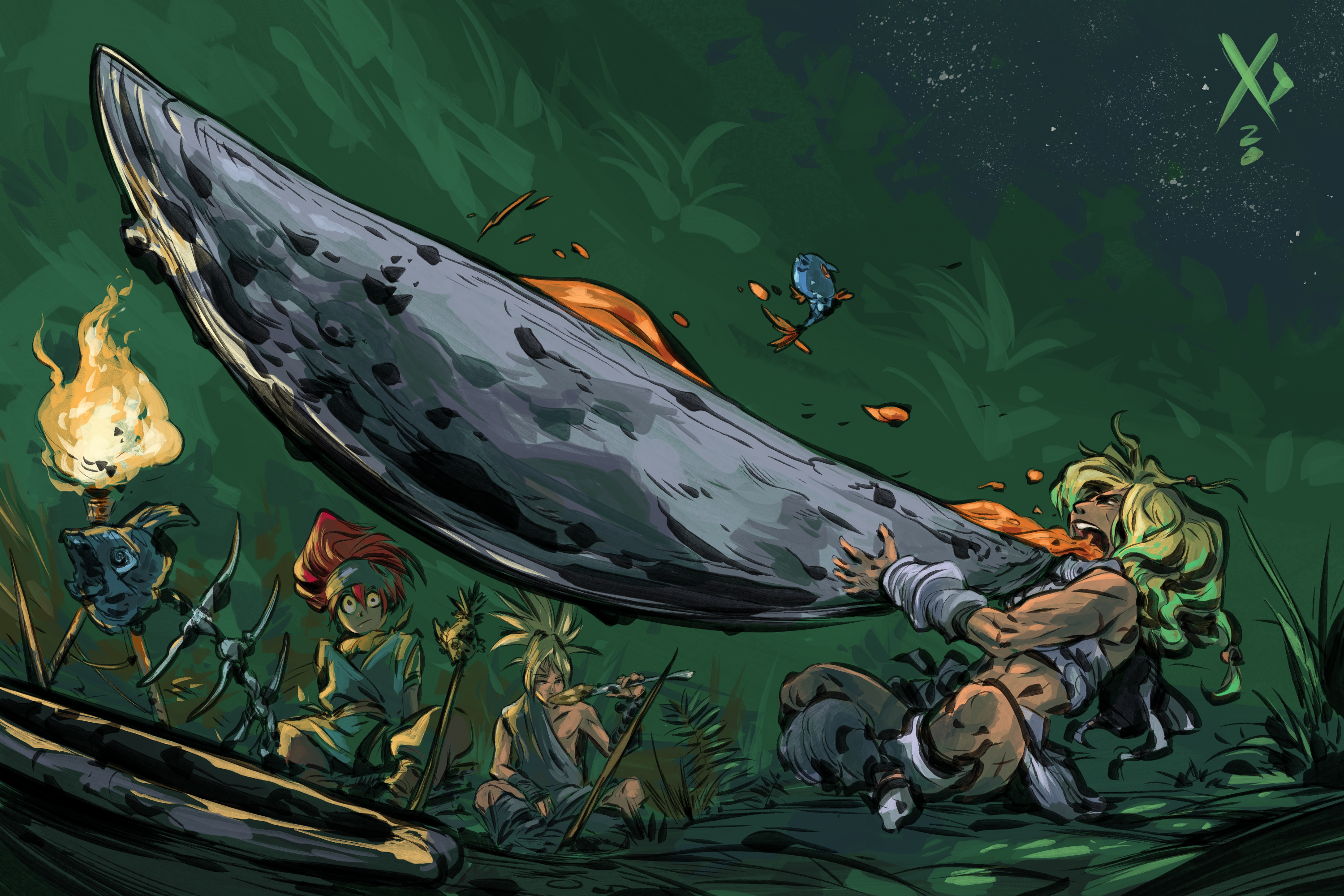
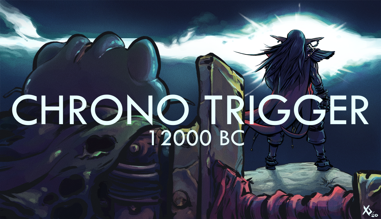
The year is 12,000 BC. Our heroes are broken, their leader missing, Lavos lives and the human race is almost extinguished. Can Frog, in a time of crisis, find enough strength to forgive Magus? Or will he give in to his rage?
FANART?!?!?!?!
Oh hi, I was always intent to return to this but, you know, professional game development and all that tends to take priority (boo!)
However, yesterday I awoke to an AWESOME surprise via twitter! Check this out!
ArtStation Link
HOLY SHIT!
-----------------------------------------------------------
Thanks for indulging me! Hopefully this goes on for a while!
Last edited:
