-
Ever wanted an RSS feed of all your favorite gaming news sites? Go check out our new Gaming Headlines feed! Read more about it here.
Mega Man Fully Charged Art Prints Hit The Web, First Look at Main Villian
- Thread starter Zippo
- Start date
You are using an out of date browser. It may not display this or other websites correctly.
You should upgrade or use an alternative browser.
You should upgrade or use an alternative browser.
they gave CutMan a BOWLCUT?! What irony is this.

Honestly though...I actually love the Art style on these prints...why does the show itself look like hot garbage?
I'm cracking up thinking about the creepy dog noises he must be making
Agreed. I actually dig the artwork - kind gives off a creepy, unsettling, almost "old-school" Cartoon Network show vibe.
Too bad the show looks nothing like it.
It's really a bummer how Megaman himself looks. The robot masters actually look kind of cool, the only thing about this whole show I've seen that I really really abhore is Megaman's design. If they'd just tweak him to look less... odd, I feel like this show could be fun to watch.

I love that this was the cartridge art work.
Poor Ice Man, he looks awful. Such a simple design, it seems like it'd be hard to mess it up, but they somehow managed.When your Pachislot game has better designs than your cartoon, you are in deep trouble. I'm going to give the show the benefit of the doubt, even if I don´t like the art direction the show may be fun. This is how they look in the show.
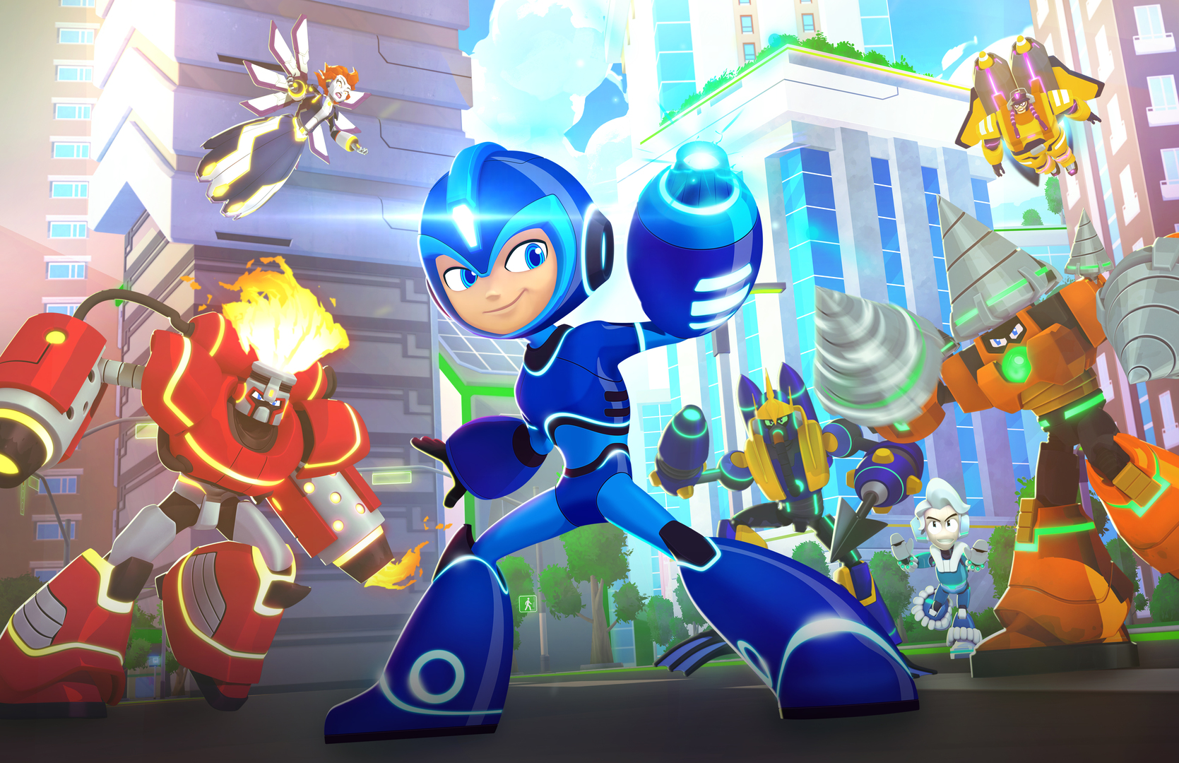
The other Robot Masters look alright. Although I think Bubble Man could be a bit fatter. Air Man is kinda weird, though, he looks more like a clock, I thought it was Time Man at first.
I honestly get the feeling this show won't look quite as bad once they're pulling facial expressions that aren't Generic Poster For The Kids creepy grins.
Still though, there's something legitimately timeless about Mega Man's original design and art direction. Say what you will about the She-Ra reboot, but that show's look would look incredibly out of place today. This Mega Man though?

It holds up! There's a reason Mickey Mouse has barely changed appearance since the '40s.
Still though, there's something legitimately timeless about Mega Man's original design and art direction. Say what you will about the She-Ra reboot, but that show's look would look incredibly out of place today. This Mega Man though?
It holds up! There's a reason Mickey Mouse has barely changed appearance since the '40s.
I honestly get the feeling this show won't look quite as bad once they're pulling facial expressions that aren't Generic Poster For The Kids creepy grins.
Still though, there's something legitimately timeless about Mega Man's original design and art direction. Say what you will about the She-Ra reboot, but that show's look would look incredibly out of place today. This Mega Man though?
It holds up! There's a reason Mickey Mouse has barely changed appearance since the '40s.
Yep, put that in HD + some good plot = win
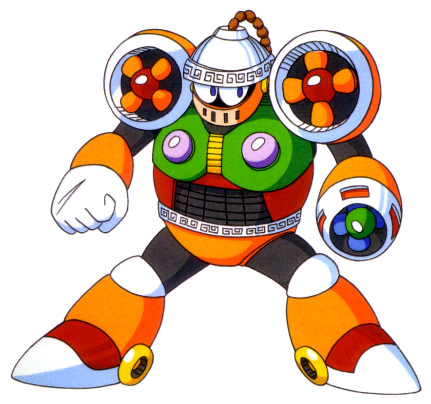
probably its too expensive, thats why rush's legs are now some circles.
Yeah, that art style is still doing nothing for me. Just doesn't really fit Mega Man.
Hopefully that villain is actually Wily. Not including him at all just feels wrong.
Hopefully that villain is actually Wily. Not including him at all just feels wrong.
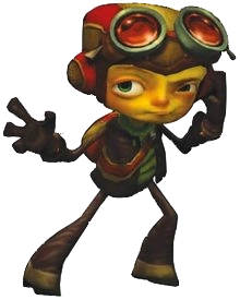
My thoughts exactly. It's really too bad they didn't carry over the style to the show.Looks kinda like psychonauts.... I'm okay with that but why doesn't the actual show look like it?
Also hire this person for a psychonauts show
If he doesn't speak with a lisp I'll be shocked.
I'm hoping the cartoon itself is able to rise above the art, because these designs suck fuzzy bean bag. I'm almost expecting the animation to look like the bone-based animation in HD 2D platformers of late.
If only the show were that stylized.
::Sigh::

::Sigh::
When your Pachislot game has better designs than your cartoon, you are in deep trouble. I'm going to give the show the benefit of the doubt, even if I don´t like the art direction the show may be fun. This is how they look in the show.

I honestly get the feeling this show won't look quite as bad once they're pulling facial expressions that aren't Generic Poster For The Kids creepy grins.
Still though, there's something legitimately timeless about Mega Man's original design and art direction. Say what you will about the She-Ra reboot, but that show's look would look incredibly out of place today. This Mega Man though?
It holds up! There's a reason Mickey Mouse has barely changed appearance since the '40s.
You think the show itself isn't going to be Generic For The Kids TV?
It's not Air Man; I present Wind Man.
Definitely not vibing with that art style ever since I first saw it revealed way back. Why do I feel better looking at that old goofy western cartoon than this. It looks too modern maybe? It must be the face and megamans general look. Maybe it looks like the target demographic was aged way down and its not really giving more mature audiences anything to appreciate. This feels like teen titans go and the new ben10.
You think the show itself isn't going to be Generic For The Kids TV?
I don't think it'll be entirely generic, mostly because the genre is so diverse at this point. It'll probably be a Ben 10 rip-off at worst.
It's still just a show aimed at kids though. This reminds me of the Duck Tales reboot thing. You had all these blogs doing episode reviews like it was actually aimed at 20/30 somethings. Nah.I don't think it'll be entirely generic, mostly because the genre is so diverse at this point. It'll probably be a Ben 10 rip-off at worst.
Meanwhile in Japan:
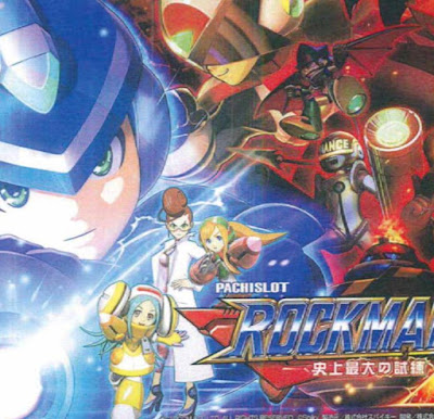
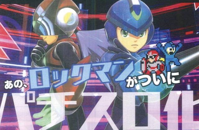
From Here: http://www.rockman-corner.com/2018/07/rockman-ability-announced-pachislot.html
Who wore it better? Fully Charged or Ability?
From Here: http://www.rockman-corner.com/2018/07/rockman-ability-announced-pachislot.html
Who wore it better? Fully Charged or Ability?
This is uncomfortably hard to take seriously. I've reached the point where I'd be grateful if my favorite things would just wait a good decade before they start making comebacks. Not a great time for cartoons.
Cartoons were constantly looking better and better for years, then someone must have realized how much cheaper it is to go distorted and minimalist. I know it's all preference and that at 27 I'm not the target audience, but "stylized" and "bad" are starting to feel synonymous.

...Christ
Cartoons were constantly looking better and better for years, then someone must have realized how much cheaper it is to go distorted and minimalist. I know it's all preference and that at 27 I'm not the target audience, but "stylized" and "bad" are starting to feel synonymous.
...Christ
Last edited:
Hopefully this is a Ben 10 Omniverse situation, where all the still images look like shit, but it's actually decent looking in motion.
That's Wave Man, not Bubble Man. I think he looks pretty great. Other than Air Man and Ice Man, I like most of the Robot Masters.
Pretty sure it actually is Air Man going by the colors. He looks nothing like Wind Man either lol. Don't know what they were thinking. At least Ice Man looks like Ice Man with the hood down more or less.
Poor Ice Man, he looks awful. Such a simple design, it seems like it'd be hard to mess it up, but they somehow managed.
The other Robot Masters look alright. Although I think Bubble Man could be a bit fatter. Air Man is kinda weird, though, he looks more like a clock, I thought it was Time Man at first.
That's Wave Man, not Bubble Man. I think he looks pretty great. Other than Air Man and Ice Man, I like most of the Robot Masters.
Pretty sure it actually is Air Man going by the colors. He looks nothing like Wind Man either lol. Don't know what they were thinking. At least Ice Man looks like Ice Man with the hood down more or less.
I think I would have actually preferred (so-called) CalArts style to this. It's just hard to see Mega Man stray too far from Astro Boy territory.