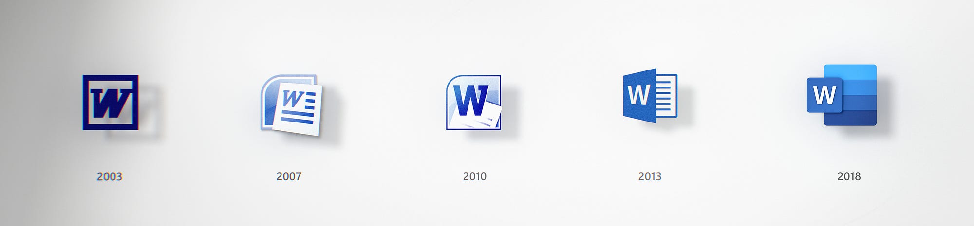
The evolution of Word.
Lot of text at the link, but who cares here are the pictures:
https://medium.com/microsoft-design...s-to-embrace-a-new-world-of-work-91d72608ee8f
I like it.
THIS.
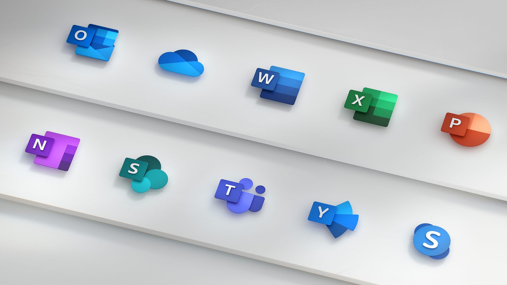
Outlook has been blue for a long time (except om Mac maybe?).
I am surprised at how many of those icons are unrecognizable to me
Ah, my work still has outlook 2010 I think and it's gold.
looks good. maybe my company will buy it in 20 years. I just wanna open separate application windows man...
sobs in 2010