First as the title says, I think it's fair to acknowledge the THQ Nordic thing to warn people about it. If you wish to talk more about that topic, this is the original thread on the topic with all the info you need on what they did. Note that I won't be supporting them myself.
With that out of the way, I made the thread to draw attention to this oddity I saw when browsing GameFly just now. It looks like download notices might take a much smaller and frankly nicer approach than the giant banner to the right of the Switch logo from before.
Here's an example of the prior usage:
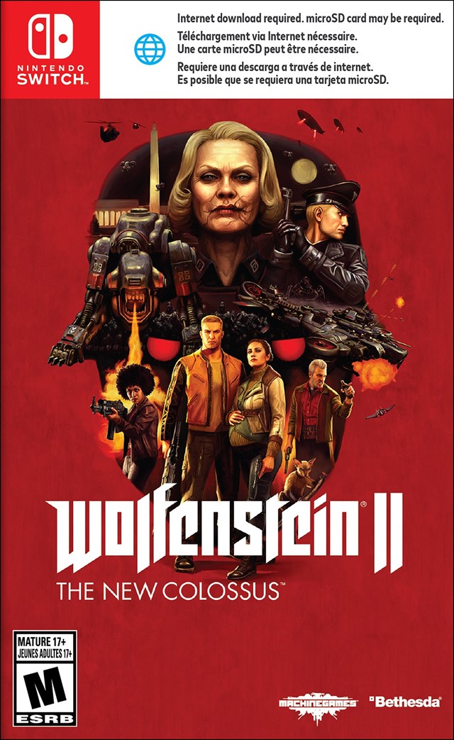
You can tell the new style may be official since it's using that same blue internet logo but now inverted.
Thoughts?


