so far, just their in-house for Pokemon and Unity for 2 new IPs. don't expect them to go crazy with engines given their sizeI wonder if they are using different engines between the games. I was pretty sure they'd be using Unity for Pokémon too but I'm not sure anymore
-
Ever wanted an RSS feed of all your favorite gaming news sites? Go check out our new Gaming Headlines feed! Read more about it here.
-
We have made minor adjustments to how the search bar works on ResetEra. You can read about the changes here.
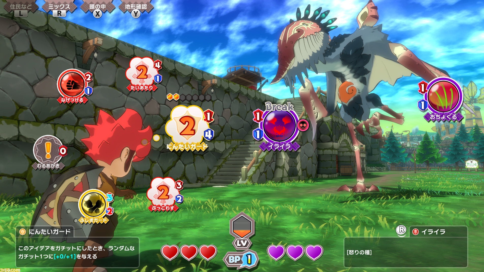
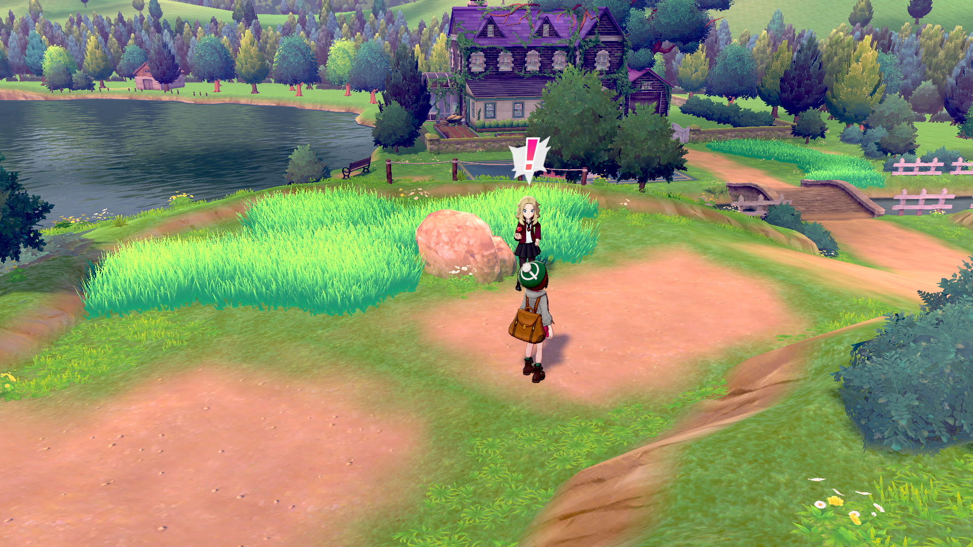
New screenshot of TOWN (Game Freak, Switch)
- Thread starter Hero of Legend
- Start date
You are using an out of date browser. It may not display this or other websites correctly.
You should upgrade or use an alternative browser.
You should upgrade or use an alternative browser.
It's quite disingenuous to post that screenshot without mentionning that you are scanning the ennemy usualy the level bar and morgana talking to you aren't on the screen.So there's only what's around the MC and at the bottom.
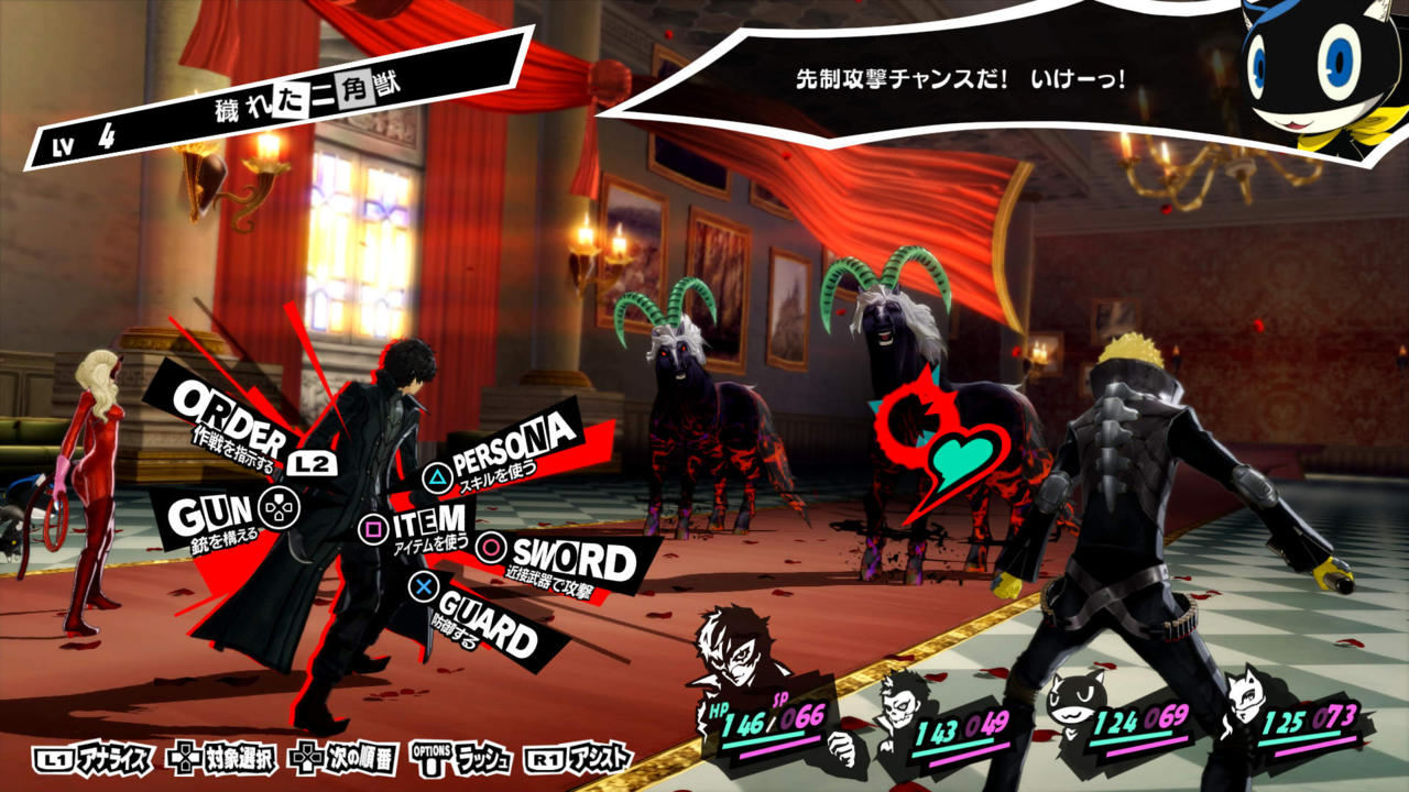
It's quite disingenuous to post that screenshot without mentionning that you are scanning the ennemy usualy the level bar and morgana talking to you aren't on the screen.So there's only what's around the MC and at the bottom.
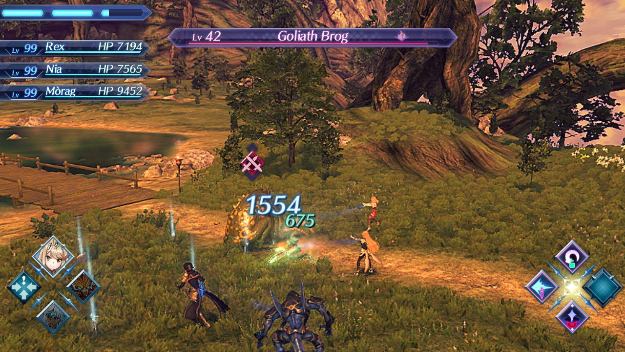
Same goes for that Xenoblade 2 screenshot.
Worst situation? It's a field with no enemies around. Don't act like you would accept that from GameFreak.
-.- yes. and you know that.
I meant specifically between SWSH and Town but yeahso far, just their in-house for Pokemon and Unity for 2 new IPs. don't expect them to go crazy with engines given their size
But the same model of different size or region counts as different enemies. And all human enemies use the same mold.From the Xenoblade 2 wiki I count 1239 enemies. That includes recolors and slight variations. But it's way more than 50-60.
You must have forgotten Torigoth my friend.

Your combat animations, because xenoblade is actually a rhythm game all along
I didn't play Xenoblade so I wouldn't know that but yeah you can really tell when someone try to damper things that obviously that UI is horrendous.
Yet it's no disingenuous to claim the Town UI is busy knowing absolutely nothing about the actual combat mechanics whatsoever and just assuming some elements are there are needless clutter?It's quite disingenuous to post that screenshot without mentionning that you are scanning the ennemy usualy the level bar and morgana talking to you aren't on the screen.So there's only what's around the MC and at the bottom.
I didn't play Xenoblade so I wouldn't know that but yeah you can really tell when someone try to damper things that obviously that UI is horrendous.
Most games have perfectly fine UI. Things are in motion, they pop in and out all the time. Everytime I see people complaining about UI in games they haven't played I just roll my eyes.
Really depends on what you want to do.
Love the XC2 battle system. Hope we get something similar in the next Monolith game.
You really can't tell that is is worse than Persona and Xenoblade at their worst?Yet it's no disingenuous to claim the Town UI is busy knowing absolutely nothing about the actual combat mechanics whatsoever and just assuming some elements are there are needless clutter?
Lmao? Wii hd game? So you're trolling or just need glassed?the 850 monsters will not be on the overworld . also xenoblade games have hundreds of monsters as well yet they are generations ahead graphically (and techically). so yea I'LL NEVER understand how sword and shield have to look like a wii hd game.
it's very, very disappointing.
Bottom right mostly, with quick glances at top right, bottom left, and middle right/left pop-ups depending on the actions you're aiming to do, while occasionally keeping an eye on top left so you don't die.
Also once you know what you're doing you can hide the names and things to minimize clutter.
Can you read Japanese? Do you know what all the various elements are saying? How can you not see the absurdity of this argument?You really can't tell that is is worse than Persona and Xenoblade at their worst?
I always hate the bloated UI And would have a lot of trouble playing xenoblade if the UI stayed that way (which you told me doesn't).Most games have perfectly fine UI. Things are in motion, they pop in and out all the time. Everytime I see people complaining about UI in games they haven't played I just roll my eyes.
But I think persona leave enough space to the eye.
I can't fathom how some people can play with the map overlaying their screen that's so unpleasant to the eye to me.
Does it feel smooth on the eye to you?Can you read Japanese? Do you know what all the various elements are saying? How can you not see the absurdity of this argument?
I don't like that UI it is a simple personal taste but I feel it is too bloated either too much icon or maybe zooming out might help but I don't need to understand japaneese to know that it would be uncomfortable to play to me ?
Don't get upset if someone doesn't like what you like.
Its quite disingenuous to say thatDoes it feel smooth on the eye to you?
I don't like that UI it is a simple personal taste but I feel it is too bloated either too much icon or maybe zooming out might help but I don't need to understand japaneese to know that it would be uncomfortable to play to me ?
Don't get upset if someone doesn't like what you like.
That was the UI with all of the elements on screen at the same time which isn't always the case, it looks like this otherwiseI always hate the bloated UI And would have a lot of trouble playing xenoblade if the UI stayed that way (which you told me doesn't).
But I think persona leave enough space to the eye.
I can't fathom how some people can play with the map overlaying their screen that's so unpleasant to the eye to me.
I think it looks really bad and it's crazy to me that people prefer that to Sword & Shield.
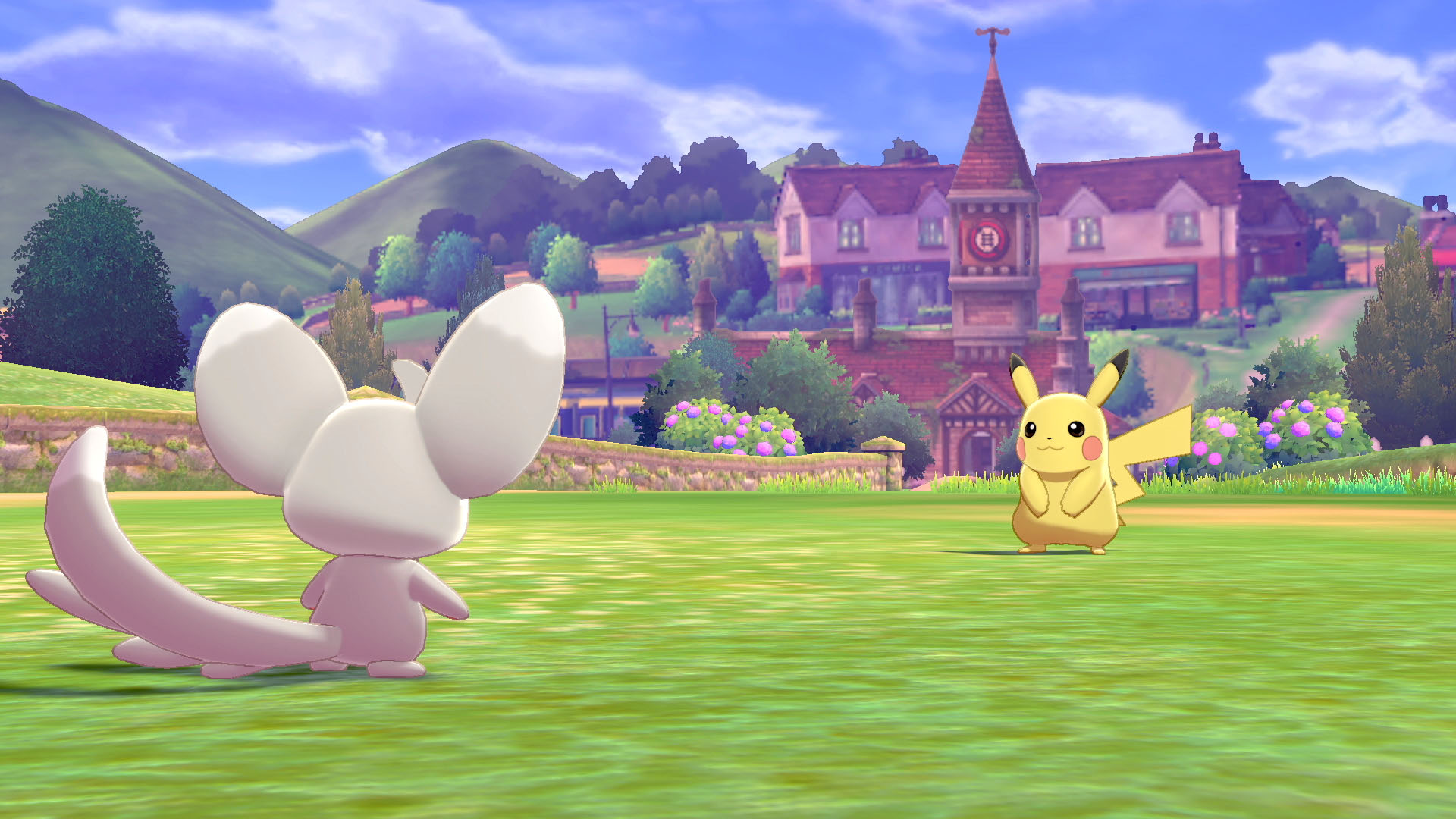
Better shading and models and less aliasing in Town are noticeable to me, no grass whatsoever in S/S, and the shading in the background could be a lot better.
That said worth noting Sword/Shield can improve between now and launch, and it's also a bigger game.
Last edited:
Does it feel smooth on the eye to you?
I don't like that UI it is a simple personal taste but I feel it is too bloated either too much icon or maybe zooming out might help but I don't need to understand japaneese to know that it would be uncomfortable to play to me ?
Don't get upset if someone doesn't like what you like.
Coming from the person doing the exact same thing at the claim that the Persona 5 UI is cluttered? Really??
Better shading and models and less aliasing in Town are noticeable to me. I don't even know if you can look at the sky in Sword and Shield.
That said worth noting Sword/Shield can improve between now and launch, and it's also a bigger game.
Sword & Shield looks clean. Colorful. It's more detailed. It has better color saturation. Better models. It doesn't have ugly shadow blobs. It's more coherent globally and artistically.
Town looks like a Ni No Kuni bootleg.
Still looks pretty ugly. Not necessarily graphics wise, but more... Artstyle wise? The colors are still so muted and weird. I'm really not feeling it. It looks better than it did before though.
That's way better I remember watching a friend playing Aion and I wouldn't have lasted more than an hour imagine this plus the map across all screen in transparency.That was the UI with all of the elements on screen at the same time which isn't always the case, it looks like this otherwise

Curious to see more gameplay details. Of all non-Pokemon games Gamefreak has ever done, this seems to be one which truly attracted me.
There are people who didn't like Drill Dozer?
and there's nothing wrong with that, i love Ni No Kuni art style.
There's still way more space free of UI in Persona than in those shots I was simply saying I find persona's UI less bloated thus I liked it more.Coming from the person doing the exact same thing at the claim that the Persona 5 UI is cluttered? Really??
If you want to argue go find someone else I'm just saying I don't like the UI if that hurts you in any personal way that's on you.
Hahaha, not disappointed!
Better shading and models and less aliasing in Town are noticeable to me.
That said worth noting Sword/Shield can improve between now and launch, and it's also a bigger game.
You are using the worst screenshot of SwSh available, it seems like you edited out a better one?
There's still way more space free of UI in Persona than in those shots I was simply saying I find persona's UI less bloated thus I liked it more.
If you want to argue go find someone else I'm just saying I don't like the UI if that hurts you in any personal way that's on you.
Okay, pot, no need to argue with this kettle any further
We literally can't go a single Gamefreak thread without things immediately going to shit lol
Town looks fine. It's hard to make any judgements without knowing how the battle system works, but I like the looks of what little we've seen thus far.
Town looks fine. It's hard to make any judgements without knowing how the battle system works, but I like the looks of what little we've seen thus far.
You are using the worst screenshot of SwSh available, it seems like you edited out a better one?
I edited cause at first i picked a random image of Sword Shield but then i thought it was better to have both images of the combat, with a camera angle that looks very similar for a better comparison.
I don't agree at all with the criticism here for the UI btw, it looks fun and fine to me.
Xenoblade Chronicles 2 UI also wasn't that bad and a major improvement over Chronicles X.
You are using the worst screenshot of SwSh available, it seems like you edited out a better one?
Town combat takes place in the same overworld since they don't have to fit Wailords everywhere, it should be compared to SWSH's overworld too.