• Ever wanted an RSS feed of all your favorite gaming news sites? Go check out our new Gaming Headlines feed! Read more about it here.

Jawmuncher

Crisis Dino
Moderator
Oct 25, 2017
38,397
Ibis Island

View: https://youtu.be/eqM3j_19d-4

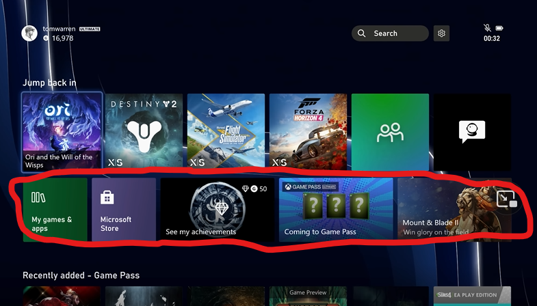
This is what was on the table proor. The only real difference is that they added pinned app support.
www.resetera.com

Xbox is experimenting with some UI layout changes with Insiders News

https://news.xbox.com/en-us/2022/09/08/xbox-insiders-help-shape-the-new-xbox-home-experience/

Seems feedback for getting this one changed more than it already is will probably fall on deaf ears in-terms of how it looks. The whole "Gamepass right under" choice must be non-negotiable.
 

Lego

Member
Nov 14, 2017
2,100
Don't get why background around search and settings isn't transparent
 

Remark

Member
Oct 27, 2017
3,542
I don't know why MS is so afraid to make the buttons smaller on the Home screen to show more of the background.

What's the point of custom and dynamic backgrounds if you can barely fucking see them. The rest of it is fine though I don't care.
 
Oct 28, 2017
303
Something just changed for me today - there's a search bar and settings button on the home page now.

I'm not even on any insider stuff and the system says it was last updated on 20/10. I don't like the search bar.
 

Wonky Mump

Member
Oct 30, 2017
3,308
The concept shown in that video is exactly what they should be doing for the dashboard/home screen.

Honestly don't see why it's so difficult tbh.
 

pg2g

Member
Dec 18, 2018
4,794
I'm fine with it based on my normal dashboard usage. It'd probably be annoying if you didn't have Game Pass though.
 

Helix

Mayor of Clown Town
Member
Jun 8, 2019
23,751
How hard is it to make that smaller? half the clutter can be reduced if they just make that highlighted area smaller or even remove it

ui.png
 

gothi

Prophet of Truth
Member
Jun 23, 2020
4,433
What gets me is they've removed the 1 giant tile and instead of using that space to show more of your recent games/apps they actually show 1 less than the current dash!
In that build it's gone from 7 to 6, that's a terrible use of the space.
 

logash

Member
Oct 27, 2017
4,723
Not a fan of the big icons and the Netflix style content suggestions. Even as a gamepass subscriber I like going into gamepass and discovering something. Just because the service is like Netflix doesn't mean it needs to have the Netflix UI.
 

Judau

Member
Oct 28, 2017
4,760
Something just changed for me today - there's a search bar and settings button on the home page now.

I'm not even on any insider stuff and the system says it was last updated on 20/10. I don't like the search bar.

I noticed it yesterday, too. I feel like it was part of last week's update, but that they were "activated" yesterday, or at least I didn't notice them until yesterday.
 

miguelfcp

Member
May 6, 2022
636
Portugal
It is almost the same.

Still bad. I think UI should be more clean, faster and easy access to what you want.

I still think that XMB from PS3 is the best interface ever on a console.
 
Nov 3, 2017
842
How hard is it to make that smaller? half the clutter can be reduced if they just make that highlighted area smaller or even remove it

ui.png

Considering the trajectory of the 360 dashboard and store and sales pages upto now, you're probably gonna see it get worse than improved. At some point one should consider the possibility that their UI/UX team know their shit and that these awful decisions, reeking of marketing and sales division, are being made by the same heads as before.
 

Lampa

Member
Feb 13, 2018
3,573
How hard is it to make that smaller? half the clutter can be reduced if they just make that highlighted area smaller or even remove it

ui.png
Yeah, these tiles being almost the same size as games make this a bit of a mess for me. I want my GAME console to be for games, not ads, or whatever.
 

Calm Killer

Member
Oct 25, 2017
824
It is just all wrong. We have dynamic backgrounds, but for what? We can't see them. Make everything smaller. Let us see the background. Pretty much every single fan made mock up is better.
 
Oct 28, 2017
1,946
Can we get dedicated store pages for each era of Xbox? I can't tell you how many times I'll run across a 360 game on sale and I'm like…wow I didn't even know that was BC and available to purchase.
 
Oct 27, 2017
1,005
While this is all subjective, I think Sony's and Nintendo's approach of just showing you a row of games without any (or much at all) bullshit is the best for gaming consoles.
The 'simple row' is fine until you have 200+ games. With Game Pass Xbox has just to many games to fit in a row.

Steam has the same problem for me (nearing 2000+ titles), that has to change as well imo. The Netflix method like used here seems must more useful.
 

Lampa

Member
Feb 13, 2018
3,573
The 'simple row' is fine until you have 200+ games. With Game Pass Xbox has just to many games to fit in a row.

Steam has the same problem for me (nearing 2000+ titles), that has to change as well imo. The Netflix method like used here seems must more useful.
Fair enough, folders are still sorely missed on PS5. The slightly redesigned My Games & Apps section of Xbox that went live recently is better to navigate and filter than PS5's game list.
 

Wonky Mump

Member
Oct 30, 2017
3,308
Can we get dedicated store pages for each era of Xbox? I can't tell you how many times I'll run across a 360 game on sale and I'm like…wow I didn't even know that was BC and available to purchase.

There's a section on the current store for Backwards Compatable games - problem is I don't think it's fully up to date showing all the titles and quite a few aren't available in the store due to being delisted or only purchasable on the old Xbox 360 Marketplace and it doesn't tell you that.
 

Deleted member 22750

Oct 28, 2017
13,267
Push everything down a little so I can see my sweet fallout wallpaper
 

DixieDean82

Banned
Oct 27, 2017
11,837
Yeah, this looks like a major step back. Let's hope they return the option to customize. Why on earth would they take that away? After Pins, this looks just like a load of random crap thrown together.
 

southwest

Member
Sep 15, 2022
1,644
The UI is the main reason I don't use my Xbox more than I do, this doesn't look to be a huge improvement on that.
 

crazillo

Member
Apr 5, 2018
8,179
It's weird, I love the "My Games & App" section since the update, I also really like the Guide button and I think the groups are fantastic (I use them for backlog, Game Pass games, all-time favorites, multiplayer etc.). But yeah, that initial homescreen row just needs to be half as big at most. I have that really nice background unlocked for a full Gamerscore completion of Elden Ring and can hardly see it.
 

AfterTheFall

Member
Oct 27, 2017
1,608
I like the New Additions to Games Pass section being on home that's handy for those not up to date with all the new content, but other than that im not seeing a big improvement around what we've had for ages.
 

Z-Brownie

Member
Nov 6, 2017
3,907
The actual UI is not bad, and neither the new one looks bad. I had both new consoles and i don't get the hate for the xbox ui honestly.
 

Ravelle

Member
Oct 31, 2017
17,767
While this is all subjective, I think Sony's and Nintendo's approach of just showing you a row of games without any (or much at all) bullshit is the best for gaming consoles.

The ideal dashboard is just a grid with game tiles in my opinion. with the option to have the console boot to most recent games played or the complete grid.
The fact that the Switch still doesn't have that is a bummer, let me boot to my big grid of games and put the most recent played games in the top left corner or something.
 

SilverX

Member
Jan 21, 2018
13,000
Got the insider update and it looks like a mess of tiles, both square and rectangular, as I scroll down on the UI. No idea why it was rolled out
 

TaleBknB

Alt-Account
Banned
May 19, 2022
331
They (and Sony) should give as many customise options as possible to people, because no matter what they do, they won't please everyone.

Do what's happening on Android and iOS
 

Deleted member 23475

User-requested account closure
Banned
Oct 28, 2017
662
I would like that they removed the 2nd line section and put "my games and apps" tile with the games line on the left instead

I mean, they are various fans suggestions online that look so much cleaner and better while keeping their language design, I assume at this point that this is a UI limit either by Microsoft policy (promote ads, gamepass tabs etc.) or technical limitation.

FcR43ibWAAA9kN9

xboxs-new-dashboard-is-getting-mixed-feedback-so-fans-are-creating-their-own.large.jpg

FcJf_qqXkAAvUpl
 
OP
OP
Jawmuncher

Jawmuncher

Crisis Dino
Moderator
Oct 25, 2017
38,397
Ibis Island
The actual UI is not bad, and neither the new one looks bad. I had both new consoles and i don't get the hate for the xbox ui honestly.
For me, it's that the screen real estate is reducing for the tiles. Might as well just have nothing but titles, ads, and banners on the Home Screen at this point. As something like Netflix is obviously what they're trying to copy.
 

Jiraiya

Member
Oct 27, 2017
10,279
Idk…other than not seeing the background. It looks like a ui designed to get you into your games or find another se quickly as possible. And I've never had a problem with my internet connected games consoles advertising games in dash. I think it would be more weird if they weren't trying to get me into more games.
 

starblue

Member
Oct 28, 2017
1,741
What's the point of backgrounds if they are 80% covered ? This is the only thing I don't like from Xbox, the UI.
 

Subaru

Member
Oct 26, 2017
335
São Paulo, Brazil
This is abysmal, why the icons are so big?
I think the current UI is somewhat functional, but it's ugly and cluttered. I love those concepts where the icons are smaller and at the bottom of the screen.
 

dodmaster

Member
Apr 27, 2019
2,548
I don't understand why they have a tile for the store, when the entire fucking dashboard is the store. What a pile of shit. Fuck this garbage.
 
Oct 27, 2017
20,757
Why can't they find a UI and stick with it? This is my biggest gripe with Xbox platforms since like 2013. UI is awful and changes in such weird ways. Love the system but wish they'd discover something and largely stick with it
 

Detective

Member
Oct 27, 2017
3,852
dm_HOYDDchSM3wC5thmLdMC0B-yUtmMSmkWp8ZV1XsE.jpg
Is it so hard to make something like this ?
Who the fucks design these dashboards at Xbox ?

We want the background to be as visible as possible damn it.