• Ever wanted an RSS feed of all your favorite gaming news sites? Go check out our new Gaming Headlines feed! Read more about it here.

Peru

Member
Oct 26, 2017
6,126
The 2019 World Cup is one week away!

"for the first time since Nike began working with the WWC tournament in 1995, each one of them was made specifically for the women's teams, not as derivations or extensions of kits made for men. Three days before, to coincide with International Women's Day, Adidas released its new designs for four WWC teams"

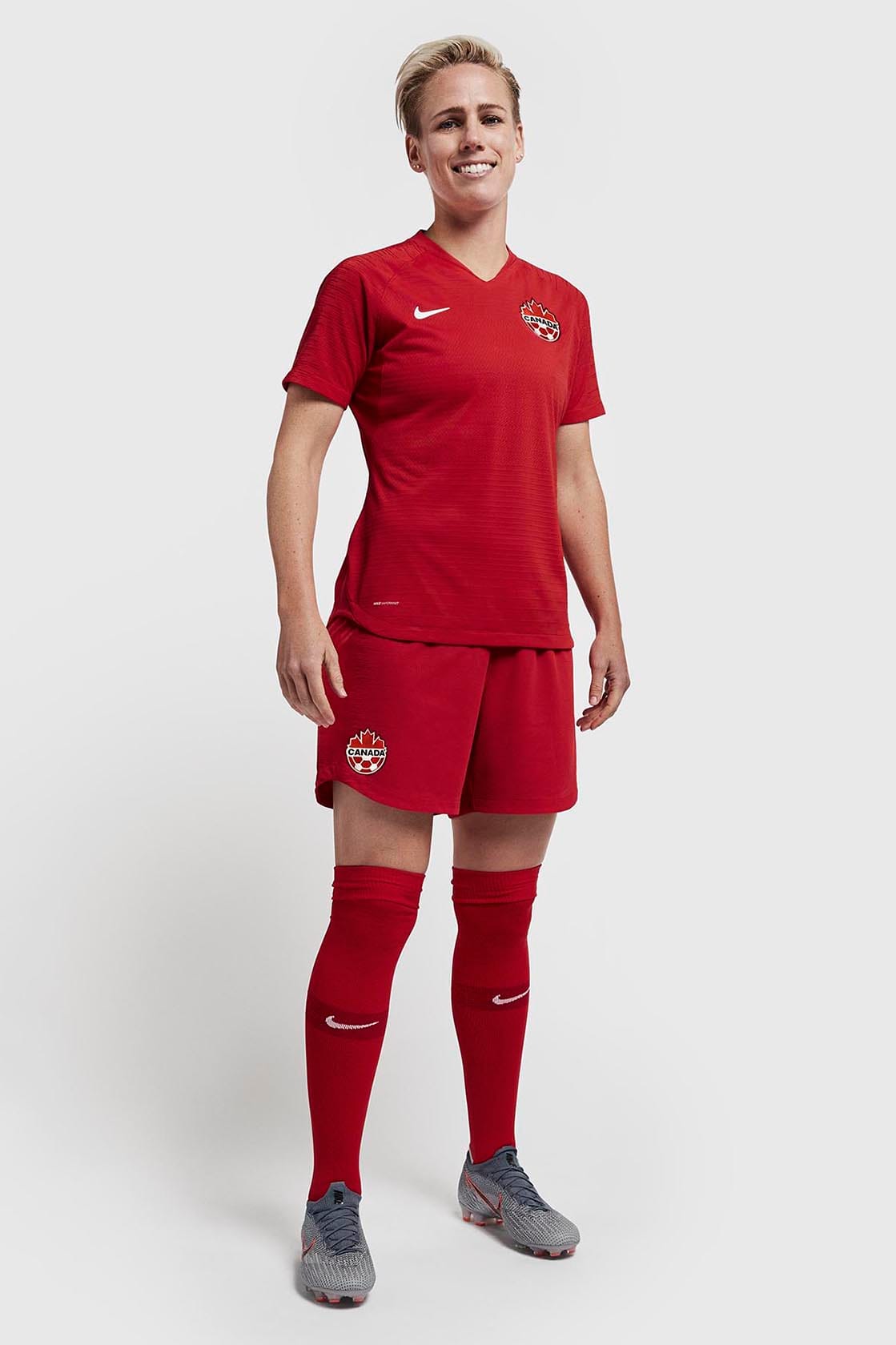
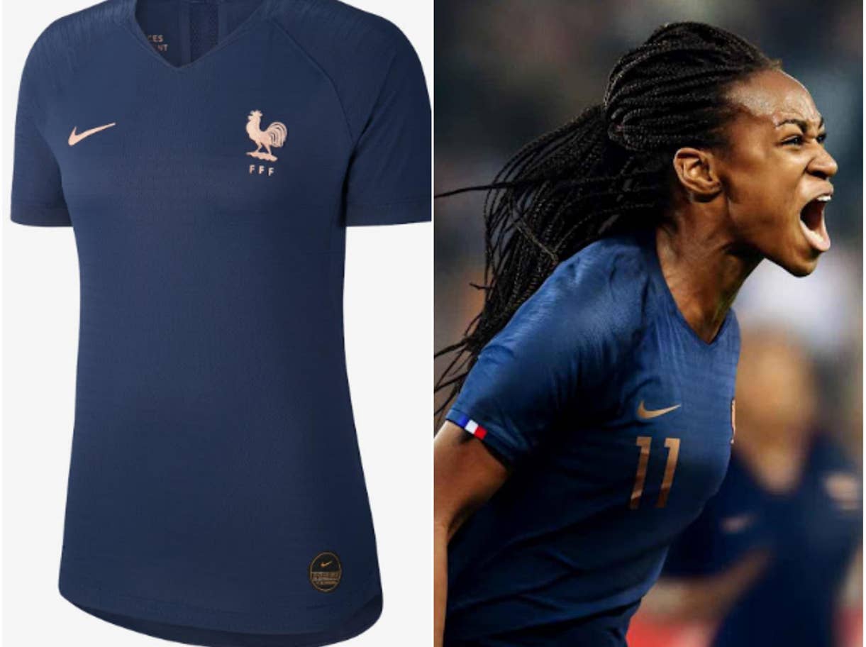
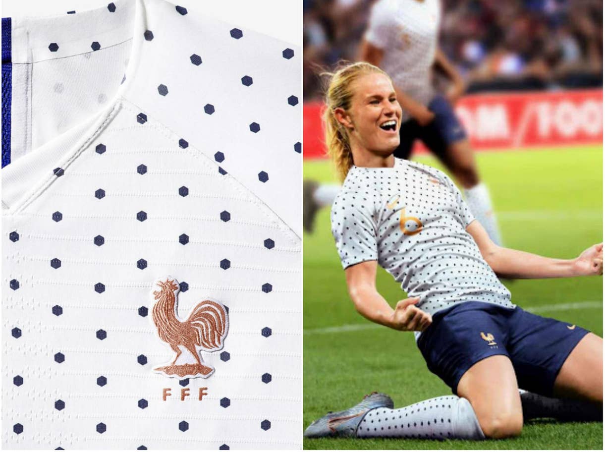
The simple boldness of the french home shirt matched with polka dots away, and the deep red of the England away kit stand out to me. I need that French away shirt.

Check em all out here

1-france-home.jpg

2-france-away.jpg


england-national-team-kit-2019-laydown-1_native_1600.jpg
 
Oct 29, 2017
4,054
Sorry rest of the world but the correct answer is the England Away kit, it's one of the most beautiful kits I've seen.

Got it the day it came out so ready for the world cup.

May grab a few of the others if they get cheap after the WWC.
 

RocknRola

Member
Oct 25, 2017
12,195
Portugal
So... while that's cool (and somewhat surprising that's it's only now happening tbh) why exactly do they need their own bespoke graphical design that's different from the men?

Like, I get having different shirt designs/shapes (the way they're cut) for the simple fact that they definitely should adjust to female bodies instead of just being smaller sizes of the men's version, so that makes 100% sense to me. Actual different graphical designs just seems...pointless?

I guess it means more marketing money in the long run, so there is that.
 
OP
OP
Peru

Peru

Member
Oct 26, 2017
6,126
So... while that's cool (and somewhat surprising that's it's only now happening tbh) why exactly do they need their own bespoke graphical design that's different from the men?

Like, I get having different shirt designs/shapes (the way they're cut) for the simple fact that they definitely should adjust to female bodies instead of just being smaller sizes of the men's version, so that makes 100% sense to me. Actual different graphical designs just seems...pointless?

I guess it means more marketing money in the long run, so there is that.

Well sure, but for so long the women's shirts have just 'copied' the design of design that was originally applied to the men's kits. So it's a nice palate cleanser to have true native designs of their own. Also Nike hired some pretty good designers to do the job.
 

InspectaDekka

Banned
Jan 4, 2019
1,820
Those are some bland designs.

Wish we got more crazy shit like the 2018 Nigerian World Cup shirt by Nike. I love that shirt so much.
 

Deleted member 27246

User requested account closure
Banned
Oct 30, 2017
3,066
pzxyEkB.jpg


Yup, digging it.
I still love the fact that they have a lioness in the federation logo (as opposed to the lion in the logo of the men)
 

Uzzy

Gabe’s little helper
Member
Oct 25, 2017
27,093
Hull, UK
The England Away Kit looks fantastic, gorgeous red and the detailing is to die for. Might have to buy it.
 

nomster

Member
Oct 27, 2017
763
So... while that's cool (and somewhat surprising that's it's only now happening tbh) why exactly do they need their own bespoke graphical design that's different from the men?

Like, I get having different shirt designs/shapes (the way they're cut) for the simple fact that they definitely should adjust to female bodies instead of just being smaller sizes of the men's version, so that makes 100% sense to me. Actual different graphical designs just seems...pointless?

I guess it means more marketing money in the long run, so there is that.
The men's designs change every year, or at least every World Cup, too. It's not like it's wasted effort.
 

RocknRola

Member
Oct 25, 2017
12,195
Portugal
The men's designs change every year, or at least every World Cup, too. It's not like it's wasted effort.
They change every 2 years, for each Cup the National teams play (Euro, Gold, World, African, etc Cup).

It's not so much wasted effort, both sides end up making more money out of this, but as fan it seems kinda pointless to really have 2 different graphical designs going on at the same time for the senior teams.

Again, the shirts themselves should have been designed around the female body ages ago. With that I have zero issues.
 

wrowa

Member
Oct 25, 2017
4,372
So... while that's cool (and somewhat surprising that's it's only now happening tbh) why exactly do they need their own bespoke graphical design that's different from the men?

Like, I get having different shirt designs/shapes (the way they're cut) for the simple fact that they definitely should adjust to female bodies instead of just being smaller sizes of the men's version, so that makes 100% sense to me. Actual different graphical designs just seems...pointless?

I guess it means more marketing money in the long run, so there is that.
I'm sure you prefer having your own clothes too over wearing the old clothes of your bigger brother. Figuratively speaking, women's teams usually only get handed down the designs their more popular male counterparts were wearing a year before. Unique designs just show a certain element of appreciation that wearing slightly modified "male" designs lacks.
 

CaptainK

Member
Oct 29, 2017
1,887
Canada
Canada has the most boring designs of them all :(

Still it's neat to see new designs for the ladies. More options for the fans, and adds a distinct look to the WWC.
 

JealousKenny

Banned
Jul 17, 2018
1,231
I thought you said they weren't derivations of the men's uniforms, the women's Nigeria jersey looks pretty close to the men's.

And what is the difference between a kit and a strip? I'm not familiar with the strip term. Does that mean the jersey portion?
 

RocknRola

Member
Oct 25, 2017
12,195
Portugal
I'm sure you prefer having your own clothes too over wearing the old clothes of your bigger brother. Figuratively speaking, women's teams usually only get handed down the designs their more popular male counterparts were wearing a year before. Unique designs just show a certain element of appreciation that wearing slightly modified "male" designs lacks.
I suppose. Ultimately I'd rather see them wear the same design (without year long delays), with cuts adapted to each of their needs.

Not against this happening though. Hell I thought it already happened, even. Kinda shocked it took soo long to even get to this stage.
 

Darkmaigle

Member
Oct 25, 2017
10,463
I wish Korea had gone with a slightly more stylized Tiger for their emblem but still these are dam fine kits. Will cop
 

Peleo

Member
Nov 2, 2017
2,656
The white french with the dots is gorgeous, really elegant.

Overall really liked the designs. Glad we are way past the 90s era of oversized shirts with pyjama patterns.
 

Parch

Member
Nov 6, 2017
7,980
Canada has the most boring designs of them all :(
Yeah, it could be better. Even if they want a solid color they can add a more distinctive pattern to it. That doesn't look like a design that is going to sell well.
Overall there are some really nice jerseys there. Fans can not only show support but look good doing it.