This was back in the mid-2000s, when the Marketing department at NoA began trying out new logo designs for the company to be less childish such as changing the font to graffiti. Nothing came of these designs thankfully.
-
Ever wanted an RSS feed of all your favorite gaming news sites? Go check out our new Gaming Headlines feed! Read more about it here.
-
We have made minor adjustments to how the search bar works on ResetEra. You can read about the changes here.
Nintendo almost changed its logo, Reggie reveals.
- Thread starter laziboi
- Start date
You are using an out of date browser. It may not display this or other websites correctly.
You should upgrade or use an alternative browser.
You should upgrade or use an alternative browser.
I don't think its even close to as iconic as the Playstation logo so I get why they thought about changing it.
The too kiddy thing I don't get.
When I started learning graphic design, more than a few of my textbooks put the Nintendo logo next to things like the Nike and Coca Cola logos as examples of successful logo design. The PS logo did not show up.
I'm sorry what?I don't think its even close to as iconic as the Playstation logo so I get why they thought about changing it.
This also reminds me of the time when the Nintendo DS had the working title of "City Boy" for NA prior to launch. It was yet another attempt to seem "cool" and "grown up" by making the Game Boy brand more adult. But eventually, "Nintendo DS" became the official name.
More like domestic appliance lolthe logo is iconic but it also looks like something youd see on some fisher price toy tbh
When I started learning graphic design, more than a few of my textbooks put the Nintendo logo next to things like the Nike and Coca Cola logos as examples of successful logo design. The PS logo did not show up.
The Nintendo logo is sleek, simple yet memorable, and easy for children to draw when they're drawing their fave Nintendo characters. The PS logo isn't all that memorable, and certainly not as easy to draw.
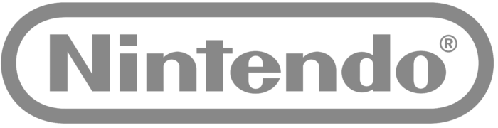
I wonder if this has anything to do with how the logo changed from red to gray partway through the Wii/DS era.
I wonder if this has anything to do with how the logo changed from red to gray partway through the Wii/DS era.
Reggie did mention that they cleaned up how the logo was presented during this time, so that's probably what he meant by that.
I know this is really not the point but their logo isn't oval shaped, OP, it's stadium shaped.
Last edited:
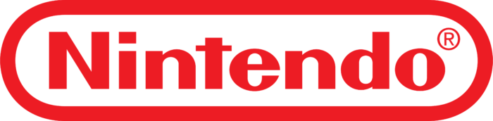
The current white on red Nintendo logo right is is probably the best.
I also liked the classic Red on white logo from the NES/SNES era
The grey on white Nintendo logo from the Wii/DS era just felt different, and I think that was the point. Nintendo was more of a lifestyle brand at the time and not a gaming company.
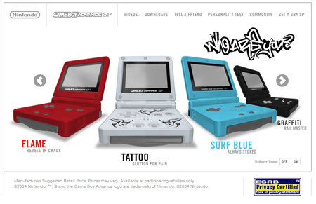
Strangely the Nintendo logo was hard to find during the GameCube/GBA era, likely precisely because marketing wanted to redesign it. The GameCube and GameBoyAdvance logos were always the most prominent in that era's marketing.
I also liked the classic Red on white logo from the NES/SNES era
The grey on white Nintendo logo from the Wii/DS era just felt different, and I think that was the point. Nintendo was more of a lifestyle brand at the time and not a gaming company.
Strangely the Nintendo logo was hard to find during the GameCube/GBA era, likely precisely because marketing wanted to redesign it. The GameCube and GameBoyAdvance logos were always the most prominent in that era's marketing.
the letterforms for the earliest predecessor of the current logo were designed in 1967. in 1968, they decided to go enclose it within a shape. in 1970, that shape would be solidified as an oval. in 1977, the oval was redesigned to the 'racetrack' design, and then it was adjusted in 1983 to be a bit tighter.
and from there it's been only slightly changed ever since.
nintendo of america wanted to throw out about 16 years of graphic design improvement that started from before the company was even making arcade games because they thought the brand was too kiddy. and they thought what... they could nail it down in a year or two?
Wtf @ the 1965-1970 logo. The Hell is that?
And the 1964-1965 logo looks like something you'd see on a car.

God the SP was a work of art.Yeah, probably wouldn't have been far off from that graffitied "who are you?" logo from the GC/GBA days.

The logo is just not really dynamic. The font dosen't work outside their logo. This is propably why they use different fonts and design in the Nintendo Direct or for the consoles with the Name Nintendo in it. Even the new Super Nintendo World uses the more iconic Mario font.
But I think they don't need a "better" logo. The Nintendo Brand lives trough their many products which have already good designed brands.
But I think they don't need a "better" logo. The Nintendo Brand lives trough their many products which have already good designed brands.
I really like the logo so I'm glad they kept it. And for what it's worth, Nintendo of today feels less kiddy simply because they have accepted a wide range of different games for different audiences on their current platform, it's an issue that solves itself within a generation.
That's just a silly NoA thing. Mario would never have a tattoo.I'm still pissed Mario didn't have this tattoo while shirtless in Odyssey. Where's the continuity, Nintendo?!
Yeah, probably wouldn't have been far off from that graffitied "who are you?" logo from the GC/GBA days.
"Glutton for Pain" lmao
God not me. Red pops and gray fades into the background.But they did change their logo.
I like that better than what they have now.
If you mean NoA's marketing, sure. Nintendo? Quite the opposite. From the GC itself to games like Wind Waker or Sunshine, they absolutely didn't try "anything and everything" to create that image.It all stems from Nintendo's identity crisis back in the GameCube days. Where they tried anything and everything to seem "cool", "Hip", and "Edgy" to keep up with Sony and Microsoft, but most of these attempts ended up as pathetic.
What makes the Nintendo logo so perfect is how it can be dressed up or dressed down, according to the context of what surrounds it.
It's perfect.
It's perfect.
If you mean NoA's marketing, sure. Nintendo? Quite the opposite. From the GC itself to games like Wind Waker or Sunshine, they absolutely didn't try "anything and everything" to create that image.
with noa running with a lot of freedom, i bet it's stuff like this that led to iwata shutting down their autonomy and us-influence in general once he had full control of the company. it's probably the right call, but one of the few things that hurts his legacy is just how far that went. although noa didn't help themselves much when it came to localizations (or the lack thereof) from 2004 through 2016.
It was Nintendo looking itself in the mirror.
That's because Nintendo never solved their "kiddy image". They just changed the entire market to include every demographic instead of being solely focused on teens & twenty year olds. Kinda hard to stigmatise a company for being for kids when the audience is everyoneI really like the logo so I'm glad they kept it. And for what it's worth, Nintendo of today feels less kiddy simply because they have accepted a wide range of different games for different audiences on their current platform, it's an issue that solves itself within a generation.
Yep, it's likely.with noa running with a lot of freedom, i bet it's stuff like this that led to iwata shutting down their autonomy and us-influence in general once he had full control of the company. it's probably the right call, but one of the few things that hurts his legacy is just how far that went. although noa didn't help themselves much when it came to localizations (or the lack thereof) from 2004 through 2016.
Nintendo is FUCKIN' PISSED
with noa running with a lot of freedom, i bet it's stuff like this that led to iwata shutting down their autonomy and us-influence in general once he had full control of the company. it's probably the right call, but one of the few things that hurts his legacy is just how far that went. although noa didn't help themselves much when it came to localizations (or the lack thereof) from 2004 through 2016.
The whole "NoA had no autonomy" thing was always a load of bullshit.
When I started learning graphic design, more than a few of my textbooks put the Nintendo logo next to things like the Nike and Coca Cola logos as examples of successful logo design. The PS logo did not show up.

I've only now realized that it is supposed to be "PS." I thought it was just a bunch of unintelligible shapes lol
In reality they just unified the color scheme worldwide. NoA/NoE had almost always used the classic red, while in Japan they used black and white colors:But they did change their logo.
I like that better than what they have now.

Are those actual prototypes or just rndom?
It's a remnant of fifth gen console branding when all console manufacturers wanted to put emphasis on their systems allowing 3D graphics for the first time:
I've only now realized that it is supposed to be "PS." I thought it was just a bunch of unintelligible shapes lol


Smart guy Reggie.
Good guy Reggie.
Only endearing himself even more to fans.
I will say, it probably would have been.a situation where they 'switched' back tot he original logo after the new one didn't help and every missed the old one ala New Coke vs Coca Cola Classic.
Good guy Reggie.
Only endearing himself even more to fans.
I will say, it probably would have been.a situation where they 'switched' back tot he original logo after the new one didn't help and every missed the old one ala New Coke vs Coca Cola Classic.
I never paid attention to how ugly the letterforms and the gradient treatment in them was for the Sega Saturn logo.It's a remnant of fifth gen console branding when all console manufacturers wanted to put emphasis on their systems allowing 3D graphics for the first time:

Nintendo has the most iconic logo in the world. If it changed suddenly, I would be devastated. Good job, Reggie.
McDonald's? Nike?
random
I always wondered why they stopped showing the logo at the start of first party games? Probably because the splash screen for the system boot up gets that job done, or maybe to make their games seem sleek and efficient or something.
Splatoon displayed it very prominently with a "Nintendo presents", which is kind of uncommon in Nintendo games, yeah. I feel like Breath of the Wild may have had something similar? Or maybe it was just the game logo and text.