-
Ever wanted an RSS feed of all your favorite gaming news sites? Go check out our new Gaming Headlines feed! Read more about it here.
ResetEra Tech Thread (Report Bugs Here)
- Thread starter Cerium
- Start date
You are using an out of date browser. It may not display this or other websites correctly.
You should upgrade or use an alternative browser.
You should upgrade or use an alternative browser.
I'm hitting a couple of issues. 1) my profile picture in the quickjump bar is smooshed for some reason 2) the last letter of my username is cut off from the line and just has an h underneath it. I tried to zoom out thinking it was my setting but nope, still cutting off the last letter.
Can the hot key navigation be disabled? Seriously annoying when you navigate through your tabs using only the keyboard (CMD + number). Pages just refresh or I end up on a different page because of it.
It's not necessarily a bug, but as someone who exclusively posts from mobile, I was desperatly hoping to see a fix for the "new replies have been posted" notification (unless there's a way to turn it off that I don't know about?), because when writing in the text box, the popup pushes everything off screen, and forces (OMFG IT JUST DID IT) users to stop typing and scroll down and start again. And it's probably the worst thing in all of life.
But I do still love you guys, and appreciate all the work you do! Just...please. Please.
But I do still love you guys, and appreciate all the work you do! Just...please. Please.
Hyperlink previews are an absolute must for threads that would normally be full of media embeds. I love these.
For us mobile users I would love to see an option to always have the full edit bar as a default, instead of needing to press on the cog icon first.
Also a I don't know how you'd fix this, but let's say you want to select a string of text to make it Bold: most of the time the os text pop-ups (copy/paste/cut/select all/ etc.) hide the icon proper and it becomes VERY difficult to select what you want.
Hope to have explained myself decently.
Yep.
Also when you put an IMG/Media in a post it always puts it at the top of the post even if the text cursor is at the bottom or wherever you'd want to put the media.
Also a I don't know how you'd fix this, but let's say you want to select a string of text to make it Bold: most of the time the os text pop-ups (copy/paste/cut/select all/ etc.) hide the icon proper and it becomes VERY difficult to select what you want.
Hope to have explained myself decently.
It's not necessarily a bug, but as someone who exclusively posts from mobile, I was desperatly hoping to see a fix for the "new replies have been posted" notification (unless there's a way to turn it off that I don't know about?), because when writing in the text box, the popup pushes everything off screen, and forces (OMFG IT JUST DID IT) users to stop typing and scroll down and start again. And it's probably the worst thing in all of life.
But I do still love you guys, and appreciate all the work you do! Just...please. Please.
Yep.
Also when you put an IMG/Media in a post it always puts it at the top of the post even if the text cursor is at the bottom or wherever you'd want to put the media.

This is the standout to me, and it's not even a new feature. How/why did I not know this until now?
does anyone else have this problem where the page like... "twitches". Ill be read a long thread and the page will just like move up a line and back down randomly. Its really annoying. Ive seen it on safari for mac and on safari for iphone. havent tested another browser.
I think it has something to do with your ads loading in. for some reason they dont load like 50% of the time for me, and no i dont have ad blockers.
I think it has something to do with your ads loading in. for some reason they dont load like 50% of the time for me, and no i dont have ad blockers.
I really like the Hyperlink Preview feature. However, I kinda wish that the URL was posted alongside the Preview window.
1) I think it would allow for better and easier copying and pasting, e.g. if I highlight and copy someone's post to my clipboard, I want to see the URL.
2) You can more easily see undesirable elements in the URL like referral links.
3)It's better security-wise because you can see the domain. EDIT: Actually I didn't notice that the domain does show.
1) I think it would allow for better and easier copying and pasting, e.g. if I highlight and copy someone's post to my clipboard, I want to see the URL.
2) You can more easily see undesirable elements in the URL like referral links.
3)
Last edited:
Holy shit at the numerkey shortcuts blowing my mind! :D
Awesome everyone, thank you all so much for the hard work keep it up! <3
Awesome everyone, thank you all so much for the hard work keep it up! <3
I love the update so far, nice little UI changes, great job overall! :D I can see me using bookmarks quite a bit and I look forward to push notifications.
It would be great for the site to reintroduce thread previews. The simple act of hovering of a title to read the first few sentences and quickly gauge the direction the thread is headed in before I ever could mistakenly dive into it was incredibly useful to me and I've begun to think I'm the only that cares for it.
The Hyperlink update is pretty sweet. Great job all around.
I noticed that 1blockX on iOS hides the Share button for posts (I thought I whitelisted Era because of having Clear, but it reverted somehow). If folks on iOS aren't seeing the Share button, try loading Era without content blockers and it'll probably appear.
I noticed that 1blockX on iOS hides the Share button for posts (I thought I whitelisted Era because of having Clear, but it reverted somehow). If folks on iOS aren't seeing the Share button, try loading Era without content blockers and it'll probably appear.
Bookmarks returning is huge, no longer do I have to bookmark entire threads to find one post to reference. On mobile, but so far the update is really nice.
Great update and it's also nice to find out there's hotkey navigation on this site! Speaking of which, is there any chance we can get some hotkeys for moving a single page back/forward? Like, left/right arrows keys for instance?
oh hey now I can bookmark Finale Fireworker 's megaton posts so i can finally get around to reading them like five fucking years later
oh hey now I can bookmark Finale Fireworker 's megaton posts so i can finally get around to reading them like five fucking years later
Your back-handed compliments are the closest thing I've ever had to love and I need them so much.
It isn't even a backhanded compliment, I have a genuine internet forum backlog. I still haven't read that "go ly dow" thread.Your back-handed compliments are the closest thing I've ever had to love and I need them so much.
I believe that watched threads is for threads and generates an alert when there's a new post, whereas bookmarks is for posts and is just an index you can come back to. Haven't played around with bookmarks yet though.
+1. The site used Roboto 500 for bolded text before the update, which seemed perfect. Now it's 700 weight, which means you have to pick between normal text and super thick text that's actually a little bit hard to read at smaller sizes. Example image (yeah it's in light mode, your eyes are bleeding etc etc)

It's a pretty minor thing, for sure. I wouldn't lose sleep over it if it remained this way. But if you're taking suggestions...! (also a cursory glance at the CSS suggests it might not have been intentional, but hard to say.)
Oh, also: thanks a lot for everything y'all do! The improvements are great and you've been pretty quick to address the minor issues so far. Much appreciated!
Last edited:
What does bookmarks actually do? Add the favourite threads to the top?
It's for bookmarking posts that you particularly like so that you can easily find them again later. It's completely private; no one else sees what you've bookmarked. You can see your list of bookmarks in your account page (https://www.resetera.com/account/bookmarks).
Getting some bizarre issues with quoting.
Like I just got this alert...
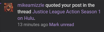
But I haven't posted in that thread at all.
Like I just got this alert...
But I haven't posted in that thread at all.
OP
OP
Looks like he accidentally quoted your post from a different thread, then edited it out.Getting some bizarre issues with quoting.
Like I just got this alert...
But I haven't posted in that thread at all.
Push Notifications now live!
OP
OP
Information
We're pleased to announce that Push Notifications are officially live and can be turned on in your Account Preferences!
Push notifications are now enabled for me. This is going particularly helpful during E3! Thanks!
Just saw it and instantly turned it off. No hard feelings, but I don't use that on any site.
Glad it's there for those who use it though and the "Never ask again" options is great for people like me.
Glad it's there for those who use it though and the "Never ask again" options is great for people like me.
InformationWe're pleased to announce that Push Notifications are officially live and can be turned on in your Account Preferences!
Sweet!
So, uh, someone reply to me. I want to see how this works.