Given the comments and discourse, a lot of the "harder than Souls/BB" comments seemed to stem from the fact that these were super-experienced Souls streamers/players not just acclimated to the pace and style of the new game. Muscle memory clashing with the new approaches required to succeed in combat
-
Ever wanted an RSS feed of all your favorite gaming news sites? Go check out our new Gaming Headlines feed! Read more about it here.
-
We have made minor adjustments to how the search bar works on ResetEra. You can read about the changes here.
Sekiro: Shadows Die Twice Previews Thread [See Staff Posts]
- Thread starter Masagiwa
- Start date
You are using an out of date browser. It may not display this or other websites correctly.
You should upgrade or use an alternative browser.
You should upgrade or use an alternative browser.
Pretty sure that's just IK being a bit wonky. Maybe mixed in with a contextual reaction to seeing allies get killed?Is that enemy on the right reacting to the kill or is it just perfectly timed step down that makes it look like he's flinching?

That should be the decompressed size after the game is installed and ready to play. This is for PC only. If it is exact same size as ds3 on pc I don't think it will vary much on consoles too.Is that after the file is decompressed or is that just because it's the PC version?
Pretty challenging and on par with their previous games. Soulsborne vets need to re-learn the control scheme and the way they approach combat. The game is tuned with a resurrection mechanic in mind so take that as you will. I found Nioh to be harder than any souls game, other's didn't.
I said this in another thread a little while ago. From a couple previews I watched of Souls players who got hands-on time with it, they said it might actually be harder. I'd take that with a grain of salt, though. They have yet to really sink their teeth in and get used to not playing it like a Souls game yet, I would think.
Thanks y'all. I'll probably wait to get it.That's a good point. I wonder if it's just the compressed game in it's entirety, or is it just a portion of it as a preload? Also Sekiro not having tons of weapons and armor sets as well as no multiplayer could also have drastically cut down on the file size as well.
Is that after the file is decompressed or is that just because it's the PC version?
From what everyone is saying, it's even harder!
I've been avoiding spoilers for the most part, but as release is nearing, I was just wondering. . . .
is there anything indicating that the game will have heavy supernatural/horror elements later on? I love fromsoft games and Sekiro's gameplay looks fun, but being strictly grounded in historical realism seems like a bit of a turnoff to me
is there anything indicating that the game will have heavy supernatural/horror elements later on? I love fromsoft games and Sekiro's gameplay looks fun, but being strictly grounded in historical realism seems like a bit of a turnoff to me
I've been avoiding spoilers for the most part, but as release is nearing, I was just wondering. . . .
is there anything indicating that the game will have heavy supernatural/horror elements later on? I love fromsoft games and Sekiro's gameplay looks fun, but being strictly grounded in historical realism seems like a bit of a turnoff to me
yes
I've been avoiding spoilers for the most part, but as release is nearing, I was just wondering. . . .
is there anything indicating that the game will have heavy supernatural/horror elements later on? I love fromsoft games and Sekiro's gameplay looks fun, but being strictly grounded in historical realism seems like a bit of a turnoff to me
I don't think you'll be disappointed.
I've been avoiding spoilers for the most part, but as release is nearing, I was just wondering. . . .
is there anything indicating that the game will have heavy supernatural/horror elements later on? I love fromsoft games and Sekiro's gameplay looks fun, but being strictly grounded in historical realism seems like a bit of a turnoff to me
Tons of hints. As for the setting, it's inspired by history but it isn't trying to be realistic at all.
I honestly don't know but I get the feeling that as the game progresses, it's gonna get pretty dark (kinda like bloodborne)I've been avoiding spoilers for the most part, but as release is nearing, I was just wondering. . . .
is there anything indicating that the game will have heavy supernatural/horror elements later on? I love fromsoft games and Sekiro's gameplay looks fun, but being strictly grounded in historical realism seems like a bit of a turnoff to me
I'm probably wrong but i dont want to be
You missed my mention a couple of posts up :)? It was a live stream with Famitsu showing of the game where Kitao played, nothing new really. It ended with showing some merchandise, the Japanese physical copy and a Japanese guide for the game.
I check YouTube everyday for Sekiro content. Saw the stream video and immediately went to post it. My bad lol
So is the genre officially known as Soulsbournekiro now ? Can't wait to play this!
At this point, "Fromlike" would be simpler.
I think it will literally get dark:I honestly don't know but I get the feeling that as the game progresses, it's gonna get pretty dark (kinda like bloodborne)
I'm probably wrong but i dont want to be
Link
Lol yeah.
I thought "soulsborne" was just an era fetish. Surprised to see IGN honor that name.
Weridos say it, BB is a souls game.Lol yeah.
I thought "soulsborne" was just an era fetish. Surprised to see IGN honor that name.
I'm really disappointed with some of the UI decisions in the game and hope to god we are able to tamper with some of them in the settings.
These white circles highlighting interactible items and NPC's are atrocious. I think the grappling point circle tends to jump all over the place way too much as well. The enemy alert markers would have been nice to turn off for immersion (optional).

A huge gripe I have with things like this is similar to what REMake 2 just did. What will happen is that while yes, you can turn off the HUD, you'll probably be fucked because the game was designed around the crutch of that giant green blob every where for example.
In short, without the contextual markers, there'll be no way to tell which enemy can be grappled during certain animations, grapple points are way too hard to make out in the environment from far away and so on. There won't be a reliable alternate in place and it blows my mind that, much like the idiotic floaty icons in REMake 2, they couldn't come up with a less incredibly intrusive and cheap looking way to highlight objects of interest.
Fucking hell, I'd prefer to go back to the 'shiny geometry' days over having these totally disjointed, flat circles floating over random areas of the screen. On top of that, I'm willing to bet we won't be able to customize certain aspects but simply be given the From choice of on/off/dynamic (or whatever they call it).
Cannot wait for this game but the whole HUD thing is a real shame especially considering how holistic and elegant their aesthetics in general tend to be.
I like it too.
I wonder if a transparency option is feasible? Just so the grappling points are a little less conspicuous and distracting, at least in the environment. Those on enemies aren't as intrusive because they don't appear for very long.
It's too early to say whether the enemy alert markers are really necessary (I imagine it's situational, although they're included for a reason), but I wouldn't mind an option for those as well.
It's too early to say whether the enemy alert markers are really necessary (I imagine it's situational, although they're included for a reason), but I wouldn't mind an option for those as well.
That's wild! Can't believe that thing actually works haha
OP
OP
A huge gripe I have with things like this is similar to what REMake 2 just did. What will happen is that while yes, you can turn off the HUD, you'll probably be fucked because the game was designed around the crutch of that giant green blob every where for example.
In short, without the contextual markers, there'll be no way to tell which enemy can be grappled during certain animations, grapple points are way too hard to make out in the environment from far away and so on. There won't be a reliable alternate in place and it blows my mind that, much like the idiotic floaty icons in REMake 2, they couldn't come up with a less incredibly intrusive and cheap looking way to highlight objects of interest.
Fucking hell, I'd prefer to go back to the 'shiny geometry' days over having these totally disjointed, flat circles floating over random areas of the screen. On top of that, I'm willing to bet we won't be able to customize certain aspects but simply be given the From choice of on/off/dynamic (or whatever they call it).
Cannot wait for this game but the whole HUD thing is a real shame especially considering how holistic and elegant their aesthetics in general tend to be.
I hear ya. There are parts of the HUD I like but just give me options. Something like God of War was great.

Stuff like this in the image below drives me crazy. That is like straight up wall-hack. If I miss something in there, it should be all on me for not exploring it even if it's a key item.

I hear ya. There are parts of the HUD I like but just give me options. Something like God of War was great.
Stuff like this in the image below drives me crazy. That is like straight up wall-hack. If I miss something in there, it should be all on me for not exploring it even if it's a key item.
I'm 100% with you on that, especially considering it's a From game, one of the last holdouts of making you actually work for the rewards.
Funny enough, GoW had so many HUD options yet you couldn't disable the incessant, stupidly big "X" prompts every time you approached a clearly-marked wall with runes all over them indicating you'd be able to climb it anyway. But, obviously I agree with your point. I'd love to see a menu like that in Sekiro and who knows, maybe it's more common sense in this case seeing how Souls/Bloodborne had much more limited UI items to begin with.
OP
OP
I'm 100% with you on that, especially considering it's a From game, one of the last holdouts of making you actually work for the rewards.
Funny enough, GoW had so many HUD options yet you couldn't disable the incessant, stupidly big "X" prompts every time you approached a clearly-marked wall with runes all over them indicating you'd be able to climb it anyway. But, obviously I agree with your point. I'd love to see a menu like that in Sekiro and who knows, maybe it's more common sense in this case seeing how Souls/Bloodborne had much more limited UI items to begin with.
Oh yeah I remember that haha. I probably have to dig trough more preview footage to see if anyone actually accessed that part of the settings if it even was available in the preview build.
Activision consulted on the tutorials in the game, right? I wonder if that extended to certain UI elements.
OP
OP
Activision consulted on the tutorials in the game, right? I wonder if that extended to certain UI elements.
I honestly think they got suggestions/feedback and some of it has absolutely made it into the game, but that's just my opinion.
Activision consulted on the tutorials in the game, right? I wonder if that extended to certain UI elements.
Oh yeah, absolutely. They've been running a lot of playtesting on the game so I'm sure some of the UI is based on that.
Oh yeah, absolutely. They've been running a lot of playtesting on the game so I'm sure some of the UI is based on that.
That actually gives me more hope that there'll be options to toggles certain aspects on and off in turn.
I think the easiest option would've been to make grappling points a distinct color in the environment, or maybe a distinct item like small lanterns with a glow...something that sticks out by its very nature.
Stuff like this in the image below drives me crazy. That is like straight up wall-hack. If I miss something in there, it should be all on me for not exploring it even if it's a key item.
That's for the grappling hook...
Nah grapple points are solid circles. That icon is used for Sculptor's Idols and possibly some other things.

OP
OP
The grappling hook icons look like this, so it's either an item, npc or an idol but that doesn't matter. The whole point is I don't want the UI to tell me what's behind that wall.

The grappling hook icons look like this, so it's either an item, npc or an idol but that doesn't matter. The whole point is I don't want the UI to tell me what's behind that wall.
It looks like there's some blue light coming out of the gap under the roof of the building, so I'm guessing it's an Idol. Do you have the time this appears in the video?
the fuck? it took him 13 hours to beat the boss?He was stuck at final boss for 13 hours. He didn't say it took him 13 hours to beat the whole game
this game is gonna fuck me sideways
OP
OP
It looks like there's some blue light coming out of the gap under the roof of the building, so I'm guessing it's an Idol. Do you have the time this appears in the video?
Around 53:09 in this video.
https://www.youtube.com/watch?v=5feudBDTg2s&t=3192s
That's the worst one by far.There's solid circles for item pickups too if you're close enough. Pretty annoying.
the fuck? it took him 13 hours to beat the boss?
this game is gonna fuck me sideways
Sounds like my time with Hollow Knight. Some bosses took me quite a while. T'was grand. However, I dont have kids so I can see where this can be frustrating for people who do.
Yes... but. There are ways to affect the % of this proc, so it's a bit complicated as usual.
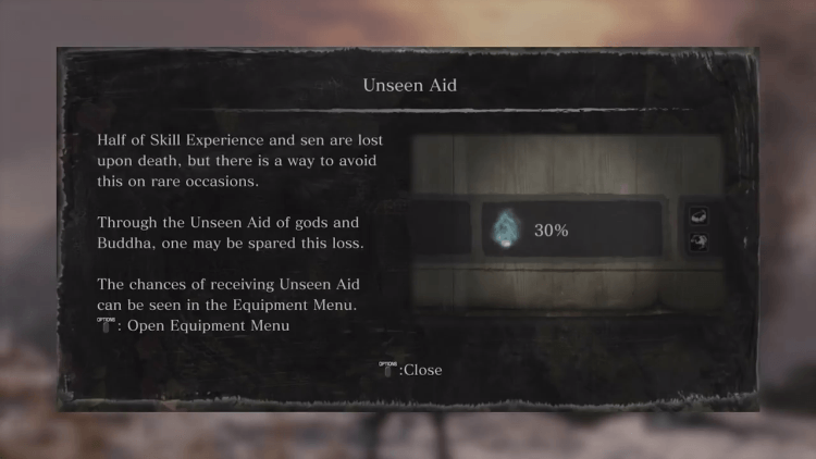
I don't know how I feel about Unseen Aid. I'll have to see it in action of course,but it's like they put it afterwards as a "sorry" for the death penalty
I have to admit I'm a bit concerned as well. Someone in other thread brought up the fact that Sekiro contains no alternative armor sets and pretty much no alternative weapons, which are usually the most detailed assets in the other games (since you get to look at them really closely and they also have to look nice for you to want to wear them) so that might account for some of it, considering even Bloodborne has a couple dozen sets and weapons. Also Sekiro is closer in file size to DS3 than BB, and I've always had the impression that DS3 is longer than BB.
I'd never pre-orderd a game from PSN before, and I don't know how the process works, and whether the 12.5GB accounts for the final ROM of the game once it's playable, or if it's a partial download so it can be preloaded and then the last 20-30% of the game is downloaded when it unlocks. Who knows.
Supposedly someone translated some of the Famitsu podcast linked in this thread, and it seemingly took one of the people in the podcast 13 hours to beat the final boss. But I wonder it that was misinterpreted and he meant to say that the whole game took him 13 hours to beat, which would be really disheartening. Unless someone in this thread understands Japanese and could confirm either way, we'll just have to wait and see.
Missing armor and weapon sets,as well as additional functionalities such as PvP and coop could certainly explain the difference in size. But in general,we can't judge a game's length by its file size,there are many factors that come into play. For example Bloodborne had the biggest size,but certainly was smaller than DS3 and didn't have that many weapons in comparison.
The real question is who or what is providing divine aid. Why are they helping you, and what kind of actions increase or decrease itI don't know how I feel about Unseen Aid. I'll have to see it in action of course,but it's like they put it afterwards as a "sorry" for the death penalty
From isn't going to include a mechanic like that as an afterthought. It's most definitely going to have narrative/lore implications
I mean if the game was 'only' 18 hours it would be fine by me. I don't need all games to be 100 hours.
That said, I'm sure is replayable to some capacity with the different endings and sidequests that you are sure to miss on the first time.
Also they mentioned already that the game length would be similar to BB. Don't freak out just with size files.
Although a 18 hour game isn't short per se,I would be dissapointed if Sekiro took less time to complete relative to the previous ones. For me all Souls games were almost exactly at the 30 hour mark with extensive exploration(with the exception of DS2 which was the lengthiest of them all) . So I will be dissapointed if I finish Sekiro in less than 30 hours
I may not have the skill to beat this game, but Imma try like hell.
Noone had the skill to beat a Souls game before they beat it. You gain the skill as you push through the game,you can't have it beforehand
You can't make a character at all. It's a set protagonist with a name, voice, background, and story
You can't make any character.
I have never in my life played a Dark Souls game, nor have I played Bloodborne. I come from a different background of loving games like the Tenchu series growing up. This game looks very reminiscent of that. I already have it pre-ordered from Steam. All of you Soulsborne fans make it clear that I'm probably going to get my ass handed to me, but I think I'll have a lot of fun just because of the nostalgia factor alone!
Dark Souls 3 had a fan made fix less then a month in and its an online game
So im guessing even if they don't implement it it'll be done by the player base.
The left shot is the grapple icon when you're not close to activating it, and the right is when you're actually on it and you can press the button to grapple.The grappling hook icons look like this, so it's either an item, npc or an idol but that doesn't matter. The whole point is I don't want the UI to tell me what's behind that wall.
It's not telling you what's behind the wall lol..
OP
OP
The left shot is the grapple icon when you're not close to activating it, and the right is when you're actually on it and you can press the button to grapple.
It's not telling you what's behind the wall lol..
Yeah I know I made the image. You might wanna take a closer look at the bottom image I posted in #1,971.