• Ever wanted an RSS feed of all your favorite gaming news sites? Go check out our new Gaming Headlines feed! Read more about it here.
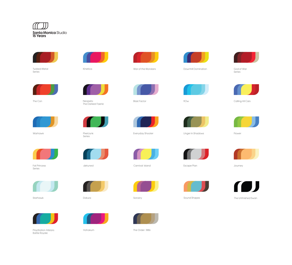
famikon

Banned
Oct 25, 2017
4,604
ベラルーシ
maybe its just me, but i hate it when letters are all drastically different sizes, even heavily stylized letters

was never a big fan
Yep. Plus I like idea behind new Santa Monica logo (depends on game, logo is changing color):

SMS.gif


CKn050cXAAAFjVU.png


And I think it's the same for Insomniac.

regular logo:
Insomniac-Games-Logo.jpg


vs. logo that was used in Spider-Man:
CEUkvDq.png
 

Ra

Rap Genius
Moderator
Oct 27, 2017
12,201
Dark Space
It's an homage/call back to a Sony involved logo which never got official use, and a very tasteful one at that. There's nothing more to it.

Calling it a coincidence is just willful ignorance.
 

eraFROMAN

One Winged Slayer
Member
Mar 12, 2019
2,874
You're...crazy if you think it's just a coincidence. But this is really cool, has the feel of a 30 year old logo, which is in style right now anyway, and calls back to Sony's video game past. I like it a lot, and it'll look nice on boxes and splash screens.