• Ever wanted an RSS feed of all your favorite gaming news sites? Go check out our new Gaming Headlines feed! Read more about it here.
  • We have made minor adjustments to how the search bar works on ResetEra. You can read about the changes here.

Deleted member 10737

User requested account closure
Banned
Oct 27, 2017
49,774
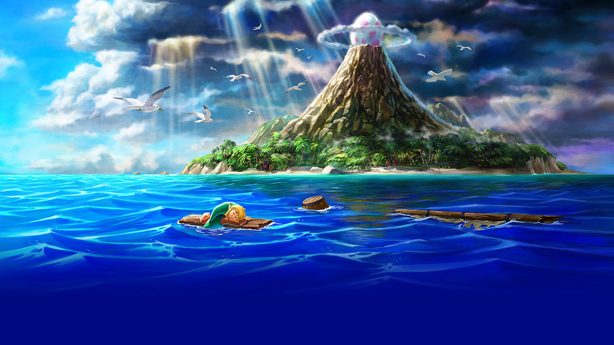
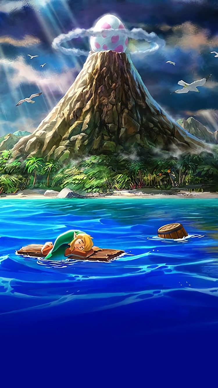
here's a phone background if anyone wants one
68e283e8-051d-4add-8tmj6h.jpeg


Also I guess the palm trees fit the Japanese subtitle better ("Dreaming Island"). On the English logo there's no obvious connection between the palm trees and the "Link's Awakening" subtitle unless you're already familiar with the game's story.
i wish they went with something else as the logo's motif, palm trees aren't that exciting. botw having the flower from the game in the logo was much better.
 

jts

Banned
Oct 26, 2017
3,018
Not a fan of this green, hopefully the main version of the logo is the white one from the trailer.

Made a tiny edit
lalogo.png
The green is probably the official color against plain/white backgrounds, just like for BotW it was golden, whereas overlayed on top of an illustration it should/will be white. And the cover will almost surely be an illustration as that's the current trend with Zelda. As well as the title screen.
 

RedSwirl

Member
Oct 25, 2017
10,060
If Nintendo was doing an RE2-level reimagining I guess it'd be interesting if it looked like this:


But instead what it seems like we're getting is a remake on the level of Crash N. Sane or the Spyro trilogy. I think this looks kinda new because we haven't had this kind of remake done for a top-down 2D game yet. Not on hardware like this anyway. It's sort of analogous to the DS remakes of the Dragon Quest games. Imagine if like, Dragon Quest V looked like this.
 

AppleKid

Member
Feb 21, 2018
2,531
Playing through the DX version and I forgot how much I love the dungeon tracks (with the exception of Angler's Tunnel of course). Bottle Grotto and Face Shrine are the two I'm most curious to hear this remake's renditions of
 

Gold Arsene

Banned
Oct 27, 2017
30,757
This is an unfair example considering that Earthbound was specifically developed with that kind of art style in mind. It's not as if Earthbound presented a realistic artstyle through artworks and photos, and then suddenly presented the game with a cartoony artstyle. Earthbound was consistent with its presentation.

Whereas with Link's Awakening, there's a lack of consistency between the artwork that we've seen prior to and after the reveal of the remake, and what the remake is presenting. For whatever reason, the artwork suggested that we'd see something akin to a Link Between Worlds quality, and yet, the remake opted for a 3D interpretation of the Game Boy graphics.
maxresdefault.jpg
 
Oct 26, 2017
8,734

So your counterargument is literally a two second photo with no visible characters and a very jumbled cut-paste job of low-res locales before the intro screen? Largely ignoring the intro screen itself (which shows the cartoony world as well as the characters), as well as multiple pieces of artwork that shared the same artstyle as the game itself? Again, Earthbound has been very consistent with it's artstyle, and it's pretty disingenuous to say that that one singular photo is the same as the contrast between the game and artstyle in Link's Awakening.
 

Spinluck

▲ Legend ▲
Avenger
Oct 26, 2017
28,473
Chicago
Is this a 1:1 remake? Doesn't look like it in some parts. I'm in either way, top down Zelda is underrated imo.
 
Oct 25, 2017
17,537
I have a coworker who hates the artstyle because "it looks like it's for little kids. Why couldn't they make it look like Breath of the Wild?"
 

Gold Arsene

Banned
Oct 27, 2017
30,757
So your counterargument is literally a two second photo with no visible characters and a very jumbled cut-paste job of low-res locales before the intro screen? Largely ignoring the intro screen itself (which shows the cartoony world as well as the characters), as well as multiple pieces of artwork that shared the same artstyle as the game itself? Again, Earthbound has been very consistent with it's artstyle, and it's pretty disingenuous to say that that one singular photo is the same as the contrast between the game and artstyle in Link's Awakening.
It was a joke about the Earthbound example relax.

Frankly I have no idea what people are complaining about I freaking love the art direction. It's to damn cute, that matches with how wacky LA already is and serves as a dramatic contrast to the melancholy.

Plus it stylistically makes for a fun throwback to the original GB in game art.
 

RagnarokX

Member
Oct 26, 2017
15,782
Funny thing is that Link's Awakening (Switch) using the BotW's logo style is true to the original GB release. The GB version used the same style logo as aLttP, so in both cases LA is using the logo style of the Zelda game it has followed.
Yes, but the BotW logo was beat up to reference the state of the Master Sword.
sVJpzTY.jpg


I don't think just changing the color and putting palm trees instead of a flower works. They should have changed the detailing on the letters, too.
 

Neiteio

Member
Oct 25, 2017
24,135
I think the "weathered" font works well for any Zelda title because they're all legends — tellings of stuff that happened long ago. An ancient-looking font works for more than just a Zelda game where Link sleeps for 100 years. They work for all of them since they're all tales of long ago.
 

RagnarokX

Member
Oct 26, 2017
15,782
Is it really faithful when you have two contrasting artstyles from the artwork and the game itself? If anything, the game is a little too faithful to what was presented in the Game Boy screen as opposed to finding consistency.
Um, it's a faithful recreation of the contrasting artstyles in the original game, yes.

Intro: realistic
whmuBE8.png


Kohilint: chibi
s37dskk.png


Ending: realistic
diJ4Mab.png
 

LesPanes

Member
Oct 25, 2017
90
France
If Nintendo was doing an RE2-level reimagining I guess it'd be interesting if it looked like this:


But instead what it seems like we're getting is a remake on the level of Crash N. Sane or the Spyro trilogy. I think this looks kinda new because we haven't had this kind of remake done for a top-down 2D game yet. Not on hardware like this anyway. It's sort of analogous to the DS remakes of the Dragon Quest games. Imagine if like, Dragon Quest V looked like this.


Wow, I like it more than the official aspect of the game...
 
Oct 26, 2017
8,734
Um, it's a faithful recreation of the contrasting artstyles in the original game, yes.

Intro: realistic
whmuBE8.png


Kohilint: chibi
s37dskk.png


Ending: realistic
diJ4Mab.png

So you think the decision to change styles was artistic and not at all taking into account the limitations of the system they were working with at the time?

I just don't see how this comparison makes sense when you're talking about a more powerful system that is able to handle a consistent artstyle from beginning to end.
 

RagnarokX

Member
Oct 26, 2017
15,782
So you think the decision to change styles was artistic and not at all taking into account the limitations of the system they were working with at the time?

I just don't see how this comparison makes sense when you're talking about a more powerful system that is able to handle a consistent artstyle from beginning to end.
All of those screenshots are from the same system... They use different artstyles...
 
Oct 26, 2017
8,734
All of those screenshots are from the same system... They use different artstyles...

You're misunderstanding what I'm asking. Do you think the change from a realistic artstyle during cutscenes, into a chibified gameplay style back in the Game Boy era was because the development team thought, "you know what, let's just make different styles for no other reason than because we can" and not the development team having to workaround the issues of the Game Boy? That's why I mentioned other franchises that dealt with contrasting artstyles as a way to workaround the issues of the Game Boy. It's also why you can't just say "well it happened back in the game boy, so it makes sense here." They had to change up the styles because there is only so much you can do with a specific art style without eating up a ton of cartridge space or running into problems with keeping a consistent pace.
 

Hailinel

Shamed a mod for a tag
Member
Oct 27, 2017
35,527
You're misunderstanding what I'm asking. Do you think the change from a realistic artstyle during cutscenes, into a chibified gameplay style back in the Game Boy era was because the development team thought, "you know what, let's just make different styles for no other reason than because we can" and not the development team having to workaround the issues of the Game Boy? That's why I mentioned other franchises that dealt with contrasting artstyles as a way to workaround the issues of the Game Boy. It's also why you can't just say "well it happened back in the game boy, so it makes sense here." They had to change up the styles because there is only so much you can do with a specific art style without eating up a ton of cartridge space or running into problems with keeping a consistent pace.
If Nintendo wanted to, they could have easily drawn any of those chibi Koholint scenes in the more realistic art style. But they didn't because it was an artistic choice not to.
 

julian

Member
Oct 27, 2017
16,786
Playing through the DX version and seeing the trailer again, I notice the camera angle presented makes seeing a few things less obvious.

In Mabe, the rooster statue has an empty space behind it, suggesting it might be movable. I couldn't find a great pic, but it's obvious in this whole town image that I found.

latest


In the remake, there's no such space (at 1:09). At least, it isn't nearly as obvious either because it isn't there or because the much sharper angle obscures it. I believe there are several movable objects in the game like this, but this one stuck out since I just dealt with it and then saw the trailer again. So they could have changed how certain events work, or the camera may be more dynamic than they're letting on.
 
Last edited:

RagnarokX

Member
Oct 26, 2017
15,782
You're misunderstanding what I'm asking. Do you think the change from a realistic artstyle during cutscenes, into a chibified gameplay style back in the Game Boy era was because the development team thought, "you know what, let's just make different styles for no other reason than because we can" and not the development team having to workaround the issues of the Game Boy? That's why I mentioned other franchises that dealt with contrasting artstyles as a way to workaround the issues of the Game Boy. It's also why you can't just say "well it happened back in the game boy, so it makes sense here." They had to change up the styles because there is only so much you can do with a specific art style without eating up a ton of cartridge space or running into problems with keeping a consistent pace.
But all of the scenes I posted are cutscenes. There were no system limitations keeping them from making the ones in the middle not chibi.
 

Zero-ELEC

The Wise Ones
Member
Oct 25, 2017
7,565
México
Playing through the DX version and seeing the trailer again, I notice the camera angle presented makes seeing a few things less obvious.

In Mabe, the rooster statue has an empty space behind it, suggesting it might be movable. I couldn't find a great pic, but it's obvious in this whole town image that I found.

latest


In the remake, there's no such space. At least, it isn't nearly as obvious either because it isn't there or because the much sharper angle obscures it. I believe there are several movable objects in the game like this, but this one stuck out since I just dealt with it and then saw the trailer again. So they could have changed how certain events work, or the camera may be more dynamic than they're letting on.
I'm pretty sure the rooster statue doesn't have an empty space behind it, rather it's part of the background layer and a such cannot display another background sprite behind it (i.e. the tiles). That being a limitation in how the game displays graphics.
 

julian

Member
Oct 27, 2017
16,786
I'm pretty sure the rooster statue doesn't have an empty space behind it, rather it's part of the background layer and a such cannot display another background sprite behind it (i.e. the tiles). That being a limitation in how the game displays graphics.

That doesn't make sense. Here's an image while it's moving.

002.png


Edit: wait I'm doubly confused by that image. Lol.
 

RagnarokX

Member
Oct 26, 2017
15,782
Playing through the DX version and seeing the trailer again, I notice the camera angle presented makes seeing a few things less obvious.

In Mabe, the rooster statue has an empty space behind it, suggesting it might be movable. I couldn't find a great pic, but it's obvious in this whole town image that I found.

latest


In the remake, there's no such space (at 1:09). At least, it isn't nearly as obvious either because it isn't there or because the much sharper angle obscures it. I believe there are several movable objects in the game like this, but this one stuck out since I just dealt with it and then saw the trailer again. So they could have changed how certain events work, or the camera may be more dynamic than they're letting on.
This is more due to sloppy spritework/system limitations:

roosterkpkey.gif

The animated version of the rooster has no transparency and blocks the tiles behind it.
When Link pushes it it changes to a non-animated version that does have transparency and you can see the tiles behind it are there.
When it stops, it animates again and goes back to blocking the tiles behind it.
 

BrianAltano

Verified
Feb 2, 2018
64
San Francisco, California
Hey everyone! Just wanted to say I've been enjoying this thread immensely and I'm pretty damn ecstatic to have a bunch of reasons to talk about my favorite game of all time all year long. I replayed the DX version of Link's Awakening this weekend out of anticipation (and because that's a thing I usually do once or twice a year anyway) and it was really wonderful to replay it with the remake in mind. I absolutely adore the new art style. I really can't wait to see how they handle stuff like the wall art in the south Face Shrine with the rudimentary sketches of the owl and Wind Fish, among other things.

Usually my repeat playthroughs of LA are on the original version because the screen warp glitch makes for some insanely fun sequence breaking stuff and also some utterly bizarre glitches, but the DX version is just so damn beautiful so it felt right to replay it there. Anyway, good to see so many Link's Awakening fans in one place. I'll be sure to pop in here often <3
 

julian

Member
Oct 27, 2017
16,786
This is more due to sloppy spritework/system limitations:

roosterkpkey.gif

The animated version of the rooster has no transparency and blocks the tiles behind it.
When Link pushes it it changes to a non-animated version that does have transparency and you can see the tiles behind it are there.
When it stops, it animates again and goes back to blocking the tiles behind it.

Lol. Well thank you for clearing up that confusion. Though in the gif the tiles don't move. So it's really weird that they put effort into making the animation look smooth but the still sprite looks messed up.
 

Zero-ELEC

The Wise Ones
Member
Oct 25, 2017
7,565
México
That doesn't make sense. Here's an image while it's moving.

002.png


Edit: wait I'm doubly confused by that image. Lol.
This is more due to sloppy spritework/system limitations:

roosterkpkey.gif

The animated version of the rooster has no transparency and blocks the tiles behind it.
When Link pushes it it changes to a non-animated version that does have transparency and you can see the tiles behind it are there.
When it stops, it animates again and goes back to blocking the tiles behind it.
Yeah, just loaded up the game in an emulator, the rooster weather vane in its default state is an animated bg tile, like the flowers around it:
o0HwjU6.png

It's the same layer as the floor tiles and such.
 

The Real Abed

Member
Oct 25, 2017
7,723
Pennsylvania
This is more due to sloppy spritework/system limitations:

roosterkpkey.gif

The animated version of the rooster has no transparency and blocks the tiles behind it.
When Link pushes it it changes to a non-animated version that does have transparency and you can see the tiles behind it are there.
When it stops, it animates again and goes back to blocking the tiles behind it.
Basically it works the same way as most games do. Namely MineCraft. Basically when it's static, it's part of the tile map. That is those two tiles in the center contain the tile data for the Rooster Top and Rooster Base. When you push on it, it changes those two tiles to Tile Floor and Stairs Down and creates a temporary moving "Rooster entity" that exists for one reason. To slide 16 pixels upwards. When the sliding animation is done, the entity is removed from the world and the two tiles below it are replaced with Flower Animation and Tile Floor. These Zelda games do the same thing with all pushable blocks.

Minecraft does the same thing with certain blocks, namely ones that have their "gravity" flag set like Sand, Gravel, Anvils, etc. Basically when a block of Sand is static, it's part of the world. When it begins to move, i.e. the tile under it is removed and gravity kicks in, the block tile is replaced with air, a "falling sand" entity is created, plays its little falling animation and when it reaches the ground it removes itself from the world and places a Sand block tile in its place. It's how these games get away with having a lot of entities in the world. When they're static, they're just part of the world. Only when they're moving do they become "actors". (Case in point, if you've ever caused a "cascade" with sand in Minecraft where you cause a lot of falling tiles to become entities at once, i.e. disturbing a sand formation that's floating in the air, the game slows to a crawl because it literally just created hundreds of falling sand entities and is now choking on itself.)
 

ArchedThunder

Uncle Beerus
Member
Oct 25, 2017
19,067
For comparison, cutscenes in Oracle of Seasons/Ages.
OOS_Link_and_Din_Dancing.png
OOS_Credits_2.png
OOS_Credits_3.png
OOA_Credits_Linked.png
Oracle_Of_Ages_-_Nayru_Singing.png
OOA_Credits_3.png
OOX_Credits_3.png
OOA_Credits_4.png
I really hope they try to emulate this style in-game if they remake the Oracle games.
None of those images are colored in the actual game, no idea why the colored ones keep getting posted. So his eyes would just be dots.
Unless they edited the lines he still has outlines to his eyes separate from his pupils, so then the whites of his eyes would be implied.

EDIT: Yeah, he has the outlines.
photo01.gif

He has whites to his eyes.
 

Serif

The Fallen
Oct 27, 2017
3,794
100% we will be able to control the camera used by the photographer in this game or have our own camera like in BotW, in addition to the moment-specific photos from the original. The artstyle of the original photos matches the real artstyle of this game close enough, and I'd love to go wild taking photos in this crisp world.