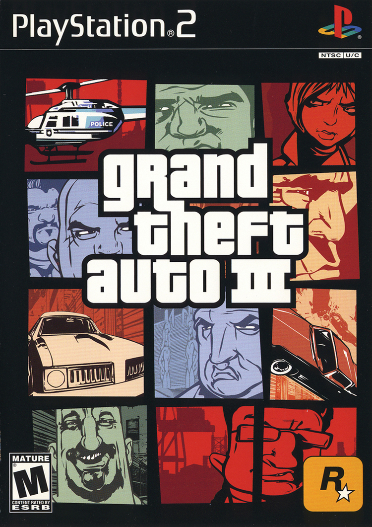
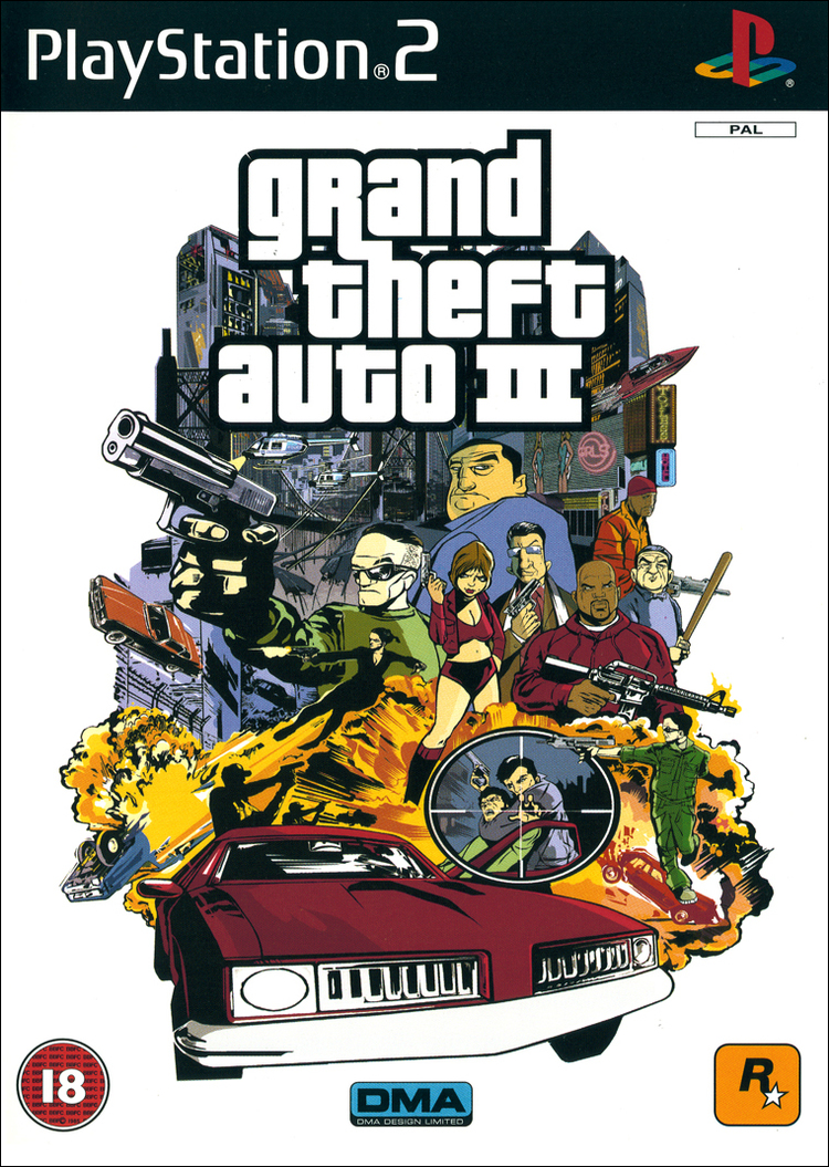
Yeah, you know the one. The box art that was the first in the series to introduce that iconic Pricedown typeface for the logo, the first to introduce that distinctive style that has been featured in every GTA game since. Designed by the one and only Stephen Bliss who's worked on basically all of Rockstar's games from GTA III onwards. From your Bully's to your L.A Noires and Red Deads...
His final project as Senior Artist before leaving Rockstar Games in 2016 was GTA V.
The story behind how this box art came to be is really interesting. But before we get into it, why not sit back, relax and listen to the game's great theme song.
So if you didn't know, GTA III was set to launch sometime in late September - early October 2001. The DMA Design crew developing the game (who would go onto be known as Rockstar North) were faced with various setbacks following the 9/11 terrorist attacks however causing publisher Rockstar to delay the game by two weeks, citing the attacks as a major reason why. Rockstar Games' global headquarters is located in New York City and naturally getting things done during that period with communications being all over the place must have been difficult. Not just for Rockstar but for everyone really. This here is an excerpt from the original press release I managed to dig up.
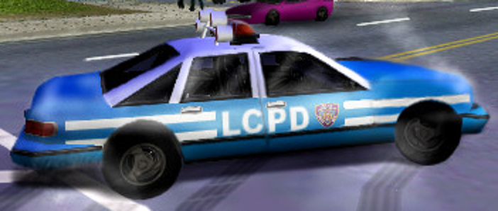
That last bit is especially important. GTA III is set in a fictional offshoot of New York City called Liberty City and naturally there's a handful of references to the real NYC, like how the police cars have a similar color scheme. This was one of the changes DMA made following the attacks
Beta
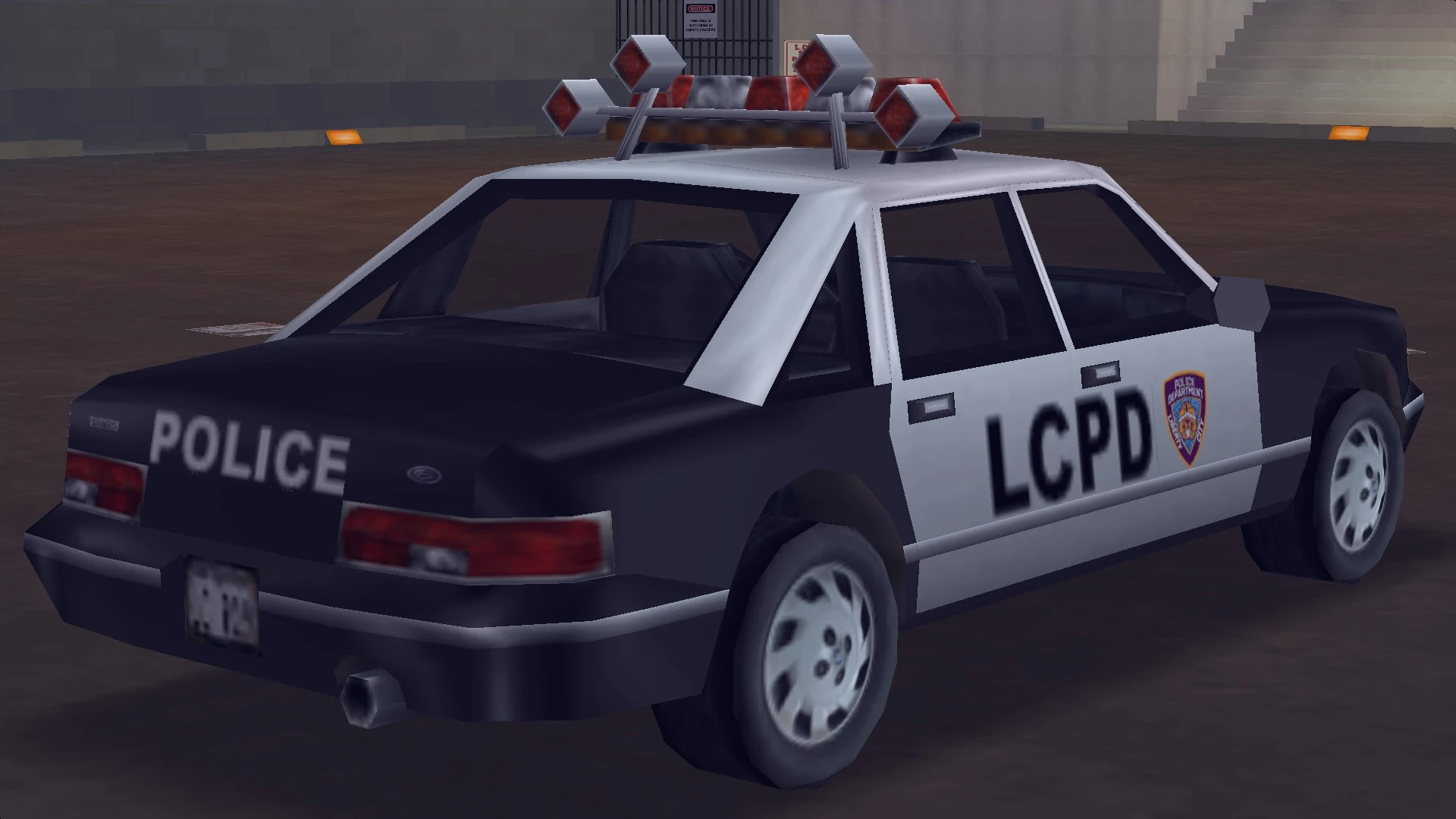
Final
Sam Houser spoke about the various changes DMA had to make following the attacks and I think it's quite insightful.
But this was just one of the several changes the DMA Design team made in the leadup to launch following the attacks, other changes included changing up the flight plan of an airplane and removing references to an NPC (Darkel) that had the player character make various bombings in the game. If you're interested in learning more about this, I highly recommend Vadim M's video on this as he does a good job of summing it up and looks through the leftover game files.
However, Rockstar and DMA claimed that these changes were only 1% of things changed and that the largest change of them all was actually the North American box art.
You see, GTA III's original box art (which was used in other territories) was quite actiony, like a classic Hollywood action movie poster. I actually think it looks quite cool myself and does a good job of selling the game. Here it is.
...But I can sorta see why the decision to change it up came in following 9/11. A Rockstar rep revealed in a R* Newswire Q/A in 2012 that the team felt the original box art felt quite 'raw', especially after 9/11, and that was when the decision to change it up came in.
Sam Houser claimed that the North American box art which would go on to become a series staple was conceived in a single evening by Stephen Bliss and that the staff instantly preferred it to the previous box art.
The new North American box art was inspired by movie posters like this one from The Thomas Crown Affair

I think it's amazing that Stephen Bliss was able to design such an iconic cover art in a simple evening. It's a change that ultimately defined GTA as a series, a convention that rears its head in every subsequent entry.
His final project as Senior Artist before leaving Rockstar Games in 2016 was GTA V.
So if you didn't know, GTA III was set to launch sometime in late September - early October 2001. The DMA Design crew developing the game (who would go onto be known as Rockstar North) were faced with various setbacks following the 9/11 terrorist attacks however causing publisher Rockstar to delay the game by two weeks, citing the attacks as a major reason why. Rockstar Games' global headquarters is located in New York City and naturally getting things done during that period with communications being all over the place must have been difficult. Not just for Rockstar but for everyone really. This here is an excerpt from the original press release I managed to dig up.
Our decision is based on 2 factors, firstly it has been a little difficult to get work done in downtown Manhattan in the last week since basic communications infrastructure has been intermittent at best, and secondly we felt that a full content review of all our titles and the marketing materials we use to represent them was absolutely necessary for us in light of the horrifying event we all witnessed in the United States last week.
That last bit is especially important. GTA III is set in a fictional offshoot of New York City called Liberty City and naturally there's a handful of references to the real NYC, like how the police cars have a similar color scheme. This was one of the changes DMA made following the attacks
Beta
Final
But this was just one of the several changes the DMA Design team made in the leadup to launch following the attacks, other changes included changing up the flight plan of an airplane and removing references to an NPC (Darkel) that had the player character make various bombings in the game. If you're interested in learning more about this, I highly recommend Vadim M's video on this as he does a good job of summing it up and looks through the leftover game files.
Sam Houser said:"We made some changes after 9/11 but they were very cosmetic. Most of the delay in releasing the game, which was only a couple of weeks, was a product of the fact that our office in New York was pretty close to Ground Zero and so any work that had to be done there was made impossible for a period. As far as I recall, we changed the colour of the cop cars so they weren't identical to NYPD, we altered the flight path of a plane so that it didn't look like it was flying into or behind a skyscraper, and we removed one mission as it made a reference to terrorists, plus a few lines of pedestrian dialogue and a line or two of talk radio. Some people believe we removed an entire strand of missions because they found some reference in the code to a character called Darkel, but he had been cut months before [release] and the missions were never completed.
Sam Houser said:The mood in the office… well, we were close to Ground Zero and lived in New York but, as people who didn't work in financial services, we didn't know too many people directly affected. It was very upsetting, very unnerving and overwhelming – perhaps particularly as people who work in media: to see a moment seemingly designed by its architects to be consumed by media, and to watch it on television and out of your window at the same time. It was the same for us as it was for anybody. But we also felt we'd come this close to making this great game and that despite these problems, just as despite the problems of Take Two, it was our duty to finish it.
However, Rockstar and DMA claimed that these changes were only 1% of things changed and that the largest change of them all was actually the North American box art.
You see, GTA III's original box art (which was used in other territories) was quite actiony, like a classic Hollywood action movie poster. I actually think it looks quite cool myself and does a good job of selling the game. Here it is.
...But I can sorta see why the decision to change it up came in following 9/11. A Rockstar rep revealed in a R* Newswire Q/A in 2012 that the team felt the original box art felt quite 'raw', especially after 9/11, and that was when the decision to change it up came in.
R* Rep said:The biggest change was the US packaging which remixed the previous packaging into what became our signature style – because the previous packaging [which was released as the cover of the game in Europe] was, we felt, too raw after 9/11. All of the more extreme rumours are amusing but impossible to have been achieved in such a short period of time.
Sam Houser claimed that the North American box art which would go on to become a series staple was conceived in a single evening by Stephen Bliss and that the staff instantly preferred it to the previous box art.
Sam Houser said:Probably the biggest single change was to the game's US box cover, which was significant in that it created the template for what was to become the game's look in all subsequent iterations. That was done by one of our artists in an evening and as soon we saw it, we preferred it to the cover we had planned to use.
The new North American box art was inspired by movie posters like this one from The Thomas Crown Affair
I think it's amazing that Stephen Bliss was able to design such an iconic cover art in a simple evening. It's a change that ultimately defined GTA as a series, a convention that rears its head in every subsequent entry.
Stephen Bliss said:My first brief at Rockstar was to paint the front box cover and develop an art style for a game called GTA 3, followed by GTA Vice City, etc. Being part of the evolution of the company for 15 years was an amazing experience
The long run at Rockstar was probably because I proved to be versatile: painting in various styles, designing logos, designing both game and non-game lifestyle merchandise, making a mean cup of tea etc
Rockstar's video games have been a huge influence because I was around them almost everyday for 15 years. We (Anthony MacBain and I) had to continually reinvent ourselves stylistically to match the increased level of detail in each new GTA game, we also had to develop art styles for RDR [Red Dead Revolver & Redemption], LA Noire etc. that were different to other Rockstar titles but still looked immediately like a Rockstar game.
Last edited: