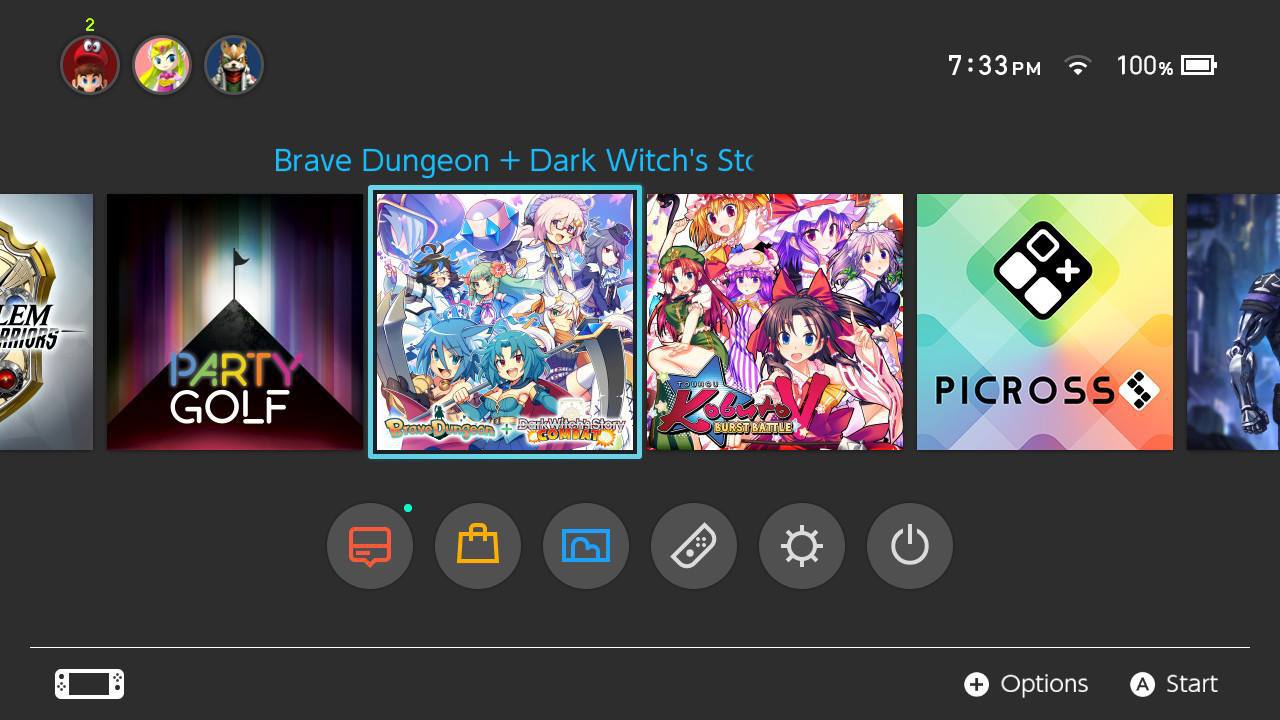
• Ever wanted an RSS feed of all your favorite gaming news sites? Go check out our new Gaming Headlines feed! Read more about it here.
Status
Not open for further replies.

Cipher Peon

One Winged Slayer
Member
Oct 25, 2017
7,783
Was pleased to see that Brave Dungeon + Dark WItch's Story: COMBAT got a stealth icon update recently.

Original:

oxd0_d03ubwvnqbsesjn5jzj5l.png


New:

23511035_197059486295f2kko.jpg
This looks awesome!

Kind of unrelated, but how are both games? :o
I was interested in getting it, but there haven't been a lot of impressions that I've seen.
 

Nav

Member
Oct 27, 2017
1,904
As it seems like media apps won't (unfortunately) get their own section and will live amongst everything else then I like this icon.
It provides a huge contrast between a (typical) game icon so you can quickly classify/identify it at a glance. Sounds weird considering the thread but hopefully all other media apps have similarly basic art.

I agree. I do wish I could anchor it to one spot though, like before or after all of my actual games.

I like it. It is identifiable, which is a tile number one concern.
I wonder what kind of "art" the streaming app could use for their tiles. It's not like they have a mascor or something along that line.

Yeah, very true. My worry is that we'd get media icons like the ones sometimes used for mobile phones, which lack text. Even though they're iconic, they'd stick out like a sore thumb on Switch. For example:

9jVlQUBmu2J96LjhxIZHnKqpFUUNhff7AoIM27_tPQ1U9lH3WQ1lyhGFRoiF7fjFOA=w300

jcbqFma-5e91cY9MlEasA-fvCRJK493MxphrqbBd8oS74FtYg00IXeOAn0ahsLprxIA=w300

Ned_Tu_ge6GgJZ_lIO_5mieIEmjDpq9kfgD05wapmvzcInvT4qQMxhxq_hEazf8ZsqA=w300
 

Cipher Peon

One Winged Slayer
Member
Oct 25, 2017
7,783
So, what do people think of the Hulu icon?

Even though it stands out, I don't mind it too much. There is a nice gradient to it and at least the name is on the icon. I tend to prefer having the name and no-art vs. full-art and no name.

DOUKoYkV4AAOgrY.jpg:large
I think the Hulu one is...fine, but no way.
I completely disagree with you on name with no art > art with no name

This is just too utilitarian and boring. Considering it's a media app, sure, but no way would I want it for games.

I wrote a review for it on another site if you want some in-depth impressions, but in a nutshell: Brave Dungeon is a simple but fun dungeon RPG, COMBAT is a crappy card game that can thankfully be ignored. Worth buying IMO.
I wanted the game for its card system first and then the RPG system later...but seeing the shade thrown at Chain of Memories has definitely illustrated that we look for wildly different things in card systems, so I feel like I'd take a look!

Chain of Memories was incredible, dammit.
 

Nav

Member
Oct 27, 2017
1,904
I think the Hulu one is...fine, but no way.
I completely disagree with you on name with no art > art with no name

This is just too utilitarian and boring. Considering it's a media app, sure, but no way would I want it for games.

Yeah, I was probably being too general there. Especially considering my least favorite bad icon is the SWD2 one, which is mostly a name (initials).

I like it for media apps. Games is more case by case for me. I can see how just names could look lifeless without nice fonts or color use. I actually don't mind the Project Octopath Traveler demo icon, for instance.
 

Camjo-Z

Member
Oct 25, 2017
6,499
I wanted the game for its card system first and then the RPG system later...but seeing the shade thrown at Chain of Memories has definitely illustrated that we look for wildly different things in card systems, so I feel like I'd take a look!

Chain of Memories was incredible, dammit.

Chain of Memories' battle system is okay, but I like the standard KH combat much better. It's not really comparable to this game though. I tend to enjoy CCGs, I just don't like when they're based on luck and grinding. There's a card game on Wii U and Steam called Lucadian Chronicles that I thought did the autobattle concept much better, you still lack any control during a match but you can see how the CPU opponent's cards are set up beforehand and place your cards accordingly to counter theirs. But hey, if you get COMBAT and dig it, let me know if I was doing something wrong and I'll give it a second look.
 

NegativeCero

Member
Oct 28, 2017
253
I just came across this thread and it's so silly. Was there a community watch for this on Vita or other icon UI's or is this new?
 

Neapolitan

Member
Oct 25, 2017
340
Indonesia
Actually I think CrunchyRoll has a mascot. Not sure if any other streaming services do though.

BnZvE-qIgAAUw_z.jpg


you'd be right!

I love the colors for the hulu icon.

Right, Crunchyroll-hime. CR got a good resource to design their tile.
Another streaming service could use their gangbuster "signature" show, but I don't think that's a wise idea.

I just came across this thread and it's so silly. Was there a community watch for this on Vita or other icon UI's or is this new?

Nothing that I'm aware of.
 

Camjo-Z

Member
Oct 25, 2017
6,499
Some more good news for lovers of proper icons! I wrote a review for Heroes of the Monkey Tavern in which I slammed the notoriously bad icon, as seen here:


...anyway, the dev apparently read the review and had this response:

"Thank you for your feedback.

I showed it to my wife, and we came to an agreement : I HAVE TO UPDATE THIS ICON!!!

Hihi, I did not realize it was as bad, I thought it was nice and simplist, now I think it sucks ;-)"
 

AndrewGPK

Member
Oct 27, 2017
3,822
I HATE that Doom icon, it's trying way too hard to look metal (a look I can't stand) when all it needed to do was recreate the classic Doom Guy box art.

I like it, they've used that image before.I do prefer the box art. Just guessing, but I think the reason they didn't use the box art is because the DOOM logo is meant to be big and bold and it probably would have been difficult to fit that and a lot of the detail of the box art that makes it so great.
 

Pandy

Member
Oct 25, 2017
1,026
Scotland
Some more good news for lovers of proper icons! I wrote a review for Heroes of the Monkey Tavern in which I slammed the notoriously bad icon, as seen here:


...anyway, the dev apparently read the review and had this response:

"Thank you for your feedback.

I showed it to my wife, and we came to an agreement : I HAVE TO UPDATE THIS ICON!!!

Hihi, I did not realize it was as bad, I thought it was nice and simplist, now I think it sucks ;-)"
Good stuff. I've downloaded the demo but haven't touched it yet for fear of bumping it up my queue!
 
OP
OP
Neiteio

Neiteio

Member
Oct 25, 2017
24,098
pretty standard, but looks good. I kind of wish they used the other promo art instead, but that's just me.

s8DW-3YMTKyPfcbHZxn40Q.png
Where would they put the title on this? This wouldn't be a good icon since the title would obscure the picture too much.

Same reason why they went with the Revenant for the DOOM icon instead of the box art. The title "DOOM" would obscure the box art if you squeezed it into a square icon.
 

Carfo

Banned
Oct 27, 2017
1,857
these are cool, reminds me of loading games onto the PSP on a CFW. You would have the ability to add your own icon and even change the music.
 

zroid

One Winged Slayer
The Fallen
Oct 25, 2017
5,785
Canada
Where would they put the title on this? This wouldn't be a good icon since the title would obscure the picture too much.

I dunno. Anywhere, I guess? Or not at all. Just would have looked cooler on my home screen than the box art, imo. But I don't really mind.

perhaps the art could be off-centre with the title on the other side
 

Robin64

One Winged Slayer
Member
Oct 25, 2017
6,623
England
YESSS

When does the new icon for Kingdom go live? Also, I heard there were some performance issues before. Does it run better now?

Should be live now, or going live any moment.

Here are the full patch notes:
  • General optimisation across the board, particularly for late-game saves
  • Altered balance of wave spawning. Let's see if you can survive this new format!
  • Reverted the save system to a system we have in other versions. So when the game saves now it will temporarily freeze while saving (intentional). This should fix most of the bad bugs that were caused by save corruption. If you've experienced a save corruption before you'll have to start a new game with this new patch. You can start from the map at least so you won't have to restart on land one
  • Various smaller fixes as a result of the save change which includes: Ballista not firing, Builders not building, and Farmers not farming
  • Fixed that parts of the background wall upon upgrading the castle would not appear
  • Payment system was partially redone, should be faster and a little bit more accurate
 
OP
OP
Neiteio

Neiteio

Member
Oct 25, 2017
24,098
The updated icon for Kingdom: New Lands is seriously gorgeous. I love how the trees are silhouetted in the foreground except for the bright green shrooms, and how they frame the view of the wooded corridor.
 

SiG

Member
Oct 25, 2017
6,485
BnZvE-qIgAAUw_z.jpg


you'd be right!

I love the colors for the hulu icon.
Right, Crunchyroll-hime. CR got a good resource to design their tile.
Another streaming service could use their gangbuster "signature" show, but I don't think that's a wise idea.


Nothing that I'm aware of.
Thanks. This gave me some inspiration to make a not-so-bland CrunchyRoll app icon for Switch
lZ21tHU.png

Here's an alternate take:
xk0Qw01.png


(Which one do you guys prefer?)

Edit: A version without the Home Screen:
ZMR04lW.png

i3m3f9Q.png
 
Last edited:
Oct 27, 2017
1,611
Australia
I like it, they've used that image before.I do prefer the box art. Just guessing, but I think the reason they didn't use the box art is because the DOOM logo is meant to be big and bold and it probably would have been difficult to fit that and a lot of the detail of the box art that makes it so great.

I think something like this would work okay. The logo's prominent, you lose the wider detail of the boxart but still have Doom Guy hoisting up an imp while toting his shotgun

doommbker.jpg
 

Bazry

Member
Oct 30, 2017
1,536
I really liked the Doom logo, but now I have it on my Switch I think its a big too mature looking for my young son
 

AndrewGPK

Member
Oct 27, 2017
3,822
I think something like this would work okay. The logo's prominent, you lose the wider detail of the boxart but still have Doom Guy hoisting up an imp while toting his shotgun

doommbker.jpg


That does look pretty good, although not as good as the box art (which also doesn't look quite as good as the original landscape art).

The art they chose is good, but even it seems a bit obscured by the logo.


b4e8fd199fab6f66b39de8127617c24e--doom-game-id-software.jpg
 
Status
Not open for further replies.