How some people can find the Xbox One interface confusing and hard to use will forever remain one of this universe's great mysteries. That's just crazy to me, I simply can't grasp it. How do you people play games that feature anything but the simplest menu systems? Yes, it's different compared to PS4 and Switch, and it will take some adjustment if you've never used it before, but it has a logic of its own, and navigating it should become second nature in no time.
-
Ever wanted an RSS feed of all your favorite gaming news sites? Go check out our new Gaming Headlines feed! Read more about it here.
-
We have made minor adjustments to how the search bar works on ResetEra. You can read about the changes here.
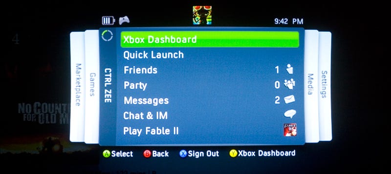
The Xbox One Dashboard is a Complete Mess
- Thread starter Stormed
- Start date
You are using an out of date browser. It may not display this or other websites correctly.
You should upgrade or use an alternative browser.
You should upgrade or use an alternative browser.
Actually the guide and the dashboard themselves are apps that run through a hyper visor (they've talked about it before in the Xbox os breakdown). One of the main reasons why the UI and apps can be so sluggish is that apps like the dash/guide are relegated to running on something like 1 CPU core, a fraction of the GPU and a small amount of ram.
I hope they take a look at this for next gen and either use a dedicated arm soc for the os or kill off multitasking in favor of giving apps the same resources that games get.
Check out the video I posted. Regardless of whether it's technically an app or not, the guide is lightning quick. Where is the sluggishness you mentioned?
That is the guide.I almost never use the "Guide". Just press the Xbox button, it's all there.
It's probably the worst user interface I've ever used, on anything. Horrible, messy, unintuitive and bloated. I got my Xbox One X a few weeks back and I was like wtf is this. It makes me want to spend as little time navigating through the console as possible, as opposed to something like my Switch which I LOVE to use and see new icons pop up etc
The dashboard is poorly organized, but the guide is fine.
But to everyone complaining about lag, change your DNS. Use 1.1.1.1 or 8.8.8.8
But to everyone complaining about lag, change your DNS. Use 1.1.1.1 or 8.8.8.8
Change/fix your DNSI just wish it wasn't so SLOW.
It is so slooooooowwwwwww.... and not the 'your internet connection is slow' slow, the kind of 'slow' that makes it feel like my Xbox One X can barely handle the challenge of running the front-end.
They need to start from scratch. Again.
Yes and you know what? Microsoft already moved on the Metro UI in Windows 10 and it's barely visible there, so why are they keep using it for Xbox?
Shame cause they added many software features but it all feels messy, slow and overwhelming.
Shame cause they added many software features but it all feels messy, slow and overwhelming.
I feel like both the consoles suffer from slowdown, especially when multitasking. I have never been impressed with either systems user interface. I feel like my Samsung Galaxy S9+ handles multitasking better than an Xbox One or PS4, nevermind my gaming PC.
I think having the next generation of consoles based around Zen 2 is going to make a huge difference, regardless of how they change their OS is designed.
I think having the next generation of consoles based around Zen 2 is going to make a huge difference, regardless of how they change their OS is designed.
All I hear when I hear people complaining about almost any use interface are lazy assholes who view themselves as far more important than they actually are to the world. Just shut and get used to it. Its functional. I'm sorry everything has to be perfect for you or it's the worst of the worst.
Could it be better? Sure, but does it have to be? No. I cant imagine what other bullshit drives op up the wall, everyday of their life.
Could it be better? Sure, but does it have to be? No. I cant imagine what other bullshit drives op up the wall, everyday of their life.
Despite what I wrote two seconds ago, this is the truth. My favorite console ui, BY FAR.

It literally used to take minutes to bring up my XBLA game list in the blades dashboard. That's lag for you. But people apparently liked that...or just forgot.All I hear when I hear people complaining about almost any use interface are lazy assholes who view themselves as far more important than they actually are to the world. Just shut and get used to it. Its functional. I'm sorry everything has to be perfect for you or it's the worst of the worst.
Could it be better? Sure, but does it have to be? No. I cant imagine what other bullshit drives op up the wall, everyday of their life.
Despite what I wrote two seconds ago, this is the truth. My favorite console ui, BY FAR.
Sorry but if you can't press the guide button and press right 2 times to reach the capture tab, the problem isn't with the dashboard.Today marks my first month owning an Xbox One X, and I still do not know how to even access my screenshots/recordings. Coming from a PS4, this is the most confusing interface I hace used in a long time.
How does ERA feel about the current state of the Xbox dashboard? What do you think could make it better?
This is fair. I was strictly non-digital in the early days of 360 so yeah, I never had to deal with that rodeo. That sucks. Just wondering, but how many games did you have at the time?It literally used to take minutes to bring up my XBLA game list in the blades dashboard. That's lag for you. But people apparently liked that...or just forgot.
Nailed it. Press the big white button on the top of the controller everything is there. Simple.
I was wondering.... Some folks new to the XB1 family may not know what the guide button is
This is that guy who did the good rdr2 video doing one about bad user interfaces. he goes in pretty hard on the Xbox dashboard but it's funny.
lol
this is good
It literally used to take minutes to bring up my XBLA game list in the blades dashboard. That's lag for you. But people apparently liked that...or just forgot.
I can't say it ever took that long for me and I downloaded a lot.
it's a UX built to sell ads first, serve you second. shame that Microsoft feels the need to force ads onto every platform they build.
Without a doubt, it is the worst of the recent devices I've used in a while (and many steps back from the ease of the 360). On top of that, downloads are slow as all get out much of the time too.
This is fair. I was strictly non-digital in the early days of 360 so yeah, I never had to deal with that rodeo. That sucks. Just wondering, but how many games did you have at the time?
XBLA had demos for every single game. And I tried a whole lot of them. There was even an option to auto download them every Tuesday! Probably >100 before NXE came out.
it's a UX built to sell ads first, serve you second. shame that Microsoft feels the need to force ads onto every platform they build.
This is a lie there is one ad on the dashboard main screen.
Yup. And zero ads in the guide.
It's not a PS4. Use the Guide.
I get that a lot of people like it. The defenses are admirable. It's basically 'use the guide it has everything' and 'use pins.'
Both of those points, while completely valid, pretty much prove that the UI-- as it is-- just isn't intuitive at all.
Pins are a great example of that. You wouldn't need pins if it was easy and quick to get to what you want. Why would you want to pin something? Because you use it a lot and it's too hard to find it, that's why.
And the guide bit, completely agree. Hit the xbox button and then quickly find what you need. Totally fine, but then the default UI experience should be _that_. The guide experience. Not the confusing array of tiles and random stuff. Why should I have to hit the guide button to find core functionality quickly? It should be there in front of me.
If they properly did usability tests, this stuff would be obvious. It works great for advanced, expert users who have taken the time to customize and who are in the UI every day. For people that aren't it's a disaster.
Are you sure your Xbox is hooked up to your router correctly? My Xbox maxes out my download speed I get from my ISP at around 200mb/s. In comparison I get around ~100 mb/s on my PS4 which I've confirmed isn't an issue with my PS4 from several friends who own PS4's (all wired).
I love my Xbox One X, but the interface drives me nuts. It's manageable, but I don't understand why it's designed the way it is.
I get that a lot of people like it. The defenses are admirable. It's basically 'use the guide it has everything' and 'use pins.'
Both of those points, while completely valid, pretty much prove that the UI-- as it is-- just isn't intuitive at all.
You and I think the same way. I absolutely love that you can make pins and folders with just entertainment apps and move them where you want them to be (instead of being forced to see icons you will never use in the TV & Video section when you want to watch something like Twitch on the PS4). However, the fact that you have to learn pins and the guide, etc... means that the UI is not intuitive at all. The RB RB down down instructions above sound like you have to type in the Contra code to do something.
I completely agree. I have the X and pro, and by far the Sony is a much better layout.Today marks my first month owning an Xbox One X, and I still do not know how to even access my screenshots/recordings. Coming from a PS4, this is the most confusing interface I hace used in a long time.
How does ERA feel about the current state of the Xbox dashboard? What do you think could make it better?
The dashboard is poorly organized, but the guide is fine.
But to everyone complaining about lag, change your DNS. Use 1.1.1.1 or 8.8.8.8
Change/fix your DNS
Lmao. My home console menu is laggy and slow. Response. Change your DNS settings!
Brilliant!!
Using both consoles since launch, and to this day i still hate the xb1 dash... no amount of DNS settings change is gonna change that.
Granted I've used it virtually everyday for 5 years in all its peaks and valleys, but I don't really get how it could be simpler, given all the things it needs to do.
I literally can do 75% of what I need without looking at this point.
Use your pins and quick guide and that takes care of 90% of your needs.
I literally can do 75% of what I need without looking at this point.
Use your pins and quick guide and that takes care of 90% of your needs.
I honestly can't stand seeing this topic come up. And it's always the same story. "It's too hard to use and so sloooooow". And every time I feel like responding the same way i.e. go try and do literally anything on a Wii U other than just launching a game and then come back to me saying the Xbox UI is slow or sluggish. What a load of nonsense. I will take the Xbox UI any day over something like the Switch which is so barebones it may as well not exist, and even that needs to constantly do things like reload the eShop each time you want to use it and has no multitasking to speak of. Meanwhile here i am streaming music from my Onedrive at the same time as playing multiplayer games online and the guide is fast and snappy enough that doing things like changing tracks or adjusting the volume can be done without me skipping a beat (or getting killed).
As for this not knowing where to find captures thing, considering you can get to it from at least 3 different ways i find it hard to believe that you genuinely struggle unless you are purposefully avoiding any prompts or onscreen guides/iconography. Off the top of my head it's Guide - View (Select if you're old school) - Manage captures (takes all of 2 seconds) for everything, Guide, RB twice and Recent captures for, you guessed it, recent captures and if it's not recent enough you can hit "See all" and that takes maybe 5 seconds unless you have arthritis. You can also get to it from your profile card which is a longer journey but even that is 10 seconds if you know how to navigate it. You're telling me you've never read the text on the bottom of the screen when you press Guide or you have never navigated to the Broadcast/captures tab? Ok then.
How, exactly, do you propose they make this any faster or easier to find? Unless your solution is "have a physical hardware button dedicated to it" then by all mean, share your solution.
My complaints with the UI boil down to speed at this point. There's some annoyances but they're in the "well that's not the way I would have chosen" rather than the issues that it had at launch.
(If they let you put your pins right up front that would be good too, but with them in the guide now it's not much of an issue.)
Wonder how much of the sluggishness is down to the hard drive versus the constant fetching off online stuff. Given that I've got a pretty good connection with minimal ping, I assume it's the former.
I get that a lot of people like it. The defenses are admirable. It's basically 'use the guide it has everything' and 'use pins.'
Both of those points, while completely valid, pretty much prove that the UI-- as it is-- just isn't intuitive at all.
Pins are a great example of that. You wouldn't need pins if it was easy and quick to get to what you want. Why would you want to pin something? Because you use it a lot and it's too hard to find it, that's why.
And the guide bit, completely agree. Hit the xbox button and then quickly find what you need. Totally fine, but then the default UI experience should be _that_. The guide experience. Not the confusing array of tiles and random stuff. Why should I have to hit the guide button to find core functionality quickly? It should be there in front of me.
If they properly did usability tests, this stuff would be obvious. It works great for advanced, expert users who have taken the time to customize and who are in the UI every day. For people that aren't it's a disaster.
It's really not that much different from the 360 UI which came out after the Blades (called NXE iirc) where the UI was centred around the Xbox guide when in-game. I think people are comparing it to the PS4 UI too much which is centred more around going back to the dashboard to access most things. As we can see from this thread, most people who got an Xbox first and then got a PS4 at a later date are feeling the same way about it as people who bought a PS4 first and an Xbox later. It's two completely different approaches.
This is that guy who did the good rdr2 video doing one about bad user interfaces. he goes in pretty hard on the Xbox dashboard but it's funny.
Lol at Smash 4. I agree. Smash ultimate too.
You and I think the same way. I absolutely love that you can make pins and folders with just entertainment apps and move them where you want them to be (instead of being forced to see icons you will never use in the TV & Video section when you want to watch something like Twitch on the PS4). However, the fact that you have to learn pins and the guide, etc... means that the UI is not intuitive at all. The RB RB down down instructions above sound like you have to type in the Contra code to do something.
You can hit right on the pad rather than hitting RB. They both work. I use RB more though. Surely you must have known that.
Answer me honestly...Do you really find the navigation in this video to be difficult?
The guide is meant to easily access your stuff quickly. The dashboard tabs are meant for casual surfing and exploring content.
It's dumb but 100% true. The Xbox One's dashboard is overly dependant on constantly pulling things from the internet. Optimizing your DNS will stop the lag and hitching.Lmao. My home console menu is laggy and slow. Response. Change your DNS settings!
Brilliant!!
Coming from mostly using the Xbox UI I find that the PS4 UI is horrible. You will notice things more on whatever youre not used to.
This. I most game on my Xbox and whenever I use my PS4 I'm completely lost. That interface is awful to me. It's just about what you're used to.
I really dont understand this complaint. It is what you're use to, but xbox in specific you literally hit RB and LB to go to each category. The games and apps icon is pretty hard to miss, and you can also pin literally anything you want to the front page. You also have the option of using xbox button to jump from place to place.
Meanwhile I dont like ps4 UI and it's branching text menus.
Meanwhile I dont like ps4 UI and it's branching text menus.
You can hit right on the pad rather than hitting RB. They both work. I use RB more though. Surely you must have known that.
Answer me honestly...Do you really find the navigation in this video to be difficult?
Did you not watch the video that is linked literally in the post right above your response to me? It spells out exactly what is wrong with the Xbox One UI in a very humorous way. You are not understanding what "intuitive" means. Watch the video and get back to me if you want. For the record, I am fine with the UI, but it is not intuitive. It's fine because I took the time to learn it and customize it to my liking. That is NOT the same thing as being intuitive.