• Ever wanted an RSS feed of all your favorite gaming news sites? Go check out our new Gaming Headlines feed! Read more about it here.
  • We have made minor adjustments to how the search bar works on ResetEra. You can read about the changes here.

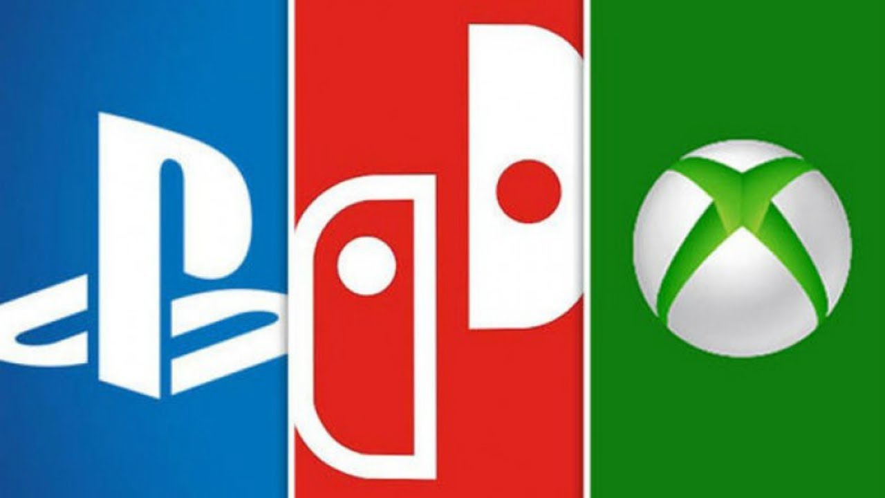
Which console logo is the best?

  • PS4

    Votes: 476 35.8%
  • Xbox One

    Votes: 150 11.3%
  • Nintendo Switch

    Votes: 703 52.9%

  • Total voters
    1,329

Deleted member 249

User requested account closure
Banned
Oct 25, 2017
28,828
Nintendo-Switch-vs-ps4-vs-xbox-one.jpg

maxresdefault.jpg

PS4SwitchXboxOne.png


Console logos are probably among the things you (and to be honest, I) think about the least when it comes to these machines; but they're a rather important part of a console's branding identity (as an encouraging exercise, I do encourage you to go and look at the logos for PlayStation and Xbox through the years, and try to correlate them with the systems' positioning in the market at the time).

This generation, we now have three consoles with three very distinct branding identities, and three stark logos- but which one is your favorite and why?
 

TerminusFox

Banned
Oct 27, 2017
3,851
Switch>PS4>Xbox

The Switch Logo is brilliant, as they could've just had no logo at all, and it would've been perfectly serviceable, like the Wii, but to use the actual controllers? It's instantly recognizable, completely unique, doesn't remind you of anything, it's intuitive.

Playstation is just simple. P and an S. Reflects the design philosophy of Sony's consoles. Make a powerful console, no gimmicks, no bullshit, just what we wanted, but more.

Xbox is...okay. Gets the job done, but nothing inherently bad, tbh.
 

Deleted member 11934

User requested account closure
Banned
Oct 27, 2017
1,045
The Switch has more meaning, the others are consolidated brands, but all three are pretty much the same at this point. No real difference to my eyes (full disclosure: I have a degree in communication design).
 

Deleted member 6436

User requested account closure
Banned
Oct 25, 2017
951
Nintendo managed to make it so that every time I hear a snap, I think of the Switch.

So probably that.
 

Rarity

Member
Dec 3, 2017
242
Switch because of that derpy dog face and that sweet, sweet clicking sound when it's in motion.
 
OP
OP

Deleted member 249

User requested account closure
Banned
Oct 25, 2017
28,828

This is the kind of hard hitting discussion I come to ERA for.

For the record the answer is PS4.
Why?

The Switch has more meaning, the others are consolidated brands, but all three are pretty much the same at this point. No real difference to my eyes (full disclosure: I have a degree in communication design).
I would be interested in learning more! Why would you argue they are the same (or mostly the same)?
 

Deleted member 17403

User Requested Account Closure
Banned
Oct 27, 2017
2,664
PS. It's something consistent. There's a history behind the brand name/product line without having to name the iteration something non-numerical.
 

Conciliator

Member
Oct 25, 2017
5,132
Raw logo, gotta give it to the Switch. It's gotta like the yin yang thing, it implies functionality and represents the product, it's hot shit

PS4 has the best font

still shouts out the Xbox, legendary logo. it's a bit 2000s
 

Zaied

Member
Oct 27, 2017
4,564
PS4 since it's just a variation of the classic PS logo which is my favorite and the most iconic. It lacks the original color scheme (looks like Sony did away with it after the PS3 Fat) but the white fits better with the marketing material and modern design of the PS4.
 
Last edited:

dirtyjane

Member
Oct 27, 2017
839
I like the switch icon, the association with the click sound is iconic, also I'm a sucker for these small chimes.
 
Oct 27, 2017
12,238
I like the Switch the most, you can almost hear that clicking noise when you see it. It is the concept of the console.

I like the PS - logo, not the "PS4" font, that is hideous. But I like more the original, colored one.

The Xbox logo is just plain ugly, looks like one of those bread-thingys, in an ugly shade of green. Console is fine tho.
 

Boiled Goose

Banned
Nov 2, 2017
9,999
Switch one communicates concept. Has dynamic animation and sound associated with it.

I can hear the sound every time I see it.


PS: I can hear the Xbox sound too. PS sound not coming to me atm. Also interesting how Nintendo can rebrand consoles while MS and sony keep their console brand identity intact
 

Dark Cloud

Banned
Oct 27, 2017
61,087
Switch logo tells you everything about the Switch from what the system means to the joy cons, to the two players and the yin and yang.
 

Thornquist

Member
Jan 22, 2018
1,500
Norway
The Playstation logo is a classic, but feels a bit 90's. Still respect Sony for holding on to the logo & the brand for all these years.

The Switch is the best one.

The Xbox logo is dead last. Xbone, you can never escape it Microsoft.
 

benbeau

One Winged Slayer
Member
Oct 25, 2017
552
0VZrJ4l.gif


I look at this gif and I hear that iconic clicking sound. It's such a wonderful little noise that immediately grabs my attention. I also love the whole yin-yang thing the logo has going for it, how simple the animation is, and Nintendo going back to the red just feels so right to me (and that color helps them stand out a bit among the PS4 and XB1 in comparison to the Wii's white and the Wii U's blue if you ask me).

I love just about everything Nintendo's doing with the Switch's branding and communication honestly. They really knocked it out of the park and I sometimes think it's baffling that this is the same company that made the Wii U.
 

Ehoavash

One Winged Slayer
Member
Oct 28, 2017
7,238
Ps4. Jus so iconic and has lasted this long

I admit though dum kid me had no idea that the playStation logo was a P and a S lmao
 

NESpowerhouse

Member
Oct 25, 2017
8,679
Virginia
I still don't really get why Microsoft decided to stay with the same logo as the 360, which was relevant to the central idea behind that console (the X in the circle, which is supposed to represent your friends or connections).
 

Deleted member 11934

User requested account closure
Banned
Oct 27, 2017
1,045
Why?


I would be interested in learning more! Why would you argue they are the same (or mostly the same)?
Because they're abstract, are basically used in the same way (white on solid color), and only one (Switch) has actually some sort of motion and experience to go with it. But they don't say much really other than that. The common design language in the industry is just contemporary minimalism, like 90% of the technology right now. The Switch does something a little different, but the logo by itself is pretty generic (not counting the motion thing)
 
OP
OP

Deleted member 249

User requested account closure
Banned
Oct 25, 2017
28,828
Urgh I fucked up my grammar and now this will bug me forever.

Oh well, I will live with my shame
 

skullwaker

Member
Oct 25, 2017
2,267
I think all 3 are excellent, but my vote goes to Switch. The fact that it symbolizes the Joy-Cons, has a yin-yang type of aesthetic and is associated with an already iconic sound is pretty impressive.

I'd go Switch > PS > Xbox.
 

Deleted member 4037

User requested account closure
Banned
Oct 25, 2017
6,989
Its weird cause at its base the switch is the worst one cause its two rounded rectangles with circles, but the animation for it is great... Such a dilemma...
 
OP
OP

Deleted member 249

User requested account closure
Banned
Oct 25, 2017
28,828
I still don't really get why Microsoft decided to stay with the same logo as the 360, which was relevant to the central idea behind that console (the X in the circle, which is supposed to represent your friends or connections).
Plus, you know, a circle. 360º. X in a circle.

Because they're abstract, are basically used in the same way (white on solid color), and only one (Switch) has actually some sort of motion and experience to go with it. But they don't say much really other than that. The common design language in the industry is just contemporary minimalism, like 90% of the technology right now. The Switch does something a little different, but the logo by itself is pretty generic (not counting the motion thing)
Ah, yes, this is something I have noticed too. All three used to go for more 'material' designs with a skeuomorphic look back in the day (the PS1, N64, and Xbox logos are the best examples of this), but they've basically reduced themselves to minimalist abstract designs, as you say. No arguments there.

I do like the starkness of their color schemes, though.
 

Argot

Member
Oct 29, 2017
1,153
My instinct is to say "Switch," but I think I'm subconsciously taking the snap sound into account, which I don't think we're supposed to be doing here. If we take the logos by themselves I'm gonna have to wait and see how the Switch logo sits with me after a couple of years and go with the PS logo, a classic. Weirdly enough I quite like the Xbox logo in the first pic, but it's clearly my least favorite of the three in the second two pics. I guess I'm afraid of more detailed shading?
 

Spyware

Member
Oct 26, 2017
2,455
Sweden
Switch is the best if the animation is there, otherwise it gets beaten by the PlayStation for me. But that is probably only nostalgia speaking. I can't say why exactly. I just feel the PS one works well and has done so since the start, while the Switch one is fun and interesting. If we bring in the PS4-part it's... eh. The Switch wins with no competition.

The Xbox logo works do much better when it is flat, then it's good. The "3D one" feels old and I think it's simply ugly.
 

sappyday

The Fallen
Oct 27, 2017
2,798
The playstation logo must have been made by the same person who made the Disney "D" cause everytime I look at them I don't see a PS or a D but their logo so I guess that
 

kennyamr

Banned
Oct 25, 2017
3,587
New York, NY, USA
Personally I've seen the PlayStation logo for more than 2 decades in my house. It's been part of my life for that long, so to me, it's a little but very essential part of who I am. It is very close to my heart so my brain, of course, will be biased forever.
For me the PS/PS4 logo will always be the best one by a mile.
 
Oct 25, 2017
5,846
From a design standpoint I love the Xbox logo even though it's kind of funny how it no longer makes innate 'sense' after the turn to a circle with the 360. The PlayStation logo has always felt stuck in its 1990s roots. And while the Switch clearly explains its premise via its logo, which is admirable... it's still not a great logo.
 

Rahxephon91

Banned
Oct 25, 2017
1,371
PS4. The Playstation logo is simply iconic and at this point when I think of Blue, I think of the PS4.
 

skeezx

Member
Oct 27, 2017
20,170
playstation has always had the sexiest logos. i like how it's essentially the same as ps2 (a console everybody is familiar with) yet modernized

as for marketing effectiveness i give it to switch. something about the color scheme and font feels off with me but i can't deny it gets the job done
 

Betelgeuse

Member
Nov 2, 2017
2,941
Switch's design is really intelligent - eminently simple yet clear what it conveys. Playstation's isn't far behind, and its iconic quality - simply from being a mainstay for four generations now - could arguably propel it above the Switch.

Xbox's is slick, but a clear third.
 

The Albatross

Member
Oct 25, 2017
39,038
I voted for Xbox because I just figured it'd have the least votes and I wanted to see the results. I imagine this would just be a vote for whatever someone's favorite brand is.
 

XrossExam

Member
Nov 1, 2017
1,904
The Switch logo reminds me of Dominos so I can't un-see it now, not that it's a bad logo, but it does make me hungry for pizza. I think the PS logo is clever and simple enough that it wins by nature of it's history and that it's never really changed other than colors.
 

dlauv

Prophet of Truth - One Winged Slayer
Member
Oct 27, 2017
11,513
Switch boxart is sharp red note in the top corner. Red is a stronger color. The iconography isn't associated with anything except the "Switch jingle."

The Playstation 4 logo is less remarkable than the PSone logo (with those colors and that strong boot-up screen) and even the PS2 logo (the one of the side of the phat PS2). It looks more utilitarian and like more of a soulless product. The white is bland.

I can't comment on the Xbox logo too much. It makes me think of the 360 boot screen. Which is memorable but not incredibly interesting and not the Xbox One boot screen.

Switch > PS4 >/= X1.