• Ever wanted an RSS feed of all your favorite gaming news sites? Go check out our new Gaming Headlines feed! Read more about it here.
  • We have made minor adjustments to how the search bar works on ResetEra. You can read about the changes here.
OP
OP
XaviConcept

XaviConcept

Art Director for Videogames
Verified
Oct 25, 2017
4,914
Wow, didn't know about this thread!

Here is work I recently touched up and am working on little by little whenever the mood strikes.

Raging Spaniard, a critique would be amazing as it's always helpful when people point out things I'd never catch/see. I call it Blind Wizard and his Cat.

blind_wizard_and_his_cat_v2_0_by_royaljester-dc8qhjj.png
Hi! This is nice! I did a paintover on the left side

tirisfal_po01.jpg


I think you did a nice job with keeping your light direction semi consistent but I think you could have taken it further in order to add more depth, thats most noticeable on the shadow being cast by the nose or how I went a lot darker in order to define the cheekbones. In the future I would suggest spending a bit more time on making the mirrored side more unique so it doesnt look so copy-paste.

In terms of painting technique, for the skin tone you added more black in order to go darker. Unless thats done on purpose I would shy away from that in the future and would urge you to always add color to your shadows by varying the hue. I started with going with a richer red to add some volume and for the darkest parts I added blue. It gives you a more natural, fun look. For the beard you actually played with some purple tones so I think instinctively youre already doing it, you just need to think about it a bit more.

Another thing I wanted to point out is depth, notice how I separated the beard elements with darker values in order to make the piece less flat. This guy has a nice chunky beard so you want to push those shapes and get the most out of them.

You added a bit of rim light to the robe, its not a bad idea but make sure youre consistent and add it to the rest of the piece.

Cat came out pretty cute :)

This is a good piece, fun shapes! I think you can be a lot more playful with color -and- depth, seems like youre holding back a bit on that front. You have some great shapes that would probably work pretty well in a world of warcraft esque style!
 
OP
OP
XaviConcept

XaviConcept

Art Director for Videogames
Verified
Oct 25, 2017
4,914
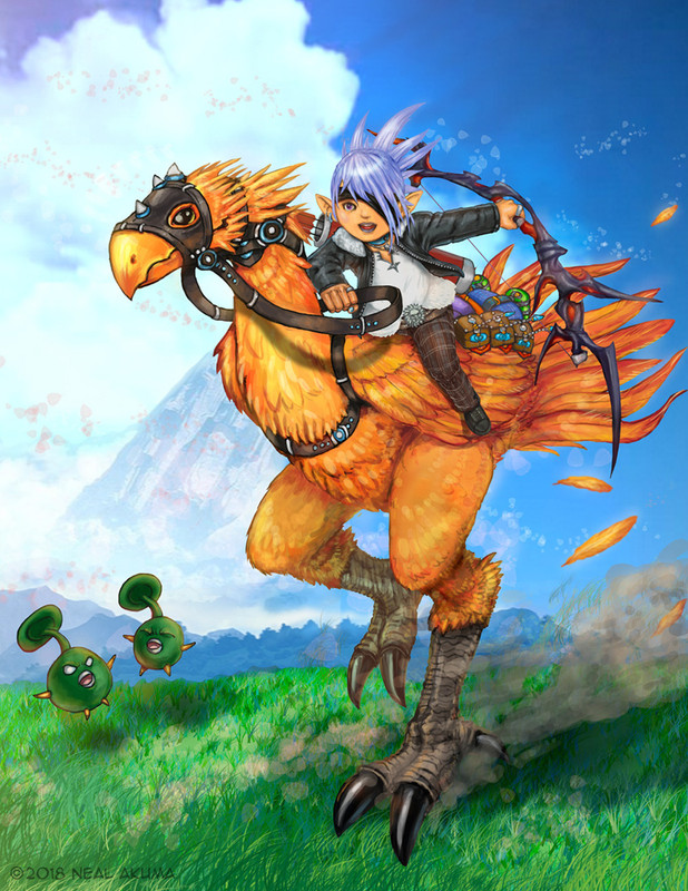
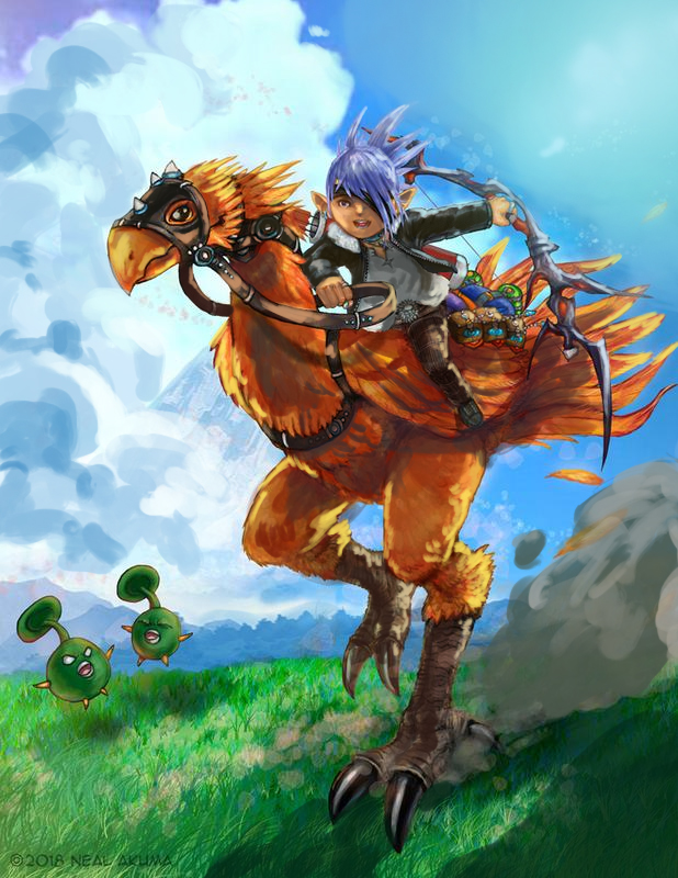
Raging Spaniard The Final Fantasy/ Chocobo piece please.

namareset.jpg

Harro, you have a good level of skill and your output is pretty nice so I can get a bit more specific with my feedback :)

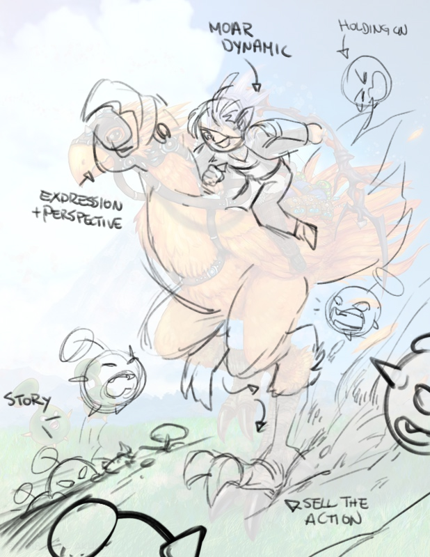
First, the concept. I played XIV as well so I can see what youre trying to convey, The piece has good energy, the characters are well drawn and theres a good level of detail! It reminds me a fair bit of my own work a few years ago. I redrew the layout to go a bit further with what you had:

akumatica_po02.jpg


First, the mobs. By adding more of them and giving them something to do, you are giving the drawing a reason to exist and a story to tell. Now it looks like your Lala is trying to get somewhere running past these little guys who are just trying to mess with you. By drawing them on the foreground, middleground and background the illustration gains depth!

The background. You can see I lowered the grass line to a more steep diagonal. This helps create more depth and diagonal lines are good if you want to sell a more action based shot.

The action itself. The chocobo was redrawn to be a bit more 3dimensional given the camera view and reposed to make a bit more sense with the action. Raising the claws and increasing the dust clarifies what the animal is trying to do, more dynamic leg angles increase the sense of movement and raising the head and opening the beak increase the drama and makes the drawing cooler to look at since its not "default chocobo face"

As for the Lala, this new pose makes it a lot more dynamic, bending the arm slightly at the elbow gives it a nice dynamic curve, lowering the head makes him look more driven, making the hair react to the speed adds storytelling and dynamism as does lifting him off his seat slightly (little fella bounces around more!)

Now onto colors, this is where you need the most time thinking about your approach, I think

akumatica_po01.jpg


Your art has a nice rendering quality to it and it seem,s like you spend a lot of time getting details just right. Thats a good thing! However, you need to start thinking big picture and realize how much more you have to gain by really exploring your light source and exploiting it, even if it hides some of your details. Adding depth will really take your work to the next level.

So, the KEY thing is that you implied the whole scene was backlit (due to the sunrays coming off of the chocobo on the left side of the image. Thats a good thing so now the entire illustration needs to follow that cue, that means that yes, your two main subjects will be mostly IN SHADOW. Now, its important to note that shadows =/ SUPER DARK DARKNESS. It just means that we need to delineate our darkest areas with our highlights and use all the available colors to their full potential. I started with adding the light direction to the clouds by adding a shadow to their left side, that lets you know where the sun is. Then I added the CAST SHADOW to the grass following the same direction which then informed the dust cloud shadows after that.

Once I got to the chocobo and lalafell they needed to be heavily altered since they looked like they were being lit from all directions. Like in the other critiques when I added shadow I did NOT add black, but rather a saturated dark red and dark blue. I took care to make sure cast shadows were strong as well (his leg casting on the feathers, the wing on the leg, etc, push your shadows further!) THEN I went in and added the crucial element to make everything pop

Rim lighting!

Look at the edge of the weapon, hair, pants, feathers, face, feet, pouches. I went with a saturated yellow or orange for the most part and used that to not just hit the rims but to add extra texture to where they lay. It really helps make everything feel 3D and separates the elements with a nice sense of depth. Notice how now you can clearly look at the reins and know which one is in front and which is behind whereas before you could only tell because of the lineart. You can also clearly tell which leg is closer to the sun than the other. Everything is a lot more consistent and ties the illustration together even with my sloppy rendering (only painted this for about 10 minutes)

If I were to give you an overall critique, it would be to integrate your characters into your backgrounds more. It doesnt mean you need to draw a castle, but even a grassy field with some foreground details like rocks and bushes would help, try to take your storytelling to the next level (I go in-depth on that subject on sinopiasaurs critique, so give that a read!) Secondly really work on your values and dont be afraid to paint over your nice detail work. You do some good stuff so Im looking forward to see how you progress!
 
OP
OP
XaviConcept

XaviConcept

Art Director for Videogames
Verified
Oct 25, 2017
4,914
You guys keep putting out good original work. I should probably get started on that...
Anyway! Justice League cover finished!

tumblr_p867oqsnRo1xpfteqo1_1280.jpg


I may just keep working on this...

OK, I didnt get to every character, but mostly look at Supes, WW, MM, Flash and Hawkgirl a lil bit.

kazoku_po011.jpg


This is, again, super quick but the main thing I focused on is building up your characters. Your work is very, very airbrushy and youre not necessarily enhancing the lineart yet. Your job as a colorist is see where the pencils want you to go and really push them to the next level.

You are adding basic shadows and basic highlights but they're very light and very blotchy, you should be sculpting these characters with your color work and using a more textured brush would be a good start. Notice the work I did on Superman's face and how it follows the lineart and makes him look a lot more 3D without taking the inks away. You also need to take some liberties and not be too anal so I went ahead and added some rim lighting atop the inks where it made sense. You need to go darker and lighter in spots in order to get a better sense of contrast, wonder woman is a good example of that where I went darker with the cape and really separated all the elements. With Martian Manhunter I darkened the space behind him so he would pop and did a once over with a dark blue to really accentuate his abs and darken his face to sell the mood.

With Flash I again added the dark blue but played with those yellow highlights to accentuate the speed force, I also darkened the Superman "S" behind him so Flash would pop more.

As a whole you need to take bolder decisions. Your colors right now are a step above "flash is red so Im gonna add red" which is fine for a beginner but you need to start thinking about moving on to the next step and I think the key steps are: more texture, less airbrush and more dramatic lighting where you see more shadows and highlights. I dont know your process but it would help to make a value thumbnail at a small size before you start your rendering.

I think this came out a little harsh and its a little late so I dont feel like editing, lol. You do good work and you should be able to get a lot better very quickly so keep at it! I hope this helps a bit :)
 

Akumatica

Member
Oct 25, 2017
2,746
Thanks for the critique! What you pointed out is a great help. The dynamism is missing as I was too tentative once I got a form and composition I was finally happy with. I'd never played FF14 before and this was for someone's specific character so I didn't want to mess it up. I almost want to redo it now integrating your tips.

The values and rim lighting are something I've been pushing in the later pieces I've posted and even more so in the batch I'm working on now. The big thing I feel I need to do is loosen up and let go of my old mindset of using Copic markers over lineart.

Thanks again for taking the time and doing this. I never went to art school or had any other artists around me growing up to bounce ideas off or get critiques from. Getting anyone to even just comment on Twitter, Deviantart or Pixiv is rough.

For now I'm making myself do subjects and techniques I've never done before and practice with as many tutorials as I can find online.


(What's Harro? Is it a greeting? I apologize, but I'm not familiar with it.)
 
OP
OP
XaviConcept

XaviConcept

Art Director for Videogames
Verified
Oct 25, 2017
4,914
(What's Harro? Is it a greeting? I apologize, but I'm not familiar with it.)

LOL thats just me saying Hello in Engrish whiiiich I should probably stop doing.

Glad you found it useful! Its easy and not destructive to play around with values in Photoshop, just throw a multiply layer + a screen layer and mess around with value to see if the piece benefits
 

Dice

Member
Oct 25, 2017
22,403
Canada
Here's a quick portrait I did, based on older one I started years ago but never finished.

https://www.instagram.com/p/Bii_2FmB9GL/

Hot dang that's fantastic! Great atmosphere and colouring!! The style has a nice softness to it; on that same note, so the piece can look a little less 'fluffy', you can add some definition to shadows or parts of the face (for instance, on the sides of the nose, or the inner part of the eye around the tear duct/eyefold that can help create depth, and the even slightly more sharing can draw nice attention to the eyes)

I think Shanoa here gives a decent example of how I mean:
ohacYVj.jpg


Working on some...complicated poses these days and I'm definitely....getting good practice repainting bits. I'm proud of the concept but I really want to nail this pose (thought Aigis and her mechanical robo-bod would be a fun task)

bVusVo0.jpg


EDIT: Those who don't know, she is a 'peg-legged android'... not many pictures show off her feet. ..Maybe for good cause, it's a tad strange. xD
 

Kazoku_

Member
Oct 27, 2017
1,398
OK, I didnt get to every character, but mostly look at Supes, WW, MM, Flash and Hawkgirl a lil bit.

kazoku_po011.jpg


This is, again, super quick but the main thing I focused on is building up your characters. Your work is very, very airbrushy and youre not necessarily enhancing the lineart yet. Your job as a colorist is see where the pencils want you to go and really push them to the next level.

You are adding basic shadows and basic highlights but they're very light and very blotchy, you should be sculpting these characters with your color work and using a more textured brush would be a good start. Notice the work I did on Superman's face and how it follows the lineart and makes him look a lot more 3D without taking the inks away. You also need to take some liberties and not be too anal so I went ahead and added some rim lighting atop the inks where it made sense. You need to go darker and lighter in spots in order to get a better sense of contrast, wonder woman is a good example of that where I went darker with the cape and really separated all the elements. With Martian Manhunter I darkened the space behind him so he would pop and did a once over with a dark blue to really accentuate his abs and darken his face to sell the mood.

With Flash I again added the dark blue but played with those yellow highlights to accentuate the speed force, I also darkened the Superman "S" behind him so Flash would pop more.

As a whole you need to take bolder decisions. Your colors right now are a step above "flash is red so Im gonna add red" which is fine for a beginner but you need to start thinking about moving on to the next step and I think the key steps are: more texture, less airbrush and more dramatic lighting where you see more shadows and highlights. I dont know your process but it would help to make a value thumbnail at a small size before you start your rendering.

I think this came out a little harsh and its a little late so I dont feel like editing, lol. You do good work and you should be able to get a lot better very quickly so keep at it! I hope this helps a bit :)
Not harsh at all! If I'm understanding it it's:
  • Higher highs
  • Deeper lows
  • Less airbrush, more texture
Among other things. I'm using mostly soft shadows and lighting because it's what makes sense to me for the most part. Even where the light is relatively "hard", as in the case of Green Lantern, it's still soft.

I'll see where I can apply your advice in the future. Thanks for the critique!
 

sinopiasaur

Member
Apr 17, 2018
179
WA, USA
Ok lets do this.

First a very basic paintover. Your painting technique aint bad, you will get better through practice but the number one thing you need to worry about is light direction and really be consistent with it, if you dont work on that now you will really struggle later. Your painting has about 3 or 4 light sources, the bench has light from underneath, the flower pot from above, the building from the front aaand the windows have none. PICK ONE and be consistent, even if you it makes you paint over some details you wanted to keep. Once you get comfortable with it you can start adding some bounce lights, but for now focus on the basics. Oh you also need to add some reflections on the glass if you want it to show (they way I did it was rushed and not well done so thats just a quick example)

sinopiasaur_po1.jpg


Now onto the meat of this piece, the concept. Its not a bad start, you have some storytelling going on and when you pay attention you will find what you were describing. However, you need to go much further. Here is a quick redo of the same idea:

sinopiasaur_po2.jpg


And a breakdown

sinopiasaur_po3.jpg


You should treat most of the elements here as an opportunity to tell a story. Ask yourself questions as you draw like "what kind of bench should this be? What kinds of plants? How -many- plants? Wouldn't a magician have some kind of unique door?" You are leaving a lot of room for a little extra detail that can really tell your story right away, having those flyers and the lamp helps the story because it hints at a more modern time, adding the vines on the top of the image gives you a sense of time, adding extra flowers gives you a sense of care, adding an extra table with more trinkets gives you a sense of wonder. Just making sure the pot has a small design on it instead of just plain ceramic can do a lot for you.

Oh btw the pole above the door is meant to hoist a flag which I didn't draw initially so you wouldn't miss the lamp behind it. That will look cool because it gives you a flag (!), extra depth (!!) and a chance for an extra lightsource in a dark part of the image (!!!)

Your initial concept was a bit one dimensional, when you design a magic store then the store itself -is- magic, not just the items on display. Even the window frame should be more than just a plain frame. Drawing wise you should also be a bit more playful, notice how the vines on the pot (top left) now has longer vines that may layer on top of the flyers, or how the magics sign is now thicker and overlaps the windows (would be casting a shadow)

You have decent ideas, just keep trying to push the envelope and remember to always try to tell a story. Execution wise stay consistent with your light sources and don't forget to add more highlights. Hope this helps!

Thanks, Raging Spaniard -- although these are not the most helpful crits for what I want to do with my art or this piece. HOWEVER these are some of the best crits I could receive were I heading into concept art in general or a different kind of bent like book cover/movie poster art.

For myself, I generally don't care about realistic lighting. Lighting that creates form is enough for me, especially since I prefer to work with diffuse light rather than point light, hence glare and shadows are subtle and non-direct---though I'm extremely aware that doing this pigeonholes my art into something that's not suitable for most commercialization or for recognition/respect among art peers, and might even be considered low-class and lazy.

However, your lighting feedback and crit is extremely good and spot-on, and one thing I might take away is reflection in the glass---though not as showy, since this is a diffuse light situation, and most likely something I would do on a much larger piece where I could get in the details.

As for the design of the store---I was going for someone who wasn't a rich magician, but someone who might not even have magic but was still peddling their wares in a less affluent part of town---not the worst place, but not really a place that would be super customizable. I feel that the story elements you suggest, while very good in the direction that you propose for the story, don't fit what I was actually going for. Also I tend to prefer to do art about people who aren't heroes or significant NPCs. So while this was interesting crit for me to read and see the example of, it doesn't fit my general ideals of what I wanted this piece to do.

But! This is all still very good and interesting crit, and a different viewpoint is always nice to get. They become useful for me later on, even if they aren't as useful now. :)
 
OP
OP
XaviConcept

XaviConcept

Art Director for Videogames
Verified
Oct 25, 2017
4,914
Thanks, Raging Spaniard -- although these are not the most helpful crits for what I want to do with my art or this piece. HOWEVER these are some of the best crits I could receive were I heading into concept art in general or a different kind of bent like book cover/movie poster art.

For myself, I generally don't care about realistic lighting. Lighting that creates form is enough for me, especially since I prefer to work with diffuse light rather than point light, hence glare and shadows are subtle and non-direct---though I'm extremely aware that doing this pigeonholes my art into something that's not suitable for most commercialization or for recognition/respect among art peers, and might even be considered low-class and lazy.

However, your lighting feedback and crit is extremely good and spot-on, and one thing I might take away is reflection in the glass---though not as showy, since this is a diffuse light situation, and most likely something I would do on a much larger piece where I could get in the details.

As for the design of the store---I was going for someone who wasn't a rich magician, but someone who might not even have magic but was still peddling their wares in a less affluent part of town---not the worst place, but not really a place that would be super customizable. I feel that the story elements you suggest, while very good in the direction that you propose for the story, don't fit what I was actually going for. Also I tend to prefer to do art about people who aren't heroes or significant NPCs. So while this was interesting crit for me to read and see the example of, it doesn't fit my general ideals of what I wanted this piece to do.

But! This is all still very good and interesting crit, and a different viewpoint is always nice to get. They become useful for me later on, even if they aren't as useful now. :)

What you are saying its fair, but please keep in mind that a lot of beginners say the same stuff when facing a critique. Its OK to want to go for a global illumination look to your art, but you should spend the time learning how to properly apply a light direction before hand, otherwise youre bending the rules before you know them. If you want to go for a flat art look, thats fine and good but as soon as you imply a light direction (which you did) anytime you have blatant contradictions its going to make the art look bad so keep that in mind.

Conceptually I am going to disagree, I dont think adding custom elements and personality speak towards affluence. Look at many Ghibli films or other reference and youll see money usually comes through with finish, polish and cleanliness. Pretty much everything I added to the store can be made to look like junk and garbage that nobody wants to buy, but it still tells a story. I also subscribe to the theory that -everything- should look interesting. If its not meant to look like the store heroes would stop by then all that means that the store the heroes WOULD stop by is even more impressive and interesting.

Anyways, feel free to disagree. Thanks for the reply :)
 

sinopiasaur

Member
Apr 17, 2018
179
WA, USA
What you are saying its fair, but please keep in mind that a lot of beginners say the same stuff when facing a critique. Its OK to want to go for a global illumination look to your art, but you should spend the time learning how to properly apply a light direction before hand, otherwise youre bending the rules before you know them. If you want to go for a flat art look, thats fine and good but as soon as you imply a light direction (which you did) anytime you have blatant contradictions its going to make the art look bad so keep that in mind.

Conceptually I am going to disagree, I dont think adding custom elements and personality speak towards affluence. Look at many Ghibli films or other reference and youll see money usually comes through with finish, polish and cleanliness. Pretty much everything I added to the store can be made to look like junk and garbage that nobody wants to buy, but it still tells a story. I also subscribe to the theory that -everything- should look interesting. If its not meant to look like the store heroes would stop by then all that means that the store the heroes WOULD stop by is even more impressive and interesting.

Anyways, feel free to disagree. Thanks for the reply :)

Thanks, but that's why I was very hesitant about replying and noted that all the crits you gave were good but still not for me. I know VERY much that it's dangerous to reject criticism at my stage (and tbh I think it almost always is to do so without processing the crit) and that's why I really try not to do it, and that's why I thought for a while before replying.

I'm not into the "straight reject all the crit because I'm super awesome" game, because that's a loser's game, and I'll be the first to say that I'm not a good artist. But I'm also moving past the stage where I can accept all crit as being equally good for what I want to do.
 
OP
OP
XaviConcept

XaviConcept

Art Director for Videogames
Verified
Oct 25, 2017
4,914
Thanks, but that's why I was very hesitant about replying and noted that all the crits you gave were good but still not for me. I know VERY much that it's dangerous to reject criticism at my stage (and tbh I think it almost always is to do so without processing the crit) and that's why I really try not to do it, and that's why I thought for a while before replying.

I'm not into the "straight reject all the crit because I'm super awesome" game, because that's a loser's game, and I'll be the first to say that I'm not a good artist. But I'm also moving past the stage where I can accept all crit as being equally good?
Its all good! My opinion is not necessarily the -right- opinion. Having confidence is important and if you have a clear idea of what you want its perfectly OK to disagree :)
 

sinopiasaur

Member
Apr 17, 2018
179
WA, USA
Its all good! My opinion is not necessarily the -right- opinion. Having confidence is important and if you have a clear idea of what you want its perfectly OK to disagree :)

Yeah. :) This is actually the first time I've ever been able to process a crit and realize that I actually had my own vision? Like that's a really weird thing for me to be able to do. My mentor says I learn so quick because I actually take in criticism with an open mind. This is the first time in the two years I've been doing art that I've ever been able to reflect on a crit in this way---to be both open-minded but also reflective of my own vision.

PLUS your crits will still be hella useful in future pieces of mine. :) I stow away knowledge like a very greedy little artist...
 

Inquisitive_Ghost

Cranky Ghost Pokemon
Member
Oct 26, 2017
6,133
Has posemaniacs.com been posted in this thread yet? I was going to ask for a good resource for practice sketching a ton of wild poses and angles from photos to really get a better handle on that sort of thing, until I remembered that posemaniacs is basically that, except with anatomical models. Though I'd still like one with real photos.
 

Tfritz

Member
Oct 25, 2017
13,290
Has posemaniacs.com been posted in this thread yet? I was going to ask for a good resource for practice sketching a ton of wild poses and angles from photos to really get a better handle on that sort of thing, until I remembered that posemaniacs is basically that, except with anatomical models. Though I'd still like one with real photos.

Quick Poses and Line of Action may be have what you're looking for. You might also try SenshiStock on deviantArt, or pick up a copy of the Comic Artist's Essential Photo Reference (People + Poses), although that definitely skews to, well, people who are built like comic book characters.
 

sinopiasaur

Member
Apr 17, 2018
179
WA, USA
Has posemaniacs.com been posted in this thread yet? I was going to ask for a good resource for practice sketching a ton of wild poses and angles from photos to really get a better handle on that sort of thing, until I remembered that posemaniacs is basically that, except with anatomical models. Though I'd still like one with real photos.

Quick Poses and Line of Action may be have what you're looking for. You might also try SenshiStock on deviantArt, or pick up a copy of the Comic Artist's Essential Photo Reference (People + Poses), although that definitely skews to, well, people who are built like comic book characters.

I usually prefer to use Croquis Cafe at OnAirVideo - http://www.onairvideo.com/

They have photo archives of many models of various ethnicities, genders, and body shapes, plus 360 degree videos you can use to get various rotations of a single model pose. They have a gallery of photographs of hands even, as well as portrait-style references.

Here's a drawing I did a year ago using one of their head studies:

portrait.jpg


I haven't found a better free resource out there (though you can also contribute to their Patreon).

But I really like to use their live drawing class style videos, of which there's a new one every week.

https://www.youtube.com/channel/UCAZZ8kXStsAD_SJS9LWNdEQ
 

Dice

Member
Oct 25, 2017
22,403
Canada
I don't think I had posted this FF VI fan art here.
DbmZWHMVMAA6wPy.jpg:large

If you're on Twitter or FB and tag @rpgfancom I'd love to RT it <3

Has posemaniacs.com been posted in this thread yet? I was going to ask for a good resource for practice sketching a ton of wild poses and angles from photos to really get a better handle on that sort of thing, until I remembered that posemaniacs is basically that, except with anatomical models. Though I'd still like one with real photos.

Posemaniacs is alright!!! They're great references and I love the 3D aspect, but it just stinks they don't really tell you much about what muscles/skin are doing.
 

sinopiasaur

Member
Apr 17, 2018
179
WA, USA
Dug up some older stuff from early 2017. I think this was around my 1-year anniversary of doing art. Before I had drawn stick figures for use case diagrams and nothing else, because my parents punished me for drawing so I just never did until late 2014, stopped for all of 2015, and I only really started pile-driving into learning art in 2016.

So yes, here is what 1 year of learning art yields.

four%20cups%20and%20fish%20adjusted_Signed.jpg


People tell me you're not supposed to be able to do that after one year, especially since I am sick over half of the time, but what the fuck do I know?

This is a weird combo of late 2016 (pen) and early 2017 (paint):

fruit%20and%20fuji-san_Signed.jpg


Like there are a lot of reasons I decided to go in an entirely different direction from caring about correct portrayals of light 100% of the time, and probably one of them is that I wanted to do something very different. Also I like to break the cognitive frame of the viewer subtly or unsubtly, which means sometimes I literally will intend to cause the viewer to question if they're looking at a landscape up until the shadow of the melon falls obviously against a close wall.

And like if I wander off the sensible art path and go into the wilds of Expressionism and obscurity, so be it. It's not like what I'm doing is ~~~deep~~~ or ~~~artful~~~, it's just what I personally want to do.
 

Kazoku_

Member
Oct 27, 2017
1,398
Quick and dirty wip:

tumblr_p8slero3NU1xpfteqo1_1280.png


Another piece from Jorge Jimenez. Colors mine. Buildings are puzzling me a bit. The colors look super weird on my new phone.
 
OP
OP
XaviConcept

XaviConcept

Art Director for Videogames
Verified
Oct 25, 2017
4,914
What started as a breaksketch quickly turned into something I want to make an illustration out of. Happy anniversary to Vagrant Story!


Loxley

Prophet of Truth
Member
Oct 25, 2017
9,623
My latest superhero - this one is of an eight year-old boy named Bryson who was born with Spina Bifida, as a result he's bound to a wheelchair:

vlgqQx5.png


I've illustrated 110 kids as superheroes over the last 3 years and this is the first time I've done one for a kid with a wheelchair - it was a lot of fun.
 
OP
OP
XaviConcept

XaviConcept

Art Director for Videogames
Verified
Oct 25, 2017
4,914
Looking good Noe! If I may, I think you could get more out of your highlights and lowlights if the values were a bit different depending on the position (less intense highlight on the bandana, right now its about the same as her knee) Youre already doling it with your shadows so itll get there soon :)

Another WIP print, NieR Automata this time


DM_Uselink

Member
Oct 25, 2017
165
Los Angeles, CA
Looking good Noe! If I may, I think you could get more out of your highlights and lowlights if the values were a bit different depending on the position (less intense highlight on the bandana, right now its about the same as her knee) Youre already doling it with your shadows so itll get there soon :)

Another WIP print, NieR Automata this time


Thanks, man. I can't unsee that bright ass scarf now! haha. I need to share more wips with other artists, so they can help me spot those type of things. ;)

Nice start on that 2B image. When's your deadline? If I recall you are doing quite a bit of new pieces.
 
OP
OP
XaviConcept

XaviConcept

Art Director for Videogames
Verified
Oct 25, 2017
4,914
Thanks, man. I can't unsee that bright ass scarf now! haha. I need to share more wips with other artists, so they can help me spot those type of things. ;)

Nice start on that 2B image. When's your deadline? If I recall you are doing quite a bit of new pieces.
Thanks! Early August for EVO so I gotta get busy. It takes me about 3 days per illustration when I get down to it, the hard part is finding the time.

What can help you spot proper value quickly is to make a new layer in color mode and fill it black. That gives you a proper grayscale image without having to go through all the menus (I assume you know this, but Im sure other people dont, lowering the saturation all the way to zero is NOT a proper grayscale image, that will give you the wrong values)
 

DM_Uselink

Member
Oct 25, 2017
165
Los Angeles, CA
Thanks! Early August for EVO so I gotta get busy. It takes me about 3 days per illustration when I get down to it, the hard part is finding the time.

What can help you spot proper value quickly is to make a new layer in color mode and fill it black. That gives you a proper grayscale image without having to go through all the menus (I assume you know this, but Im sure other people dont, lowering the saturation all the way to zero is NOT a proper grayscale image, that will give you the wrong values)

Cool man, best of luck. One day I'll get a table somewhere and try to sell my stuff.

Yep, I use (except on this image lol) this method http://www.artofscholes.com/checkingvalues/ by Thomas Scholes that sets it to a keyboard shortcut.

Menu > View > Proof Setup > Device to Simulate - Working Gray > OK. Keyboard shortcut Ctrl+Y will now preview a more accurate Value Check.

1404196729982


Jo-awn

Member
Oct 25, 2017
2,039
New York, NY
A bit of a somewhat art related question but is Vero really the great art bastion that people hyped it up as? I have the app an account but I haven't followed people to know if it's the next best thing since Instagram. I feel like the hype for it died down significantly after its staggered launch. I haven't heard anyone talking about it lately.

I haven't posted my art on social media in over a year because I wish Instagram allowed for web browser uploads and schedule posts ala Tweetdeck. I have a huge backlog of drawings and stuff. If I start posting it again, I would have to either watermark it or make sure my stuff has my signature on it. I should start posting art again here soon enough. Most of my stuff has been digital these days (Note 3 stylus plus Sketchbook for Galaxy) with the occasional ink and watercolor. I've been slowly adding the values to a portrait from the Portrait drawing thread as it's not something I typically do.
 

Fulminator

Member
Oct 25, 2017
14,202
A bit of a somewhat art related question but is Vero really the great art bastion that people hyped it up as? I have the app an account but I haven't followed people to know if it's the next best thing since Instagram. I feel like the hype for it died down significantly after its staggered launch. I haven't heard anyone talking about it lately.

I haven't posted my art on social media in over a year because I wish Instagram allowed for web browser uploads and schedule posts ala Tweetdeck. I have a huge backlog of drawings and stuff. If I start posting it again, I would have to either watermark it or make sure my stuff has my signature on it. I should start posting art again here soon enough. Most of my stuff has been digital these days (Note 3 stylus plus Sketchbook for Galaxy) with the occasional ink and watercolor. I've been slowly adding the values to a portrait from the Portrait drawing thread as it's not something I typically do.
vero died pretty much within the week it was hailed as the next bastion
 

sinopiasaur

Member
Apr 17, 2018
179
WA, USA
Seconding Fulminator and Raging Spaniard -- plus Vero does something most social networking sites have the good sense not to do because lawsuits are not great.

Vero has nothing in their privacy policy that states how long they store your content (such as images you upload) after you delete your account. So technically they could store your content indefinitely. And also Vero's privacy policy allows third parties to use your data (which might include your content? It's not clear to me)... without specification of what restrictions would be on that data (such as, using your content for ads or whatever without recompensing you).

Stay FAR away from Vero.
 

Inquisitive_Ghost

Cranky Ghost Pokemon
Member
Oct 26, 2017
6,133
I bought some painting brushes for Clip Studio Paint, on account of the default painting brushes in that program being godawful, and I wanted to try them out.

practice_01_by_quarksney-dcc0ivc.png


It's referenced from an image on www.quickposes.com, though it was part of a shuffle and I can't find it in their library to link it directly.

I was feeling really good about this painting when it was just her face, and then as I added the hair and hood it became more and more obvious that I had fucked up the values and didn't make the shadows nearly deep enough on the skin compared to everything else and thus it looks kinda shitty and digital painting 101-ish, at least in terms of colour range. And also I'm sick of looking at it. Oh well. At least the brushes are damn good for painting!

(I'm just getting back into really doing this stuff after mostly lapsing for a few years and my hand is cramping so badly, oh my god)
 

Graefellsom

Avenger
Oct 28, 2017
1,644
plasticineghostmis.jpg


Slightly mis-registered this screen print (I was in a bit of a rush), but gonna print this edition with a few variants colours this coming week. Also there's a subtle greyish cream around the ghost that the scanner didn't seem to pick up.
 

sinopiasaur

Member
Apr 17, 2018
179
WA, USA
I bought some painting brushes for Clip Studio Paint, on account of the default painting brushes in that program being godawful, and I wanted to try them out.

Yeah, the default brushes are very awful. CSP was the one app I used where I bought some brushes, and I usually never do that. Both Procreate and ArtRage make it much easier to create your own brushes. CSP isn't even good at importing multiple brushes.

I was feeling really good about this painting when it was just her face, and then as I added the hair and hood it became more and more obvious that I had fucked up the values and didn't make the shadows nearly deep enough on the skin compared to everything else and thus it looks kinda shitty and digital painting 101-ish, at least in terms of colour range. And also I'm sick of looking at it. Oh well. At least the brushes are damn good for painting!

I don't know if you've done this yet, but perhaps put this painting away for a few days, then take it out and look at it again. It'll be easier to pick out what you've done right and what you've done wrong, and make notes on things you need to work on. It's usually the case that we are super not objective after having finished a thing, either hating the work or loving the work more than it's actually worth doing hate/love to it.

Also you're getting back into things, so I think you're going to accelerate as you get back into the groove.

(I'm just getting back into really doing this stuff after mostly lapsing for a few years and my hand is cramping so badly, oh my god)

You might also already be doing this, but hand exercises are a really good thing to keep down the cramping. It works better than counting on doing art a lot to keep the cramping down.

plasticineghostmis.jpg


Slightly mis-registered this screen print (I was in a bit of a rush), but gonna print this edition with a few variants colours this coming week. Also there's a subtle greyish cream around the ghost that the scanner didn't seem to pick up.

Oooo. This will be interesting to see in various colors. Even if it's missing the greyish cream.
 

Jo-awn

Member
Oct 25, 2017
2,039
New York, NY
vero died pretty much within the week it was hailed as the next bastion
Avoid Vero, stick to IG, twitter etc
Seconding Fulminator and Raging Spaniard -- plus Vero does something most social networking sites have the good sense not to do because lawsuits are not great.

Vero has nothing in their privacy policy that states how long they store your content (such as images you upload) after you delete your account. So technically they could store your content indefinitely. And also Vero's privacy policy allows third parties to use your data (which might include your content? It's not clear to me)... without specification of what restrictions would be on that data (such as, using your content for ads or whatever without recompensing you).

Stay FAR away from Vero.
Thanks guys! I was trying to look for a delete account option on the app but couldn't find one so I logged out and uninstalled it. Thankfully I never posted anything so I'm safe on that end.
 

Nepenthe

When the music hits, you feel no pain.
Administrator
Oct 25, 2017
20,725
I'm not a digital painter. I'm an animator. But I'd like to be a better digital painter, so I've been trying to practice. Been watching a lot of Marco Bucci to help me out. It's a frog:

tumblr_p90mt7QYst1rpha45o1_1280.png
 

DeeDogg

Banned
Oct 29, 2017
4,509
Florida
I havent been drawing in a looong time. Im trying to save up for an art pad to hone my skills

Ill be more active in this thread when that happens