Africa's Perception War
- Thread starter greengr
- Start date
You are using an out of date browser. It may not display this or other websites correctly.
You should upgrade or use an alternative browser.
You should upgrade or use an alternative browser.

Drag Russia (or any other country) around on this world map to see its true relative size:

Compare Countries With This Simple Tool
Drag and drop countries around the map to compare their relative size. Is Greenland really as big as all of Africa? You may be surprised at what you find! A great tool for educators.
thetruesize.com
Drag Russia (or any other country) around on this world map to see its true relative size:
Compare Countries With This Simple Tool
Drag and drop countries around the map to compare their relative size. Is Greenland really as big as all of Africa? You may be surprised at what you find! A great tool for educators.thetruesize.com
This is amazing!
Drag Russia (or any other country) around on this world map to see its true relative size
Compare Countries With This Simple Tool
Drag and drop countries around the map to compare their relative size. Is Greenland really as big as all of Africa? You may be surprised at what you find! A great tool for educators.thetruesize.com
People complain a lot about American transit systems, but France and Germany for example are roughly the size of Texas. You can put like roughly two Texas landmasses from Seattle to Texas. There is so much space in the U.S, of course its harder for infrastructure to get off the ground.
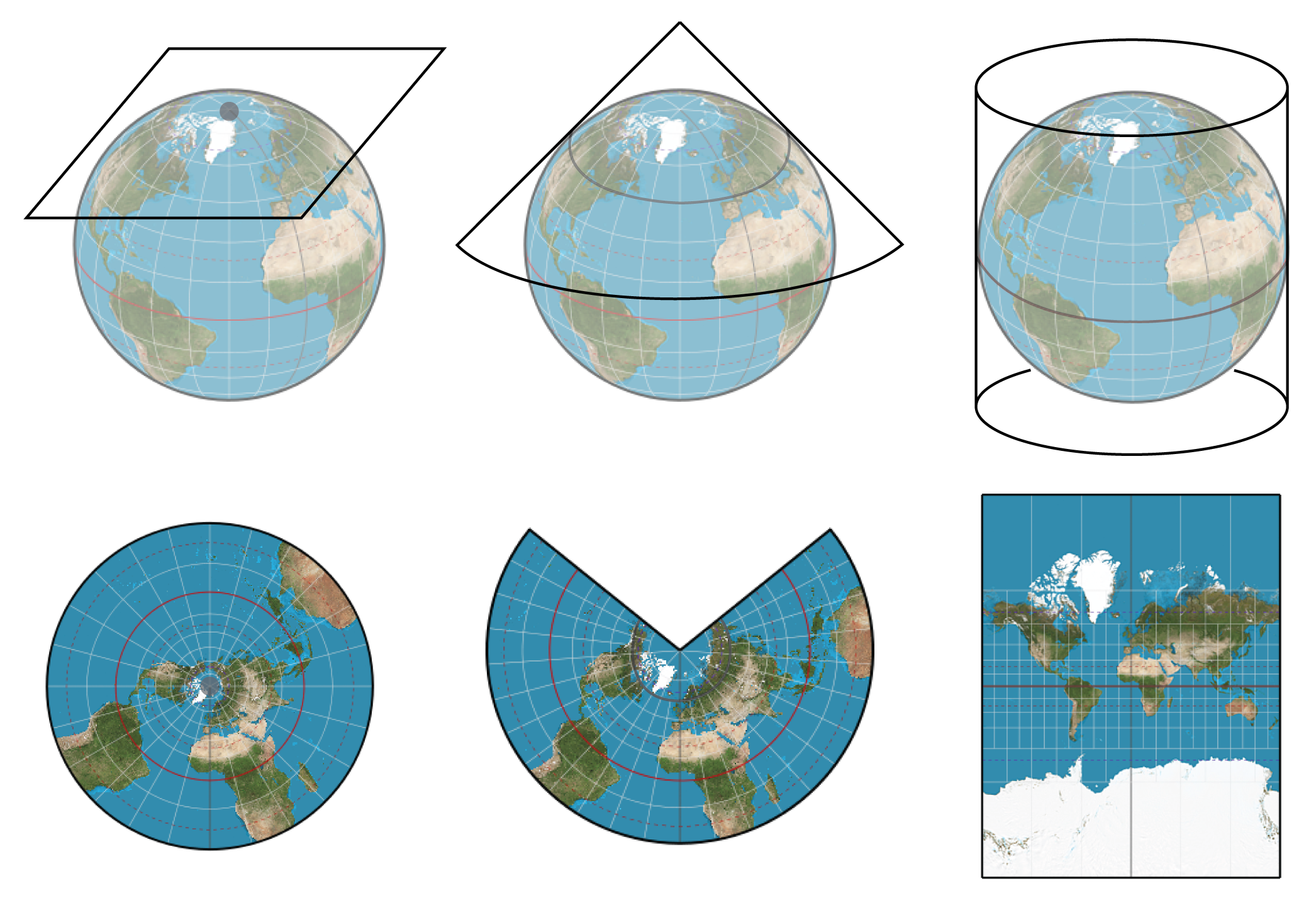
Forget what's its called but there's a couple different types of maps that scale continents differently. It has to do with styles of globes that carried over to written maps. Someone here made a post about it once
I believe the image in the OP tweet is the Mercator projection.
It is a great projection for its purpose. It wasn't meant to be used as an indicator of how big countries are. It is also why it is still in use for a lot of navigation services.I mean, yeah, it's the second largest continent. All projections are a lie, but the mercator one is pretty insidious in its lie.

Greenland:Drag Russia (or any other country) around on this world map to see its true relative size:
Compare Countries With This Simple Tool
Drag and drop countries around the map to compare their relative size. Is Greenland really as big as all of Africa? You may be surprised at what you find! A great tool for educators.thetruesize.com

Oh yeah, don't get me wrong, different projections have different utilities. It's just not the best map for the classrooms imo.It is a great projection for its purpose. It wasn't meant to be used as an indicator of how big countries are. It is also why it is still in use for a lot of navigation services.
Um. What. Is this real? My life is a lieThis twitter thread is making me go what the fuck in real time,whats real anymore lol
Drag Russia (or any other country) around on this world map to see its true relative size:
Compare Countries With This Simple Tool
Drag and drop countries around the map to compare their relative size. Is Greenland really as big as all of Africa? You may be surprised at what you find! A great tool for educators.thetruesize.com
That is a really cool map, thanks!
Jfc I stared at that tweet for 5 min reading it as "perception of war".
With that, this is crazy. I never realized the size diff.
With that, this is crazy. I never realized the size diff.
I mean, that's basic geometry, isn't it? The length of latitudes increases the closer you get to the equator. Spheres are widest at their center, narrower near the poles. Is this not taught in high school?

It's called Projection, the term coming from how maps could be made by literally projecting the shadows of a globe onto a piece of paper. How the paper was held against the globe determined what it would be focusing on, with the stuff closer to touching the globe being most accurate. Shape, distance, and area get distorted the further away from that focal point you get.Forget what's its called but there's a couple different types of maps that scale continents differently. It has to do with styles of globes that carried over to written maps. Someone here made a post about it once
People complain a lot about American transit systems, but France and Germany for example are roughly the size of Texas. You can put like roughly two Texas landmasses from Seattle to Texas. There is so much space in the U.S, of course its harder for infrastructure to get off the ground.
US also doesn't have good transit inside most of their cities.
Also, China seems to be the king of trains right now, they would face similar issues.
My understanding is basically that when you take the 3D Earth and turn it into a 2D image, the size or the shape have to be fucked up, and often we've tended more towards retaining the shape. The big tell usually mentioned is that Greenland is nowhere close to the size of Africa, but a lot of popular map projections will have them basically the same.
The Mercator projection is good for navigation, but something like Gall-Peters would be better for instruction.My understanding is basically that when you take the 3D Earth and turn it into a 2D image, the size or the shape have to be fucked up, and often we've tended more towards retaining the shape. The big tell usually mentioned is that Greenland is nowhere close to the size of Africa, but a lot of popular map projections will have them basically the same.

More emphasis on the limitations of Mercator's projection (and 2D projections) in general shouls be put when teaching geography.
How small Europe as actually is always gets me. It's tiny. I think learning European history makes it sound much larger than it actually is. You're talking about empires spanning multiple regions, languages, and people. World Wars that involve dozens of nations. But really you can fit most of that history in the land mass of the United States and all of it in Northern Africa with plenty of space left over.
It's small but the diversity of countries and climates is virtually unmatchedHow small Europe as actually is always gets me. It's tiny. I think learning European history makes it sound much larger than it actually is. You're talking about empires spanning multiple regions, languages, and people. World Wars that involve dozens of nations. But really you can fit most of that history in the land mass of the United States and all of it in Northern Africa with plenty of space left over.
It's small but the diversity of countries and climates is virtually unmatched
Except, you know, in Africa or Asia or... this is a very Eurocentric comment to make.
It's small but the diversity of countries and climates is virtually unmatched
It is diverse although I think many would argue that it is unmatched. The US has forest, mountains, deserts, grasslands, etc. China also has a diverse range of landscapes. Frankly the viewpoint that Europe is unmatched in diversity would only come from a very Euro-centric perspective. I've met people who are so profoundly different culturally despite having come from the same country. Different dialects or languages, different foods, different customs, and appearances.
So I've heard the stuff about Mercator being awful for size comparisons, Africa being deceptively large, etc., but one thing I'd never put together until seeing the light blue/dark blue map up above is that Alaska isn't nearly as big as I'd always been told. Back in elementary school it was common knowledge that Alaska was the size of the lower 48 put together, but apparently it's only about 20% of the area (663k vs 3.1m square miles). Still over twice as big as Texas, though.
So I've heard the stuff about Mercator being awful for size comparisons, Africa being deceptively large, etc., but one thing I'd never put together until seeing the light blue/dark blue map up above is that Alaska isn't nearly as big as I'd always been told. Back in elementary school it was common knowledge that Alaska was the size of the lower 48 put together, but apparently it's only about 20% of the area (663k vs 3.1m square miles). Still over twice as big as Texas, though.
I never once heard some say that Alaska was the size of the lower 48. Everyone knew it was the largest state but no one said it was bigger than the rest of the entire country.
I mean this has been very well known for literally decades (or even centuries, depending on how you count).
Also, when you look at China on the map, it looks quite a bit smaller vs what it is, ie quite a bit larger vs US and basically equivalent to top portion of African continent.
Also, when you look at China on the map, it looks quite a bit smaller vs what it is, ie quite a bit larger vs US and basically equivalent to top portion of African continent.
People complain a lot about American transit systems, but France and Germany for example are roughly the size of Texas. You can put like roughly two Texas land masses from Seattle to Texas. There is so much space in the U.S, of course its harder for infrastructure to get off the ground.
I'll bet this would tie in really well with the discussions we have here sometimes about the number of cars in the U.S. It would certainly help me understand how some people find it odd that everyone has a car. Even if we had public transportation here, it would take centuries to grocery shop where I live. Automobiles of some kind, preferably personal are of humongous utility.
To be fair part of US issue is shitty zoning. Outside countryside, you could have neighborhood grocery stores almost anywhere and be within easy transport distance sans cars. However, due to the zoning laws in majority of US, that's simply not possible.I'll bet this would tie in really well with the discussions we have here sometimes about the number of cars in the U.S. It would certainly help me understand how some people find it odd that everyone has a car. Even if we had public transportation here, it would take centuries to grocery shop where I live. Automobiles of some kind, preferably personal are of humongous utility.

It's small but the diversity of countries and climates is virtually unmatched
Do you realise how diverse Africa is?
Just black people right? /s
Totally off topic, but I always find it fascinating how people hand wave whole continents of people away due to a lack of familiarity. Not event from an ethnicity perspective from a political diversity perspective like in Africa which is 27 very different countries with vastly different histories and domestic and international challenges. I hope they mean well, but, ugh.
I said in terms of countries(/political systems) and climates, not ethnicities
I said in terms of countries(/political systems) and climates, not ethnicities
You know it snows in Africa? And has more biomes than Europe unless I am missing the tropical and rainforests and extensive deserts.
But please, go on.