I wrote this post on Medium and wanted to share, in case it sparks discussion. I've quoted the full post here because I don't want to force people to redirect away from ERA to read. However, there's a link for those that might want to read the article with its original formatting.
Link to original Medium article
Notably, this regards something that I think is a significant issue with the player experience in Monster Hunter World. For me, it's a big turn off when it comes to playing the game, and why I'm always hesitant to recommend the game to new players without a caution that it's often, needlessly complicated and obtuse.
How do you feel about this? The impact of a usability issue tends to vary from player to player, are you happy to step around these problems, or do they meaningfully detract from your experience of the game?
Link to original Medium article
Notably, this regards something that I think is a significant issue with the player experience in Monster Hunter World. For me, it's a big turn off when it comes to playing the game, and why I'm always hesitant to recommend the game to new players without a caution that it's often, needlessly complicated and obtuse.
Critical Failings of Monster Hunter World's Early Player Experience
For many, Monster Hunter World offers an enticing gameplay experience. A compelling gameplay loop, coupled with a robust combat system that's simply unrivalled. However, like a delicious cake with a stale crust, Monster Hunter World also presents a significant number of barriers to reaching that experience.
Before criticising the player experience, it's important to understand the games' design intent. If navigating the interface was an intended source of challenge, then critiquing seemingly counterintuitive interfaces may be unwarranted. This may sound usual, but it's not uncommon for games to feature this type of design. Games like Exapunks feature complex interfaces, filled with jargon and mechanics that the player is unlikely to intuitively understand. Yet it's the design intent that players spend time learning how these work, and stripping away this complexity would subsequently harm the games core design.
However, this isn't the case for Monster Hunter World. The design intent is clearly focused around it's combat and RPG systems — using a wide variety of weapons, armour and tools to fight giant dinosaur like monsters, only to upgrade your weapons, armour and tools to fight stronger and stronger monsters. The intended source of challenge stems from the moment to moment combat mechanics, and how the player choses to prepare and strategise for each fight. Issues with learnability or understandability that detract from this experience, act as barriers to the design intent and harm the player experience.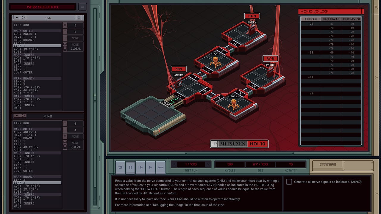
Exapunk's interface is intentionally complex, yet developing a gradual understanding of it is core to the design intent
With this criteria in mind, Monster Hunter World features numerous usability issues that present a barrier to the intended player experience. I want to highlight these with this article, as well as discuss the impact these issues are likely to have and how they may be addressed.
Information Overload
Something that players are likely to notice early on in Monster Hunter World, is that the game seems to have a lot of information that it wants to teach. The first time player experience is front-loaded with instructions for the player to take in.
Every time the player approaches a new non-player character, the game presents an additional set of instructions for the player to parse. Every time the game does this, the player must add new information to their mental model of the game. Because of the frequency with which the game presents this type of information to players, this can become very demanding on the players cognitive load. Just as the player is exposed to one complicated system or mechanic, the game presents another for the player to process.
It simply doesn't give the player the time to consolidate the information it provides, demanding that the player update their mental model of the game before they've even fully understood how the previous piece of information fits in. You're told about the armoury but it's likely that before you've even explored this interface properly, you'll also be informed about the canteen, the research centre, several different types of quest, and multiplayer.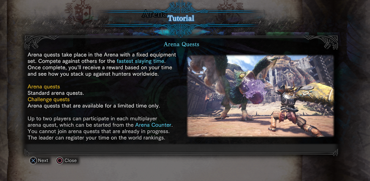
This is just one of many tutorial screens in Monster Hunter World. Many of these panels feature multiple pages of information for the player to read
Consequentially, players are likely to feel overwhelmed by the amount of information they're being asked to process. As a result, the player is likely to seek a means out of this uncomfortable scenario, which lead to players skipping tutorial instructions. This alleviates the moment to moment sense of confusion, but likely results in long-term issues with the players understanding of core gameplay systems.
Additionally, much of the information that the game pelts the player with feels as though it exists as a means of compensating the unintuitive interaction design (discussed later). If customising the radial menu wasn't an exhaustive six-step process, then it may not require as extensive instruction to support the players understanding.
Suggestions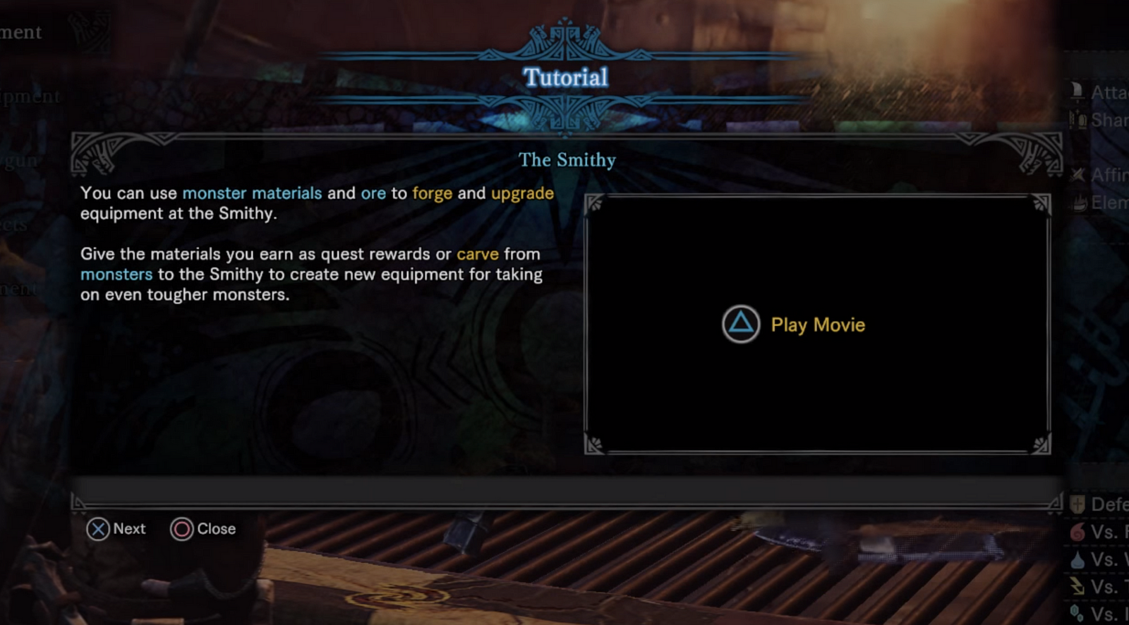
Should players need two paragraphs of instructional text and a tutorial movie to understand the crafting station?
Reliance on Memory
- Seek ways to minimise tutorial content in the early game experience. Which information is crucial for the player to understand?
- Tutorialisation can be replaced with a reliance on intuition, familiarity and feedback. Do players need any explicit tutorialisation for mechanics like the 'tent'? Could clear feedback about what happens when it's used teach the player how this system works?
- Consider how tutorial content can be paced more evenly throughout the game. At present the tutorial content is very heavy early on, overloading new players. Could some of this content be staggered further into the game?
Related to informational overload, the game also places a very high demand on the players memory. Everything that the game teaches you, you need to remember for later. For instance the opening tutorial to the camp, tells you about the tent, the item box, and other functions you can use. However, it's very possible that the player won't want to use these at that moment in time, and instead just run wilderness to track their monster.
The game expects the player to simply remember all of this information, so that they can review it later. However, the reality is that we simply don't work that way — human beings are not machines, we can't infinitely stack information and expect it to be easily recalled later.
In these instances, the player is likely to be unable to recall the information when they need it. For instance, a player might forget that they can use the item box to access more resources for a mission; this consequentially makes the mission much harder than it would otherwise be. The player is no longer experiencing the intended difficulty of Monster Hunter World.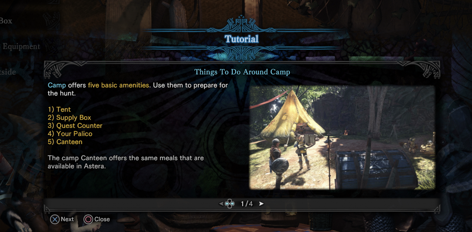
Monster Hunter chooses to provide new players with a list of 5 mechanics that they should remember for later, this informational panel is four pages long
Suggestions
Unclear Terminologies
- Where possible, Monster Hunter World should provide its tutorial information at the exact moment in time when the player needs it. The game shouldn't expect players to remember information about your gameplay systems for later, as they will most likely forget.
- As with reducing informational overload, the designers should consider means in which a reliance on explicit tutorialisation can be reduced by instead leveraging familiarity and feedback as teaching tools.
Monster Hunter World players are quickly introduced to a myriad of different terms pertaining to its various mechanics. Players that want to find the mechanic they're looking for need to understand the difference between terms like an investigation, and an assigned quest, or difference between the botanical researcher, and the ecological researcher.
It's easy to get confused by these terms as they closely interlink. The difference between the Smithy, and Amourer, requires that players understand that the Smithy crafts weapons and armour, and the Armourer sells weapons and armour. Assigned Quests and Investigation requires players understand that Assigned Quests advance the main story, and Investigations are side-content. Another game would label these main quests and side quests — a familiar term that players are likely to have a pre-existing understanding of — but Monster Hunter World chooses not to.
The naming conventions simply don't intuitively infer the function of each mechanic, and as a result, the player will need to build an understanding through association. This takes time, and players may find themselves getting confused during the early player experience — going to the wrong location, speaking to the wrong character, using the wrong system. This is likely to be frustrating, and harmful to the overall player experience.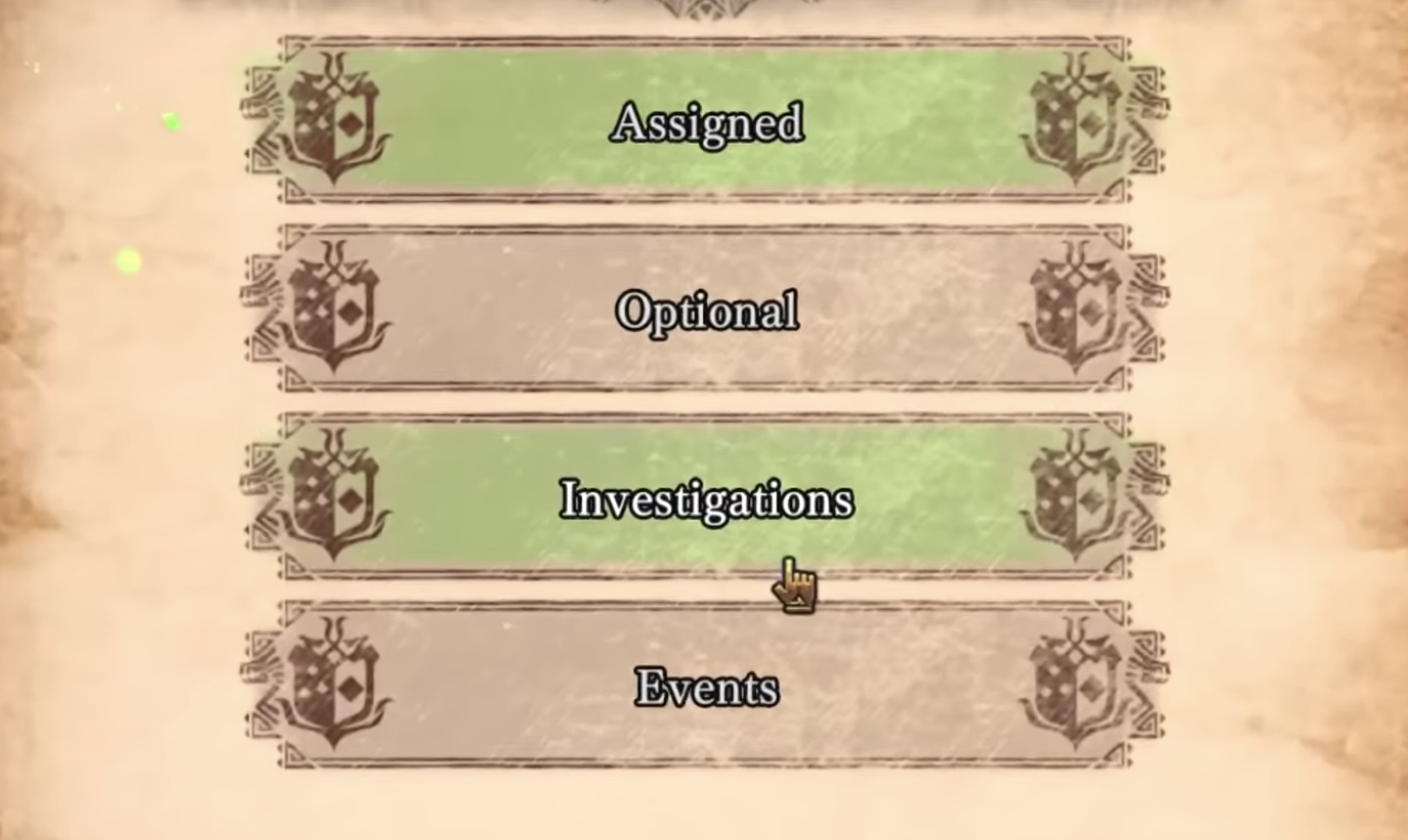
The player needs to juggle the difference between assigned quests, optional quests, investigations, and events.
Suggestions
Unintuitive Interaction Design
- Naming conventions should intend to intuitively suggest the function of the thing you're tying to use. For instance, if you intend to distinguish between the Smithy, and the Armoury, then labelling one as 'Crafting' and another as 'Shop' would logically communicate their function when they both exist in the context of the Blacksmith's building.
- Label systems in a way that's likely to be more familiar to players.Consider how other popular games label their systems, and what players are likely to have a pre-existing understanding of. For instance, could main story quests, simply be called story quests, or main quests?
- Could playtesting be used in order to determine how players might naturally label each system and mechanic? For instance, if a playtest reveals that players always describe 'Investigations' as 'Side quests' then this may be a naming convention that more intuitively aligns with the players mental model.
Monster Hunter World features a vast array of different systems, and many of these have their own interface. Not only does this mean that there's a greater reliance on the players memory, it's also the case that many of these systems are unintuitive, and difficult for new players to get to grips with.
This affects many core mechanics of the game, from the armory and smithy, to online lobbies and the quest board, but perhaps none are less intuitive than the radial menu. The radial menu's design intention is that it makes inventory management faster, allowing you to use items in the heat of battle, without opening up the full menu; however this is only achievable, if players can figure out how the menu works.
In order to successfully operate your own, custom radial menu, players must: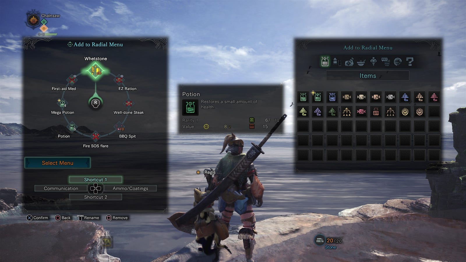
The multi-step process involved in getting the custom radial menu to work, is likely to confuse players
If the player misses out any one of these disjointed steps, the custom radial menu that the player attempted to use, won't be present. Defaulting back to one of the presets. This resulted in an incredibly large number of players assuming that this system simply wasn't functioning correctly.
- Open the item box
- Create a custom loadout
- Save and name it
- Open the radial menu
- Map items from the custom loadout to the menu
- Save it
A significant component of the issue is that the radial menu assumes that all players wanting to use the radial menu, also want to use custom item boxes and mission specific item-box loadouts. One doesn't work without the other, and unless the player understands and uses both systems, they don't work.
Players flooded forums to ask why the radial menu wouldn't save.
There are other examples of this type of issue in Monster Hunter World. Even creating a lobby to play with a friend is a complex, and convoluted process. In order to do so you must:
All the while ensuring that your aware of some bizarre circumstances in which a quest won't be playable in co-op. Such as if the host hasn't seen the quest cutscenes before.
- Go online
- Invite a friend
- Post a quest
- Get your friend to accept that quest
- Initiate the quest
As a consequence, it's often a laborious process to get everyone on the same page, and in the same lobby. Something that's simple in other games, becomes a high-workload task in Monster Hunter World. It's easy to see how this might act as a barrier to the design intent — with players experiencing difficulty playing the game with their friends.
Suggestions
Pervasive Barriers to the Design Intent
- How could the game scale down the complexity, and increase the intuitiveness of of these systems for new users. For instance, could the radial menu be setup to work with the default item box, without the need to save item loadouts if players didn't want to engage with the system in this much depth.
- Could a competitor analysis reveal means in which similar games have approached these or similar usability challenges? Sending an invitation to a friend in other cooperative games is as simple as clicking invite, then selecting a friend. Are there logistical reasons this cannot be the case in Monster Hunter World?
This only scratches the surface of Monster Hunter World's usability issues — these, and many similar issues present a significant barrier to the experience that the game designers sought for their players.
Players that can't invite their friend because they're struggling to understand the invitation system, are no longer experiencing the design intent. The same is true for a player that keep finding themselves interacting with the armorer, when they want the smithy, or the player that doesn't understand the why their radial menu items keep resetting to the default configuration.
When these issues are isolated, it's easy for players to ignore and compensate. If the player has to learn a counter-intuitive process for inviting a friend to a game, that's something they can work around. However, with Monster Hunter World these issues are much more frequent and pervasive than just one system. While fans have fallen in love with the gameplay and RPG systems, the usability issues surrounding them cause persistent friction, and persistently harms the player experience.
A lens on the player experience
Although I've provided numerous individual suggestions to some of the issues faced players of Monster Hunter World, the ultimate resolution has to stem from Capcom's design philosophy. Monster Hunter World was clearly developed by a team of phenomenal game designers, however; it's unfortunate that it has to be recognised as a great game, in spite of its very evident usability issues.
All of these which, could be remedied with greater focus on the player experience. A combination of diary studies and playtesting could be used to understand the issues that players currently face in Monster Hunter World. Further iterative usability playtesting, heuristic analysis and co-design with user researchers could be employed to ensure that the designs are more player friendly moving forward. Throughout the development lifecycle, these methods could be leveraged to improve the player experience in both Monster Hunter World, and the Monster Hunter series.
How do you feel about this? The impact of a usability issue tends to vary from player to player, are you happy to step around these problems, or do they meaningfully detract from your experience of the game?
Last edited: