Final Fantasy Main Menus
- Thread starter signal
- Start date
You are using an out of date browser. It may not display this or other websites correctly.
You should upgrade or use an alternative browser.
You should upgrade or use an alternative browser.
Nope! So it's still unconfirmed. But if (and let's be honest, when) it does happen, and if it's Virtuous who've done it, it'll be an interesting indicator of how long these things take!Nah first time hearing about this, did square release a statement at all about it after it was found?
Either way I'm hoping it's announced for next year.
nah, this is bad and aged poorly.
Yusuke Naora: "Kobe!" *nails the art style*Fun fact: The art director Yusuke Naora used these colors (which are also those of the airship) because he is a fan of the Los Angeles Lakers.
It's this, easily.
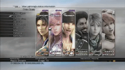
XIII had incredible menus that were easy to use and pleasing to the eyes with the little animations when opening a determined character being very sleek and cute.
I am also a bit biased towards XII menu becuase I love the more "somber" aesthetic.
XV, X and X-2 (cry) can kick rocks lmao, they look fan-made or like glorified placeholders even at release.
I am also a bit biased towards XII menu becuase I love the more "somber" aesthetic.
XV, X and X-2 (cry) can kick rocks lmao, they look fan-made or like glorified placeholders even at release.
I hadn't played XV in about 2 or more years so I booted it up recently after the hype of it being 60fps on nextgen. The menus were somewhat convoluted for the weapon switching and clothing switching and the categories. I definitely forgot how to use it.
I always think back to VII or XIIIs systems being really simple.
I always think back to VII or XIIIs systems being really simple.
This reminds me of early 2000s DVD menu, lol. It's overkill but I liked it.
I remember being super impressed by the menus when I first played XIII. Hah.
The XIII menu reminds me of how much i like Lightning CGI model in that game, i wish they hadn't of changed it, she looks amazing.
FFVII for nostalgia, FFXII for ease of use, FFXIII for style.
I loved the short cutscene clips! It also felt really snappy, so I never found that it caused much delay going through menus.
I loved the short cutscene clips! It also felt really snappy, so I never found that it caused much delay going through menus.
I have a soft spot for the blue menus. I love them for Deep Dungeon in FF14.
I wish the rest of the menus could be that colour....
I'm pretty sure Yoship has said that they are working on a classic blue UI theme.
I know that it's not quite in the spirit of the thread, but I have to mention it:
Even as a kid, it always bothered me that Ⅷ has color banding in the menus.
I always thought it must have been an issue with the PC port and some obscure color format being used by the PSX which was not supported by 3D Accelerator cards on PCs at the time.
But no, it turned out to be like that everywhere. Why?
I cannot find references to this anywhere, where did you see that?I'm pretty sure Yoship has said that they are working on a classic blue UI theme.
FFVII. I liked the smooth blue gradient in a diagonal direction. It's the pinnacle of the classic FF menu style.
OP
OP
I kind of cheated in posting the HD remaster menu but yeah the original didn't eitherFFX is speacial bc It didn't have hand icon when choose menu unlike all main series game right

And nowdays I don't understand why FF10 not use hand icon LOLI kind of cheated in posting the HD remaster menu but yeah the original didn't either
From the OP's images, FF6, FF7 and FF7:R is good (with FF7:R obviously being better due to age).
All others literally spam you with numbers which don't seem that relevant for landing page when you open up the menu, or those fonts which are kinda hard to read sometimes.
All others literally spam you with numbers which don't seem that relevant for landing page when you open up the menu, or those fonts which are kinda hard to read sometimes.
XII is the sleekest and most immediately comprehensible so I think it's that
I know it originated the trope, but I think the original VII menu has been tarnished by all the bad RPG Maker games that use the exact same menu format, it makes it feel kind of low rent looking at it now, if you don't have nostalgia for it. I'm kind of surprised seeing people say VII's is the best, but I wonder if nostalgia and being in the right time/place when that game came out has something to do with it.
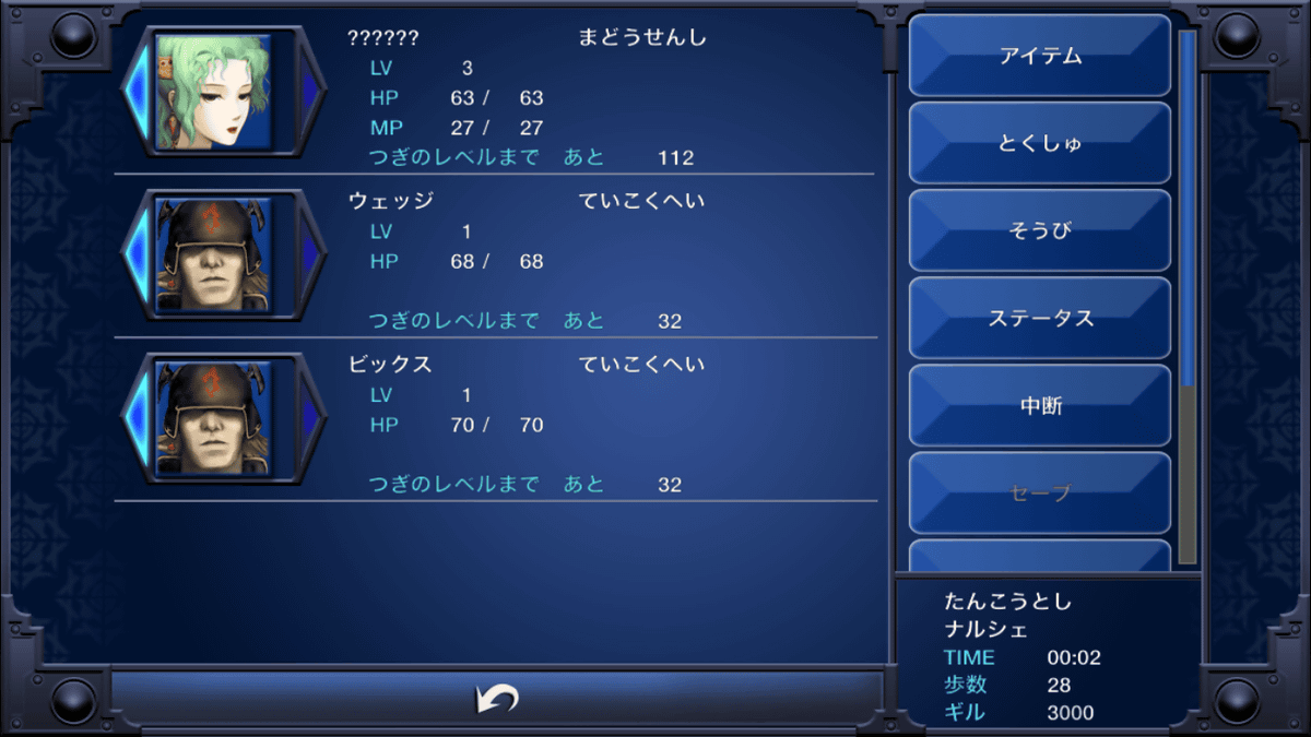
And that FFX menu's just awful, just feels like big overwhelming block of text without images or enough space to let anything breathe. It feels like it'd take just a bit too long to get to what I need while navigating that menu. FF1-6 menus feel a bit more simplified which I appreciate. There's a lot of information there still, but it feel manageable and well-spaced.
Note that I haven't played FFVII or FFX myself, but have absorbed a lot from those games just from cultural osmosis.
I know it originated the trope, but I think the original VII menu has been tarnished by all the bad RPG Maker games that use the exact same menu format, it makes it feel kind of low rent looking at it now, if you don't have nostalgia for it. I'm kind of surprised seeing people say VII's is the best, but I wonder if nostalgia and being in the right time/place when that game came out has something to do with it.
And that FFX menu's just awful, just feels like big overwhelming block of text without images or enough space to let anything breathe. It feels like it'd take just a bit too long to get to what I need while navigating that menu. FF1-6 menus feel a bit more simplified which I appreciate. There's a lot of information there still, but it feel manageable and well-spaced.
Note that I haven't played FFVII or FFX myself, but have absorbed a lot from those games just from cultural osmosis.
Last edited:
13 is the clear winner.
X-2 is quite good too, I just wish the font was a little more legible and stood out a bit. X is unique and XIIZA looks excellent but can be obnoxious to navigate sometimes, such as in the Gambit, Item and License Board menus which got on my nerves quite a bit.
X-2 is quite good too, I just wish the font was a little more legible and stood out a bit. X is unique and XIIZA looks excellent but can be obnoxious to navigate sometimes, such as in the Gambit, Item and License Board menus which got on my nerves quite a bit.
What am I looking at here
aaaaaaaaaaaaaaaaaaaaaaaaaaaaaaaaaaaaaaaaaaaaaaaaaaaaaaaaaaaaaaahhhhhhhhhhhhhhhhhhhhhhhhhhhhhhhhhhh
Work in-progress look at a new UI theme for XIV.
New (blue) UI theme for XIV.
There we go. The GOAT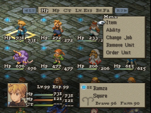
I can hear all of these pictures. Better add one more though at least.
This as well. Close runner up.