I deeply miss cel animation, sadder yet is even during this nostalgia boom it seems like no one is even trying to keep that look/feel alive.
- Thread starter Zutrax
- Start date
You are using an out of date browser. It may not display this or other websites correctly.
You should upgrade or use an alternative browser.
You should upgrade or use an alternative browser.
IMO, Daria looks really good on cells, in part because it has some of those cell imperfections that give it a certain look.
Daria season 4 and 5 went digital, and it looks sooooo much worse. In fact, on the DVD releases, you can even see some of the pixels (which are poorly filtered with a bilinear filter or something) when they zoom in on some shots.
It's the first and only time I noticed such a transition, from cell to digital, and it was harsh.
Edit: Captured some footage straight from my DVDs. Can you guess which ones were cells and which ones were digital? lol


(and one more image for good luck)
Daria season 4 and 5 went digital, and it looks sooooo much worse. In fact, on the DVD releases, you can even see some of the pixels (which are poorly filtered with a bilinear filter or something) when they zoom in on some shots.
It's the first and only time I noticed such a transition, from cell to digital, and it was harsh.
Edit: Captured some footage straight from my DVDs. Can you guess which ones were cells and which ones were digital? lol
(and one more image for good luck)
Last edited:
OP
OP
I'm a massive fan of animation in general, so don't get me wrong I think digital animation is extremely important and can look downright fantastic. Doesn't mean I don't miss the old styles though, it's not necessarily a one or the other situation, just a "why not both" kind of feeling.Digital 2D animation can look amazing, but it requires 1. A decent budget/production timeline, and 2. A talented studio working on it.


I miss the look of Disney's xerography animation. It just had such a unique look to the the way the characters moved.

Honestly, with how technology is marketed now adays I feel like hand drawn 2D animation (digital or otherwise) is likely to be used less and less based sheerly on the fact that people don't even know how to comprehend what they are looking at any more. The amount I see people whining about frame rates or prying through each frame and whining about smears, or line quality and other stupid shit like that and dismissing shows as low quality. People gauging the quality of a show off of how many over all cels are made. Akira had 160,000 cels so that makes it objectionably the best anime ever created!! Not the usage of the cels or motion. Just the amount.
Some of the best animators in the business get shit on for animation smears or dynamic poses, it's ridiculous. Like people hating on Hiroyuki Imaishi or Masaaki Yuasa for being sloppy and bad, like, what???
People's brains are poisoned, they think about everything in statistics and it's totally going to kill 2D animation.
Honestly, I'm waiting for someone to post some picture of Cel as a bad joke.
But when did Super start looking this good? I've watched the first 40 episodes or so and it looked absolutely awful?
Mid-way during the Universe Survival arc the quality increased mainly because an animator (who liked the old ways of drawing) got to do a number of episodes, he was later asked to help out with the Broly movie. Unfortunately I am unable to recall his name.
Cel animation isn't going to come back, outside of possibly small independent projects or big dumb stupidly expensive vanity projects, simply due to the economics involved. Especially not for TV animation, lol.
They can't quite match the feeling of cel animation yet, but studios have been making strides in getting there.
and hey, more modern anime still looks great in its own right
They can't quite match the feeling of cel animation yet, but studios have been making strides in getting there.
and hey, more modern anime still looks great in its own right
OP
OP
God you're so right it hurts.Honestly, with how technology is marketed now adays I feel like hand drawn 2D animation (digital or otherwise) is likely to be used less and less based sheerly on the fact that people don't even know how to comprehend what they are looking at any more. The amount I see people whining about frame rates or prying through each frame and whining about smears, or line quality and other stupid shit like that and dismissing shows as low quality. People gauging the quality of a show off of how many over all cels are made. Akira had 160,000 cels so that makes it objectionably the best anime ever created!! Not the usage of the cels or motion. Just the amount.
Some of the best animators in the business get shit on for animation smears or dynamic poses, it's ridiculous. Like people hating on Hiroyuki Imaishi or Masaaki Yuasa for being sloppy and bad, like, what???
People's brains are poisoned, they think about everything in statistics and it's totally going to kill 2D animation.
All you need to do is look at the discourse on the infamous Naruto vs Pein fight (which is a wonderful piece of kinect animation that I adore dearly) to see that people just plain don't appreciate this sort of thing en masse...
God you're so right it hurts.
All you need to do is look at the discourse on the infamous Naruto vs Pein fight (which is a wonderful piece of kinect animation that I adore dearly) to see that people just plain don't appreciate this sort of thing en masse...
The internet's reaction to the Pokemon Sun and Moon anime proves we didn't deserve it anyway.
OP
OP
This is another one that hurts, Sun and Moon looked so nice. It was pure energy in an otherwise very stale looking anime prior to it...The internet's reaction to the Pokemon Sun and Moon anime proves we didn't deserve it anyway.
I'm a massive fan of animation in general, so don't get me wrong I think digital animation is extremely important and can look downright fantastic. Doesn't mean I don't miss the old styles though, it's not necessarily a one or the other situation, just a "why not both" kind of feeling.
Yeah I feel you, seeing GIF's of things like Akira is always a reminder of how good things often were back in the 80's/ early 90s anime wise.
It's a shame good looking anime in general is still the exception rather than the norm, which is ironic considering the whole point of moving to digital.
OP
OP
Frankly, as bad as it seems, that has nothing to do with being animated on cels and more due to time/budgetary constraints and actual artist shortcuts. I still like the -look and feel- of the screen cap you posted regardless of the ridiculous artistry.It's a bit unfair to compare modern tv digital animation to stuff like Akira. A lot of 80s tv anime looked like this:
EDIT: Not really responding to anything in particular, just I think we tend to remember mostly the cream of the crop.
Yeah I feel you, seeing GIF's of things like Akira is always a reminder of how good things often were back in the 80's/ early 90s anime wise.
It's a shame good looking anime in general is still the exception rather than the norm, which is ironic considering the whole point of moving to digital.
The point was to save money, nothing more.
Frankly, as bad as it seems, that has nothing to do with being animated on cels and more due to time/budgetary constraints and actual artist shortcuts. I still like the -look and feel- of the screen cap you posted regardless of the ridiculous artistry.
RIght I don't disagree, I would love to see stuff with the old look too. i'm just referring to people talking about how anime doesn't look as good these days in general. That I strongly disagree with.
The point was to save money, nothing more.
RIght I don't disagree, I would love to see stuff with the old look too. i'm just referring to people talking about how anime doesn't look as good these days in general. That I strongly disagree with.
A lot of people do conflate OVAs with anime as a whole in the 80s and early 90s, yeah.
DYRL looks amazing, sure, but Macross the show was more or less on this level most of the time:
and occasionally like this
I want to say that what Megalo Box did is straight up nonsense. It doesn't look like cel animation, and it's not trying to catpure the look of cel animation. It's trying to inexplicably capture the look of early 2000s digital anime which were finished in SD and then upscaled to HD. Because that's what Megalo Box. A digital animation that was rendered in 480p.The closest we've gotten is Megalo Box, which attempts to look like cel, but it's digital with some filters. It looks okay but it really doesn't quite hit it right.
p.s. traditional, actually hand-drawn animation on paper and cels is an expensive and laborious endeavor. It's the opposite of making something like Shovel Knight.
Last edited:
Is it not possible to reproduce this look with digital tools? Similar to what DP Steve Yedlin did in Knives Out and The Last Jedi?
I'd love some modern day cel animated projects, but I don't have any interest in keeping the look through filters.
Oh so that's why that show looks as hideous as it does. Some garish filter has been slathered all over the picture. When I see people posting pictures of Super as an example of a good looking a show I'm always left confsued.The episode where Dragon Ball Super switched over from standard digital to the new filter also allowed a peek into it as the episode preview beforehand hadn't been filtered yet, giving you a look at before and after:


It's sad that cel animation reached its technical apex with Akira 30 years ago, but it's also wonderful that we got at least one example of the art form with a practically unlimited budget and the greatest talent being involved.
A lot of people do conflate OVAs with anime as a whole in the 80s and early 90s, yeah.
DYRL looks amazing, sure, but Macross the show was more or less on this level most of the time:
and occasionally like this
There were scenes in that show where the animation literally just stops and they have uncoloured keyframes. It's glorious.
the movie looks so incredible it's like a completely different show.
OP
OP
I actually agree with all of this, early 2000's digital might be the ugliest animation has ever been.I want to say that what Megalo Box did is straight up idiotic. It doesn't look like cel animation, and it's not trying to catpure the look of cel animation. It's trying to inexplicably capture the look of early 2000s digital anime which were finished in SD and then upscaled to HD. Because that's what Megalo Box. A digital animation that was rendered in 480p.
p.s. traditional, actually hand-drawn animation on paper and cels is an expensive and laborious endeavor. It's the opposite of making something like Shovel Knight.
And don't get me wrong, I am definitely not trying to coorelate the equivalence of Shovel Knights sprite look with cel animation, I'm very aware how expensive cel animating is and how designing a game with sprites is actually more cost effective in general and not nearly as hard. I was more equating the idea that nostalgia is there for everything, so you'd think the passion would lie here too.
The better equivalence would be my statement in the OP on how Studio Laika persists with Stop Motion animation in the way it does, despite it being labor intensive and really doesn't quite make the money back it should be. But the passion is there, so they do it.
I think some of the recent modern digital filters being implemented do help recapture some of the richness and depth lost in the shift to digital, specifically for shows/movies on a budget or with lesser staff. The often poor quality of digital scene composition had also been a key factor in making lower budget/lesser anime look substantially worse than they should.
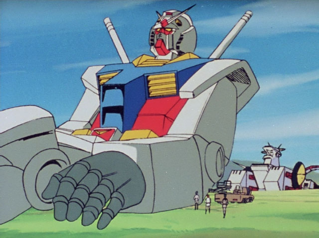
Using that Gundam shot posted earlier, like yeah that's clearly a "budget" shot with lower quality technical art, but it still has a better feel to it than some of the really bad digital shots out there that you could pull where characters and objects appear to not even mesh with the background and scene correctly, and the backgrounds look like some stock shit pulled from a program.
Using that Gundam shot posted earlier, like yeah that's clearly a "budget" shot with lower quality technical art, but it still has a better feel to it than some of the really bad digital shots out there that you could pull where characters and objects appear to not even mesh with the background and scene correctly, and the backgrounds look like some stock shit pulled from a program.
If you've seen how dreadful it looked prior to the switch, you'd understand why lol. The the general quality of art, animation, etc., did also get a bump at that time as well, but yeah it's still not a great looking show.Oh so that's why that show looks as hideous as it does. Some garish filter has been slathered all over the picture. When I see people posting pictures of Super as an example of a good looking a show I'm always left confsued.
OP
OP
1st and 3rd image are obviously on cel.IMO, Daria looks really good on cells, in part because it has some of those cell imperfections that give it a certain look.
Daria season 4 and 5 went digital, and it looks sooooo much worse. In fact, on the DVD releases, you can even see some of the pixels (which are poorly filtered with a bilinear filter or something) when they zoom in on some shots.
It's the first and only time I noticed such a transition, from cell to digital, and it was harsh.
Edit: Captured some footage straight from my DVDs. Can you guess which ones were cells and which ones were digital? lol
(and one more image for good luck)
2nd and 4th belong in the garbage, yikes. Look at that aliasing.
Because you're mistaking character design and cel animation ?
The examples you gave look virtually NOTHING like "the old school" dbz movies.


The grain, the coloring, the lines, the agressive bloom... Not to mention the over use of CGI (from models, to backgrounds which leads to the camera movement that you wouldn't see with cel).
Just because animators are drawing well or they use artificial line width doesn't mean it somehow is matching the old school cel animation.
I am not saying this is bad animation or "worse" btw, I'm just saying I disagree that this looks like old school. Besides character designs matching (which has nothing to do with this film as it happened in the regular DB super show as well), I'm not seeing it.
OP
OP
It's honestly what I've been doing the last few months...The silver lining when it comes to cel animation is that there's so much of it out there already, that nobody has time to watch all of it in one lifetime. You can ditch the new shows and find a classic you've never seen before.
I remember seeing stuff like Dexters Labratory, after growing up with TMNT, Hey Arthur and all that good stuff and... it looks just disgusting. Still does to this day. Go back to proper animation.
OP
OP
I'm not sure I understand what you're saying here. That you think Dexter's Lab looks disgusting? That you think cel animation looks disgusting? Or that you think when these shows transitioned to digital they look disgusting?I remember seeing stuff like Dexters Labratory, after growing up with TMNT, Hey Arthur and all that good stuff and... it looks just disgusting. Still does to this day. Go back to proper animation.
I think old (seasons 1 and 2) Dexter's Lab looked really good! The revival (seasons 3 and 4) of Dexter's Lab looked absolutely terrible!
OP
OP
Mank I'm not sure of, I'm mostly posting it for it's painstaking attempt at recreating that "look".Wait... Once Upon a Time in Hollywood and Mank were shot on 8/16mm? That doesn't sound right...
Once Upon a Time in Hollywood definitely had several specific scenes shot on a Super 8 and 16mm not the whole movie I believe, but Tarantino in general is a stickler for this stuff:
Here's an article going over some of it.
I must have seen the latter.. I mean the really cheaply made digitally animated stuff that is super poor quality and has no warmth or charm whatsoever to it is just awful.I'm not sure I understand what you're saying here. That you think Dexter's Lab looks disgusting? That you think cel animation looks disgusting? Or that you think when these shows transitioned to digital they look disgusting?
I think old (seasons 1 and 2) Dexter's Lab looked really good! The revival (seasons 3 and 4) of Dexter's Lab looked absolutely terrible!
mmmthe movie looks so incredible it's like a completely different show.
DYRL still holds up.
Spoilers for the climax of SDF Macross I guess.
One of the nice parts about the push for HD is the remastering of old cel shows but with the original detail restored for modern displays. Check out the G Gundam remaster.
OP
OP
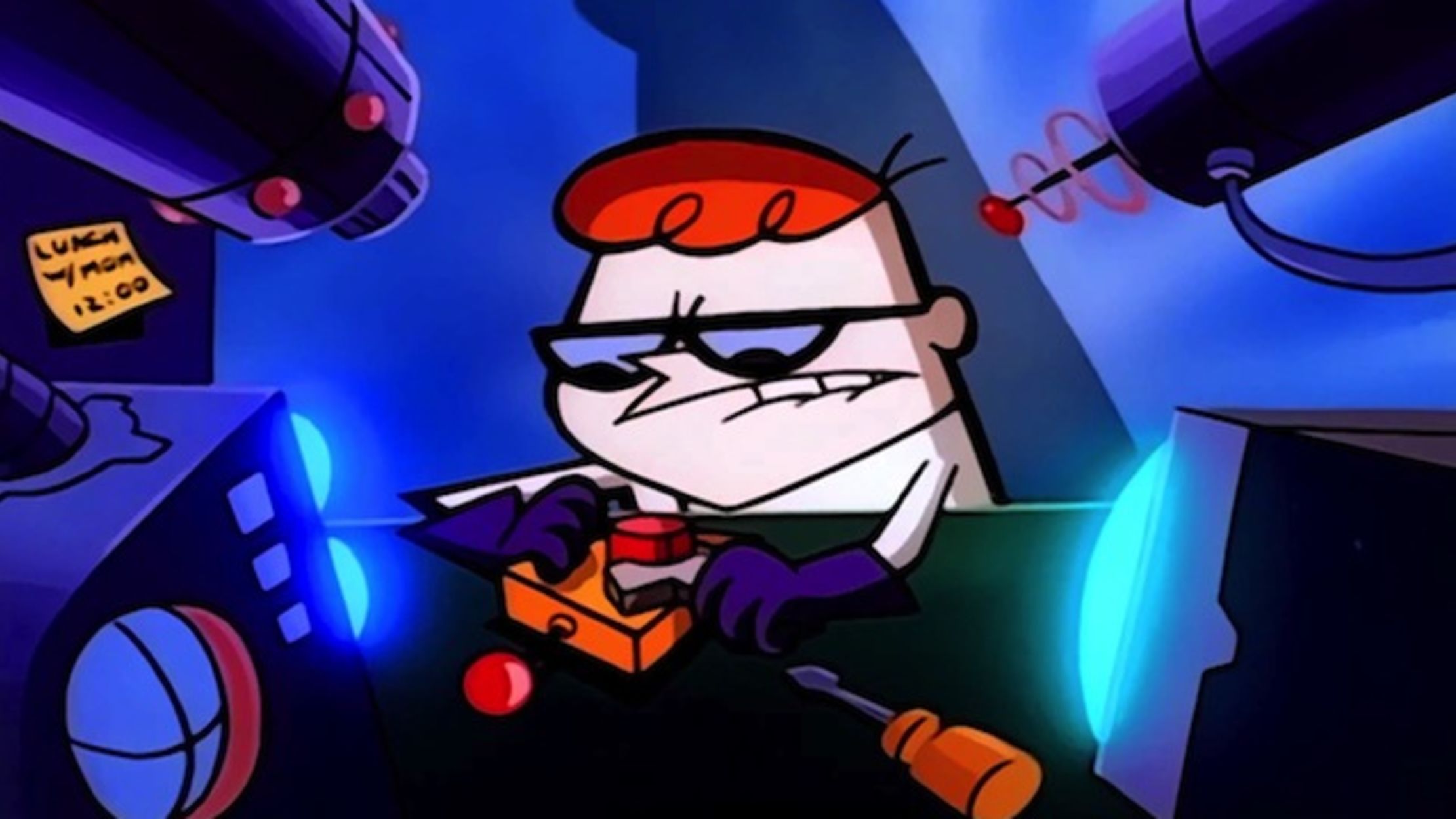
Yeah here's old Dexter's Lab:I must have seen the latter.. I mean the really cheaply made digitally animated stuff that is super poor quality and has no warmth or charm whatsoever to it is just awful.
Here's new:


OP
OP
mmm
DYRL still holds up.
Spoilers for the climax of SDF Macross I guess.
One of the nice parts about the push for HD is the remastering of old cel shows but with the original detail restored for modern displays. Check out the G Gundam remaster.
I just got done rewatching the entirety of G Gundam on the new blu-ray remasters, and they looks so fucking good. They've really been killing it with all these Gundam blu-ray releases I feel.
I think the passion for hand drawn stuff is there, just look at the success of Cuphead. The problem really is all in the cost. With hand-drawn 2D projects being so prohibitively expensive it prevents community projects, or independent content from taking off. There's also the fact nostalgic indie games can be sold and gain popularity as a finished product. Animation doesn't have that sort of outlet, artists either get picked up by a company willing to foot the bill, or stick to shorts for something like Youtube. Laika is a interesting studio, I believe one of the owners has a family that's independently wealthy. They don't have to worry about funding.I actually agree with all of this, early 2000's digital might be the ugliest animation has ever been.
And don't get me wrong, I am definitely not trying to coorelate the equivalence of Shovel Knights sprite look with cel animation, I'm very aware how expensive cel animating is and how designing a game with sprites is actually more cost effective in general and not nearly as hard. I was more equating the idea that nostalgia is there for everything, so you'd think the passion would lie here too.
The better equivalence would be my statement in the OP on how Studio Laika persists with Stop Motion animation in the way it does, despite it being labor intensive and really doesn't quite make the money back it should be. But the passion is there, so they do it.
Last edited:
Yes, one of the owners is the co-founders of NikeLaika is a interesting studio, I believe one of the owners has a family that's independently wealthy. They don't have to worry about funding.
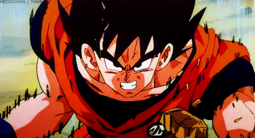
I get where the OP is coming from. Biggest thing for me these days is the coloring. Hand painted cels didn't have a 100% uniform color in the areas with the same color. Like the DBS Goku uniform vs some of the other DBZ shots above. The orange isn't 100% perfect all across the uniform in DBZ. Whereas in DBS, the color is put on perfectly. No changes in opacity because someone painted a little thicker in one spot vs another.
That leads into another thing with a lot of modern animation that bugs me — limited color pallets. Which I think is more a time/budget thing these days rather than a fault of digital animation.
That leads into another thing with a lot of modern animation that bugs me — limited color pallets. Which I think is more a time/budget thing these days rather than a fault of digital animation.
Ah yes that's right. Thanks for the reminder. I believe I was thinking of his son.
There may be a point where we can "fake" it again, but let me just say that, as an animator, I learned on traditional cels and I miss the craft, while also knowing if I had my own choice I'd stick with digital because it's just so much easier, cheaper, and convenient.
That said... traditional cel animation remains magical to me.


I think my biggest thing is cel-shading really seemed to do "atmosphere" better than digital often does. It takes more effort to match the inky feeling of the blacks, the pulsating glow of lights, the coarseness of paint and texture, etc.
But we're getting there.
That said... traditional cel animation remains magical to me.
I think my biggest thing is cel-shading really seemed to do "atmosphere" better than digital often does. It takes more effort to match the inky feeling of the blacks, the pulsating glow of lights, the coarseness of paint and texture, etc.
But we're getting there.
I miss the look of Disney's xerography animation. It just had such a unique look to the the way the characters moved.

Holy shit, I've found another person who loves the Xerox era too.
When it comes to traditional drawing, I find that the more you clean up the art, the more you lose things like suggestion and weight that either are just gone forever or, instead, must be made up for in other (admittedly less appealing) stylistic ways. There's a tangibility and a grit to the Old Men's sketches that makes these drawings so damn solid, so damn perfect, and for someone to come in behind them and clean them up with ink and paint removes the weight and feel. And to think Walt was about to let his company go under until they figured Xerox out, and that he hated it until the literal end of his days (whereupon he finally realized he had the wrong opinion). Thank you 101 Dalmatians.
Back more on the main topic though, it's ironic what I said above about, but I miss ink and paint as well. Sorry zoomers, but digital colors and physical colors do not look the same, nor do they act the same when either exposed to light or projected by light. That gives them a different look and feel. A bad drawing from an intern in Dragon Ball/Z will always look more pleasing and relaxing to the eye to me than the best drawing from a key animator you can pull from Super, simply because of the fact that the latter is made on the computer. And for some reason, no one has been able to, like, get a night scene to look good, with the way dark colors play off of each other. Think back to shit like old Initial D or Yu Yu Hakusho, and those rustic browns and blues. I can hear the jazz music playing in my head already.
This looks digital af. Just look at the backgrounds.


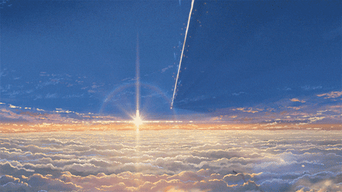
This is what stands out the most to me. Nothing glows quite like this anymore.There's quite a lot honestly, one of my favorite things about cel is just how "bright" and "glowy" lights look due to light effects just being a straight up real life glow of a lamp instead of emulated lighting. You get some really amazing effects like this:


But there's plenty of other stuff, like frames wobbling slightly, sharper line art, painted backgrouns, sometimes you get shadows under separate cel layers.
Another notable thing is just the tactile feel, you can see some grain, and sometimes even dust and hairs that get into the machinery. Some modern releases will try and "degrain" these sorts of effects from the transfers, so you may not see it and it kind of looks off in blu-ray releases for older stuff. I prefer to keep it as original as possible.
Huh, I figured the whole thing was shot on 35mm but I guess I shouldn't be surprised. I recall a lot of the flashback scenes in Django using 8mm with very "cheap" chemical development practices used to make it look distinct from the main timeline:Mank I'm not sure of, I'm mostly posting it for it's painstaking attempt at recreating that "look".
Once Upon a Time in Hollywood definitely had several specific scenes shot on a Super 8 and 16mm not the whole movie I believe, but Tarantino in general is a stickler for this stuff:
Here's an article going over some of it.
Beyond just the methods there are also some stand out styles of anime/manga that just seem impossible to bring back or reference anymore. You will see these collections and throw backs of old 16/8 bits with classic artstyles and the cover art will look like any given anime on TV this season. I'm thinking of the SNK collection, the Aleste collection, Langrisser, YuNo, Sakura Wars, etc. etc. etc. Everything is simple and flat. There seems like there is no nostalgia for that look, even in the output that would be hard to argue the expense angle.