EDIT 2: See threadmark "Its 99% official at this point"
EDIT:

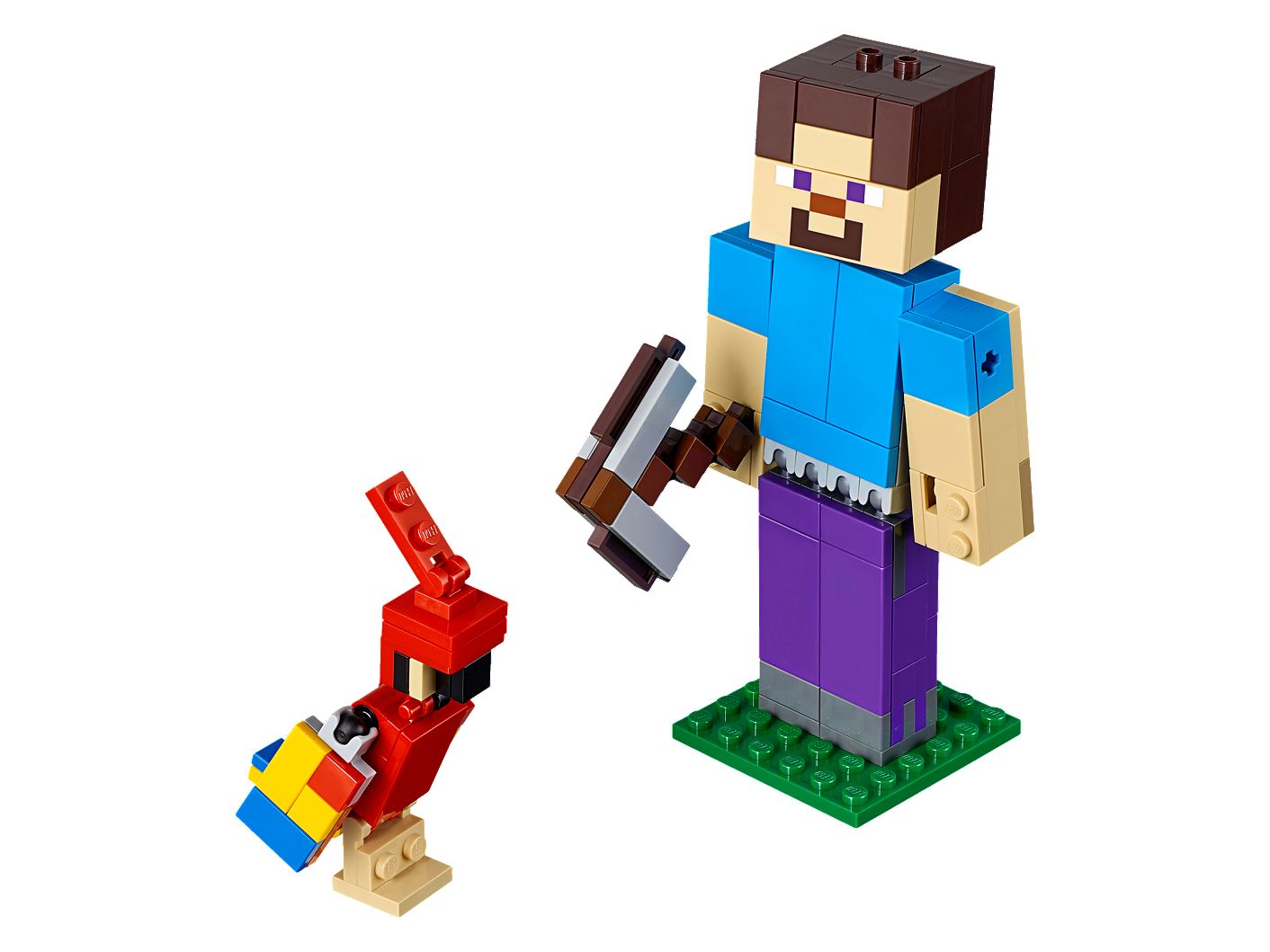
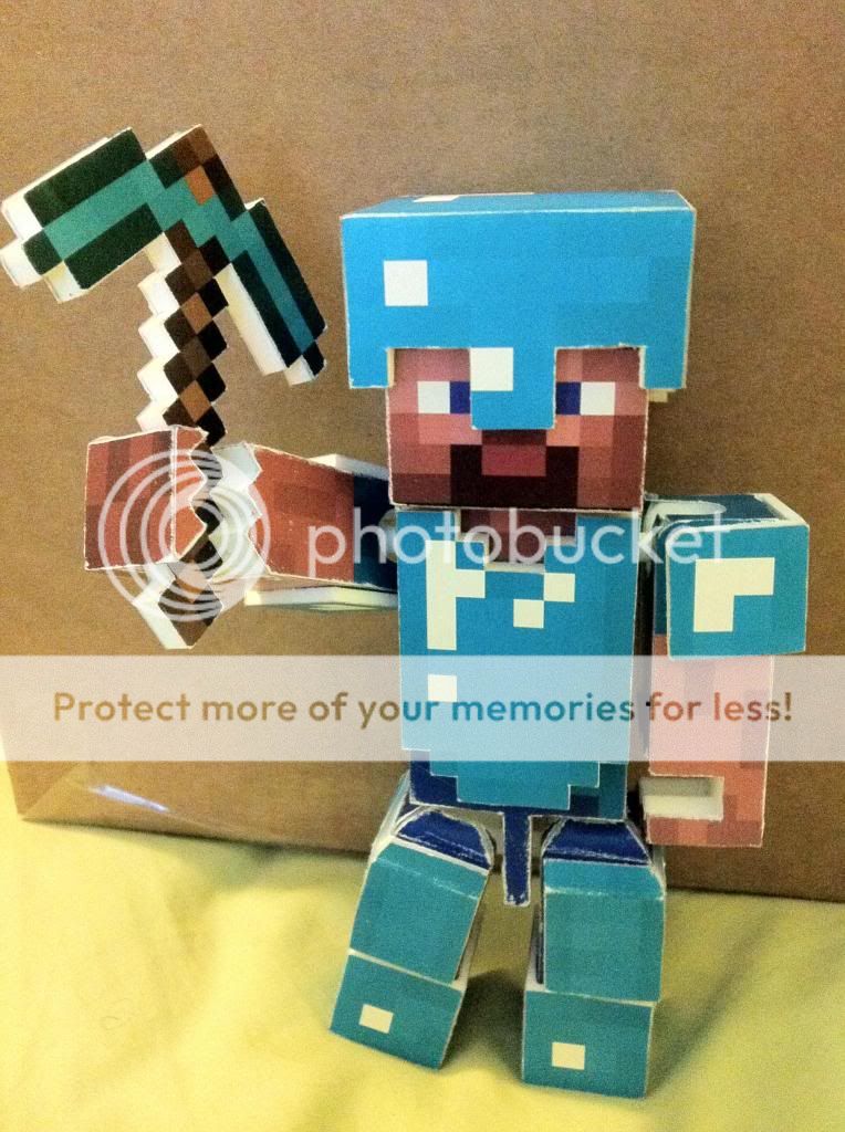
I love Minecraft. I've been playing nearly since it's existed, so it's a little strange to me that a lot of the older Era folk don't, or didn't know who Minecraft Steve was. He's the closest thing to a new Mario in the 2010's. Look at this iconic blockman.

Recently, Mojang were kind enough to introduce a friend for him, Alex. Here's a comparison.

This makes it easier to see the intent of the skin tones - Alex has lighter skin, while Steve has darker skin. Steve has lighter patches here and there, but the overwhelming majority of the coloring is a brownish color. And yet, in nearly every single product tie in, Steve's skin is whitewashed into this:


Why do the colors not more closely resemble this?
And I'm not referring to the lack of a pixelated texture over everything like it is in the game - the colors themselves are just wrong.
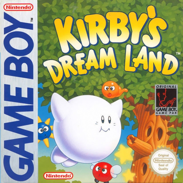
Here in the 3DS box art, they're portrayed as having the same skin tone as well. In isolation, you could chalk Steve's coloring up to the dramatic lighting, but again, using Alex as a point of comparison, he doesn't look right.

Though in the Switch box art, this is corrected to something more accurate looking, where Steve is darker toned than Alex. It still doesn't seem game accurate to me, but it's perhaps the lighting.

What gives? Is this an intentional whitewashing, or does Mojang not care about monitoring this stuff from their partners?
Is there a more whitewashed character in games?
EDIT:
I love Minecraft. I've been playing nearly since it's existed, so it's a little strange to me that a lot of the older Era folk don't, or didn't know who Minecraft Steve was. He's the closest thing to a new Mario in the 2010's. Look at this iconic blockman.
Recently, Mojang were kind enough to introduce a friend for him, Alex. Here's a comparison.
This makes it easier to see the intent of the skin tones - Alex has lighter skin, while Steve has darker skin. Steve has lighter patches here and there, but the overwhelming majority of the coloring is a brownish color. And yet, in nearly every single product tie in, Steve's skin is whitewashed into this:
Why do the colors not more closely resemble this?
And I'm not referring to the lack of a pixelated texture over everything like it is in the game - the colors themselves are just wrong.
Here in the 3DS box art, they're portrayed as having the same skin tone as well. In isolation, you could chalk Steve's coloring up to the dramatic lighting, but again, using Alex as a point of comparison, he doesn't look right.
Though in the Switch box art, this is corrected to something more accurate looking, where Steve is darker toned than Alex. It still doesn't seem game accurate to me, but it's perhaps the lighting.
What gives? Is this an intentional whitewashing, or does Mojang not care about monitoring this stuff from their partners?
Is there a more whitewashed character in games?
Last edited: