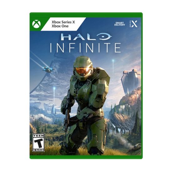
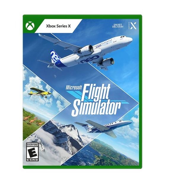
It seems like Microsoft updated the retail box art for Xbox games (Halo Infinite, Flight Simulator, & Forza Horizon 5, showcased)
- Thread starter Slash
- Start date
You are using an out of date browser. It may not display this or other websites correctly.
You should upgrade or use an alternative browser.
You should upgrade or use an alternative browser.
I don't think Smart Delivery has anything to do with Series S/X. It's about cross generational gameplay.
It's how I've witnessed network transfer working between the X and S as well as across then previous gen, though the migration from previous gen to the series x is how it was advertised.
Has nothing to do with cross-gen. It's literally a system that optimizes how SKU and assets are bundled so you download the best assets for your system. Smart delivery existed for Xbox one before series consoles were a thing.I don't think Smart Delivery has anything to do with Series S/X. It's about cross generational gameplay.
Forza Horizon 5 is using the same template
Whether is good or bad, it doesn't matter. They had to do it, because the way it is now is so confusing.
I believe they are also trying to prevent stupid lawsuits from all the confusion.
I believe they are also trying to prevent stupid lawsuits from all the confusion.
I like it better then the current one but Im still not a fan of the move to white. I guess from a marketing pov its smart to copy the market leader who already uses white but Im not a fan of the ps5 white or this white.
That big ass standard label needs to gtfo now thats ugly as hell
Has nothing to do with cross-gen. It's literally a system that optimizes how SKU and assets are bundled so you download the best assets for your system. Smart delivery existed for Xbox one before series consoles were a thing.
Does buying the physical edition also entitle you to the digital edition If not then why label a version of the game with a feature that you cant even make use of (unless they plan on releasing a series S with a disc drive).
Means it's using smart delivery system and if there's any higher spec or lower spec physical platform in the future, it'll automatically download the best assets *should they be available.Does buying the physical edition also entitle you to the digital edition If not then why label a version of the game with a feature that you cant even make use of (unless they plan on releasing a series S with a disc drive).
It's better but I hate that it's white. Probably for visibility but still. You get more real estate for the boxart, at least.
EDIT: They need to change the STANDARD label ffs. That is dumb. Just make it match up with the white area on the left side. It going all the way across and cutting through box art like that is UGLY.
EDIT: They need to change the STANDARD label ffs. That is dumb. Just make it match up with the white area on the left side. It going all the way across and cutting through box art like that is UGLY.
the white bg - black text seems really cheap somehow. like something done on paint
but i like the idea behind it and showing more cover art
but i like the idea behind it and showing more cover art
To increase visibility since they're not much different from the Xbox One/PS4 casesWhy is MS and Sony obsessed with that white banner at the top?
yupp, should've been green to match the logo bg.
The black on white stands out and that's what matters here. They need to make sure people see it is for Series X only and its pretty tough to not notice that.
They should move Master Chief a little to the left so we can see more of the Halo ring.
EDIT: I mean, move the background to the right.
The box art scans are coming out for games announced today and feature a new box art design for the Xbox Brand:


I like it, although I wish they would have started it when the Series launched.
I like it, although I wish they would have started it when the Series launched.
We'll this is the first Xbox series x exclusive physical game

The Flight Simulator Xbox preorder showcases a new box art design for Series X games
Thoughts on this design change?
 www.resetera.com
Not really, you can't buy a physical copy for the Series S, it's a digital console only.
EDIT: Oh, I think you meant about the Xbox One? This is for the Series X/S console only.
I appreciate this very much. Almost went full digital because of the original design which was horrible.
I'm joking. But I do like these much better
I'm joking. But I do like these much better
Haha really? Less than a year into the gen? I'm guessing they got complaints and confusion from ppl. It was a bad choice IMO, this looks ok. Not bad it's starting to grow on me