Let’s post old gimmick comic book covers
- Thread starter Bengraven
- Start date
You are using an out of date browser. It may not display this or other websites correctly.
You should upgrade or use an alternative browser.
You should upgrade or use an alternative browser.
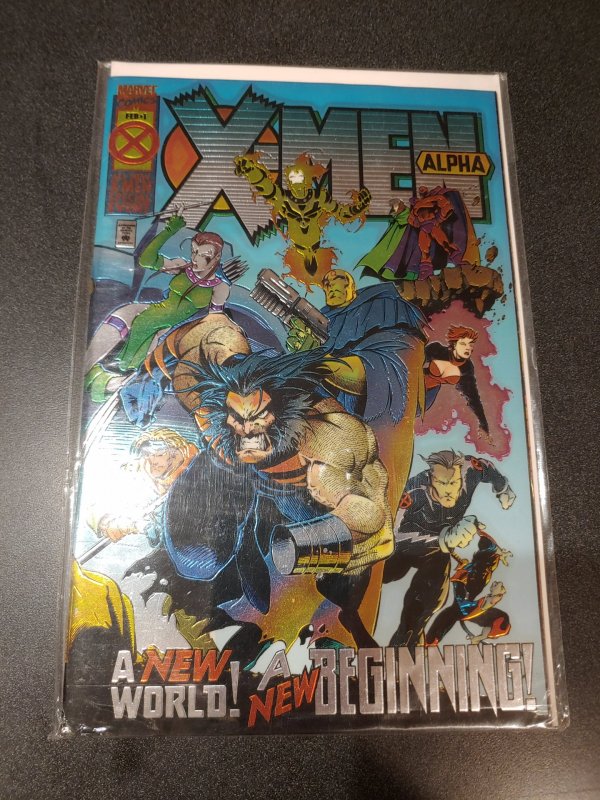


I started reading comics just a few months before these works of art.
I mean, I could and that's the point. There were a ton of them, so we likely never saw them all. I know people who are not aware of the laser cut bullet hole cover and I've never seen the thermal cover posted above.

I helped my uncle with the ordering because the printer at his house was shit and man alive, there were about a dozen #1's every single month.We should also talk about the habit of creating a million ew heroes so they could sell #1 issues during the 90s 'everything goes up in value!' craze

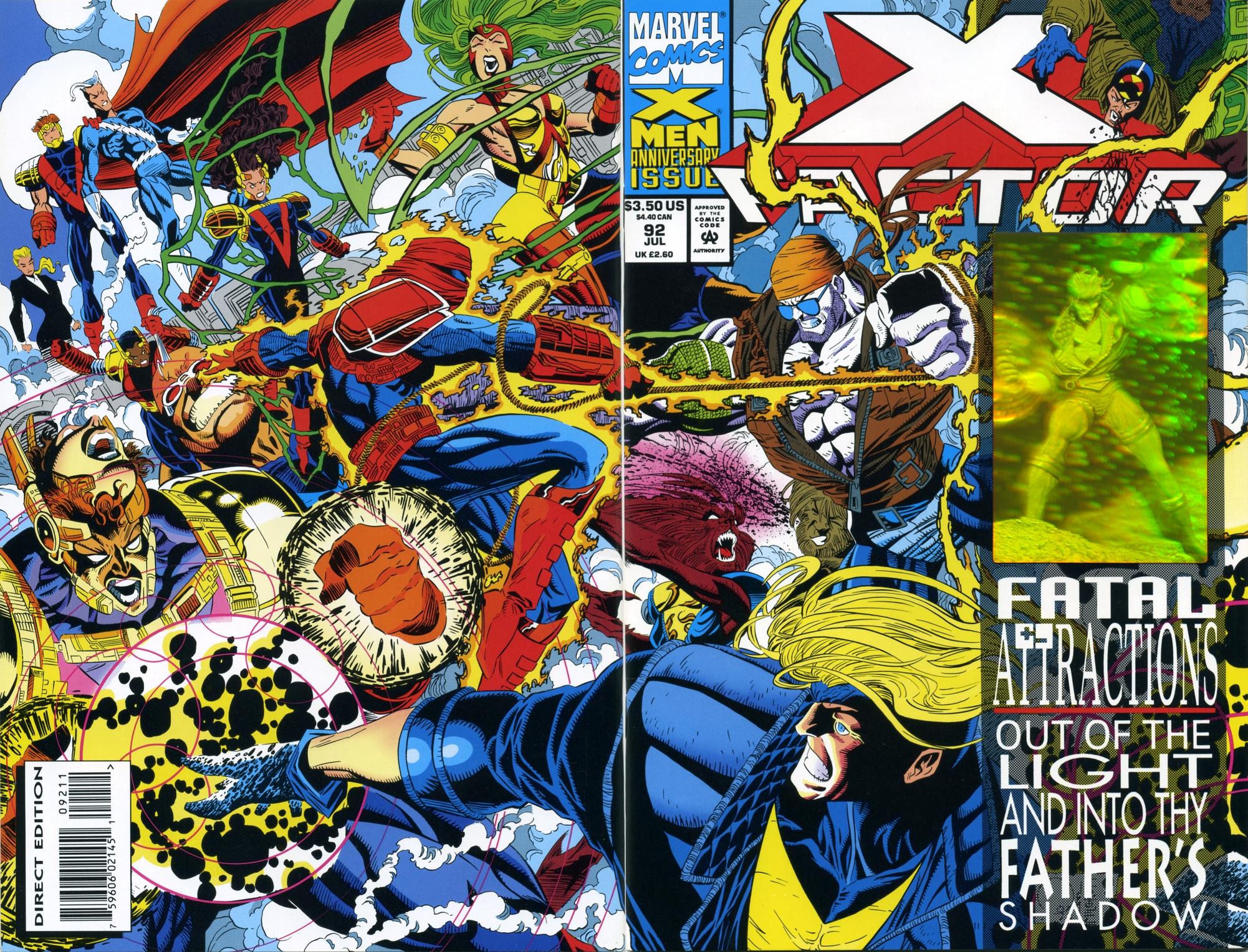
Chromium
I only bought comic books from like 1992-1993 but boy did I end up with a lot of this bullshit.

KISS had a comic in the late 70s that had the band's blood mixed into the ink.

The Gen 13 #1 variants. I remember scraping together like $15 when I was a broke ass little kid to get the Gen 13 Bunch one from my local comic shop thinking it'd be worth thousands some day
Chromium
I only bought comic books from like 1992-1993 but boy did I end up with a lot of this bullshit.
Still have this one! I think it's worth about $7.
Also the Chromium Magnus Robot Fighter issue!
That looks like Spidey faceplanted in the snow.Gotta love Amazing Spider-Man 400, which was a tombstone but the image was fucked:
i Loved the lingerie one!The Gen 13 #1 variants. I remember scraping together like $15 when I was a broke ass little kid to get the Gen 13 Bunch one from my local comic shop thinking it'd be worth thousands some day
i think it was the only time I paid more than cover price for variant covers lol
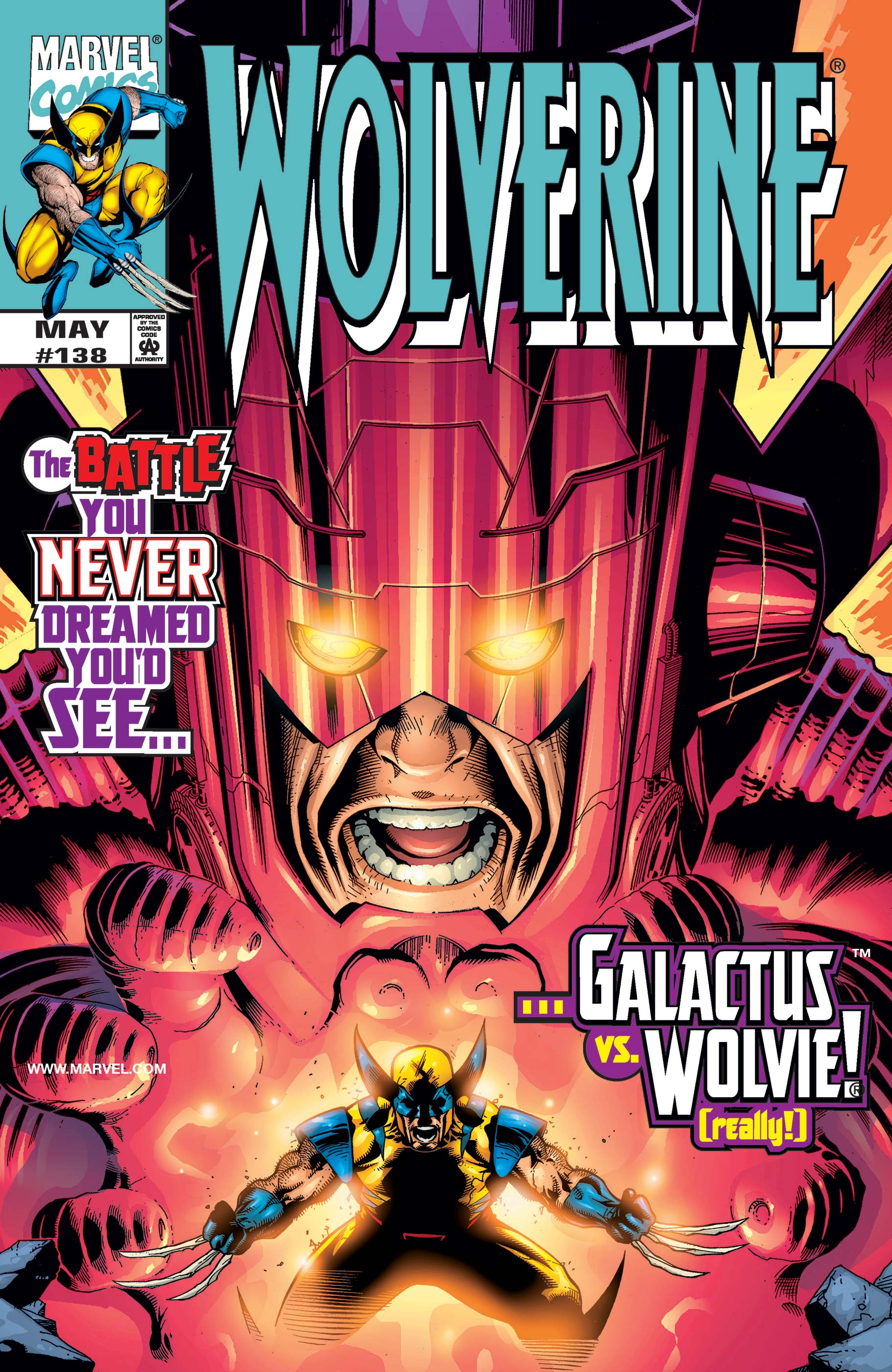
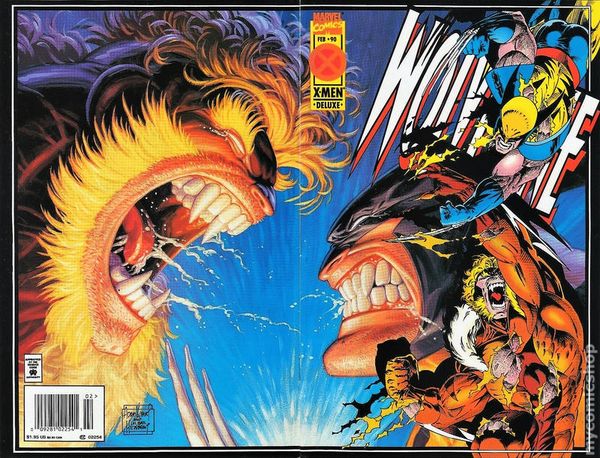
OutstandingSpeaking of Wolverine, I fucking loved this Adam Kundera and Hildebrandt Brothers mashup.
Still one of my favorite comics and inside, the ending was great.
What a great twist, because of the four, he seemed like the real deal when compared to Eradicator, Superboy, and Steel.
literally have this one lol (Stadium Comics)
"Spider-Man Saves Local Comic Store" cover. It was a variant cover depending on the comic store you picked it up at.

For a second, I thought this was a pile of cocaine.Gotta love Amazing Spider-Man 400, which was a tombstone but the image was fucked:

I've owned this since the day it came out, but I've never been sure, is there a story behind the cover? This couldn't have been the result they wanted when they designed it.Gotta love Amazing Spider-Man 400, which was a tombstone but the image was fucked:
These obnoxious sideways covers/panels. It happened often mostly in Liefeld books. This whole comic was sideways, ugh.
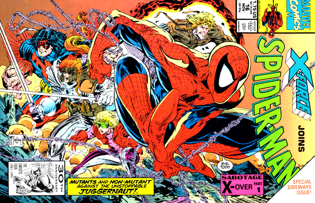
This is also the book where Juggernaut knocks over the World Trade Center buildings.
"Spider-Man Saves Local Comic Store" cover. It was a variant cover depending on the comic store you picked it up at.
These made a comeback recently. I know idea and dark horse did some where like Godzilla stepped on your comic book shop
I've owned this since the day it came out, but I've never been sure, is there a story behind the cover? This couldn't have been the result they wanted when they designed it.
Funny you should ask! So this came out during the Clone Saga and the Life of Reilly, which was a long ass essay that interviewed basically everyone involved, actually covered this:
Now, remember that gimmick cover for ASM #400? It was supposed to be a tombstone, featuring both the familiar ASM logo and a small Spider-Man figure engraved upon the face of the stone. I remember that this was the first gimmick cover that Bob had to oversee as Spider-Man EIC, and he was a little overwhelmed by it. I'm not sure if it was his idea to do this gimmick cover, of if it was an idea that was foisted upon him by our marketing department. I suspect it was the latter, because the marketing guys were obsessed with gimmick covers and used any excuse to do one, as often as possible. Well, the cover looked pretty good at the final stage, everything was readable and the engravings looked good. But when it finally saw print, the cover's engraving was so shallow and so faint that the cover was essentially unreadable. It looked like a dull gray, blank cover of... something. Not a success, to put it mildly. Thank goodness the story inside made up for it, proving the old adage that you can't judge a book by looking at the cover.
What a great twist, because of the four, he seemed like the real deal when compared to Eradicator, Superboy, and Steel.
I mean, as long as we're doing gimmick covers you gotta do the bestseller of the arc.

Last edited:
Ah yes I remember reading that now! That whole piece is a great read.Funny you should ask! So this came out during the Clone Saga and the Life of Reilly, which was a long ass essay that interviewed basically everyone involved, actually covered this:
Clone Saga is still a great idea to fix Spider-Man torpedo'd by fans unable to realize they'd get the best of both worlds out of it.
Something that would have totally worked in DC but never in Marvel is another way to put it.
Also the greatest era of spidey suits ever.
Something that would have totally worked in DC but never in Marvel is another way to put it.
Also the greatest era of spidey suits ever.
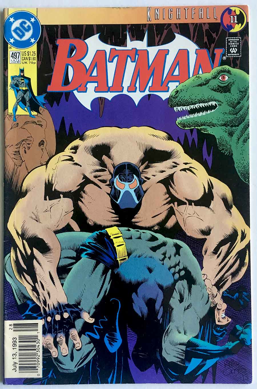
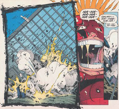
Superman #78, after his death you think he's back until you open it up and see this Terminator motherfucker smiling at ya.

I still feel kinda dumb for thinking he was the real Superman.
The devil horn on his brow probably shoulda tipped me off.
I still feel kinda dumb for thinking he was the real Superman.
The devil horn on his brow probably shoulda tipped me off.
I mean, it makes sense.
Superboy. No. Just no.
Eradicator. If you knew anything about his weird ass history then no, no fucking chance.
Steel. Actually a super great character and having the soul of Super Man isn't that far off, but its also the mid 90's and no fucking way.
Cyborg Super Man. I mean, he looks like Supes, but with some metal. And while he's acting a bit off its not that weird as he just died. Give him a break...
Yeah, I remember this crossover. Todd McFarlane did that ond & Liefeld did this-These obnoxious sideways covers/panels. It happened often mostly in Liefeld books. This whole comic was sideways, ugh.

Wasn't a fan of the sideways gimmick either.