Saw this chart making the rounds on Twitter, mostly cause of where the red areas are situated.
View: https://twitter.com/nsjersey/status/1642165562464673794?t=QAtPxmBxnxsFvKs0Ch8qLA&s=19
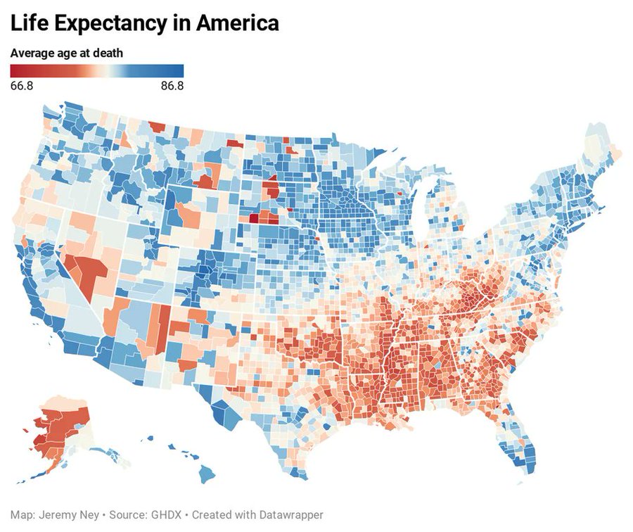
Chart comes from Jeremy Ney, who did a TED talk about where you live in the country determines your quality of life.
View: https://youtu.be/fvf1FrsB4Rw
View: https://twitter.com/nsjersey/status/1642165562464673794?t=QAtPxmBxnxsFvKs0Ch8qLA&s=19
Chart comes from Jeremy Ney, who did a TED talk about where you live in the country determines your quality of life.
View: https://youtu.be/fvf1FrsB4Rw