Enduin

You look 40
Member
Oct 25, 2017
11,590
New York
Looks pretty great for the most part. Some of the overall lighting choices make some scenes look a bit blown out and over exposed even if the original scenes were overly dark often times, but it's not too bad. Some of the touched up locations in ME1 look really amazing though. Feros and Noveria look so damn good. Citadel too.

Using the shitty vacuum sealed ME3 scientist outfit for Liara is definitely unfortunate. Always hated the look of those outfits throughout the series. Looked cheap and weird and then needlessly form fitting. Hopefully some good modders can create some complete replacement outfits and not just touch ups since they're just ugly across the board.
 

Deleted member 8579

Oct 26, 2017
33,843
Looks good for the most part but the lighting changes are quite stark and suck a bit of the atmosphere out in some of them.
 

hydruxo

▲ Legend ▲
Member
Oct 25, 2017
20,638
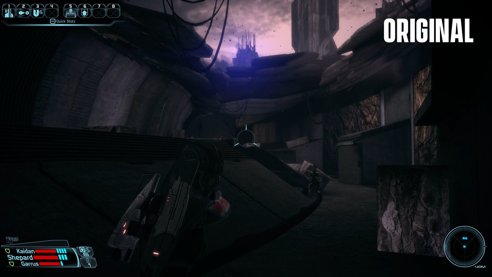
Maybe I'm just so used to the darker look of the original ME, but those environment comparison shots in some ways look like they're lacking in a lot of the atmosphere that the original had. Like, obviously there are a lot of upgrades with the new version and I'm definitely not going to say it looks worse because that'd be ridiculous, but I liked the darker look of the original. It's particularly noticeable in the blizzard shot where it's much more brighter now than before and as a result it looks sort of washed out.

Regardless, I'm getting this day one anyways and I'm sure when I'm actually playing it I won't really mind/notice. It's just sort of jarring when they're right next to each other. Characters look great minus the weird choice of tight fitting outfit for Liara.
 

AWizardDidIt

Member
Oct 28, 2017
1,461
Looks great, but I definitely see what people mean about the Liara thing.

They should have fixed that scientist outfit so it wasn't so "booby".
 
Oct 27, 2017
4,565
Man Suicide Mission is such an incredible song. I cant wait for this. Other than Andromeda, I haven't played Mass Effect since I 1k'ed ME3 back in 2012.
 

Kawngi

Prophet of Truth
Member
Oct 30, 2017
3,227
This will essentially be my first real experience with the series. So excited!
 

AllMight1

Member
Oct 27, 2017
4,759
It is my opinion that there's not a big jump on this remastered on terms of upgrades and modders have done waaaay better a lot of years ago, still, will get it on a big sale.
 

Soj

Member
Oct 27, 2017
10,804
Did someone accidentally hire Crowbcat to do their trailer?

7eRoeOa.png


lLdK5bD.png

It's like art direction has been toggled off in the settings.
 

HotHamBoy

Banned
Oct 27, 2017
16,423
Maybe I'm just so used to the darker look of the original ME, but those environment comparison shots in some ways look like they're lacking in a lot of the atmosphere that the original had. Like, obviously there are a lot of upgrades with the new version and I'm definitely not going to say it looks worse because that'd be ridiculous, but I liked the darker look of the original. It's particularly noticeable in the blizzard shot where it's much more brighter now than before and as a result it looks sort of washed out.

Regardless, I'm getting this day one anyways and I'm sure when I'm actually playing it I won't really mind/notice. It's just sort of jarring when they're right next to each other. Characters look great minus the weird choice of tight fitting outfit for Liara.
No, i agree, i prefer the darker lighting with heavier shadows
 

SofNascimento

cursed
Member
Oct 28, 2017
21,709
São Paulo - Brazil
It's like art direction has been toggled off in the settings.

Although I think one of ME1's shortcoming is underdeveloped art, I wouldn't go as far as say it has its art direction "toggled off". For example, in Noveria it was very hard to see some of the buildings in the background when you're driving the Mako, on account of the storm being so thick. The LE fixed that and now the art style can shine much more. And it makes me wonder if the deicion back in ME1 was due to technical limitations. I mean, those very buildings are in the cover of ME1 art book!
 

Rats

Member
Oct 25, 2017
8,133
Noveria looks better to me in the remaster but I can see why people prefer the original look. It's a lateral change.
 

Samiya

Alt Account
Banned
Nov 30, 2019
4,811
Criticisms:
the square pattern they've put on ME1 armors sucks a lot and I much prefer the original!
Garrus' ME2 armor looks worse.

Otherwise, incredible job all around
 
OP
OP
Schlorgan

Schlorgan

Banned
Oct 25, 2017
14,932
Salt Lake City, Utah
Although I think one of ME1's shortcoming is underdeveloped art, I wouldn't go as far as say it has its art direction "toggled off". For example, in Noveria it was very hard to see some of the buildings in the background when you're driving the Mako, on account of the storm being so thick. The LE fixed that and now the art style can shine much more. And it makes me wonder if the deicion back in ME1 was due to technical limitations. I mean, those very buildings are in the cover of ME1 art book!
I think a lot of the things that are being called "atmosphere" were 100% technical limitations.
 

Samiya

Alt Account
Banned
Nov 30, 2019
4,811
I honestly prefer the original color of Feros and Noveria.
  • The azure blue white and grey sky of Feros was more distinct and felt very alien. Now Feros looks like Tuchanka from ME2 with saturated yellow browns.
  • Noveria loses a lot of saturation and looks more like a regular snow map rather than the impenetrable dark blue color before. It also results in losing the visual signification of the different orange lighting beacons because they stand out less.

51112280244_e33d0cbdb7_h.jpg
51111961012_efaa86086c_h.jpg


and


7eRoeOa.png
 

Kinthey

Avenger
Oct 27, 2017
22,667
Not any outrageous changes but I generally prefer it when it sticks to the original vision. They did a great job with most aspects though, like the face models which keep the original appearance intact while substantially upgrading the fidelity
 

Gestault

Member
Oct 26, 2017
13,576
I don't love some of these changes, stylistically/artistically. I'm sure it will look fine overall, but uh....eh. I'm trying to be fair, knowing this is mostly a new team, and they are working within an older framework.
 
May 26, 2018
24,263
Any level of increasing sexualization for a character should be pushed back on, especially if when it's so blatant.

Like Liara at this stage in her career is still very much a scientist and a dork, why do her Boobs need to be more prominent?

I have no idea. In the original she's an excited young scientist and her design totally matched that.
 

shinobi602

Verified
Oct 24, 2017
8,598
uhh, using saturation and lighting is super important parts of art direction and is literally what establishing an 'atmosphere' is about...
Thanks for the explanation, I had no idea. My point is turning color saturation and contrast up or down obviously changes the 'look' of the image, but I think many decide to call it 'atmosphere' when that word encompasses a huge range of things from VFX to ambient occlusion to depth-of-field to light sources and yeah, color as well.

I don't love some of these changes, artistically. I'm sure it will look fine overall, but uh....eh. I'm trying to be fair, knowing this is mostly a new team.
There's quite a few veterans from the original trilogy on this. Much of the artistic changes went through Derek Watts, the original art director.
 

SteelOak

Member
Oct 28, 2017
179
Looking good, every excuse to replay ME1 is OK with me. I love driving on these barren planets looking for resources etc. The skyboxes, sound and overall mood on them is spot on for me and I really want to see all this upgarded.
 

Gestault

Member
Oct 26, 2017
13,576
The texture changes are almost universally positive, but I don't understand why some of these were featured so prominently in the trailer. For example, the way the bump-mapping highlights are applied on Garrus' armor looks distracting:

V2kZ41S.png


I don't disagree about it looking much better it just kind of looks like she's looking in two different directions.

Her eyes do look like they're tracking two different directions in that picture, as though the curvature of the head determined their orientation. I assume that's just a default-state thing, and when cinematic rigging is active, it will be better; My guess is it's more a fluke of the particular image/angle than anything else.
 
Last edited:

Kinthey

Avenger
Oct 27, 2017
22,667
Isn't it a bit funny that they first show the remastered version and then the original? Probably has a better effect the other way around. My first instinct was "yep, that's what Thane used to look like, oh wait, that's the remastered version, the original looks much worse"
 

Samiya

Alt Account
Banned
Nov 30, 2019
4,811
Thanks for the explanation, I had no idea. My point is turning color saturation and contrast up or down obviously changes the 'look' of the image, but I think many decide to call it 'atmosphere' when that word encompasses a huge range of things from VFX to ambient occlusion to depth-of-field to light sources and yeah, color as well.

my point is that obviously saturation and lighting contributes to atmosphere (just like VFX, ambient occlusion, dof, etc, do), so your post lol'ing at people who find that the changes in saturation and lighting impacts the atmosphere is a very perplexing contribution.