This is it though, I think this is Bioware's make or break moment. A new logo for a new outlook. They're (attempting at) revamping Anthem and going to give Mass Effect another go. If they go well, Bioware will absolutely be back in the spotlight as a great developer. If they don't, well knowing EA, they'll probably be shuttered. Personally I hope they pull through. I'd like to see Anthem become something good, it's a great idea with horrible execution. As for Mass Effect, it's one of my favorite franchises of all time, so obviously I'd like to see it back in its prime.
New BioWare Visual Identity
- Thread starter FuturaBold
- Start date
You are using an out of date browser. It may not display this or other websites correctly.
You should upgrade or use an alternative browser.
You should upgrade or use an alternative browser.
I think this looks fantastic. And how they are implementing content and screenshots inside of it is really smart way of giving it context.
Great work for the rebranding team.
Great work for the rebranding team.
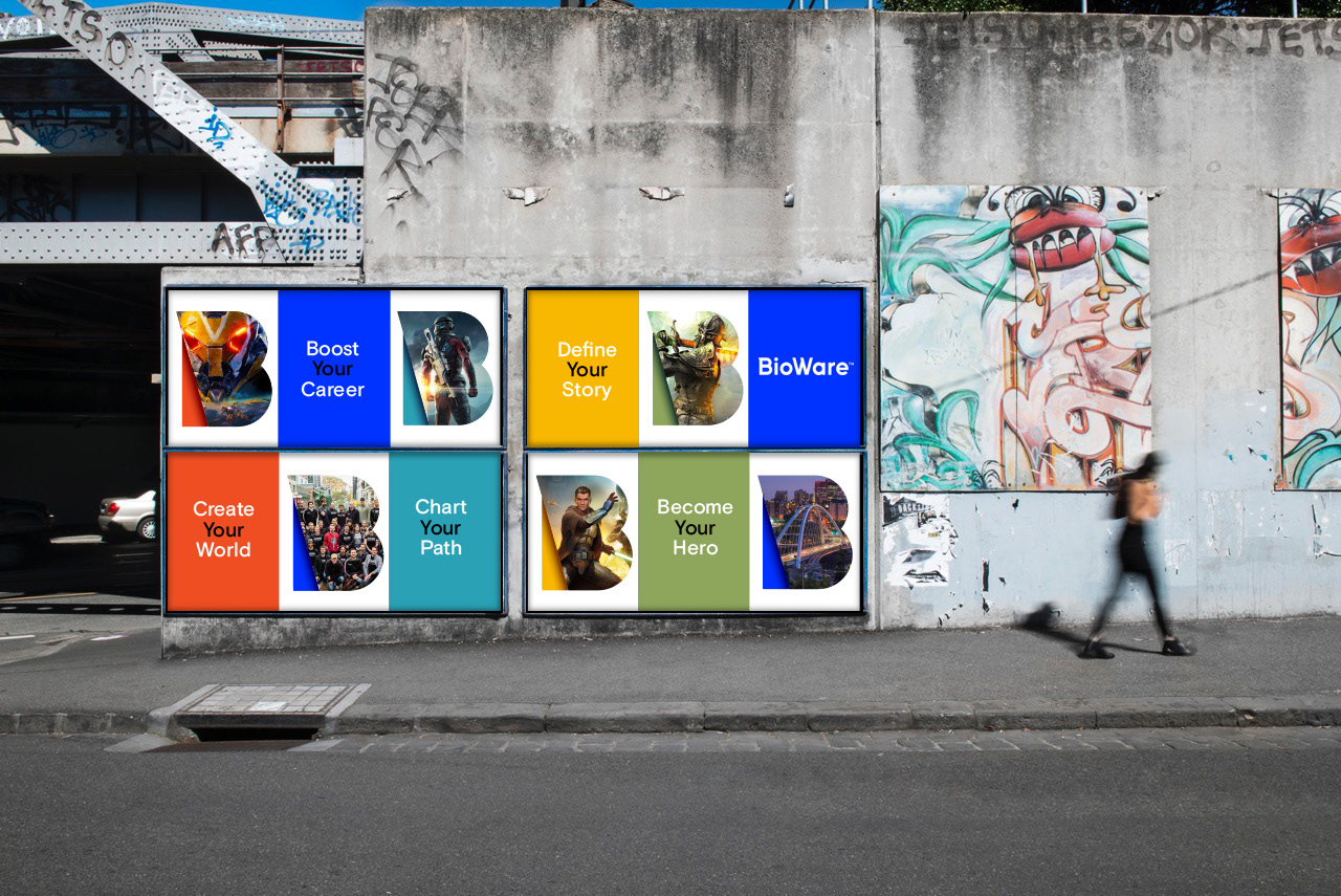
Is this fan made or official? That black "Your" text against the blue background can't be real.
It's a mockup but the actual content is official yesIs this fan made or official? That black "Your" text against the blue background can't be real.
What was wrong with the old one?
Bioware's problem in not their logo, it's their output. Maybe change that first and then start decorating.
Bioware's problem in not their logo, it's their output. Maybe change that first and then start decorating.
Even Bioware's logo is getting a remaster but not Mass Effect.
Mass Effect Trilogy Remaster is bound to happen at some point. EA seems to be changing their stance on Remasters, as they are planning to release a few in their FY2021.
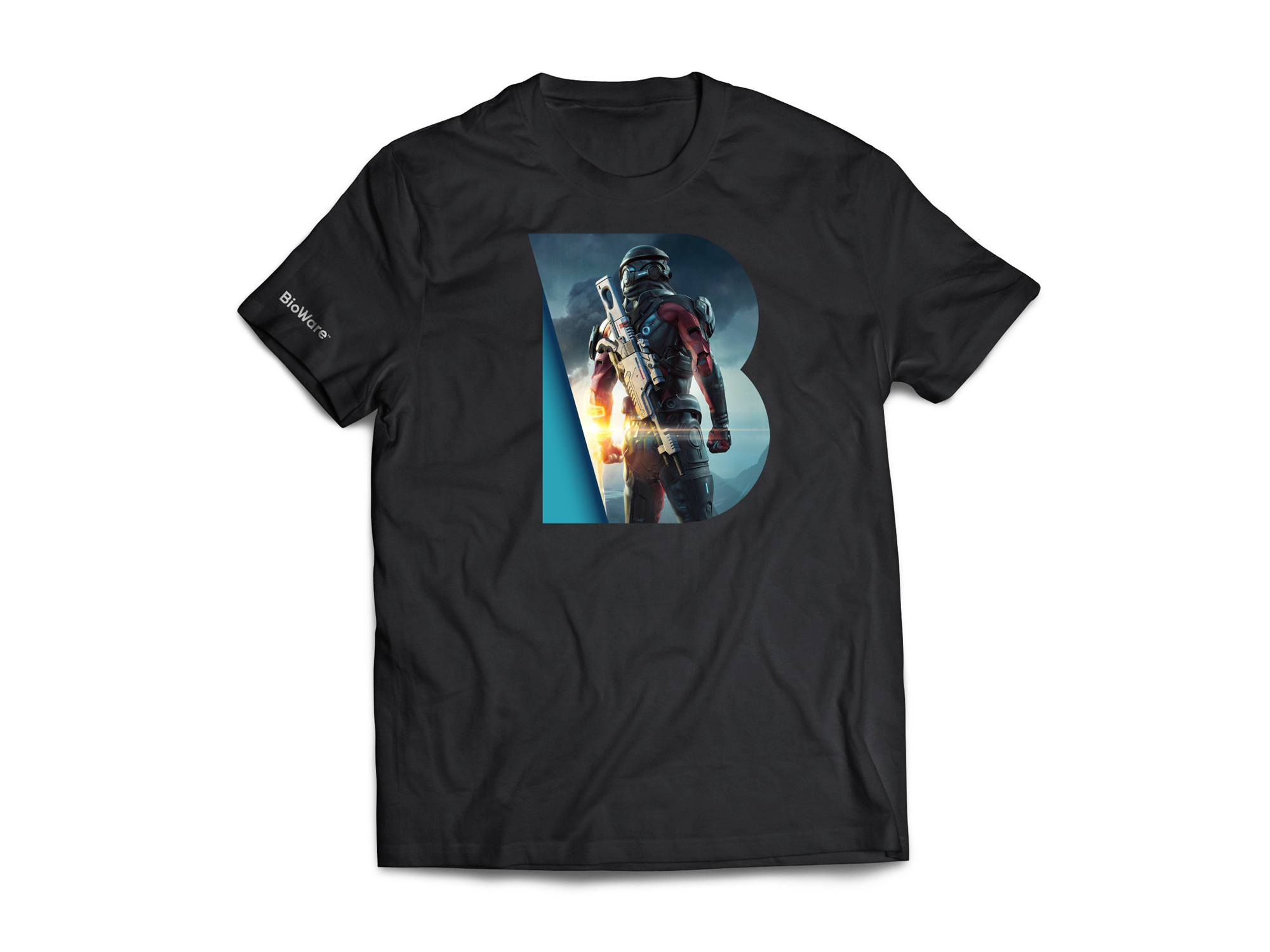
Honestly the letter B is just a dumb looking letter and putting it in focus like this is not great.
The old game logo was a lot of what's bad with game company logos... Particularly western devs who needed these sorta...aggressive and bold fonts to appeal to dude-bros across the North America.
The old logo was the 'bad part' of "geeky". New one is definitely more professional and I like the flexibility.
This is going to be a collector's item when EA shuts them down in two years.
[makes booty cheeks B logo]Some executive who gets paid eight figures was like "Yes, this will change everything."
I don't like it.
"NOW people will love us again!"
Makes sense if it's an internal mockup, but still that's a very basic mistake to make.
When I was in school, gradients on logos or signets were considered a career killer. More so, it was seen as infantile and gaudy.They're very "in" at the moment. Then two years from now someone will question your entire existence for daring to use a gradient.
Goddamnit, I can't unsee it now, thanks.
Because it has sharp serifs? Give me a break. It has personality and legacy compared to the bland super generic new one. Regression for sure. Conveys only a death sentence.
The old game logo was a lot of what's bad with game company logos... Particularly western devs who needed these sorta...aggressive and bold fonts to appeal to dude-bros across the North America.
The old logo was the 'bad part' of "geeky". New one is definitely more professional and I like the flexibility.
As long as they don't slap any images into the B, the new one is fine, IMO. It's ugly when they do it, just like it was ugly when DC did it.
Don't understand people bemoaning the death of "old BioWare". that company hasn't existed for over a decade now. I hope this EA subsidiary can make some better selling games soon, otherwise, they'll face closure, which would be sad for the people working there unless EA can offer them other positions.
The old game logo was a lot of what's bad with game company logos... Particularly western devs who needed these sorta...aggressive and bold fonts to appeal to dude-bros across the North America.
The old logo was the 'bad part' of "geeky". New one is definitely more professional and I like the flexibility.
Love Bioware but godness gracious who the fuck thought of that logo. Looks like something a 12 yo would do for their gaming youtube channel with 50 suscribers.
The old game logo was a lot of what's bad with game company logos... Particularly western devs who needed these sorta...aggressive and bold fonts to appeal to dude-bros across the North America.
The old logo was the 'bad part' of "geeky". New one is definitely more professional and I like the flexibility.
Incredible.
Even a plain text logo can't escape the stupid "western Dude Bro" slander
I see people having a go at you with this, but you are absolutely right. The old logo fit right into the old marketing for games which was completely guy focused. The new one feels a lot more open and neutral.
The old game logo was a lot of what's bad with game company logos... Particularly western devs who needed these sorta...aggressive and bold fonts to appeal to dude-bros across the North America.
The old logo was the 'bad part' of "geeky". New one is definitely more professional and I like the flexibility.
I'm a western dude bro and am sad that their old logo is gone now.
Hey bro you gonna get the new mass effect bro? I hear you can bang mad chicks bro
Nahhhh dude they fucked up the bioware logo. It's too corporate and nerdy, like it's not western anymore dude
Shit bro you're right
This was this morning's water cooler conversation to a tee!Hey bro you gonna get the new mass effect bro? I hear you can bang mad chicks bro
Nahhhh dude they fucked up the bioware logo. It's too corporate and nerdy, like it's not western anymore dude
Shit bro you're right
Gotta say that blue is horrendous. I would have gone with that cyan they did for the Mass Effect one or like a pink. Like generally kept it to either bold or light shades, not mix both.
Yeah that looks so goofy to me. "What game is that?"
Featuring unforgettable BioWare heroes like the Inquisitor and Casey Hudson, I see.
Yeah that looks so goofy to me. "What game is that?"
Just like their games
It looks exactly like it came from the type of company that made this shot :PHey bro you gonna get the new mass effect bro? I hear you can bang mad chicks bro
Nahhhh dude they fucked up the bioware logo. It's too corporate and nerdy, like it's not western anymore dude
Shit bro you're right

New logo is way less harsh, and even if you didnt like my assessment, it was definitely in need of a change, for a game company the logo was rough and way more edgy (literally and figuratively) than it needed to be (its a kinda cheesy sci fi font)
It looks exactly like it came from the type of company that made this shot :P
New logo is way less harsh, and even if you didnt like my assessment, it was definitely in need of a change, for a game company the logo was rough and way more edgy (literally and figuratively) than it needed to be (its a kinda cheesy sci fi font)
I don't think BioWare ever has had a good logo, but I hate the phrase "dude bro"
The old logo was terrible, change is a good thing. While this one is better, I'm not convinced it's great though.
What is everyone's favorite developer logo? I've always loved Neversoft's

Simple, iconic, stands out, and has years of history, good or bad.
Reads like a parody.
The old game logo was a lot of what's bad with game company logos... Particularly western devs who needed these sorta...aggressive and bold fonts to appeal to dude-bros across the North America.
The old logo was the 'bad part' of "geeky". New one is definitely more professional and I like the flexibility.