My favorite part of physical media's cover art is its spine, the fold that holds it all together. When you walk into a library and you look at the books, audiobooks, music cds, and dvds lining the shelves, what do you see? You see uniquely printed cover spine art across the board. Every piece of media has its own style, and if you're just browsing, that's the first thing that grabs your attention.
Now, let's look at some video game spine art!


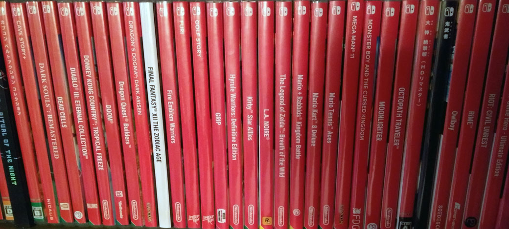
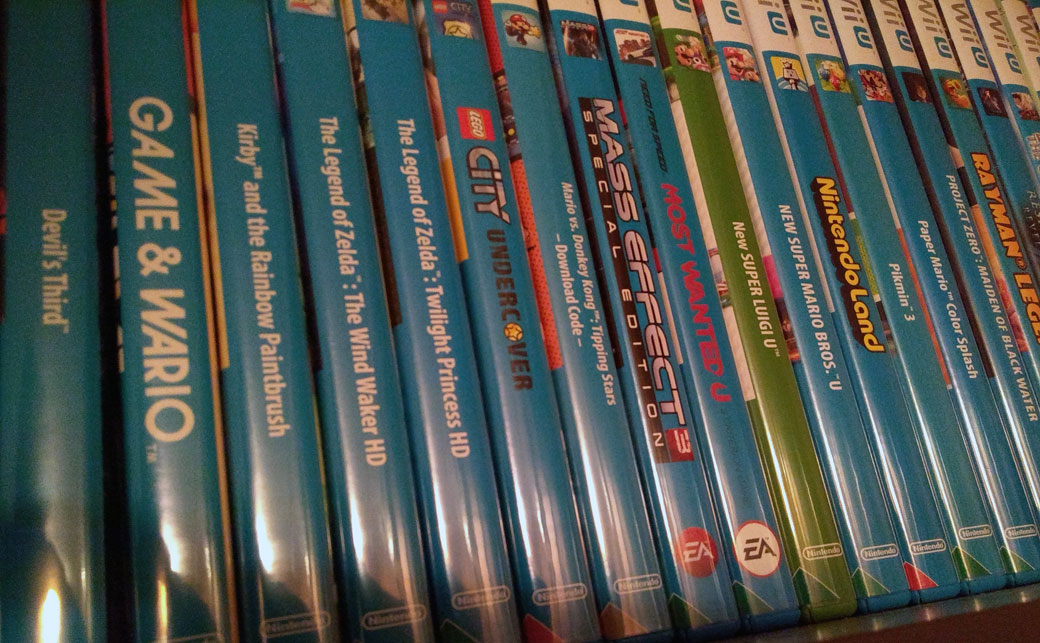
I could stare at these all day. I've been archiving my video game collection lately because when I get the space, I intend to buy some shelves and display my collection proudly. However, I will be slightly disheartened when I get to the Nintendo Switch games. My least favorite out of the above photos would be the Wii games since they have a uniform background color across the whole console, but at least they all have unique title art, which is not something I can say about these...

Isn't this just dreadful to look at? Imagine going to a game store that's selling classic games, and see all the different sections lined up with cases spine-out. Then, you look at the Nintendo Switch section and you see no distinction among the games. The font is so uniformly basic and small that they'll start to blend in and you'll probably have to squint to read the title. For someone just browsing, nothing about these jumps out at you.
There is one beacon of hope for spine art diversity, however, and that's Super Bomberman R. It is the one game that dared to be different, and I refuse to display my Switch collection without it. If Konami missed the memo about making uniformly basic spine art, I'm glad they did. I wish others would follow Super Bomberman R's example.

Anyway, feel free to use this thread to discuss and show off your favorite video game cover spine art! I think this is a very underappreciated aspect of physical media and deserves more attention by product designers.
Now, let's look at some video game spine art!
I could stare at these all day. I've been archiving my video game collection lately because when I get the space, I intend to buy some shelves and display my collection proudly. However, I will be slightly disheartened when I get to the Nintendo Switch games. My least favorite out of the above photos would be the Wii games since they have a uniform background color across the whole console, but at least they all have unique title art, which is not something I can say about these...
Isn't this just dreadful to look at? Imagine going to a game store that's selling classic games, and see all the different sections lined up with cases spine-out. Then, you look at the Nintendo Switch section and you see no distinction among the games. The font is so uniformly basic and small that they'll start to blend in and you'll probably have to squint to read the title. For someone just browsing, nothing about these jumps out at you.
There is one beacon of hope for spine art diversity, however, and that's Super Bomberman R. It is the one game that dared to be different, and I refuse to display my Switch collection without it. If Konami missed the memo about making uniformly basic spine art, I'm glad they did. I wish others would follow Super Bomberman R's example.
Anyway, feel free to use this thread to discuss and show off your favorite video game cover spine art! I think this is a very underappreciated aspect of physical media and deserves more attention by product designers.