retroman

Member
Oct 31, 2017
3,056

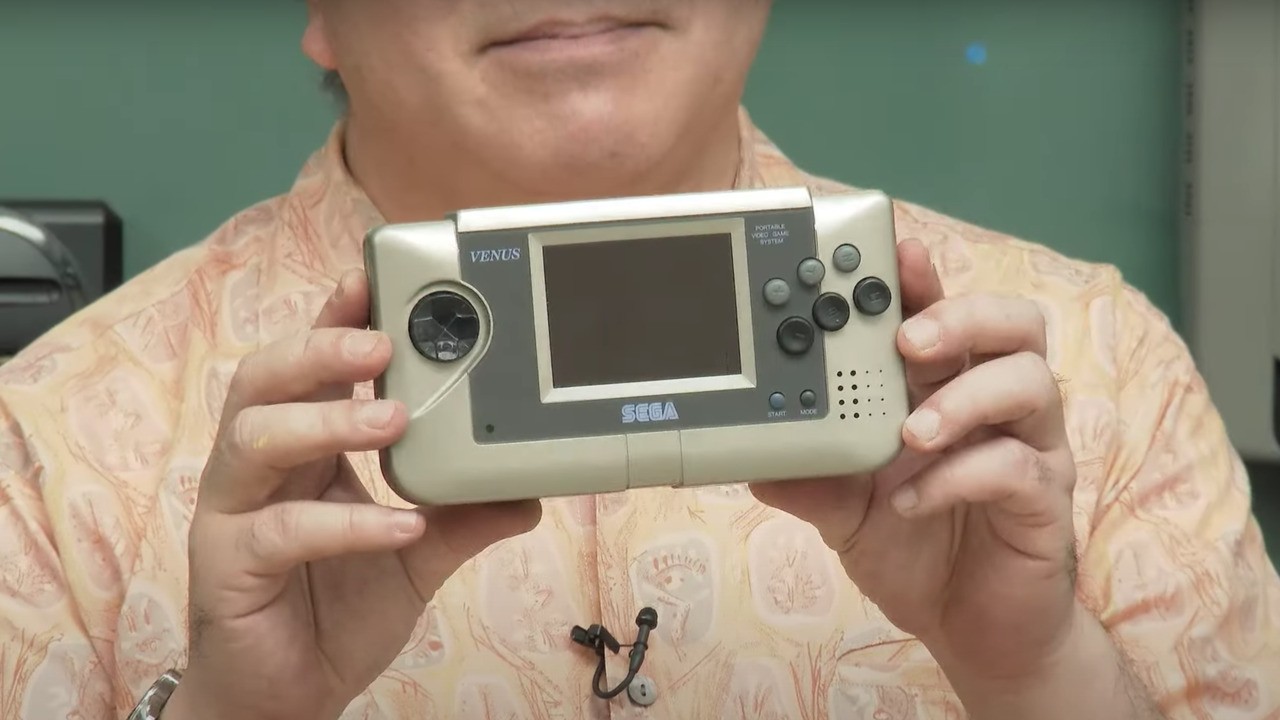
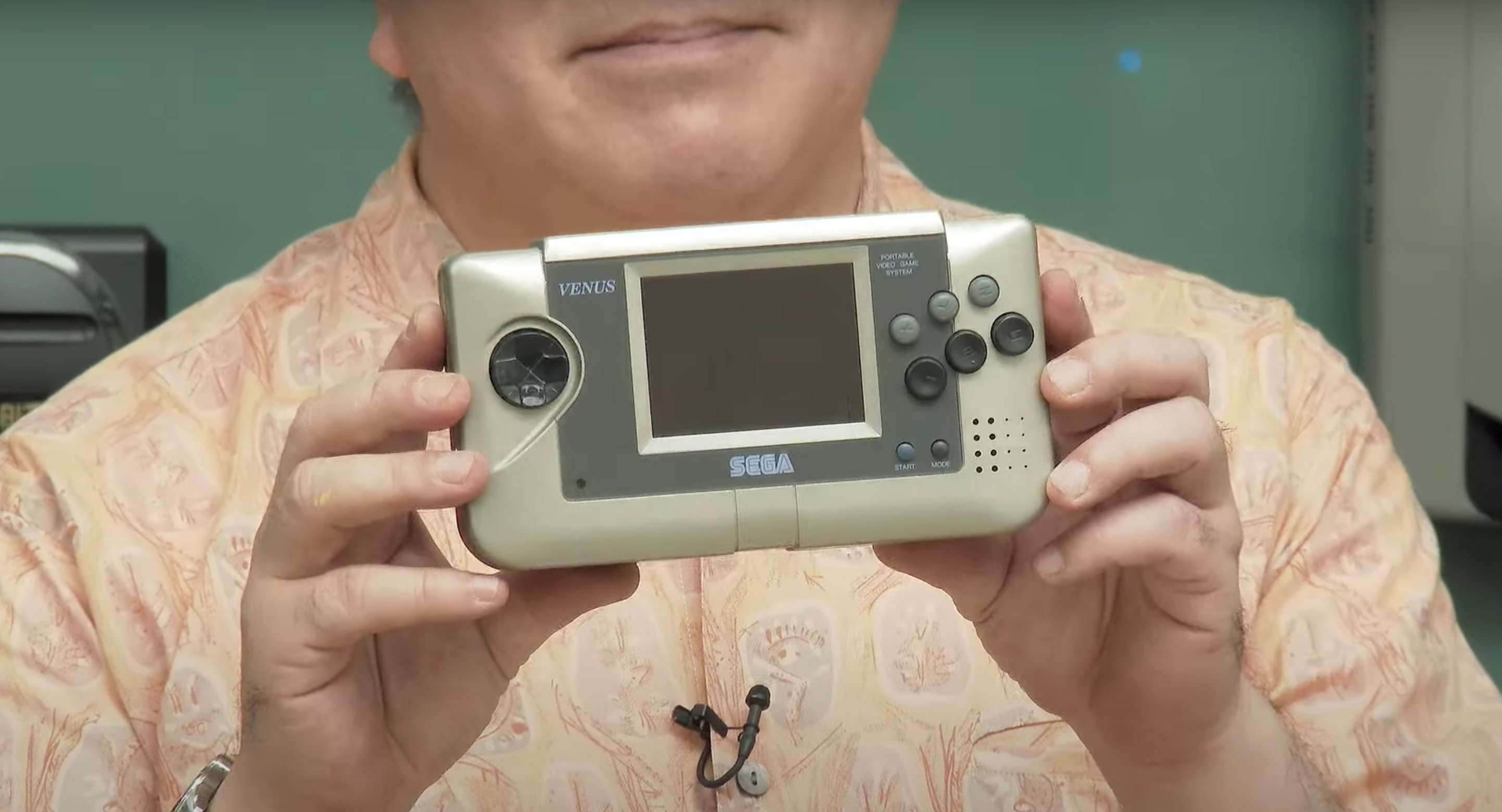
Miyazaki goes into detail on how Sega was fond of using the names of planets as the internal codenames for its systems (the exception being the Saturn, which retained its codename right the way up to launch). He speaks about the Sega Nomad, a portable Mega Drive system which was released in North America in 1995 and was Sega's final attempt to wrestle control of the handheld market away from the Nintendo Game Boy (spoiler: it didn't work, but the machine is great – if a little battery-hungry).

A nice surprise was that Miyazaki showed off a prototype of the console that has, up until now, never been seen in public. Still retaining the "Venus" codename, the prototype Nomad is rather fetching, and arguably more attractive than the oddly-shaped system we actually got. (What is that slanting top section all about, anyway?)

screenshot-2020-11-30-at-10-08-27.original.jpg


Pretty interesting stuff! For comparison, here's what the Nomad would eventually end up looking:

img-6016.original.jpg


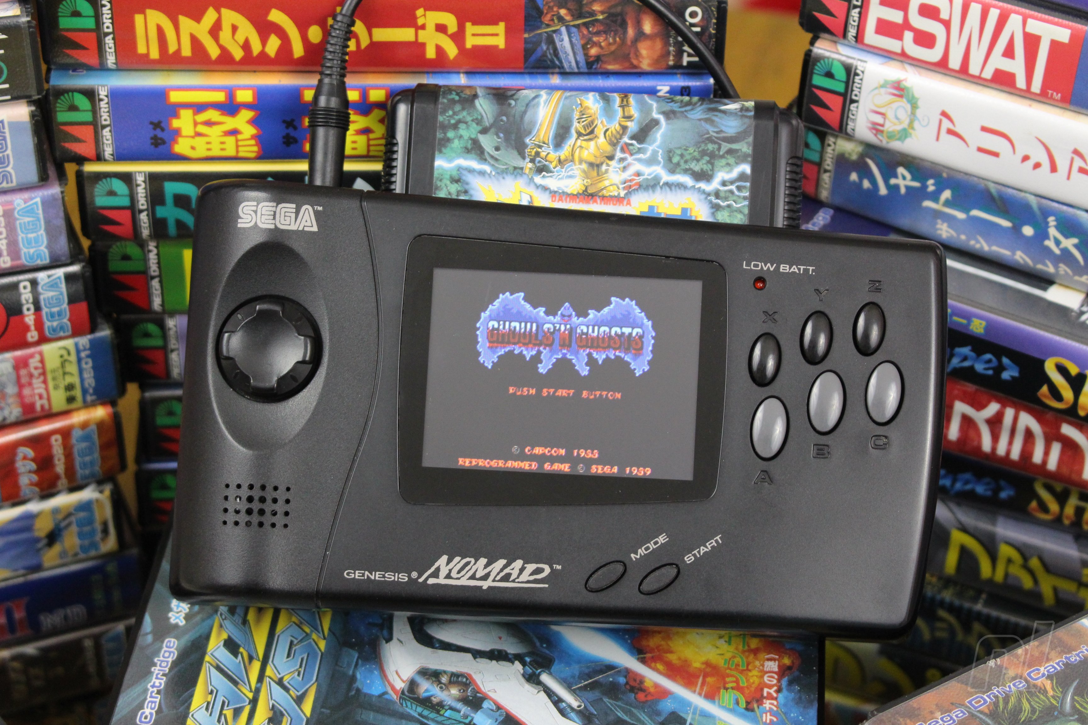
I think the Game Gear-esque design of the Venus looks a lot more ergonomical than the Nomad, not to mention the shape of the d-pad and the buttons. Then again, I've never owned a Nomad, so perhaps someone who had one could chip in and tell about their experiences with the device.
 

dlauv

Prophet of Truth - One Winged Slayer
Member
Oct 27, 2017
11,515
Looks more ergonomical but I suppose they jazzed it up for marketing reasons. They might have left it alone had it come out in Japan too.
 

jetsetrez

Member
Oct 27, 2017
1,940
If you applied the two-tone black colorway to it like the Genesis/Nomad I think it would look a lot better than the Nomad we got.
 

Martin

One Winged Slayer
Member
Oct 25, 2017
2,432
Wow the prototype looks really good!
What I don't like about the release version are the uneven bezels ... kind of a distraction to me.
 

Deleted member 51848

Jan 10, 2019
1,408
Yep - whoever said 'Well, the round buttons of the joypad layout are nice... but what if we made them ovular?' should have been kicked directly in the testicles.
 
Oct 25, 2017
15,174
I still don't understand why they gave it that slant and the oval buttons in the final product, prototype looks much better.
 

Akira86

Member
Oct 25, 2017
19,614
looks like they tried to make it more aggressive and angry for the American market.
 

L Thammy

Spacenoid
Member
Oct 25, 2017
50,134
I guess the final model's supposed to look more futuristic, but it just ends up seeming more like a cheap toy.
 

Vinegar Joe

Member
Oct 26, 2017
1,161
Wow that prototype looks so much nicer than the final unit you kinda have to wonder what the thought process was that led from that to...that.
 

Keym

The Fallen
Oct 26, 2017
9,237
I still have my Nomad and using it felt great back then, even with my tiny kid hands. The prototype looks too small in comparison.
 

Atolm

Member
Oct 25, 2017
5,849
The final design was no doubt after the "aggressive" aesthetic Sega followed during the MD/Genesis days and that also extended for most of Saturn's Western lifespan.
 

FormatCompatible

One Winged Slayer
Member
Oct 25, 2017
12,071
Wow that prototype looks so much nicer than the final unit you kinda have to wonder what the thought process was that led from that to...that.
I imagine it was probably the same thought process that led NEC to redesign the awesomely compact PC Engine to the unnecessarily bulky TurboGrafx-16, ''Gotta make it bigger and cooler for american kids!''
 

FarZa17

Member
Oct 27, 2017
1,578
The buttons placement that overlap the screen frame area in the prototype looks unappealing. It's good the final design did not keep that.
 
Oct 29, 2017
4,721
Prototype looks pretty rough (as you would expect from a prototype), but still looks far better than the final product regardless.

Great tech that was ultimately ruined by bad timing and stupid marketing decisions. Vintage mid-90s SEGA.

I imagine it was probably the same thought process that led NEC to redesign the awesomely compact PC Engine to the unnecessarily bulky TurboGrafx-16, ''Gotta make it bigger and cooler for american kids!''

You're almost certainly spot on here. Would be willing to bet money that this was their exact thought process here.
 

Tokyo_Funk

Banned
Dec 10, 2018
10,053
If that prototype was done in a black, deep grey or black/grey combo it could have looked nice. I remember my Nomad feeling kinda strange to hold.
 

Celine

Member
Oct 26, 2017
5,030
Reminds me a bit of the Neo Geo Pocket (though NGP was a much better handheld with a very long battery life):

ptTnQljUSE-6XpLilR_3_A.jpg
 

IronicSonic

Attempted to circumvent ban with alt account
Banned
Oct 25, 2017
3,639
For a moment I thought It was a Saturn handheld prototype
 

SnatcherHunter

The Fallen
Oct 27, 2017
13,547
I still own my Nomad. The final design is indeed very comfortable and appealing. I loved playing all games even down to fighting games on it. The DPAD and buttons felt great.

Protip- brings tons of batteries with you.
 

Deleted member 6056

Oct 25, 2017
7,240
I still own my Nomad. The final design is indeed very comfortable and appealing. I loved playing all games even down to fighting games on it. The DPAD and buttons felt great.

Protip- brings tons of batteries with you.
I thought the protip would be bring the power adapter. Did it use 6 AA batteries with only a 3hr lifespan like the game gear?
 

Pyccko

"This guy are sick"
Member
Oct 25, 2017
3,882
"a little battery hungry" they say. that thing will eat 4 double As in about an hour.

but I still love my nomad
 

SnatcherHunter

The Fallen
Oct 27, 2017
13,547
I thought the protip would be bring the power adapter. Did it use 6 AA batteries with only a 3hr lifespan like the game gear?

Yes, it barely survived 3 hrs. Power Adapter is the way to go but it wasn't viable back then while traveling.

Are they really as good as the ones on the megadrive/saturn controllers?

This was before the Saturn. Nothing really matches the feel of the Saturn IMO. However, it was heading towards that direction.
 

Symphony

Member
Oct 27, 2017
4,361
Interesting to note that it is also the same colour as the prototype Sega Saturn design (I think I read that the final ugly grey they used in Japan was because it's the base shell and the final intended silver paint wouldn't adhere to it), and of course uses the Saturn controller buttons.

2mFsfoc.jpg


Too close to Nintendo's design language. Pity they couldn't speak their own.
In what way does that resemble a Game & Watch or original Gameboy, the only two handhelds Nintendo had produced at the time? In design terms it's a mix of a Game Gear and the prototype Saturn.
 

fiendcode

Member
Oct 26, 2017
24,994
I love it! Sega and M2 should do a microconsole variant rerelease of it. But include Gauntlet IV this time.
 

BlueTsunami

Member
Oct 29, 2017
8,534
Curious as to how power hungry the Nomad was. Apparently it took six AA batteries and lasted two to three hours lol I have very fond memories of my blue game gear and Shining Force: Sword of Hajya

Edit: power consumption already brought up 🔋
 

lowendtheory

Banned
Sep 25, 2020
135
I owned a Nomad too. You can't overstate just how powerful it felt in your hands, probably because of the unusual design choices. I still play Gunstar Heroes and Shining Force at it whenever I'm home for the holidays, and it still feels amazing to be able to plug in a Genesis cart and play it on this wonderful black plastic brick.

i don't think the Nomad gets enough credit for how forward-thinking it was. it certainly inspired systems like the Switch decades later.
 

freikugeln

Member
Oct 27, 2017
338
I really wish they had done a small japanese release for Nomad because it 's almost certain it would be near identical to this prototype design instead of the gaudy US model.
 

lowendtheory

Banned
Sep 25, 2020
135
The crazy thing is, I think I once read that the original plans for the Venus included a touchscreen. And this was back in 1994.
 

Nathan

Member
Oct 27, 2017
727
Wow very cool, interesting how functionally it looks identical but looks radically different for purely aesthetic/marketing reasons.

I do like the oval buttons on the Nomad, they feel really good.
 

myojinsoga

Member
Oct 29, 2017
1,036
In what way does that resemble a Game & Watch or original Gameboy, the only two handhelds Nintendo had produced at the time? In design terms it's a mix of a Game Gear and the prototype Saturn.
I was looking at the meta more than the specifics ... Best way I can describe it is that this is the product you get if you design function first, and then give a quick nod to form. If you do that, you get a Nintendo product. It's got the buttons here, the screen there, a logo for people who like that sort of thing, and then there it is. I'd characterise Sega's approach as placing more emphasis on coming up with something eye-catching, then asking the function guys what this thing was supposed to do again.

Cards on the table, I'm a long-standing, non-practicing, Nintendo fanboy and snotlord, so this is all meant in a spirit of grown-up fraternal love. The remark about not speaking their own language came out a bit strong, but I do think the Nomad design is a bit garbled.
 

Empyrean Cocytus

One Winged Slayer
Member
Oct 27, 2017
18,817
Upstate NY
Always wondered why it didn't have a planet codename when all of Sega's hardware did at that point. There was the Saturn, the Mars (which became 32X), the Neptune (a Genesis with 32X tech built in, never released), the Jupiter (prototype of the Saturn before they added a CD drive), the Pluto (Saturn with a built-in modem). I think the Mercury was code name for the Game Gear too.

Also the reason there was no Sega Uranus, other than the obvious one, is because "Uranu" translates to "Something that won't sell" in Japanese.
 

axo_tio

Member
Oct 25, 2017
75
The video explaining Sega's history and codenames for its projects was really cool (english subs):