The Pringles guy has been updated
- Thread starter HustleBun
- Start date
You are using an out of date browser. It may not display this or other websites correctly.
You should upgrade or use an alternative browser.
You should upgrade or use an alternative browser.
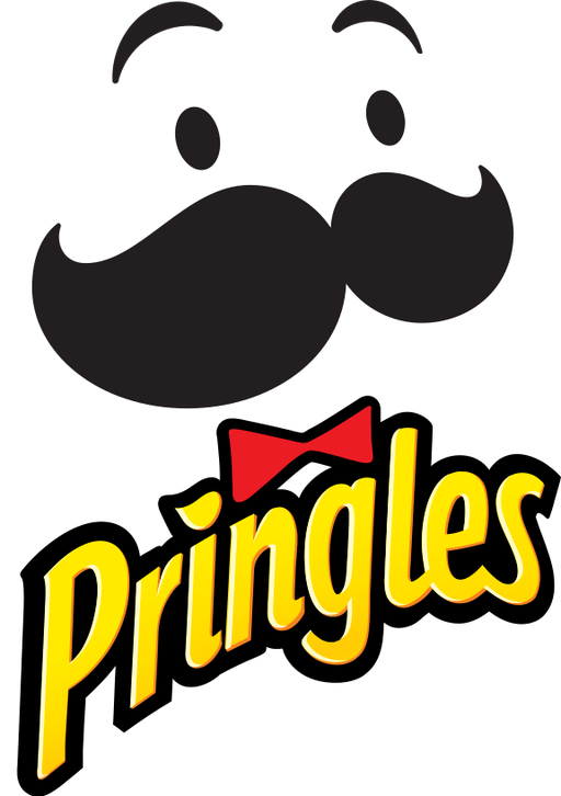
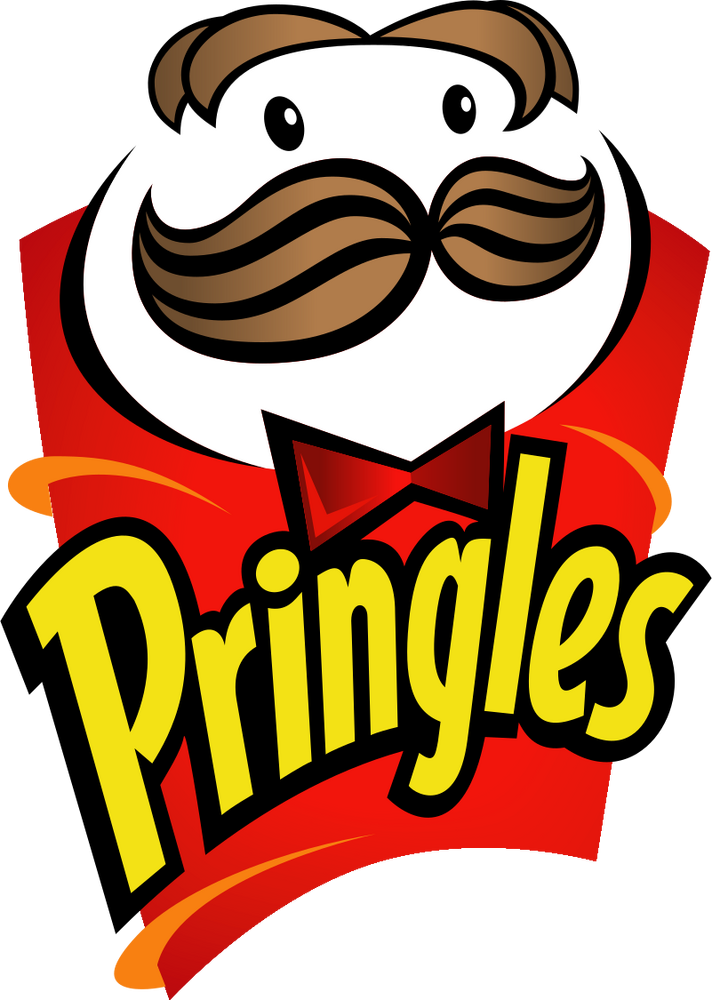
The face from the late 90s is still the best. None of the typeface treatments have really been very good. Surprised they didn't take it back to a flat look for the font, it already looks dated
Usually these redesigns aren't good, but this one is pretty decent.
Lmao, that is what it looks like huh?
Lmao, that is what it looks like huh?

It's weird that they've made his head and tie so flat but kept the subtle beveling and gradient on the Pringles logotype.
Why was I thinking the same thing ...
Cost-cutting move. Fewer colors = less expensive printing.
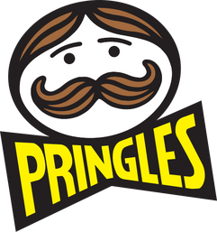
Also, apparently there was originally an apostrophe that disappeared in 1986.
Also, apparently there was originally an apostrophe that disappeared in 1986.
It's honestly not bad.
You know what is bad? How fucking hard it is to find a store that carries pizza flavored Pringles.
You know what is bad? How fucking hard it is to find a store that carries pizza flavored Pringles.
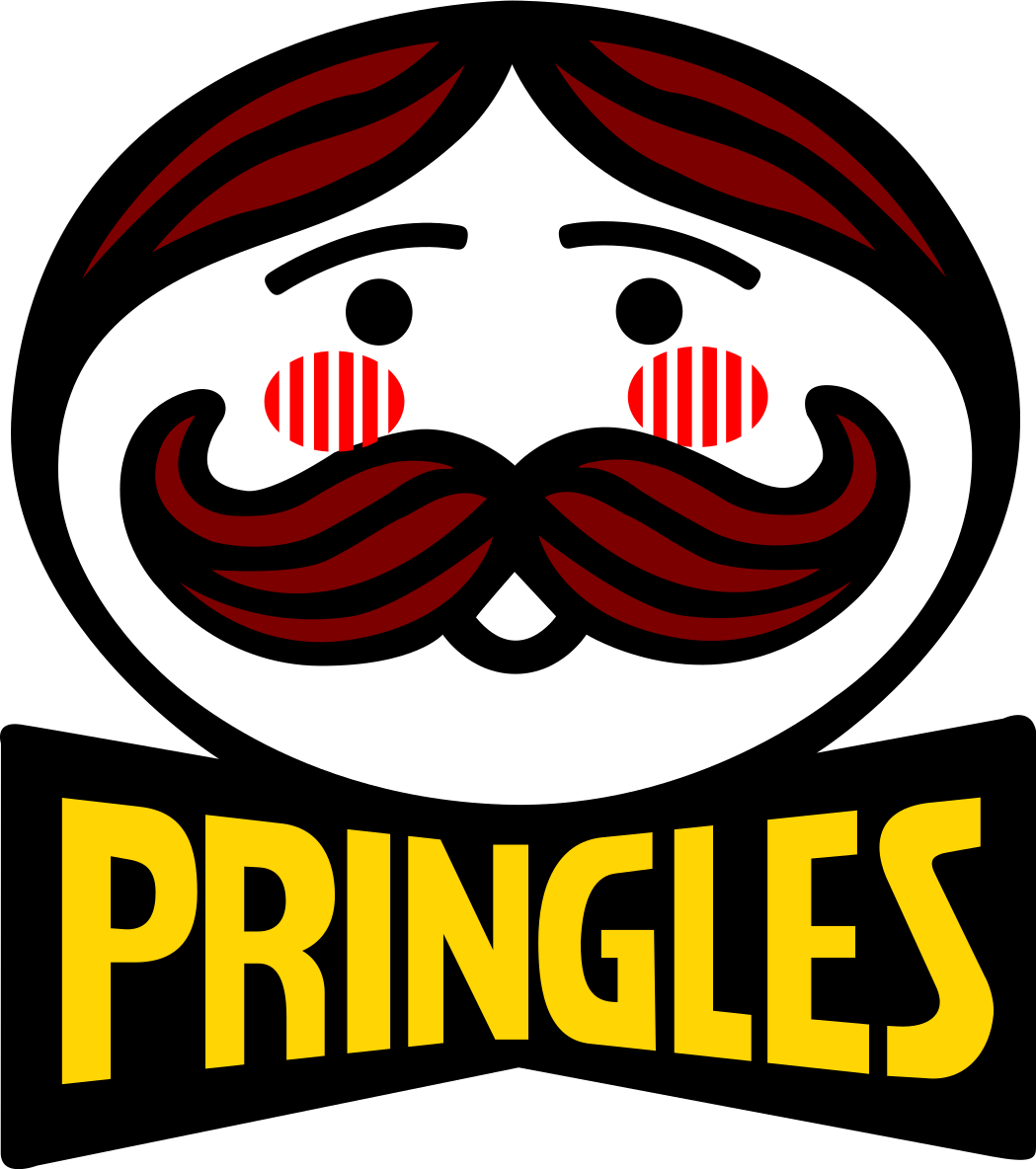
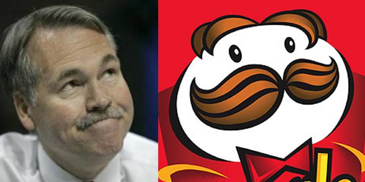
Show me that curleh mustache
So I immediately read the moustache as a gaping maw and I'm losing my mind trying to figure out what video game monster it's reminding me of
This is what the cans seem to look like:

It feels too weird, with the art being very simple and vectory, closer to like a semiotic symbol, but then you have the Pringles logo still using a very fine bevel and emboss, the font has more dimension than the art and I don't like it.
In the other flavors and spinoffs, you can see the rebranding pay off a bit more, with the Pringles guy emoting, etc for different product lines:

These cans actually look pretty good imo, the colored wavy flames in the background are pretty sharp and add some complexity to the can. The "Scorchin" logo fits right in with the face logo. The "Pringles" logo is still very out of place and needs to be simplified.
It feels too weird, with the art being very simple and vectory, closer to like a semiotic symbol, but then you have the Pringles logo still using a very fine bevel and emboss, the font has more dimension than the art and I don't like it.
In the other flavors and spinoffs, you can see the rebranding pay off a bit more, with the Pringles guy emoting, etc for different product lines:
These cans actually look pretty good imo, the colored wavy flames in the background are pretty sharp and add some complexity to the can. The "Scorchin" logo fits right in with the face logo. The "Pringles" logo is still very out of place and needs to be simplified.
That's the best thing i've seen all year.
I appreciate the irony that as the pringles man loses his hair, I've got hair transplant adds showing up on my browser.
Too topical.
Too topical.
gained eyebrows lost his hair
ahh the monkey's paw wish
Dude probably looks at his floating eyebrows in the mirror and says I renounce my wish everyday hoping to get his hair back
ahh the monkey's paw wish
Dude probably looks at his floating eyebrows in the mirror and says I renounce my wish everyday hoping to get his hair back