Neiteio

Member
Oct 25, 2017
24,302
Thanksgiving is almost here.

Let's start thinking about the real blessings in life — those Switch icons that don't suck, or arbitrarily change themselves from good to sucky with an unwanted patch.

These are the Terrific Icons for The Switch Awards.

Here's the trophy, the Golden TITS.


icons01y2qud.gif


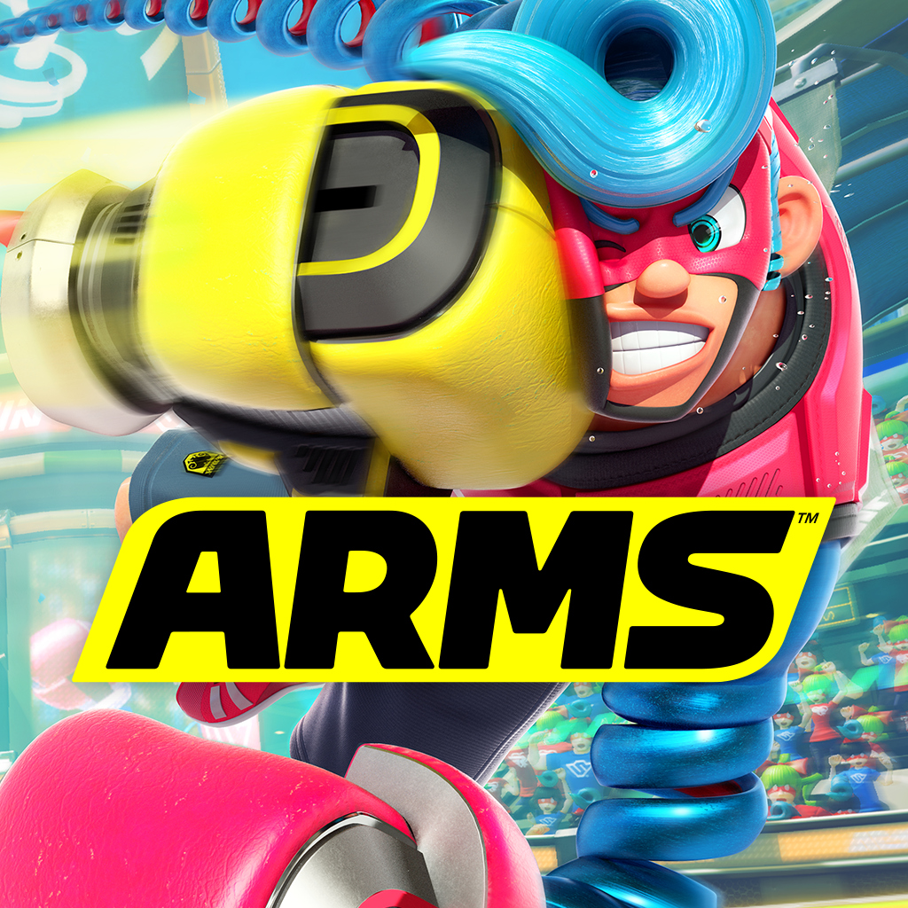
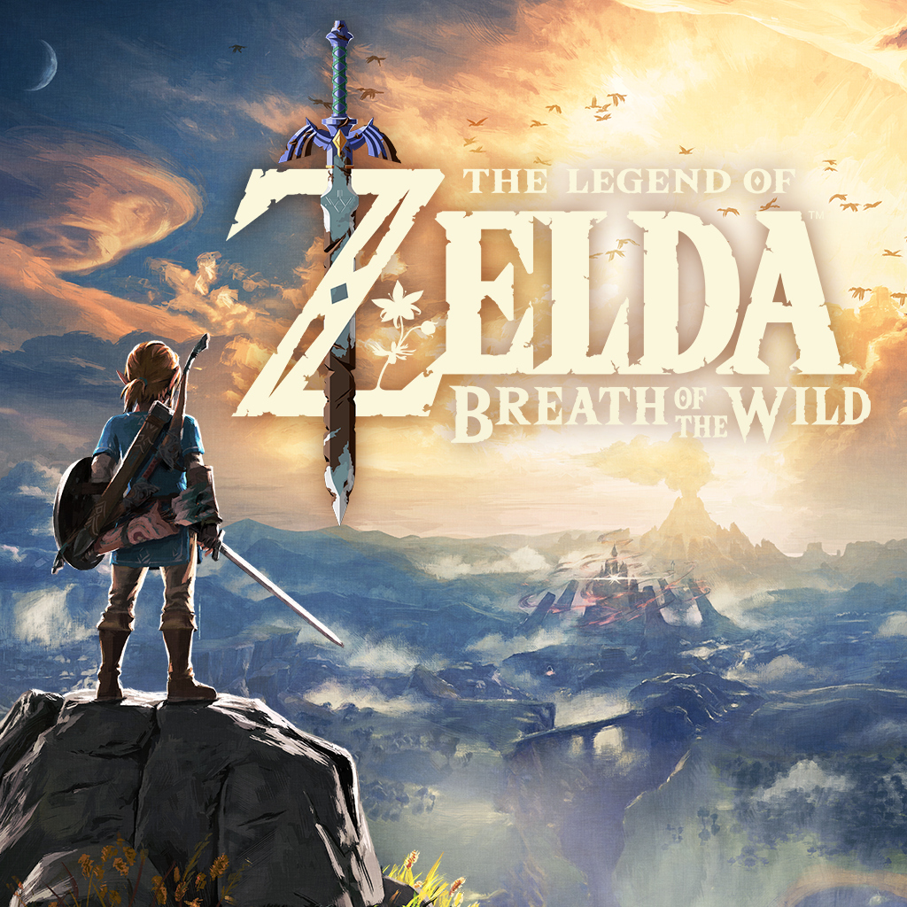
2017 introduced the Nintendo Switch — and with it came massive screen-filling icons on the well-trafficked home menu. These are icons you'll see again and again and AGAIN as you check your screenshots, friends list, settings, battery, etc, and change controllers.

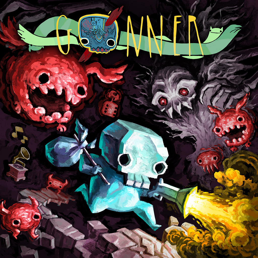
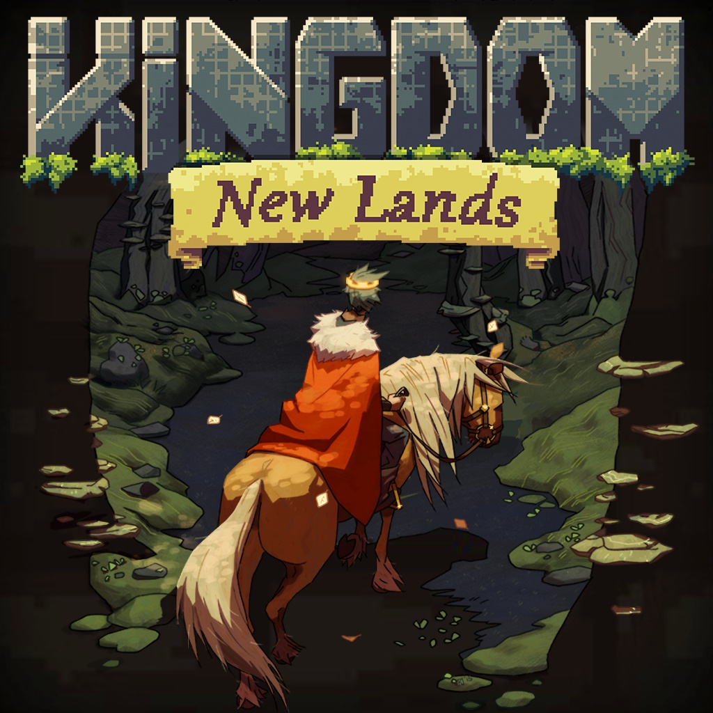
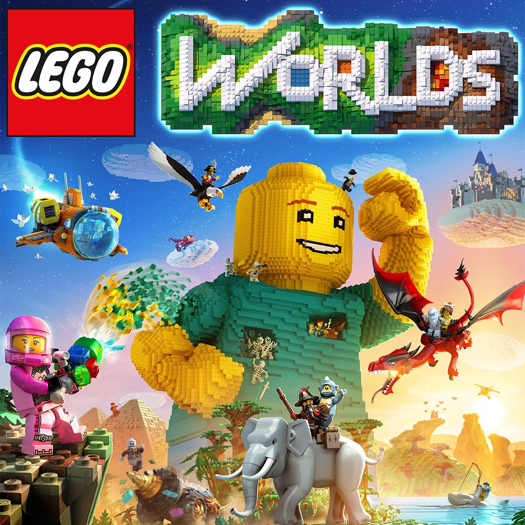
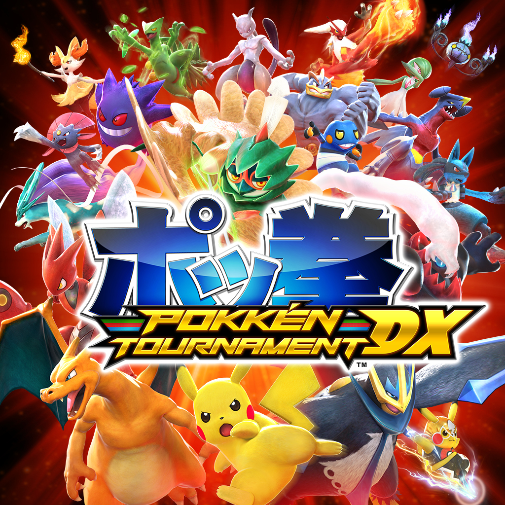
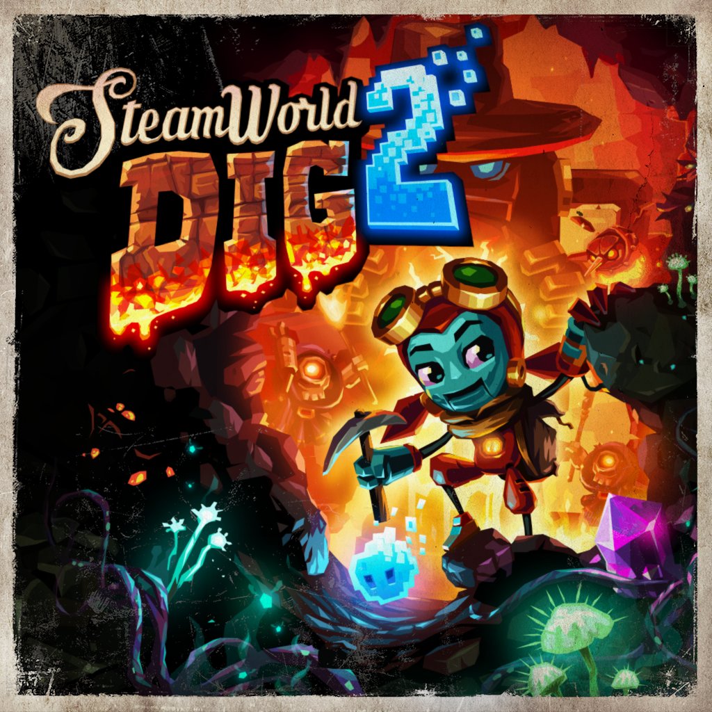
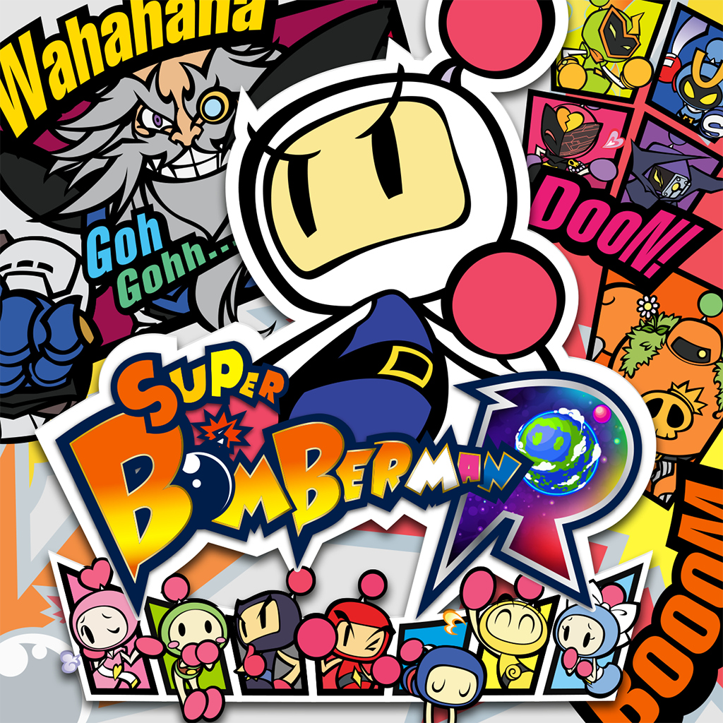
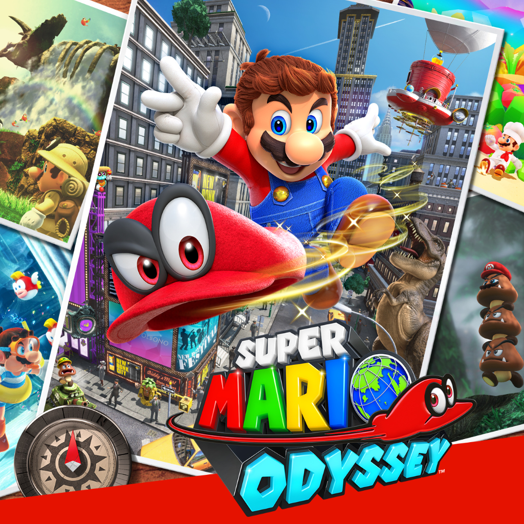
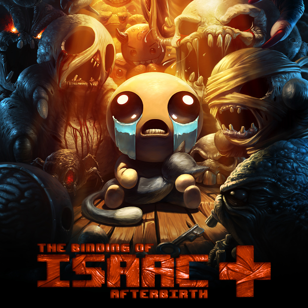
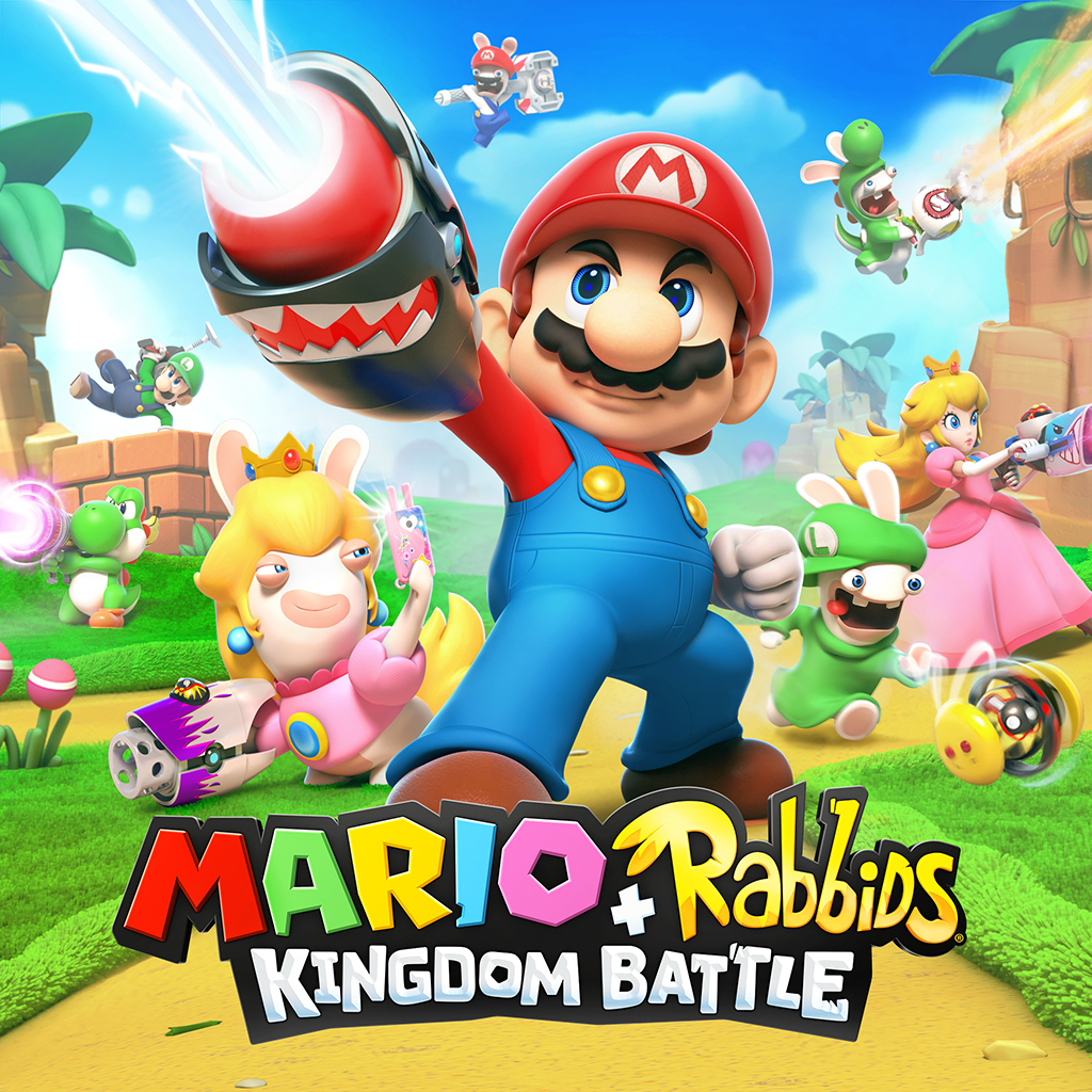
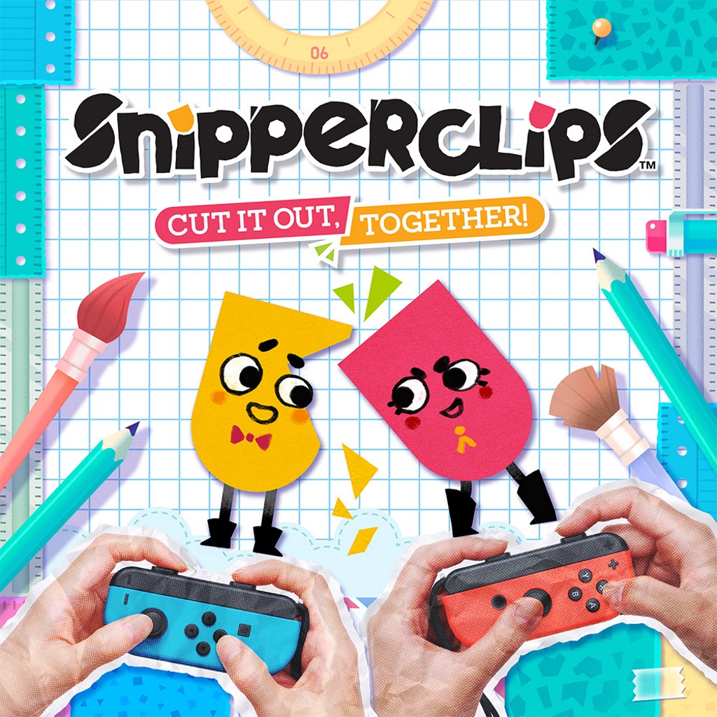
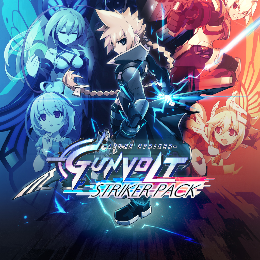
Some devs used those icons for good, giving us gorgeous works of art you can frame on the wall, complete with the game's title for easy identification. They make you proud to own the game and proud to own a Switch. They make you happy to keep them in rotation on your system. They're functional and fun. They invite you into a world of magic and wonder, and they ensure your first impression is, "Wow, the devs really took pride in their game! They care about even the finest of details!"

Sadly, other devs used them… for evil. Cheap-looking visuals. Poor framing. No titles. BLECH!!

But we're here to celebrate the GOOD ones.


You can check out a gallery of all Switch icons HERE: http://abload.de/gallery.php?key=siFV0nnI


The question, which icon will take home the prize? Only you, the ERA Academy comprised of distinguished scholars with the finest tastes in home menu aesthetics, can decide this most crucial question.

Fine print disclaimer: all votes for Snake Pass are automatically disqualified.


Voting is simple! Like the GOTY Awards, list your Top Five Terrific Switch Icons.

Format your ballot like this:

5. Game title ; reason
4. Game title ; reason
3. Game title ; reason
2. Game title ; reason
1. Game title ; reason


And the point values go like this:

5 = 1 point
4 = 2 points
3 = 3 points
2 = 4 points
1 = 5 points


At 12:00 A.M. Jan. 2, 2017, polls will close! You're free to change your ballot anytime before then. Once polls have closed, we'll tally 'em up and hand out the coveted Golden TITS — probably the most prestigious award in any medium.

Hopefully someone can run a script to tabulate it, tho. I'm a writer — I couldn't count to save my life.


Now then: Which icon was the most iconic of all? Share your thoughts.

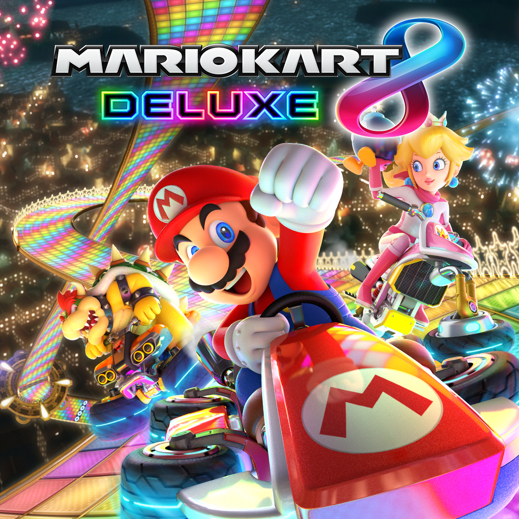
(It's probably Mario Kart 8 Deluxe)
 
Last edited:

carlosrox

Banned
Oct 25, 2017
10,270
Vancouver BC
BUTCHER and it's not even close. (lol)

Bomberman and Kamiko have really nice icons... Hmmmmm a lot to think about...

I'm also partial to Yono, Splatoon 2, Odyssey, Axiom Verge, and Steamworld Dig 2.

My tentative voting goes like this for now but is subject to change.

5. Kamiko shows off gorgeous pixel art and a nice sense of adventure.
4. BUTCHER, I just love the no nonsense Terminator like character on the cover with a shotgun and the giant bold red letters BUTCHER. It evokes TERMINATOR and DOOM at the same time.
3. Mario Odyssey uses the gorgeous cover art we've come to love (right?) And it's really eye catching.
2. Splatoon 2 also uses colors and contrast really well and I like the two sides thing.
1. Mario Kart 8 Deluxe has a fabulous use of color and a very slick composition.
 
Last edited:

Jumpman84

Member
Oct 30, 2017
19
Watching this thread for now. I'll have to think long and hard about this before casting my vote.
 

JazzmanZ

One Winged Slayer
Member
Oct 25, 2017
2,452
5.Sonic Mania
Mgr0xVg.jpg


4.Heroes of the Monkey
a5I5EIh.jpg


3.Human resource machine
RDIHS2z.jpg


2.Semispheres
0GhLWjM.jpg


1.Troll and I
qp3O86n.jpg
 
Last edited:
OP
OP
Neiteio

Neiteio

Member
Oct 25, 2017
24,302
If people can pictures of said icons would be nice! If possible.
There's some talk in the Icon Watch thread about assembling a catalogue of all icons. That would be... amazing. And probably a lot of work. But if someone figures out how to do this, I'll put them in the OP!
 
OP
OP
Neiteio

Neiteio

Member
Oct 25, 2017
24,302
BUTCHER and it's not even close. (lol)

Bomberman and Kamiko have really nice icons... Hmmmmm a lot to think about...

I'm also partial to Yono, Splatoon 2, Odyssey, Axiom Verge, and Steamworld Dig 2.

My tentative voting goes like this for now but is subject to change.

5. Kamiko shows off gorgeous pixel art and a nice sense of adventure.
4. BUTCHER, I just love the no nonsense Terminator like character on the cover with a shotgun and the giant bold red letters BUTCHER. It evokes TERMINATOR and DOOM at the same time.
3. Mario Odyssey uses the gorgeous cover art we've come to love (right?) And it's really eye catching.
2. Splatoon 2 also uses colors and contrast really well and I like the two sides thing.
1. Mario Kart 8 Deluxe has a fabulous use of color and a very slick composition.
Hey Carlos, I think we'll need a semicolon between the game's name and the reason for the game, in order for the tabulator script to tally it

Also, commendable No. 1 pick. That's probably my No. 1, as well.
 

Deleted member 1062

User requested account closure
Banned
Oct 25, 2017
3,160
do people unironically care about this? This is all still a joke about that one guy that overreacted about the snake pass icon right?
 

carlosrox

Banned
Oct 25, 2017
10,270
Vancouver BC
Hey Carlos, I think we'll need a semicolon between the game's name and the reason for the game, in order for the tabulator script to tally it

Also, commendable No. 1 pick. That's probably my No. 1, as well.

I know, sorry. I was posting in a rush. I'll edit it when I can.

I think my picks might change but it's gonna be hard to knock MK8D off the top spot!

(Why didn't DOOM use the cover art?? Woulda won if it had instead of that lame Revenant icon)
 

Dyle

One Winged Slayer
The Fallen
Oct 25, 2017
30,271
1. Snake Pass
2. Kingdoms New Lands (OG)
3. Sonic Mania
4. Steamworld Dig 2 (OG)
5. Heroes of the Monkey Tavern

I'm sorry Neiteio, but I have awful taste

1. Mario and Rabbids Kingdom Battle
2. BoTW
3. Steamworld Dig 2 (Revised)
4. Golf Story
5. Splatoon 2
 
OP
OP
Neiteio

Neiteio

Member
Oct 25, 2017
24,302
do people unironically care about this? This is all still a joke about that one guy that overreacted about the snake pass icon right?
I'm that guy. :-)

And nope, people really do care! I'd recommend the massive thread on the old forum or the thread here on ERA and learn why!

A number of devs updated their icons in response to feedback. More are on the way.

At any rate, here are 10 of my favorites, in no particular order. You can see all of the icons here.

This is not my ballot, though. I'll vote later:


mariokart8deluxemssaj.jpg

gonners0syi.jpg

golfstoryi0sw5.jpg

kingdom-newlandsnewuzkwg.jpg

legoworldsnewihsqm.jpg

pokkentournamentdx85swl.jpg

steamworlddig2newzlsyq.jpg

superbombermanrj3sfq.jpg

supermarioodysseyldsb7.jpg

thebindingofisaac-aftpnszd.jpg
 

Linkhero1

Member
Oct 25, 2017
1,154
Bay Area
5. Super Mario Odyssey
4. Skyrim
3. Steamworld Dig 2
2. Stardew Valley
1. Legend of Zelda Breath of the Wild (NA)

Funny enough, I don't have Skyrim or Stardew Valley, but they have fantastic icons.

Edit: I don't really have any reasons other than they're pleasant to look at.
 
Last edited:
OP
OP
Neiteio

Neiteio

Member
Oct 25, 2017
24,302
5. Super Mario Odyssey
4. Skyrim
3. Steamworld Dig 2
2. Stardew Valley
1. Legend of Zelda Breath of the Wild

Funny enough, I don't have Skyrim or Stardew Valley, but they have fantastic icons.

Edit: I don't really have any reasons other than they're pleasant to look at.
For Zelda, you should specify "North America" or "PAL"

Come to think of it, I wonder why the PAL icon/cover is different from the North American one
 

Spartacris

Member
Oct 26, 2017
1,065
Los Angeles
5. Kamiko
4. Arms
3. Doom
2. Mario+Rabbids
1. Mario Oddyssey

Special mentions: Lego Worlds and Super Bomberman R are really gorgeous must say.

I like icons that at a glance convey the title in question while at the same time being inviting to the user.

I also look for legible logos as a priority.

The best are the ones that fulfill these requirements, while managing to have simplicity and elegance (sometimes like Doom through minimalism, sometimes by good design balance).
 
Oct 25, 2017
8,115
My list:

5. Snipperclips ; I rarely use this word but damn it's cute. And you can see that it's enjoyable for two persons, a perfect couple game.
4. ARMS ; I just like that it captures a moment when you get hit. Nice colors as well.
3. L. A. Noire ; Looks like a proper detective cover, very stylish.
2. The Binding of Isaac Afterbirth ; The creepiness of the icon is just perfect.
1. The Legend of Zelda Breath of the Wild ; NA cover. Even without knowing what the game is about, you can sense something from the icon. It indicates to open world, exploration and battle. It's pretty as a... well, picture.

Edit: Actually I'm gonna change Mario Kart to Snipperclips.
 
Last edited:

Phife Dawg

Member
Oct 27, 2017
1,049
5. Doom ; It's like a Metal cover from the 90's, fits like a nailed glove and sets the tone of the game
4. Super Bomberman R ; I know it's super busy but Blue and the logo stick out nicely and it fits the crazyness that ensues when you play the game
3. The Flame in the Flood ; Very simplistic but that's what I like about it, the sepia look and sparse use of colour makes it stand out nicely
2. Steam World Dig 2 ; Very nice, would maybe have been my No. 1 If it weren't for that border, bright and colourful
1. Kingdom New Lands ; The updated icon is simply art, awesome composition
 

VZ_Blade

One Winged Slayer
Avenger
Oct 27, 2017
1,339
5. Xenoblade Chronicles 2
There are probably better alternative artworks that serve as a better icon; nevertheless, I like it.

4. L.A. Noire
I can always appreciate classy artwork for the cover. The style of it certainly did take me back to 1940s Los Angeles.

3. Mario Kart 8 Deluxe
This cover pops out like no other. The use of color just pulls you in and everyone's gesture on the icon is suggesting that it will be a great experience.

2. Super Mario Odyssey
This is isn't your father's Mario, but a journey through vastly different kingdoms! Props for also highlighting the main mechanic of the game front and center.

1. The Legend of Zelda: Breath of the Wild (JP/NA)
Link with a sword, looking towards the vast world of Hyrule (which is most likely unknown to him) echoes the way how I would depict a sprawling adventure in a single image. Everytime I look at this icon, it never fails to remind me the sense of awe and discovery in my playthrough.

Now I want to play Zelda...

Honorable mentions:
Doom (should've use the box art)
Monster Hunter XX
 
Last edited:

Cipher Peon

One Winged Slayer
Member
Oct 25, 2017
7,947
10. Mario + Rabbids: Kingdom Battle
mariorabbidskingdombafbspa.jpg


9. Snipperclips
snipperclipscutitouttpnsh0.jpg


8. Super Bomberman R
superbombermanrj3sfq.jpg


7. Azure Striker: Gunvolt Striker Pack
azurestrikergunvolt-sp5s97.jpg


6. Arms
arms66s4p.jpg

5. Planetera DX
planteradx9rs52.jpg


4. Pokken Tournament DX
pokkentournamentdx85swl.jpg


3. Golf Story
golfstoryi0sw5.jpg


2. The Legend of Zelda: Breath of the Wild
thelegendofzeldabreatwyspa.jpg


1. Mario Kart 8 Deluxe
mariokart8deluxemssaj.jpg
 

EarthPainting

Member
Oct 26, 2017
3,886
Town adjacent to Silent Hill
5. Breath of the Wild ; Just a nice layout and easy to read at multiple sizes.
4. Ittle Dew 2+ ; Clean, sets you up for adventure. Also for some reason makes me think of Yoshi's Island.
3. Steamworld Dig 2 ; Just pleasant looking artwork.
2. Golf Story ; Gives the vibes of a resort, and to me already communicates that this is going to be more than a simple sports game.
1. Kingdom New Lands ; Slightly mysterious, which fits in with how the game obscures your information. Just all-around nicely made too. I'm a fan of when pixel art games have pixel art icons.
 

Cantaim

Member
Oct 25, 2017
33,560
The Stussining
Gimme a few hours gotta get some sleep in me and think this over (lol yes I'm partially serious) but for a quick spoiler alert I'm a fan of axiom verges screen icon.
 

//ARCANUM

Member
Oct 25, 2017
2,411
Omg this thread.

You were so concerned about wether or not you could, you didn't stop to think if you should.

you should
 
OP
OP
Neiteio

Neiteio

Member
Oct 25, 2017
24,302
Omg this thread.

You were so concerned about wether or not you could, you didn't stop to think if you should.

you should
My goal is to launch the Golden TITS this year, keep it lowkey and humble, and next year it'll be a televised black-tie gala with musical numbers and Billy Crystal hosting
 

Barn

Member
Oct 27, 2017
3,137
Los Angeles
Neiteio, you have owned the mantle of Switch Icon Guy, and I love you for it. Here's my contribution:

Runners Up:


Ballot:

5) Kamiko for its use of stunning pixel art.


4) PAN-PAN is entirely pleasing to the eye, and incorporates its logo more naturally than just about any other icon.


3) Oxenfree looks like a great prog-rock album cover, and I like minimalism.


2) I Am Setsuna, because remember what I said about minimalism?


1) The Legend of Zelda: Breath of the Wild has already become an iconic piece of gaming artwork. Unlike most other icons, it tells you exactly what to expect from the game.
 

D.Lo

Member
Oct 25, 2017
4,348
Sydney
I prefer the term 'Game Cover' to Icon on the Switch. They're not really icons in the classic desktop sense.

5. Yono
4. Cave Story
3. Golf Story - perfect summary of the adventure within
2. I am Setsuna - all class
1. Wonder Boy

All reasons are the same, great art and a great box art style cover for the game, and not too busy.

The old Snake Pass would have been up there too, it looked exactly like an N64 box.

Man how I would love to have the US BotW cover. The EU one is so much worse.
Totally agree, stuck with goof link looking over shoulder in Australia too, despite getting the US box art.
 

Zevenberge

Member
Oct 27, 2017
570
5. VOEZ ; even though it has no title, the art style is really beautiful
4. Pan-Pan
3. Perspective
2. Steamworld Dig 2 ; the colour palette is really something. It's simple on a glance and detailed when looked at
1. Zelda: Breath of the Wild (JP) ; it beautifully paints the atmosphere
 

Stopdoor

Member
Oct 25, 2017
5,786
Toronto
I'm too lazy to format my post nicely but shout out to the ARMS Testpunch icon, it was way cooler than the final one. Doesn't even seem to be in that gallery.
 
OP
OP
Neiteio

Neiteio

Member
Oct 25, 2017
24,302
The Troll and I is the perfect end for that list.
I can't believe Jazzman would cast a joke ballot like that. This is like the people who voted for Vermin Supreme in the U.S. presidential election. All they did was help Donald Trump win. Now imagine if you vote for terrible icons in this election. That will only mean more Snake Pass icons — which is, quite possibly, even worse!
 

JazzmanZ

One Winged Slayer
Member
Oct 25, 2017
2,452
I can't believe Jazzman would cast a joke ballot like that. This is like the people who voted for Vermin Supreme in the U.S. presidential election. All they did was help Donald Trump win. Now imagine if you vote for terrible icons in this election. That will only mean more Snake Pass icons — which is, quite possibly, even worse!
Whoa whoa whoa, that's casting a broad stroke! I do not endorse that orange potato
 

Nav

Member
Oct 27, 2017
1,904
I will chime in with a ballot after deliberating a bit more. So many good candidates!

Between this, the "this Switch icon is a crime against humanity" thread, the "Switch has ruined Steam" thread, and the "Switch graphics are comparable to XB1/PS4" thread, the Switch lore and hyperbole is deepening in a way that I love, lol.
 

JershJopstin

Member
Oct 25, 2017
5,332
I think the EU one looks OK, but I don't know why they're different in the first place, and would be interested to know the thought process behind that marketing decision.
It matches the box art for the region.

If you want to know why that's different, it's because NoE makes weird choices sometimes. They historically have not picked the same boxart as NoA for Zelda games, though.