Mortal Kombat II post
SUPER EDIT: Have a poll now that this thread is basically complete: https://strawpoll.com/polls/1Mnwvr1zKy7
EDIT: I forgot to mention, credit goes to L Thammy for providing me advice on thread construction and setting the tone for a good OP.
So here it is. Myonly first thread. I wasn't expecting it to be this of all things. There have been many discussions about Mortal Kombat online. Talk about the Fatalities, the employee suffering caused by researching for the Fatalities, the lore, the animations, and the years and years of rumors and secrets. The designs of the various kombatants have also been a subject of frequent discussion, occasionally colored by when someone came on board with the franchise. And yet, I feel like it's something we kind of take for granted; the franchise has always featured a colorful assortment of fighters whose designers haven't been afraid to visually retool -- sometimes drastically -- to line up with story developments or just for kicks. And now I will take up the self-inflicted task of providing my personal thoughts on the various journeys the veterans of the Mortal Kombat franchise have gone on in the kostumes department.
I am not an artist and I am not a fashion designer by trade, I'm just a dude who played Deadly Alliance way too young and seemingly got attached to the people of this Power Rangers by way of death metal album world and the fantasy kitchen sink threads they've donned over the years.
We start with the franchise's first sequel.
Mortal Kombat II released less than seven months after the original game proved to be a smash success. As such, the ambition of this game increased rather drastically. More kharacters, more finishing moves, more violence. "Mortal Kombat, but with a bigger budget" seems to have been the meta aesthetic to the game's actual aesthetic. Moving beyond the Enter the Dragon send-up of the inaugural entry, MKII opted to take a more dark fantasy direction, and its newcomer designs (most prominently Baraka) reflect this...but we're not talking about the new guys. We're talking about the old guys, who finally got to have some color added to their designs thanks to this Outworld sorcery technique called "money."
Since there are only really two games to compare for this post, that makes my job formatting easy. Images on the left are from Mortal Kombat; images on the right are from Mortal Kombat II.
This could take a while, so here's some music to set the mood:
View: https://www.youtube.com/watch?v=fkRR7yNemB4
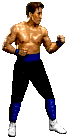
Liu Kang...
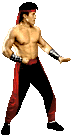
Mortal Kombat II's sprites were much brighter than those of its predecessor, and from what I know they were also bigger in general. Midway's team of programmers and artists made the most of the arcade hardware and kharacter design took a more detailed approach. OG Bruce Lee clone Liu Kang certainly benefitted from this new aesthetic splash. Moving away from his simple martial arts pants and shoes, he instead adopted a slightly more bombastic look that would set the tone for all of his subsequent designs. The black and red are just wonderful contrasts and are neat to see on a then-incorruptible video game protagonist as opposed to being strictly reserved for villains, and the headband improves his silhouette ever so slightly. His metal arm bracelets also give his top half a bit more...well, just a bit more. And sometimes that's all you need.
Raiden...
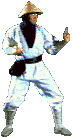
The God of Thunder probably had one of the more striking silhouettes among the playable fighters in the first outing and it's been largely maintained for the sequel. Just as Liu Kang would come to be associated with a recurring support color from the second game onwards, Raiden would take one as well, in this case, blue. I've seen someone refer to the blue overtunic(?) as a bib at the old place and I don't entirely disagree. I welcome the flair added to many of the veterans, though in this case, the splash of color looks a little odd at times. I like Raiden wearing blue and love several of his designs that feature the overtunic with even more extravagant designs, folds, and the like. In this case, however, I think it's the boxiness of the tunic that makes it look like a plain apron. Defenders of the Realm and the arcade games' promotional art admittedly make the design look better, but I think I actually prefer Raiden's less ostentatious white robes from the first game. Amusingly, Raiden's sprite in the second game seems to have widened his hat to obscure his eyes. You'd think they'd want players to see Raiden's eyes more when his depiction transitioned to that of a more benevolent deity in the lore.
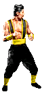
Johnny Cage...
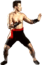
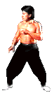
Much like Liu Kang, this is an example of a kharacter taking steps away from their real-world inspiration and gradually taking more of a life of their own. In Johnny's case, his inspiration was a Bloodsport-era Jean-Claude Van Damme, but MKII opted to ditch the MMA shorts and red sash for exercise pants and white shoes with splashes of blue to serve as a contrast. This would effectively be the template for all of Johnny's default designs up through the reboot, and while I think later games would provide better takes on the design, I like the 1993 version as well. I do like that similarly to Kitana's attire they chose a darker shade of blue to set him apart from Sub-Zero.
...Still no sunglasses in the default sprite yet, though.
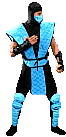
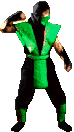
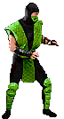
Scorpion...
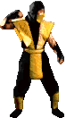

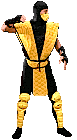
Yay, I get to be redundant with these guys. The palette swaps probably got the least overt changes between games and were touched up in more subtle ways, probably because they had strong silhouettes and upfront colors to begin with. Scorpion (and by extension Sub-Zero and Reptile) got the expected budget increase glow-up, meaning the quilted pattern on their tunics was more easily noticeable. Some additional padding to their leg areas and new belts, pretty under-the-radar differences. Honestly, the best thing they got as far as I'm concerned is the new masks. They're my favorite of the arcade-era ninja masks, maybe it's because I just love the venting on them, maybe it's because they're the closest thing we got to the awesome movie ninja masks. Overall, the trio just received small but welcome adjustments to their already iconic designs.
Sub-Zero(s)...
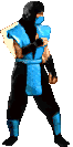

Yeah, I guess we have to deal with this early. You all know the drill, there was Bi-Han in the first game, Kuai Liang in the sequels, and Bi-Han was eventually revealed to have become Noob Saibot. So we're just going to compare all of them right now. Maybe I'll split them up for MK3 and MK9.
Yeah, Bi-Han got his glow-up like Scorpion did and decided to hide it by dumping a bucket of printer ink all over himself. I've got nothing else to say.
Reptile...
The original secret fighter finally got promoted to a playable role and celebrated with an idle animation he could actually call his own. And his green tunic became a few shades lighter, which fits with his whole acid-spitting gimmick. That's about all I can say other than that this is the first game where we actually see glimpses of Reptile truly being a reptile underneath the mask. But that's a larger discussion for another time.
Shang Tsung...
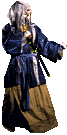
And finally, we have the original final boss of the series, now "demoted" to a playable fighter. Keeping in line with the sequel's story as seen in its opening, Shang Tsung has seen his youth restored by his superior Shao Kahn so that he can take a more active role in thwarting the forces of Earthrealm. Alas, I miss the evil kung fu wizard look he sported in the first game. His new kostume is certainly more conducive for maneuverability for the actor and the spriters, but the robes provided a stronger silhouette and I personally preferred the color scheme. Now, Shang Tsung is basically in his corrupted former Mortal Kombat Champion state. He looks like could've been the protagonist of another series or Mortal Kombat in an alternate timeline, which is an interesting conceit I'll admit. The suspenders are also interesting, and I admit I don't know if they have some real-world inspiration relating to Shang Tsung's Chinese background or if that was just Tobias and co. getting creative.
Overall, we have a quite solid set of redesigns for the first sequel. "The first game but with a budget" is surprisingly an effective means by which to retool kharacters' kostumes (no, I will not stop putting "k" in these words). Truthfully, just the wholehearted embrace of color is something that I appreciate. No reason the ninjas have to have all the fun. Liu Kang, Raiden, and Johnny all got what would effectively become their iconic looks just with a bit of tweaking upon their original designs. It should be noted that in my pursuit of deliberately focusing on the veterans, I'm missing the whole of these games' aesthetics. For example, a good portion of the dark fantasy vibe of Mortal Kombat II's aesthetic is notably because of the more eccentric fighters like Shao Kahn, Baraka, and to a slightly lesser extent Mileena. With any luck, I'll actually update this thread and talk about how they changed or didn't change in Mortal Kombat 3 and its updates.
EDIT: I forgot to mention, credit goes to L Thammy for providing me advice on thread construction and setting the tone for a good OP.
So here it is. My
I am not an artist and I am not a fashion designer by trade, I'm just a dude who played Deadly Alliance way too young and seemingly got attached to the people of this Power Rangers by way of death metal album world and the fantasy kitchen sink threads they've donned over the years.
We start with the franchise's first sequel.
Mortal Kombat II released less than seven months after the original game proved to be a smash success. As such, the ambition of this game increased rather drastically. More kharacters, more finishing moves, more violence. "Mortal Kombat, but with a bigger budget" seems to have been the meta aesthetic to the game's actual aesthetic. Moving beyond the Enter the Dragon send-up of the inaugural entry, MKII opted to take a more dark fantasy direction, and its newcomer designs (most prominently Baraka) reflect this...but we're not talking about the new guys. We're talking about the old guys, who finally got to have some color added to their designs thanks to this Outworld sorcery technique called "money."
Since there are only really two games to compare for this post, that makes my job formatting easy. Images on the left are from Mortal Kombat; images on the right are from Mortal Kombat II.
This could take a while, so here's some music to set the mood:
View: https://www.youtube.com/watch?v=fkRR7yNemB4
Liu Kang...
Mortal Kombat II's sprites were much brighter than those of its predecessor, and from what I know they were also bigger in general. Midway's team of programmers and artists made the most of the arcade hardware and kharacter design took a more detailed approach. OG Bruce Lee clone Liu Kang certainly benefitted from this new aesthetic splash. Moving away from his simple martial arts pants and shoes, he instead adopted a slightly more bombastic look that would set the tone for all of his subsequent designs. The black and red are just wonderful contrasts and are neat to see on a then-incorruptible video game protagonist as opposed to being strictly reserved for villains, and the headband improves his silhouette ever so slightly. His metal arm bracelets also give his top half a bit more...well, just a bit more. And sometimes that's all you need.
Raiden...
The God of Thunder probably had one of the more striking silhouettes among the playable fighters in the first outing and it's been largely maintained for the sequel. Just as Liu Kang would come to be associated with a recurring support color from the second game onwards, Raiden would take one as well, in this case, blue. I've seen someone refer to the blue overtunic(?) as a bib at the old place and I don't entirely disagree. I welcome the flair added to many of the veterans, though in this case, the splash of color looks a little odd at times. I like Raiden wearing blue and love several of his designs that feature the overtunic with even more extravagant designs, folds, and the like. In this case, however, I think it's the boxiness of the tunic that makes it look like a plain apron. Defenders of the Realm and the arcade games' promotional art admittedly make the design look better, but I think I actually prefer Raiden's less ostentatious white robes from the first game. Amusingly, Raiden's sprite in the second game seems to have widened his hat to obscure his eyes. You'd think they'd want players to see Raiden's eyes more when his depiction transitioned to that of a more benevolent deity in the lore.
Johnny Cage...
Much like Liu Kang, this is an example of a kharacter taking steps away from their real-world inspiration and gradually taking more of a life of their own. In Johnny's case, his inspiration was a Bloodsport-era Jean-Claude Van Damme, but MKII opted to ditch the MMA shorts and red sash for exercise pants and white shoes with splashes of blue to serve as a contrast. This would effectively be the template for all of Johnny's default designs up through the reboot, and while I think later games would provide better takes on the design, I like the 1993 version as well. I do like that similarly to Kitana's attire they chose a darker shade of blue to set him apart from Sub-Zero.
...Still no sunglasses in the default sprite yet, though.
Scorpion...
Yay, I get to be redundant with these guys. The palette swaps probably got the least overt changes between games and were touched up in more subtle ways, probably because they had strong silhouettes and upfront colors to begin with. Scorpion (and by extension Sub-Zero and Reptile) got the expected budget increase glow-up, meaning the quilted pattern on their tunics was more easily noticeable. Some additional padding to their leg areas and new belts, pretty under-the-radar differences. Honestly, the best thing they got as far as I'm concerned is the new masks. They're my favorite of the arcade-era ninja masks, maybe it's because I just love the venting on them, maybe it's because they're the closest thing we got to the awesome movie ninja masks. Overall, the trio just received small but welcome adjustments to their already iconic designs.
Sub-Zero(s)...
Yeah, I guess we have to deal with this early. You all know the drill, there was Bi-Han in the first game, Kuai Liang in the sequels, and Bi-Han was eventually revealed to have become Noob Saibot. So we're just going to compare all of them right now. Maybe I'll split them up for MK3 and MK9.
Yeah, Bi-Han got his glow-up like Scorpion did and decided to hide it by dumping a bucket of printer ink all over himself. I've got nothing else to say.
Reptile...
The original secret fighter finally got promoted to a playable role and celebrated with an idle animation he could actually call his own. And his green tunic became a few shades lighter, which fits with his whole acid-spitting gimmick. That's about all I can say other than that this is the first game where we actually see glimpses of Reptile truly being a reptile underneath the mask. But that's a larger discussion for another time.
Shang Tsung...
And finally, we have the original final boss of the series, now "demoted" to a playable fighter. Keeping in line with the sequel's story as seen in its opening, Shang Tsung has seen his youth restored by his superior Shao Kahn so that he can take a more active role in thwarting the forces of Earthrealm. Alas, I miss the evil kung fu wizard look he sported in the first game. His new kostume is certainly more conducive for maneuverability for the actor and the spriters, but the robes provided a stronger silhouette and I personally preferred the color scheme. Now, Shang Tsung is basically in his corrupted former Mortal Kombat Champion state. He looks like could've been the protagonist of another series or Mortal Kombat in an alternate timeline, which is an interesting conceit I'll admit. The suspenders are also interesting, and I admit I don't know if they have some real-world inspiration relating to Shang Tsung's Chinese background or if that was just Tobias and co. getting creative.
Overall, we have a quite solid set of redesigns for the first sequel. "The first game but with a budget" is surprisingly an effective means by which to retool kharacters' kostumes (no, I will not stop putting "k" in these words). Truthfully, just the wholehearted embrace of color is something that I appreciate. No reason the ninjas have to have all the fun. Liu Kang, Raiden, and Johnny all got what would effectively become their iconic looks just with a bit of tweaking upon their original designs. It should be noted that in my pursuit of deliberately focusing on the veterans, I'm missing the whole of these games' aesthetics. For example, a good portion of the dark fantasy vibe of Mortal Kombat II's aesthetic is notably because of the more eccentric fighters like Shao Kahn, Baraka, and to a slightly lesser extent Mileena. With any luck, I'll actually update this thread and talk about how they changed or didn't change in Mortal Kombat 3 and its updates.
Last edited: