A personal rundown of Mortal Kombat & Injustice veterans' kostume redesigns (MK/Injustice series spoilers)
- Thread starter Scrappy-Fan92
- Start date
You are using an out of date browser. It may not display this or other websites correctly.
You should upgrade or use an alternative browser.
You should upgrade or use an alternative browser.
Threadmarks
View all 45 threadmarks
Reader mode
Reader mode
Recent threadmarks
Injustice 2 post (part one) Injustice 2 post (part two, now w/Speedsters, Lobo, Lucius Fox, Lucy Quinzel, Connor, Hawkman, Etrigan, & Deadman) Injustice (2021) post Final wrap-up (part one) and announcements for future plans Final wrap-up (part two) What's next? Mortal Kombat Legends: Snow Blind post What could be next for this thread.Yeah, what's up with that? Like I love it, but where did it come from? Was the new movie that much of a zeitgeist?There's so many Mortal Kombat threads on Era lately. It's great!
Love threads like these! I'm a sucker for written comparisons and this thread is scratching that itch perfectly.
Mortal Kombat 3 post (now with Ermac & Dan Forden)
OP
OP
And we're back.
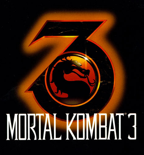
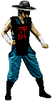
After the dark fantasy outing of Mortal Kombat II, Midway took a bit longer for the next entry. Mortal Kombat 3 released in April 1995, and was notable for introducing a slew of new kharacters (as well as initially omitting many old ones) and taking the story into a more urban fantasy direction. Outworld's forces would invade Earthrealm directly, meaning Raiden's champions would have to take to the streets to defend their home. Keeping in line with this more "grounded" story and definitely not because Daniel Pesina got dismissed, MK3 would pivot away from the original recolors the series had become famous for and alter its Lin Kuei warriors accordingly (mostly via roboticization). Hope you like WWF, because we're about to enter the wacky pants era.
View: https://www.youtube.com/watch?v=j6a7Ku87tRc&pp=ygUjbWszIGNoYXJhY3RlciBzZWxlY3QgdGhlbWUgZXh0ZW5kZWQ%3D
Liu Kang...
I told you the MKII design set the stage for his subsequent looks. Liu Kang's largely entered the third game with the same kostume as he had before with perhaps one key difference: the black bindings around his legs. Those too would be consistent parts of the overall look from here on out.
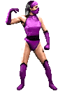
Sonya...
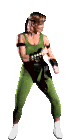
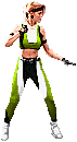
Remember how I mentioned ad nauseam that the first sequel basically took the original game's designs and supercharged them with additional details and colors? That's more or less how I feel about Sonya's new duds here. Taking the basic MMA fighter/aerobics instructor garb of the first game and adding some detailed patterning and another support color. I'm digging the gloves, too. You skipped a game, Sonya, but it seems Midway made it up to you with a snazzy new look.
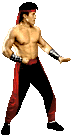
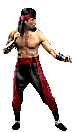
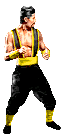
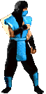
Sub-Zero (Kuai Liang)...
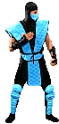
Now I can separate the two Cryomancer brothers because they each have their own unique designs. For the younger Sub-Zero, story decisions led to him abandoning the Lin Kuei lifestyle over objections to their internal corruption (and that whole thing about them forcibly converting their ranks into soulless cyborgs). For the first time ever, Kuai Liang is truly his own man. This is probably the most controversial of the redesigns featured in this game, but you know what, I like it. Could've done without the blue crotch patch, but the suit's unique and would provide the foundation for some similar suspender-centric kostumes down the line. It's only just occurred to me how much metal plating there is on this design compared to the previous one, which is funny given what Kuai Liang's trying to run away from...
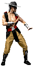
Kano...
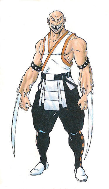
Black and red and evil all over, it's Kano alright. He already looked like a no-nonsense mercenary in the first game, but MK3 Kano? He looks like he's ready to kill you and his outfit is just bragging about how he's going to do it. Look at those knife holders. I didn't even know he had them until today. I love this redesign, and I love that MK9 basically reused it. Pre-Trevor Goddard Kano went out in style.
Shang Tsung...
His kostume in MK3 is kind of just an inversion of the MKII one. Black pants with a yellow sash and straps jutting outward are succeeded by yellow pants with a black sash and straps closer to the neck. Underoos aside, I think I prefer this new design. For me, I'm not even sure it's a less-is-more situation so much as a same-but-somehow-better one. Also, honorable mention to the facial markings. Are they there to mask the identity of the new actor? Possibly. But they look cool on their own merits and it's a little weird they never really showed up again.
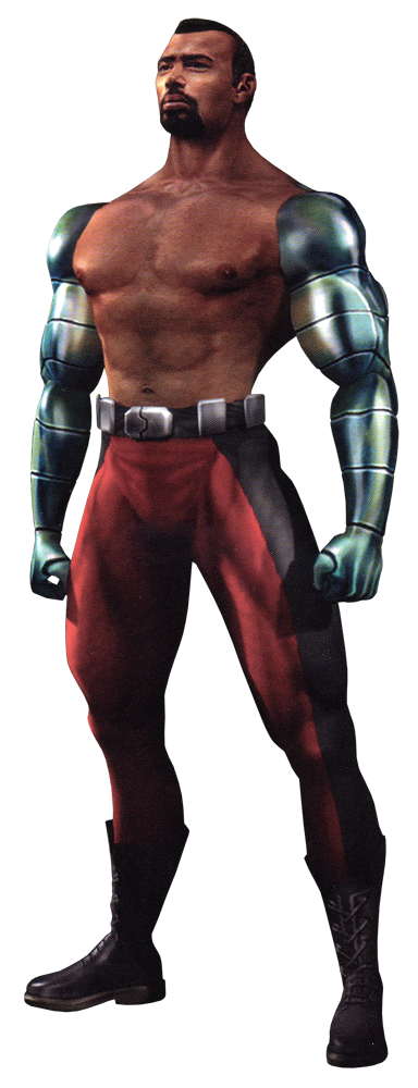
Jax...
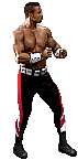
At last, Major Briggs gets his most famous attribute. For the purposes of this thread, the metal arms will be counted as clothing and I say they look awesome here. They give him something he can really call his own. Putting that aside, I just prefer the pants he has in MK3 as well. For him, two colors work better than the specific three he had in MKII, and this shade of purple is something no one really had at the time, so it adds further uniqueness to him. Amusingly enough, I think the belt and boots are the same between both designs. All in all, Jax got a glow-up.
Kung Lao...
The other Shaolin monk finally gets his due. Admittedly, I prefer the color scheme of his first kostume and it seems the devs agreed given how the former's palette served as the basis of many of his other designs for the next 16 years. With that said, his garb in MKII hits a similar snag as Raiden's. The outfit's fabric just looks a bit flimsy to me. CMM1215 on the NintendoEra Discord server offhandedly referred to it as a trash bag, and now I can't unsee it. The MK3 design, while trading away the snazzy blue undersuit just flows a bit better. I like the patterning on one of his suspenders, the shinier gauntlets, and the loincloth, and even the way his hat is tipped here looks cooler in his idle stance. He almost looks evil here, but Kung Lao's just a douche at worst in canon and largely a boy scout at this point in the series, so I'll take Tony Marquez at his word when he cited the Man with No Name as the inspiration for the kharacter's look.
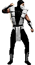
Smoke...
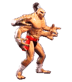
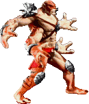
And so begins the long road of the other heroic Lin Kuei getting screwed over in canon. Not the design itself, though, it's awesome. I love the klassic cyborgs. Discount Predators in BMX gear is the specific kind of stupidity I didn't know I needed in this series. And the klassic designs are probably the only time the cyber "ninja" actually looked the part (note: I'm just saying that because the metal loincloths are here. I feel they contribute a fair deal in making the robots look less naked). Not sure why his armor is more of a purplish blue as opposed to gray, but I dig it.
Noob Saibot...


Noob returned as a secret opponent in vanilla MK3. Unfortunately for him, there was no traditional ninja template for him to copy off of, so the devs just darkened Kano's sprites. Why they didn't just use the unmasked Sub-Zero as a base I don't know.
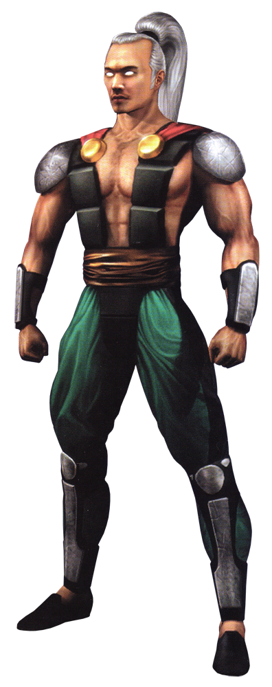
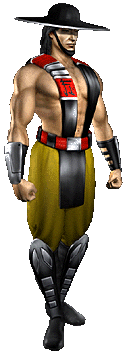
Shao Kahn...
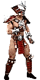
Unlike everyone else in vanilla and Ultimate MK3, Shao Kahn retained his sprite from the prior sequel, though with some new attacks added. Shao Kahn needs no elaborate description. He's human Bowser if he opted to wear red armor and become a stripper warlord, and as such he's the perfect foil to Shang Tsung's appearance in the original game. On the right of his sprite is concept art from MK Trilogy which opted to depict Shao Kahn with a cape for the first time. I think it completes the look and this too will be something carried over into subsequent titles.
That about covers every returning fighter in the original version of MK3. Now let's talk about the army of recolors.
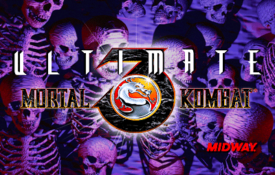
Ultimate Mortal Kombat 3
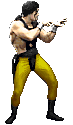
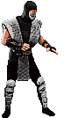
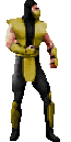
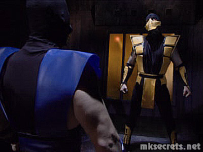
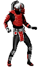
Scorpion...
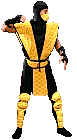
Heck yes. This is what I consider to be the definitive Scorpion design. The sprites to some extent don't do him justice. The skull lining (or very skull-esque shadows) on his mask in concept art is awesome and MK4 would thankfully make it more apparent in-game. I miss the hockey masks and cross-stitched tunics of the MKII ninjas, but they were replaced by something slightly more unique and thankfully still aesthetically pleasing in its own right.
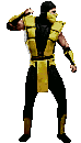
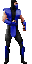
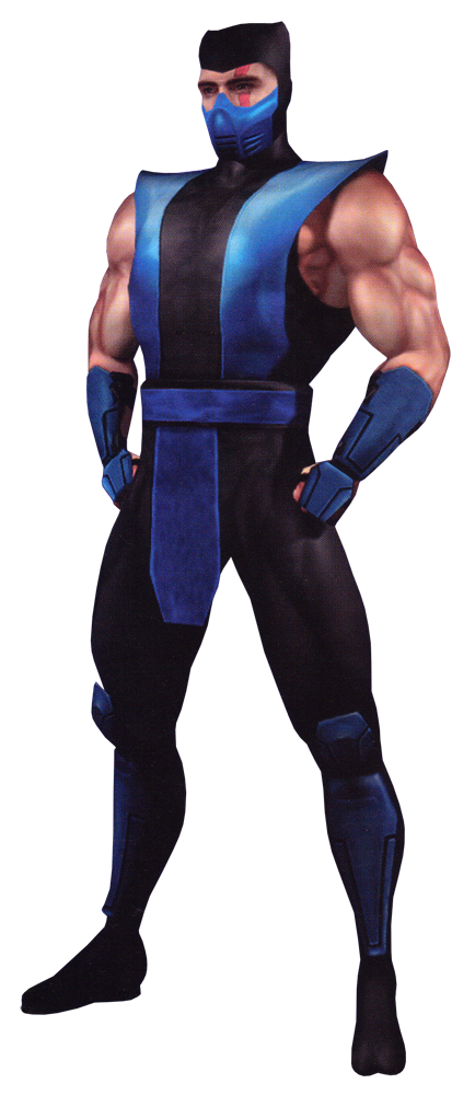
Sub-Zero (Bi-Han)...
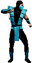
Seems Bi-Han got to retain the sky blue while his baby brother opted for a shade closer to Kitana's blue. Pretty much everything I said about Scorpion applies to him as well.
Reptile...
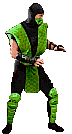
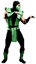
His tunic's taken a more pastel shade of green now. If I may digress, I think this is the best idle he ever had in the 2D arcade games. It's just snakelike swagger. Now before I move on, I want you all to take a good long look at Reptile right here, because this is the last game to fully commit to the disguised human in green gimmick. He'll get to more unique (and greener, much greener) pastures eventually, and for the most part I'm alright with that.
Kitana...
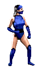
It's hard to modify what's effectively a one-piece swimsuit, but I think Midway pulled it off. The heavier use of black on the female ninjas' outfits works well without completely overtaking the primary colors, and I like the new boots. If I have any real complaint about the new outfit, it's that the MKII kostume looks more comfortable to wear.
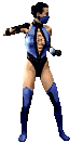
Jade...
Second verse, same as the first. Jade would honestly take more long-term inspiration from her UMK3 attire than Mileena or even Kitana ever would which is certainly interesting.
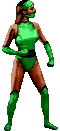
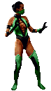
Mileena...
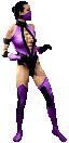
After the second, is the third verse I reckon. I suppose now would be as good a time as any to point out MK3's more muted color palette. I'm personally fonder of MKII's brighter colors which helped make the outfits pop. Mileena's kostume and its coloration still pop, mind you, I just prefer the brighter shade of purple.If When I get to MK4 and beyond, I'll finally be able to go more in-depth on the other Edenian women's outfits once they stop stealing from Kitana's wardrobe.
Smoke...Smoke? Again?
UMK3 offered a secret input to change Cyber Smoke back into his human counterpart, which means we get Gray Scorpion again. Oddly enough, I think I prefer human Smoke in his MKII attire. I don't even know why, I just like the shade of gray he's rocking with the hockey mask and kneepads.
Ermac...

Ermac started off as a color-display error from the original game due to Midway's use of digitally altered red suits for the ninja motion capture, which apparently became a schoolyard rumor that was eventually brought to life. Most assumed he became an official kharacter with UMK3's arcade release, but I've apparently learned otherwise. According to this decade-old Tweet from series co-creator John Tobias, Ermac made his first appearance in the MKII collector's edition tie-in comic that was apparently published in 1993 or 1994. He's seen pictured in the comic alongside Kuai Liang, Smoke, and the Shaolin monks as their ally which contradicts his (original) canonical role as an amalgamation of souls serving under Shao Kahn. For his comic appearance, he wears the comic's rendition of the MKII ninja uniform.
Noob Saibot...again...
Finally, he can be a normal recolor again. I'm noticing the ninjas this time around seem to share idle stances more. More importantly, we can actually make out some features on Noob this time around which roughly coincides with when he started having actual story relevance and thus graduated from a mere shadow to a shadow with an agenda.
And finally, we can move on to the rest. With the exception of one kharacter, none of the following received new battle sprites.
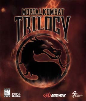
Mortal Kombat Trilogy
Raiden...
He's back with the apron (and his original design is accessible via input, a feature that also applies to Kano, Jax, and Kung Lao). On the right is his versus screen sprite, which actually has Raiden portrayed by Sal Divita instead of Carlos Pesina.
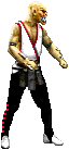
Johnny Cage...
Let me be upfront. The Trilogy design is not red by default, the P2 version is just the only sprite I could find. Color change aside, it's not all that different aside from the black shoes and more elaborate gloves. Frankly, I'm just happy he wears his shades by default for the first time.
Goro...and Kintaro...
Yeah, I'm putting these two next to each other. They've got no MK3 art and no versus screens I could use because they're veteran sub-bosses who were added into MK3 in its last major revision. So for fun, I'll compare the two Shokan to each other. Goro is iconic for a reason and Kintaro very much fills the same Claymation monster niche in MKII. And because he's from MKII, Kintaro animates better and has more detail. Alas, our tiger-themed friend's appearances would be quite sparse after Trilogy, and Goro's designs would largely stay the same for the remainder of the 90s and 2000s, so I won't get to talk much about either of these guys for a while.
Baraka...
And we end this section with the first overtly monstrous playable kharacter in the series (Goro's playable stint in the first title's Game Boy version notwithstanding). Baraka's cool. He's a jobber in a Halloween mask, but he's cool. He always had a surprisingly basic design for a high-ranking general of the villain faction's main grunts. Given we learn the Tarkatans are a nomadic warrior tribe who had the misfortune to fall under Shao Kahn's dominion, I think it works. Likely coincidental, but it is funny that Richard Divizio wound up playing two different villains with contrasting color schemes in MK Trilogy. On an unrelated note, the metal loincloth was always an interesting choice to me. Not bad, just interesting. I am a little surprised that in-game and in MKII's concept art, his eyes just look like empty black voids. It's interesting that Midway changed that come the next game.
And such are the designs of Mortal Kombat 3 and its revisions. Like I said, Mortal Kombat II did a lot of the heavy lifting in sprucing up kharacters, but honestly, I like just about every redesign in this game. Even ones people might be iffy on like Kuai Liang and Cyber Smoke are at least interesting in concept and demonstrate unique implications for "the lore" (arguably the first time a sequel in this series attempted to do so through kostume design for the veterans). And even so, they're mitigated by "klassic" versions being provided in UMK3.
Now unfortunately for this game's batch of newcomers, I won't be able to talk about them as a collective for the next mainline game as I was for MKII's newcomers here due to the simple fact that MK4 never built itself up to becoming a Dream Match via asset reuse. Though I'm getting ahead of myself, 'cause I'm going to take a brief detour to the franchise's first spin-off -- and the only one definitively in continuity with the fighting games -- Mortal Kombat Mythologies: Sub-Zero. Stay tuned.
EDIT: I realize I missed someone else featured in multiple games.
Dan Forden...

I gotta say, the decision to improve Dan's color palette with a purple shirt was a stroke of genius. He sticks out far more when he pops up in battles now and it's a nice way to tie into his story arc where he fakes his allegiance to Rain. One of MK3's best redesigns.
After the dark fantasy outing of Mortal Kombat II, Midway took a bit longer for the next entry. Mortal Kombat 3 released in April 1995, and was notable for introducing a slew of new kharacters (as well as initially omitting many old ones) and taking the story into a more urban fantasy direction. Outworld's forces would invade Earthrealm directly, meaning Raiden's champions would have to take to the streets to defend their home. Keeping in line with this more "grounded" story and definitely not because Daniel Pesina got dismissed, MK3 would pivot away from the original recolors the series had become famous for and alter its Lin Kuei warriors accordingly (mostly via roboticization). Hope you like WWF, because we're about to enter the wacky pants era.
View: https://www.youtube.com/watch?v=j6a7Ku87tRc&pp=ygUjbWszIGNoYXJhY3RlciBzZWxlY3QgdGhlbWUgZXh0ZW5kZWQ%3D
Liu Kang...
I told you the MKII design set the stage for his subsequent looks. Liu Kang's largely entered the third game with the same kostume as he had before with perhaps one key difference: the black bindings around his legs. Those too would be consistent parts of the overall look from here on out.
Sonya...
Remember how I mentioned ad nauseam that the first sequel basically took the original game's designs and supercharged them with additional details and colors? That's more or less how I feel about Sonya's new duds here. Taking the basic MMA fighter/aerobics instructor garb of the first game and adding some detailed patterning and another support color. I'm digging the gloves, too. You skipped a game, Sonya, but it seems Midway made it up to you with a snazzy new look.
Sub-Zero (Kuai Liang)...
Now I can separate the two Cryomancer brothers because they each have their own unique designs. For the younger Sub-Zero, story decisions led to him abandoning the Lin Kuei lifestyle over objections to their internal corruption (and that whole thing about them forcibly converting their ranks into soulless cyborgs). For the first time ever, Kuai Liang is truly his own man. This is probably the most controversial of the redesigns featured in this game, but you know what, I like it. Could've done without the blue crotch patch, but the suit's unique and would provide the foundation for some similar suspender-centric kostumes down the line. It's only just occurred to me how much metal plating there is on this design compared to the previous one, which is funny given what Kuai Liang's trying to run away from...
Kano...
Black and red and evil all over, it's Kano alright. He already looked like a no-nonsense mercenary in the first game, but MK3 Kano? He looks like he's ready to kill you and his outfit is just bragging about how he's going to do it. Look at those knife holders. I didn't even know he had them until today. I love this redesign, and I love that MK9 basically reused it. Pre-Trevor Goddard Kano went out in style.
Shang Tsung...
His kostume in MK3 is kind of just an inversion of the MKII one. Black pants with a yellow sash and straps jutting outward are succeeded by yellow pants with a black sash and straps closer to the neck. Underoos aside, I think I prefer this new design. For me, I'm not even sure it's a less-is-more situation so much as a same-but-somehow-better one. Also, honorable mention to the facial markings. Are they there to mask the identity of the new actor? Possibly. But they look cool on their own merits and it's a little weird they never really showed up again.
Jax...
At last, Major Briggs gets his most famous attribute. For the purposes of this thread, the metal arms will be counted as clothing and I say they look awesome here. They give him something he can really call his own. Putting that aside, I just prefer the pants he has in MK3 as well. For him, two colors work better than the specific three he had in MKII, and this shade of purple is something no one really had at the time, so it adds further uniqueness to him. Amusingly enough, I think the belt and boots are the same between both designs. All in all, Jax got a glow-up.
Kung Lao...
The other Shaolin monk finally gets his due. Admittedly, I prefer the color scheme of his first kostume and it seems the devs agreed given how the former's palette served as the basis of many of his other designs for the next 16 years. With that said, his garb in MKII hits a similar snag as Raiden's. The outfit's fabric just looks a bit flimsy to me. CMM1215 on the NintendoEra Discord server offhandedly referred to it as a trash bag, and now I can't unsee it. The MK3 design, while trading away the snazzy blue undersuit just flows a bit better. I like the patterning on one of his suspenders, the shinier gauntlets, and the loincloth, and even the way his hat is tipped here looks cooler in his idle stance. He almost looks evil here, but Kung Lao's just a douche at worst in canon and largely a boy scout at this point in the series, so I'll take Tony Marquez at his word when he cited the Man with No Name as the inspiration for the kharacter's look.
Smoke...
And so begins the long road of the other heroic Lin Kuei getting screwed over in canon. Not the design itself, though, it's awesome. I love the klassic cyborgs. Discount Predators in BMX gear is the specific kind of stupidity I didn't know I needed in this series. And the klassic designs are probably the only time the cyber "ninja" actually looked the part (note: I'm just saying that because the metal loincloths are here. I feel they contribute a fair deal in making the robots look less naked). Not sure why his armor is more of a purplish blue as opposed to gray, but I dig it.
Noob Saibot...
Noob returned as a secret opponent in vanilla MK3. Unfortunately for him, there was no traditional ninja template for him to copy off of, so the devs just darkened Kano's sprites. Why they didn't just use the unmasked Sub-Zero as a base I don't know.
Shao Kahn...
Unlike everyone else in vanilla and Ultimate MK3, Shao Kahn retained his sprite from the prior sequel, though with some new attacks added. Shao Kahn needs no elaborate description. He's human Bowser if he opted to wear red armor and become a stripper warlord, and as such he's the perfect foil to Shang Tsung's appearance in the original game. On the right of his sprite is concept art from MK Trilogy which opted to depict Shao Kahn with a cape for the first time. I think it completes the look and this too will be something carried over into subsequent titles.
That about covers every returning fighter in the original version of MK3. Now let's talk about the army of recolors.
Ultimate Mortal Kombat 3
Scorpion...
Heck yes. This is what I consider to be the definitive Scorpion design. The sprites to some extent don't do him justice. The skull lining (or very skull-esque shadows) on his mask in concept art is awesome and MK4 would thankfully make it more apparent in-game. I miss the hockey masks and cross-stitched tunics of the MKII ninjas, but they were replaced by something slightly more unique and thankfully still aesthetically pleasing in its own right.
Sub-Zero (Bi-Han)...
Seems Bi-Han got to retain the sky blue while his baby brother opted for a shade closer to Kitana's blue. Pretty much everything I said about Scorpion applies to him as well.
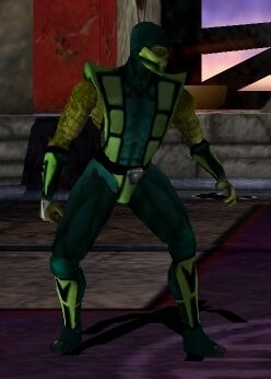
Reptile...
His tunic's taken a more pastel shade of green now. If I may digress, I think this is the best idle he ever had in the 2D arcade games. It's just snakelike swagger. Now before I move on, I want you all to take a good long look at Reptile right here, because this is the last game to fully commit to the disguised human in green gimmick. He'll get to more unique (and greener, much greener) pastures eventually, and for the most part I'm alright with that.
Kitana...
It's hard to modify what's effectively a one-piece swimsuit, but I think Midway pulled it off. The heavier use of black on the female ninjas' outfits works well without completely overtaking the primary colors, and I like the new boots. If I have any real complaint about the new outfit, it's that the MKII kostume looks more comfortable to wear.
Jade...
Second verse, same as the first. Jade would honestly take more long-term inspiration from her UMK3 attire than Mileena or even Kitana ever would which is certainly interesting.
Mileena...
After the second, is the third verse I reckon. I suppose now would be as good a time as any to point out MK3's more muted color palette. I'm personally fonder of MKII's brighter colors which helped make the outfits pop. Mileena's kostume and its coloration still pop, mind you, I just prefer the brighter shade of purple.
Smoke...Smoke? Again?
UMK3 offered a secret input to change Cyber Smoke back into his human counterpart, which means we get Gray Scorpion again. Oddly enough, I think I prefer human Smoke in his MKII attire. I don't even know why, I just like the shade of gray he's rocking with the hockey mask and kneepads.
Ermac...
Ermac started off as a color-display error from the original game due to Midway's use of digitally altered red suits for the ninja motion capture, which apparently became a schoolyard rumor that was eventually brought to life. Most assumed he became an official kharacter with UMK3's arcade release, but I've apparently learned otherwise. According to this decade-old Tweet from series co-creator John Tobias, Ermac made his first appearance in the MKII collector's edition tie-in comic that was apparently published in 1993 or 1994. He's seen pictured in the comic alongside Kuai Liang, Smoke, and the Shaolin monks as their ally which contradicts his (original) canonical role as an amalgamation of souls serving under Shao Kahn. For his comic appearance, he wears the comic's rendition of the MKII ninja uniform.
Noob Saibot...again...
Finally, he can be a normal recolor again. I'm noticing the ninjas this time around seem to share idle stances more. More importantly, we can actually make out some features on Noob this time around which roughly coincides with when he started having actual story relevance and thus graduated from a mere shadow to a shadow with an agenda.
And finally, we can move on to the rest. With the exception of one kharacter, none of the following received new battle sprites.
Mortal Kombat Trilogy
Raiden...
He's back with the apron (and his original design is accessible via input, a feature that also applies to Kano, Jax, and Kung Lao). On the right is his versus screen sprite, which actually has Raiden portrayed by Sal Divita instead of Carlos Pesina.
Johnny Cage...
Let me be upfront. The Trilogy design is not red by default, the P2 version is just the only sprite I could find. Color change aside, it's not all that different aside from the black shoes and more elaborate gloves. Frankly, I'm just happy he wears his shades by default for the first time.
Goro...and Kintaro...
Yeah, I'm putting these two next to each other. They've got no MK3 art and no versus screens I could use because they're veteran sub-bosses who were added into MK3 in its last major revision. So for fun, I'll compare the two Shokan to each other. Goro is iconic for a reason and Kintaro very much fills the same Claymation monster niche in MKII. And because he's from MKII, Kintaro animates better and has more detail. Alas, our tiger-themed friend's appearances would be quite sparse after Trilogy, and Goro's designs would largely stay the same for the remainder of the 90s and 2000s, so I won't get to talk much about either of these guys for a while.
Baraka...
And we end this section with the first overtly monstrous playable kharacter in the series (Goro's playable stint in the first title's Game Boy version notwithstanding). Baraka's cool. He's a jobber in a Halloween mask, but he's cool. He always had a surprisingly basic design for a high-ranking general of the villain faction's main grunts. Given we learn the Tarkatans are a nomadic warrior tribe who had the misfortune to fall under Shao Kahn's dominion, I think it works. Likely coincidental, but it is funny that Richard Divizio wound up playing two different villains with contrasting color schemes in MK Trilogy. On an unrelated note, the metal loincloth was always an interesting choice to me. Not bad, just interesting. I am a little surprised that in-game and in MKII's concept art, his eyes just look like empty black voids. It's interesting that Midway changed that come the next game.
And such are the designs of Mortal Kombat 3 and its revisions. Like I said, Mortal Kombat II did a lot of the heavy lifting in sprucing up kharacters, but honestly, I like just about every redesign in this game. Even ones people might be iffy on like Kuai Liang and Cyber Smoke are at least interesting in concept and demonstrate unique implications for "the lore" (arguably the first time a sequel in this series attempted to do so through kostume design for the veterans). And even so, they're mitigated by "klassic" versions being provided in UMK3.
Now unfortunately for this game's batch of newcomers, I won't be able to talk about them as a collective for the next mainline game as I was for MKII's newcomers here due to the simple fact that MK4 never built itself up to becoming a Dream Match via asset reuse. Though I'm getting ahead of myself, 'cause I'm going to take a brief detour to the franchise's first spin-off -- and the only one definitively in continuity with the fighting games -- Mortal Kombat Mythologies: Sub-Zero. Stay tuned.
EDIT: I realize I missed someone else featured in multiple games.
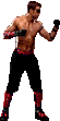
Dan Forden...
I gotta say, the decision to improve Dan's color palette with a purple shirt was a stroke of genius. He sticks out far more when he pops up in battles now and it's a nice way to tie into his story arc where he fakes his allegiance to Rain. One of MK3's best redesigns.
Last edited:
To the OP: Yes, the markings on the face are to hide the actor for Shang Tsung. It's the same guy as Sub-Zero (John Turk).
That out of the way, I really didn't like any of the MK3 designs outside of Sonya. She's the only one where I preferred the new actor (Kerri Hoskins) to the original's (Elizabeth Malecki). I preferred the way Pesina did Cage's standard attacks and the Ninja's over the newer actors. I also really like Ho Sung Pak Liu Kang--I didn't like Eddie Wong's portrayal. I preferred the MKII look for all of the female ninja's as well. The lack of consistency in fighting stances is also something that bothered me moving to 3. Even the ones where the actor stayed the same with Kano (Rich Divizio), Jax (John Parrish) and Kung Lao (Anthony Marquez), I greatly preferred their look in the earlier games. This is also where the fatalities became too goofy with way too many bones and characters not falling over--the series has since way over-corrected on this.
I've actually never seen that Raiden Trilogy versus screen image. Interesting. I always had the PlayStation version, which had horrific load times. You could shut the versus screen off to save on time.
I just pretend there's a lore reason for this: Scorpion in MK was there to kill his arch nemesis. In MKII he already thought he did that, but Sub-Zero showed back up and he had to begin the hunt again. So, by this time, he was pretty much over it.Just noticed now that MK1 Scorpion is a lot more committed to his fighting stance, making MK2 Scorpion's stance look quite half-assed in comparison. MK1 Scorpion really seems eager to crack some skulls, while MK2 Scorpion seems barely able to hold his limply wobbling arm in the air.
Last edited:
MKII's Shang Tsung 'dad energy dance' stance will never not be hilarious.
Great thread so far OP 👏🏻
Great thread so far OP 👏🏻
Thank you! I'm not the only one who saw this and noticed the similarities.
I gotta say if there's one thing that's become apparent to me it's just how much the animations improve from game to game. Not the biggest player of the first three mortal kombat games so comparing the idle animations of MK1 to MK3 is just cool to see in terms of quality jump.
also op again love the thread and how you talk about the characters! Gotta agree with the women of mortal kombat 3 complaint.Outfits look like they are giving all three a permanent wedgie. Can't wait for mythologies!
also op again love the thread and how you talk about the characters! Gotta agree with the women of mortal kombat 3 complaint.Outfits look like they are giving all three a permanent wedgie. Can't wait for mythologies!
OP
OP
Never really cared for MK3's aesthetics tbh. Pretty much all of the characters look worse than before, except probably Sonya, Scorpion and Jax (and maybe Jade). The music had some bangers tho, such as Soul Chamber.
Edit: fun fact that I didn't notice until MK Trilogy came out. The MK3 streets theme is a remix of the MK1 courtyard theme
Edit: fun fact that I didn't notice until MK Trilogy came out. The MK3 streets theme is a remix of the MK1 courtyard theme
Last edited:
Mortal Kombat Mythologies: Sub-Zero post
OP
OP
Alright, we close out Midway's digitized actor era with the experimental side-game/prequel Mortal Kombat Mythologies: Sub-Zero. As this game boasted FMV cutscenes with live actors, I've used their un-digitized likenesses for comparison shots whenever in-game sprites weren't available.
View: https://www.youtube.com/watch?v=G5WdsAeprhI
Raiden...
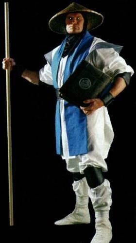
Despite Mythologies being a prequel to the original Mortal Kombat (while also setting up some plot points for the almost concurrently released Mortal Kombat 4), Raiden's design in this game is pretty much a modified version of his MKII attire. Though I'd say this kostume handles the blue tunic better, basically by segmenting the "apron." I'm also noticing stuff like the black shoulder pads and kneepads, design elements that would carry over into MK4. Overall, it's a nice take. And as a silly trivia bonus, while vanilla MK3's intro was the first time Raiden was depicted with a staff in-game, Mythologies is the first title to actually feature Raiden with his staff and have him move around with it.
Scorpion...
Mythologies' sprites have a somewhat claylike look to them, no? I do wonder if the digitization process was significantly different for the first Mortal Kombat game made specifically for home consoles. Regardless, Scorpion looks fine here. He and Bi-Han are basically just wearing modified versions of their original game outfits, which makes sense given this is a prequel. It should be noted that Scorpion's (first) in-game sprite differs heavily from his appearance in cutscenes after he becomes a spectre:
Here, he's just wearing his UMK3 kostume with a hard vented mask akin to MKII's. It works.
Sub-Zero...
The elder Sub-Zero gets his turn in the spotlight in the only game that has him playable but not Scorpion as well. He's opted for a darker shade of blue this time around, and his kostume (much like Scorpion's) looks like a mix of MK1 and MKII's
Shang Tsung...
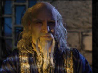
Shang made an appearance in the "good" ending of this game to give Bi-Han his mission to attend the upcoming Mortal Kombat tournament. As such, he's reverted to his old-man sorcerer design. It's nice to see him in a game wearing the old robes without being a floating brick for a change.
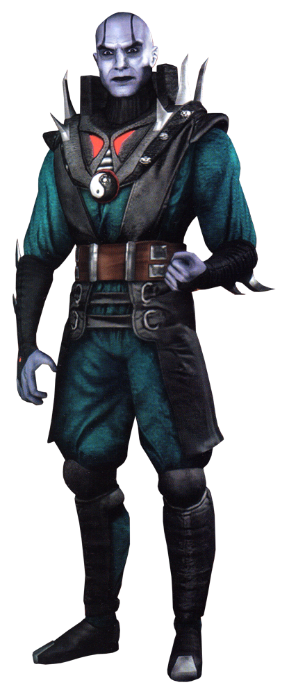
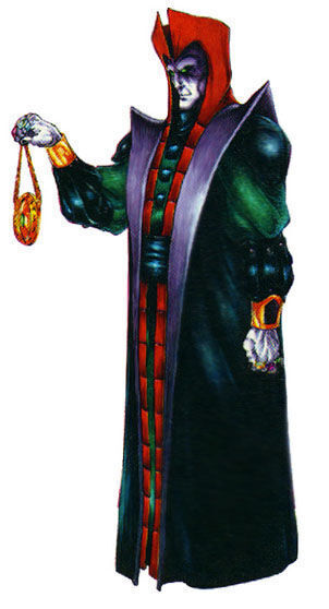
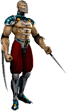
Quan Chi...
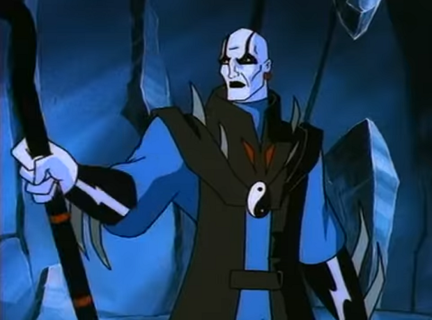
And we end this section with a comparison for the series' most famous canon immigrant. Quan Chi was a one-shot villain from the 1996 animated series Mortal Kombat: Defenders of the Realm and was integrated into the games' lore a year later. DOTR took a few liberties with kharacter designs from time to time, but it seems Midway didn't really feel the need to do the reverse with Qualm Cheeky here. He's got more belts(?) around and below the waist, his gloves' fabric centers around his middle fingers now, and his blue robes took a more aqua tint in the transition to the games (game Quan Chi is also sporting a black turtleneck), but most of his design silhouette is maintained for the jump to the games. If anything, the most notable changes are the more pronounced spikes and collar. That's admittedly one area I think the cartoon's design handled better. The game's tweaks are largely fine, but do look a bit cumbersome for his movement.
I enjoyed this write-up being relatively short. I will return with a look at the franchise's first full foray into 3D graphics and how Midway visually adapted its kharacters into the extra dimension.
Last edited:
I detest Shang's look in MK3. Like the longer hair is fine but the compression pants with the vest looks fucking weird. I'd think he was a WWF wrestler and for some reason he reminds me of Golddust.
Quan Chi's spiked shoulder pad look was always better than the costumes that followed.
Quan Chi's spiked shoulder pad look was always better than the costumes that followed.
Noob returned as a secret opponent in the console editions of vanilla MK3. Unfortunately for him, there was no traditional ninja template for him to copy off of, so the devs just darkened Kano's sprites. Why they didn't just use the unmasked Sub-Zero as a base I don't know.
MK3 Kano's costume in silhouette looks more like the classic ninja outfit than MK3 Sub-Zero's. It's missing the loincloth and it's got those extrusions where the bandolier and ankle holsters are, but the shoulders are a dead ringer.

Thank you for this awesome thread, OP. I'll be following it closely.
MK2 was my introduction to the series, and its aesthetics still are what I think of when people mention Mortal Kombat. There's something really dark and oppressive about MK2 that following titles never really managed to recapture.
MK2 was my introduction to the series, and its aesthetics still are what I think of when people mention Mortal Kombat. There's something really dark and oppressive about MK2 that following titles never really managed to recapture.
This should have been his friendship, Reptile throws a rave or something while DJ'ing for the cast of MKII. lol
I've always appreciated that MK is one of the few fighters not afraid to drastically change up designs while sticking to a general "layout" for characters. There's no need to rigidly cling to their original outfit, that's what klassic costumes are for.
I'm always amused when there's the argument posed that if you change up the costumes for Street Fighter or Tekken too much they won't be as iconic or recognizable. I've yet to see a Mortal Kombat game reveal trailer where the audience doesn't IMMEDIATELY recognize Scorpion and Sub-Zero. It's a totally made up problem.
Right? Feels like it was a lot lot longer.Cool thread! I much preferred the MKI versions of Raiden and Cage. I think the MKII ninjas are my favorites from all the games though.
The only thing that blew my mind a little was that MKII was only 7 months after the first game? It seemed like much longer than that as a kid.
I hated when Namco got stingy and stale in that regard with Tekken. T5 had nice updates to classic looks... but then outside of a few alts and Tekken 7's tacky overabundance, not much has changed.I'm always amused when there's the argument posed that if you change up the costumes for Street Fighter or Tekken too much they won't be as iconic or recognizable. I've yet to see a Mortal Kombat game reveal trailer where the audience doesn't IMMEDIATELY recognize Scorpion and Sub-Zero. It's a totally made up problem.
As a Reptile fan, I didn't care for tiny headed, tailed Reptile...
Edit: btw, MK2 Reptile doesn't move that fast in game.
OP
OP
You know what? This is fair and something I never thought of before. It's just that Kano's slouch is so distinct that it just looks weird on anyone else.MK3 Kano's costume in silhouette looks more like the classic ninja outfit than MK3 Sub-Zero's. It's missing the loincloth and it's got those extrusions where the bandolier and ankle holsters are, but the shoulders are a dead ringer.
It's odd, 'cause Tekken characters (barring a handful of holdouts) were constantly getting new default designs up through Tekken 5 before resuming the practice in Tekken 7: Fated Retribution. It's just Tekken 6 and any ancillary appearances in the immediate wake of that game that retained legacy designs for about a decade longer than most people expected. I admittedly prefer the Tekken 5/6/Tag 2 looks of certain characters like Hwoarang and Anna over their Fated Retribution attire, but it's nice to see Namco taking aesthetic risks again.I'm always amused when there's the argument posed that if you change up the costumes for Street Fighter or Tekken too much they won't be as iconic or recognizable. I've yet to see a Mortal Kombat game reveal trailer where the audience doesn't IMMEDIATELY recognize Scorpion and Sub-Zero. It's a totally made up problem.
Last edited:
That out of the way, I really didn't like any of the MK3 designs outside of Sonya. She's the only one where I preferred the new actor (Kerri Hoskins) to the original's (Elizabeth Malecki). I preferred the way Pesina did Cage's standard attacks and the Ninja's over the newer actors. I also really like Ho Sung Pak Liu Kang--I didn't like Eddie Wong's portrayal. I preferred the MKII look for all of the female ninja's as well. The lack of consistency in fighting stances is also something that bothered me moving to 3. Even the ones where the actor stayed the same with Kano (Rich Divizio), Jax (John Parrish) and Kung Lao (Anthony Marquez), I greatly preferred their look in the earlier games. This is also where the fatalities became too goofy with way too many bones and characters not falling over--the series has since way over-corrected on this.
I agree with pretty much all of this! Reflecting in this thread, I was surprised at how much I dislike the MK3 redesigns. Sonya is good, and the ninjas and Kung Lao are decent. The subtle skull in Scorpion's portrait is great (edit: I just looked, and it's less subtle than I remember!). Ho Sung Pak will always be Liu Kang to me.
I also hated how Sub-Zero and Shang Tsung went from Asian to non-Asian in this installment. (I don't know John Turk's actual background, but I'm just guessing he's not). Sub's ending screen in MKII and the character in this one look nothing alike. The first two games always felt like this mystic, Chinese, Enter the Dragon-type thing and MK3 certainly did not. The choice of actors certainly didn't help that. I also always thought Cage's sprite in Trilogy looked weird, like it was a different resolution than the rest or something.
If the sprites are accurate, all of the female ninjas had their own separate idle animations, but Scorpion and Classic Sub-Zero had the same one? That's kind of lame.
I never really played Mythologies, but the ninja sprites look kinda janky.
Yeah Sub is just a pure Scorpion pallet swap when it comes to masked Sub Zero.I agree with pretty much all of this! Reflecting in this thread, I was surprised at how much I dislike the MK3 redesigns. Sonya is good, and the ninjas and Kung Lao are decent. The subtle skull in Scorpion's portrait is great (edit: I just looked, and it's less subtle than I remember!). Ho Sung Pak will always be Liu Kang to me.
I also hated how Sub-Zero and Shang Tsung went from Asian to non-Asian in this installment. (I don't know John Turk's actual background, but I'm just guessing he's not). Sub's ending screen in MKII and the character in this one look nothing alike. The first two games always felt like this mystic, Chinese, Enter the Dragon-type thing and MK3 certainly did not. The choice of actors certainly didn't help that. I also always thought Cage's sprite in Trilogy looked weird, like it was a different resolution than the rest or something.
If the sprites are accurate, all of the female ninjas had their own separate idle animations, but Scorpion and Classic Sub-Zero had the same one? That's kind of lame.
I never really played Mythologies, but the ninja sprites look kinda janky.
He was totally rushed/incomplete as his Fatality just fades to black and he only as the two special moves. it was really sad to get Masked Sub back in UMK3 but find out he had no real fatal's and had none of the cool Ice Rain abilities that Maskless Sub had.
male ninjas in UMK3 only having two idle stances between all of them is pretty lame but it's kind of redeemed by one of them, Reptile's, being an all time klassic.
He was totally rushed/incomplete as his Fatality just fades to black and he only as the two special moves. it was really sad to get Masked Sub back in UMK3 but find out he had no real fatal's and had none of the cool Ice Rain abilities that Maskless Sub had.
Oh yeah I forgot that he only had the fade to black fatality! I think they added an ice spike one in Trilogy. I guess they needed to get it out before Christmas or something.
OP
OP
In time, friend.
Johnny was the only fighter to get an entirely new, non-recolored sprite for Trilogy so he was likely at the mercy of the technical limitations of the consoles as opposed to the arcade hardware darn near everyone else got. I've also heard reports that Johnny was just a last-minute addition to Trilogy to begin with, so there may have been some jank that wasn't able to be ironed out in time.I also always thought Cage's sprite in Trilogy looked weird, like it was a different resolution than the rest or something.
Last edited:
Johnny was definitely late for Trilogy. They had said in the marketing he wasn't going to be in it and he wasn't shown or on the character select screen in most of the early footage. Luckily he made it, that would have been super lame.
I always felt like MKT Cage seemed like he wasn't a martial artist. IDK anything about the guy, Chris Alexander, but his moves and animations just seemed real stiff and uncoordinated, like Stryker or something(but that makes sense for him)
I always felt like MKT Cage seemed like he wasn't a martial artist. IDK anything about the guy, Chris Alexander, but his moves and animations just seemed real stiff and uncoordinated, like Stryker or something(but that makes sense for him)
Mortal Kombat 4 post
OP
OP
And now we arrive at Mortal Kombat 4. A game of extremities; the first to feature fully polygonal visuals, and the last to see an arcade release. The first mainline game to integrate kharacters from spin-offs and non-game media, and the last mainline game to have involvement from John Tobias. Ed Boon's mission statement for this entry seemed to be taking the franchise back to its darker and more vaguely Eastern roots. Gone are the rent-a-cops, the Indigenous American shamans, and (initially) the cyborgs. Out with Kuai Liang's suspenders, in with Bi-Han's hand-me-downs, mask included. I have no idea if this attempted "darkening" had any serious influence on how kharacter design was dictated. With that said, it does seem that something influenced some of the receding of the...let's call them eccentricities of MK3's kostumes. This game released in the same month as Mythologies: Sub-Zero and the two games' narratives are linked by the presence of several kharacters.
View: https://www.youtube.com/watch?v=zRJ5UU-MHQA
Liu Kang...
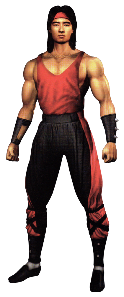
The funny thing about this design is that it's arguably one of the more daring kostumes for the simple fact that Liu Kang gets to wear a shirt for the first and last time in the original continuity. It's MK3 Liu Kang with a red tank top and more black around his waist. It's the most lateral design shift I can think of in this game and yet this is one of my favorite -- if not my all-time favorite -- Liu Kang designs. I won't lie, it's probably just because I'm reminded of Robin Shou's get-up from the film and Jason from Power Rangers. They could've just taken the left design, put it into 3D as is, and called it a day
Raiden...
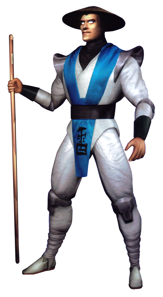
I considered excluding his Mythologies design and opting to simply compare the fighting game designs, but for a myriad of petty reasons, I will keep it for the comparison. Frankly, it just works as a bridge to denote the evolution between MKII and MK4. The latter definitely borrowed a lot from Raiden's appearance in its sister game, though the designers opted to conjoin the blue tunic below the waist somewhat similarly to his 2D arcade appearances. I do sort of prefer how Mythologies Raiden's shoulder pads rest in the picture above, but his 3D counterpart is a fine retooling in its own right and arguably the first time the white and blue were able to coexist in a mainline game without the latter overpowering the former.
Sonya...
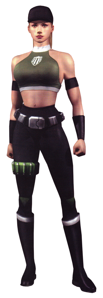
Amusingly, she might be the only kharacter who actually lost her bright colors in the transition to 3D. If I were to describe Sonya's design in MK4, I would say it's streamlined. Less flashy color contrast, a more reserved palette, and even her aerobics headband has been replaced with a cap, presumably issued by the newly formed Outer World Investigation Agency. The most ornate parts of this new design are the futuristic belt and the bullet holder wrapped around her leg. Sonya was always a no-nonsense military woman, but this design is probably the closest she ever came to looking the part in the 90s. A solid retool, and they at least kept some green on her even if it's darkened to the point where I thought it was black.
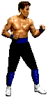
Johnny Cage...
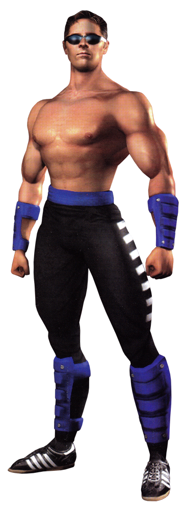
Welcome back to the land of the launch roster, Mr. Cage. Unlike most everyone else here, he only had about one year between his two most recent playable appearances. As such, it seems Midway didn't do much to change his outfit, beyond stripping the black from his gauntlets and adding white stripes to his pants (which now look less loose than before). He also seems like he got new shoes.
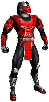
Scorpion...
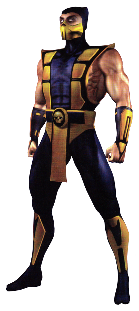
He's gone back to his UMK3 look and not a single soul complained. Even better, they touched it up with some unique details like a skull belt and that skull lining on the mask I mentioned earlier. I don't fault Midway for keeping the look, it's awesome. And since the other two ninjas from MK1 would begin to diverge more starting with this game, the UMK3 look is basically unique by process of elimination. Victory by technicality is the best kind of victory.
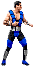
Sub-Zero...
Say it with me now: hand-me-down. I guess Midway decided Kuai Liang flew a bit too close to the sun in creating his own look after leaving the Lin Kuei, so they had him adopt a more traditional look for his next appearance. In-universe, Kuai Liang is wearing his late brother's uniform due to realizing that Bi-Han's mission during the events of Mythologies could provide some answers to the issues at hand with a recently unleashed Shinnok wreaking havoc on the realms. It's a fine design, though not really something Kuai Liang can call his own (they did thankfully retain his scar on the kharacter model just so you can tell it's the younger Sub-Zero). In light of the small touches done to Scorpion's outfit, I wish they had added some new details to Kuai Liang's. Shout-out to one of his alternate skins which allows Kuai Liang to go maskless and attain a happy compromise of sorts.
Reptile...
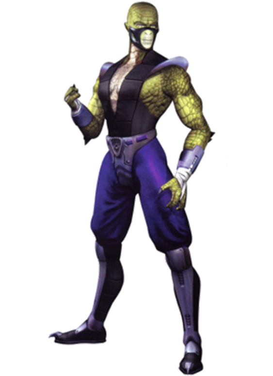
Here we go. By far the most drastic of the redesigns featured in this game and with the possible exception of one other, probably my least favorite in the game period. Let me be clear: I think lizard Reptile on paper is better than recolor Reptile. I just don't think Midway did the best job making the transition this time around. Series lore states that Reptile (effectively an endling of the Zaterran race) suffering prolonged separation from other members of his species causes him to "devolve" into a more overtly reptilian appearance. Whether that devolution extends to the scales seen here or just the more bestial appearance he would later take in Deadly Alliance, I don't know, but later games covering the events of the original games would make his non-human nature more apparent from the beginning.
...I'm not really talking about the kostume right now. I'm not a big fan of it. I like the silver boots, don't like the silver diaper. The black and purple are interesting color choices (and possibly for the best, given his UMK3-inspired alt kostume had perhaps a bit too much green in conjunction with his already green scales), but I really think what ruins this design is the mask. I'd rather Reptile just go "naked" from the neck up than try and utterly fail at hiding his new look. And this is apropos of nothing, but he looks like a Goomba from the 1993 Mario movie to me. Sorry, MK4, I think this one is a miss.
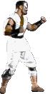
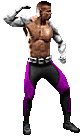
Jax...
And now for something more positive. A lot of the stuff I said about Sonya could also apply to Jax. Just a more streamlined design, and while missing some iconic flair, I think it reads better on an aesthetic level. Jax's pants retain the two-tone style of MK3 with the less overly segmented look of MKII and I think it works. I also just really like how Jax's arms look in this render. Sleek without being overdesigned.
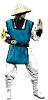
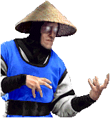
Fujin...
Fujin was one of several bosses Bi-Han fought in Mythologies, and he's returned in MK4 to assist Raiden's forces in opposing Shinnok. The God of Wind has mostly retained his primary design quirks in the jump to 3D, with one tragic exception.
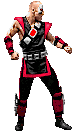
Quan Chi...
Frankly, he looks about the same. The chestpiece on the MK4 render just looks less loose because it's not a prop on an actor anymore.
Shinnok...
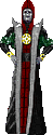
I've got the Tobias art in this comparison because I feel the static sprite I was able to find doesn't quite do justice to Shinnok's original design on its own. Dark Sith Lord-esque deity of evil, it's immaculate. For his playable debut, Shinnok ditched the long robes but kept the color scheme. Honestly, I don't hate it. I just don't like it as much as the Mythologies design. Now that's a final boss design. The MK4 get-up does make more sense for a more active Shinnok no longer encumbered by the shackles of the Netherrealm and who's also more willing to get his hands dirty. It's an odd mix of armor and cloth, and perhaps doesn't have the straightforward oomph of Shao Kahn's barbarian shogun regalia, but it works for Shinnok, gaudy warmongering deity that he is. But that Mythologies design tho-
Goro...
It's Goro. He's got bracelets for his arms now and is notably missing the knot from his sash from his 2D appearances (which is a shame), but he hasn't changed much otherwise.
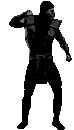
Noob Saibot...
Digging the blue eyes in the render. Overall, it's Noob. Since he's a secret kharacter with no endings added to the home ports after newcomer Reiko took his place, he's not really had any significant design shifts. He's taken design cues from Kuai Liang, who's taken design cues from Bi-Han which is a retroactively amusing coincidence if there ever was one. I'd argue the more interesting parts of Noob's presence in MK4 are his two alternate kostumes which do unmask him (despite him being a faceless shroud at this point in time) and give us some indication that there is a being with his own personality underneath the black suit.
That's all for the playable kharacters featured in vanilla MK4 and its initial ports, but Kitana (who narrowly missed the cut and was replaced with newcomer and fellow Edenian Tanya) was featured in Liu Kang's ending, from which a screenshot is posted below:
It's obscured by the fact that she's communicating via astral projection, but she seems to be wearing what looks like a black leotard with boots and a choker. If the outfit is actually black, then I do wonder if the 1995 film played a part in influencing the design, but that's never been confirmed. Though I suppose it's a moot point, considering what happened when Mortal Kombat 4 was ported to the Dreamcast in 1999...
Mortal Kombat Gold
Kitana...
When Kitana properly returned to the roster two years after MK4's arcade launch alongside five other veterans, most of them just retained their designs from the previous mainline game. Kitana's effectively back to her UMK3 look sans mask. Now I don't know why she's maskless, perhaps it was so she could have a more emotional heart-to-heart with Liu Kang in the aforementioned ending and the devs just decided to keep consistency for her playable appearance here. Or maybe it was to show a newly ruling Kitana of a newly liberated Edenia taking on a more personable appearance and trying to put her past as an assassin in Shao Kahn's employ behind her. It's a minor change, but I do like it. Various cutscenes also mean players can make out the corset design Midway was likely going for all along. She and her sister are still suffering from massive wedgies, though.
Mileena...
At last, the veteran female ninjas begin to gain their own identities. Mileena, now with likely Baraka-inspired white eyes, has opted to go for new boots and a different leotard sans corset. She's also kept her mask for obvious reasons and began sporting the ponytail that would become her trademark throughout the 2000s. It is funny to think of how relatively cautious Midway was in differentiating the former palette swaps for the first 3D game. It's like all of the weirdness was channeled into Reptile and everyone else got minor variations akin to the Sailor Soldiers.
Kung Lao...
More armored footwear aside, Kung Lao's been largely unchanged. I have no problem with this.
Baraka...
Much like Reptile, I appreciate the attempts at trying something new. Also like Reptile, I kind of dig the weird armored boots Baraka's sporting. The visible stitches (showing where Kung Lao bisected him with his hat) are a nice touch as well. It's everything else that falls a bit flat for me. The metal diaper strikes again and what I'm going to presume is a support collar to keep his torso in one piece does look a bit odd on its own. I'd love to hear from the art team about the design elements for Baraka in MK Gold. If nothing else, it'd give me a greater appreciation for why kharacters get changed the way they do.
Cyrax...
One of only two returning newcomers from MK3, Cyrax has been largely unchanged for his jump to 3D. If anything, the jump meant he no longer had to be constrained by the limitations of formerly being a man bravely pulling off fight choreography in an uncomfortable prop suit. His BMX suit pieces now look like actual (fictional) metal. The Cyber Lin Kuei look quite nice.
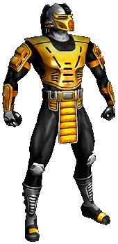
Sektor...
Sektor, much like Noob Saibot, was a hidden kharacter when MK Gold hit shelves, so I suppose he wasn't given much priority for a new design to differentiate himself from Cyrax. I suppose it works and got some justification in the lore. The Cyber Lin Kuei are mass-produced killing machines with little individuality beyond color and the remnants of the Lin Kuei have fallen on hard times at this point in the series, which would mean they'd have little interest in exterior customization for exterior customization's sake. Not when they were so desperate they had to literally dig out a malfunctioning Cyrax from the desert just so they wouldn't be understaffed.
And there you have it. All in all, I would say MK4 did well with kharacter redesigns. Far less drastic reinterpretations than you would expect for the first 3D entry. These are very much Tobias' designs that could go toe to toe with the rest of his output, even if MK4 itself is sort of treated like a black sheep among the fandom. If anything, the redesigns are perhaps a little too safe at points and Midway could've maybe strove to give MK4 a bit more of its own visual identity as it was starting a new story. Nonetheless, I appreciate the general simplicity and generally brighter colors which are especially helpful when trying to read these kharacters without the aid of higher-quality promotional renders. The efforts to begin the diversification process for the old palette swaps en masse are also appreciated. These would be the last "klassic" takes for a lot of Mortal Kombat's regulars before the mainline series took a bit of a hiatus as the new millennium approached. But Midway would have one last game from this interregnum between the original trilogy and the later Dragon King trilogy, one that would somewhat forcibly close the book on the first era of Mortal Kombat's art direction.
Last edited:
Really enjoying this stuff. Now I want to go a few rounds in MK4, my guiltiest of guilty pleasures.
Thanks for the tremendous work OP, your observations definitely made me think...I agree with you that the bear share of the MKIII designs all make some really great adjustments and improvements on the MKII designs for the most part—still I find I prefer the overall design of MKII's cast. Maybe it's more cohesive? Maybe because I never really warmed up to the new characters in MKIII and UMK3.
Ahhh MK4. The original version of the game coulda been something great with some tweaks, just so something better for combo balancing rather than maximum damage. Also arguably has my favourite atmosphere in the series. I think a lot of characters in MK4 have my favourite looks for them. In fact this might apply for everyone except Kuai Liang (I am partial to his MK:DA unmasked look) and Reptile (his ninja MK4 alt is near perfection tho).
MK Gold was a broken mess and none of the new stuff looked good imo.
MK Gold was a broken mess and none of the new stuff looked good imo.
Fantastic thread. Mortal Kombat is such a unique game in that it has such a huge cultural presence (at least in the US) that always makes me interested in what they're doing even though the last one I played was MK2.
But Midway would have one last game from this interregnum between the original trilogy and the later Dragon King trilogy. One that would somewhat forcibly close the book on a staple of Mortal Kombat's art direction.
Aren't there two MK games that proceed the Dragon King trology that are left? There's Shaolin Monks and then there's also *cough* Special Forces *cough*.
Aren't there two MK games that proceed the Dragon King trology that are left? There's Shaolin Monks and then there's also *cough* Special Forces *cough*.
I think Shaolin Monks came out after Deception but before Armageddon
I think Shaolin Monks came out after Deception but before Armageddon
Yeah, you're right. I've just checked and it came between Deception and Armageddon.
Yep, that's exactly how I felt about the way his moves looked. It's a shame about everything that happened, cause it seems like the MKII sprite would have been a much better alternative than using Alexander. I also found it strange his split punch didn't make it in the game.Johnny was definitely late for Trilogy. They had said in the marketing he wasn't going to be in it and he wasn't shown or on the character select screen in most of the early footage. Luckily he made it, that would have been super lame.
I always felt like MKT Cage seemed like he wasn't a martial artist. IDK anything about the guy, Chris Alexander, but his moves and animations just seemed real stiff and uncoordinated, like Stryker or something(but that makes sense for him)
ML4 post came faster than I thought. Loved it but I would've included the alternate outfits of Cage, noob and whoever else for fun comparisons. Noobs grim reaper hoodie thing going on is awesome.
ML4 post came faster than I thought. Loved it but I would've included the alternate outfits of Cage, noob and whoever else for fun comparisons. Noobs grim reaper hoodie thing going on is awesome.
This one is cool too
Threadmarks
View all 45 threadmarks
Reader mode
Reader mode