Welcome, readers, to the next installment of my rundown of
Mortal Kombat veteran redesigns. This is the part where I would go into some extended diatribe about how John Tobias' departure would inevitably lead to a shift in design sensibilities for the series' next mainline game (and it did) while trying to weave some coherent narrative about how and what the individual new designers did to make the series their own. Unfortunately, specific correlation on which Midway artists did which designs for these years is a bit spotty. I've seen the likes of Steve Beran, Herman Sanchez, Luis Mangubat, and various others generally credited for the art for
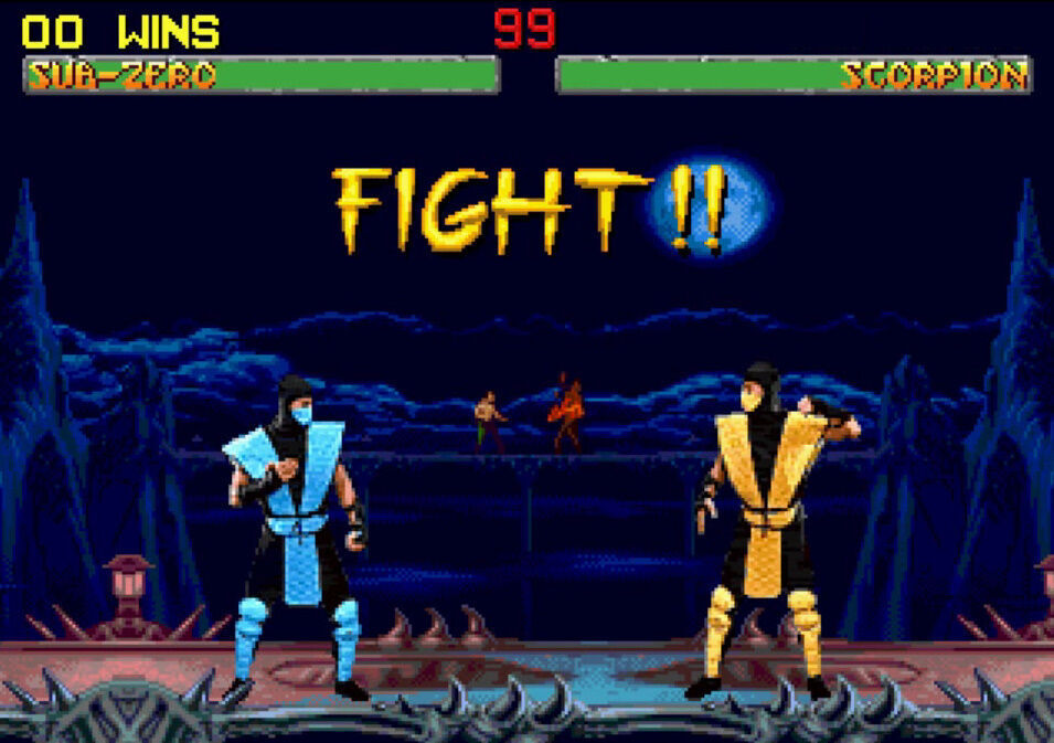
Deadly Alliance and its two immediate sequels, but I don't know much beyond that. Steve Beran is credited as the one who did the concept sketches for kharacters in this game, so there's that at least. Nonetheless, this is the fifth mainline game and the start of a new story arc. To quote Raiden, Liu Kang is dead. And that's not even the weirdest thing in this sequel. Take a listen to the awesome kharacter select theme and get comfortable.
View: https://www.youtube.com/watch?v=flQEnC6pjPE
Raiden...
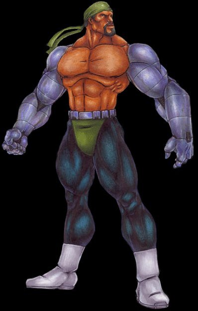
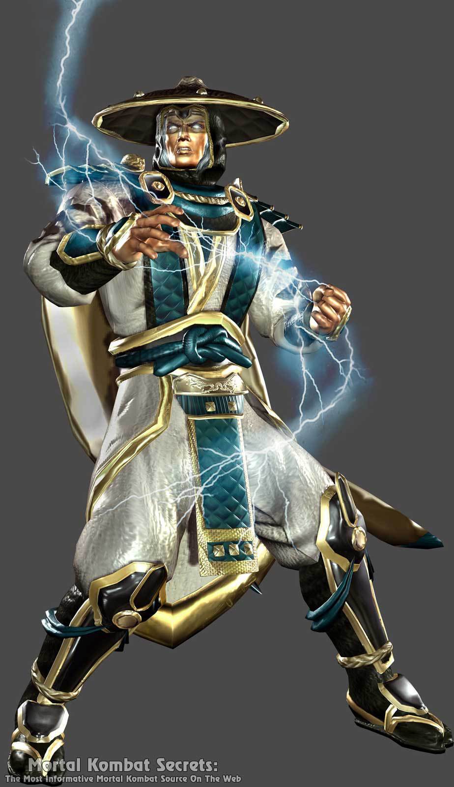
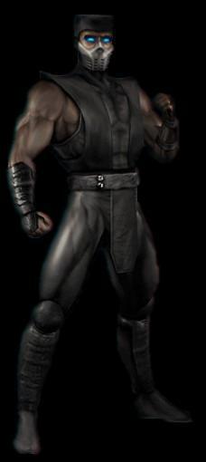
With the first
MK game built from the ground up for sixth-gen consoles (and the first entirely new mainline game to forgo the arcades), there was an opportunity to take advantage of the power of the PS2, Xbox, and GameCube and demonstrate it through the kharacters' far more detailed garb. Look at Raiden. He's moved beyond his humble days of simple robes and dresses himself in something far more ornate; even his hat has ornamental plating. Still, he's recognizably Raiden. They even kept the general silhouette of his overtunic (which has more of a sea green color now), just with more detailed fabric and gold trim. I really do like the gold trim running throughout the kostume. The cape is also a great addition, it really helps sell the look of a proud deity (one who at this point in the lore recently renounced his status as Elder God). Also of note is his hood/cowl, loosened so that for the first time in a game we can actually see Raiden's hair poking out (and in a possible nod to the movies and
Mortal Kombat: Conquest, it's pure white). Raiden's design has always looked pretty baggy since
MKII, but
Deadly Alliance's rendition makes it look even baggier. You can almost feel the layers just by looking at the render. Amusingly, I'd say the design element I like the least here is the knotted belt. As far as prime examples of
Deadly Alliance's style goes, Raiden is a pretty good initial indicator for how many of the other veterans would be interpreted, though I'd say he got one of the best overhauls out of the bunch.
Sonya...
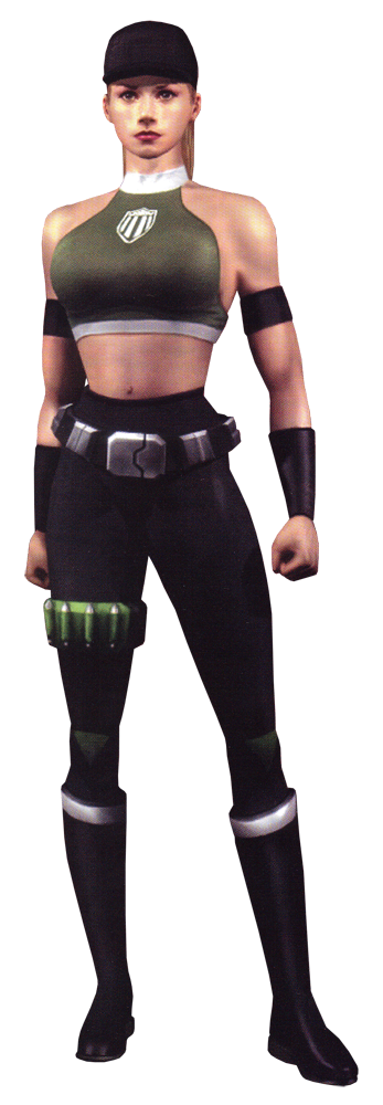
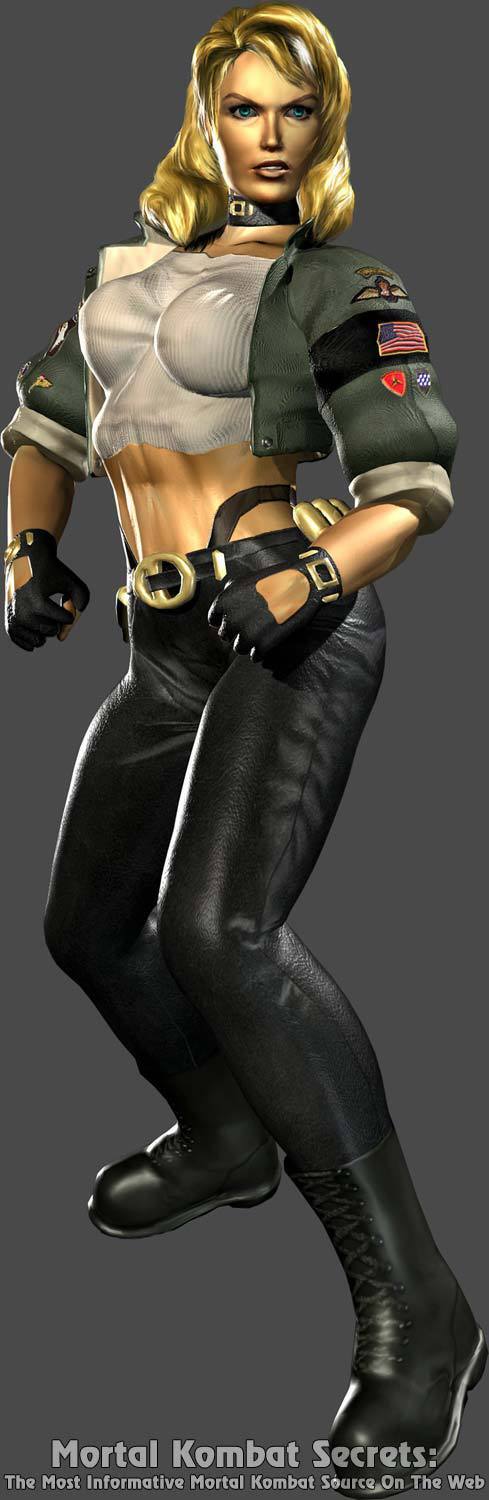
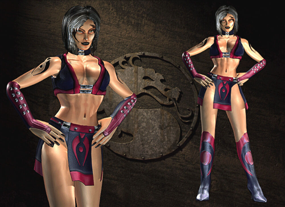
I told you all the aerobics era was ending. With this game, Sonya begins her transition from comic book MMA fighter to sexy Halloween military lady, which means consecutive designs that attempt to convey a serious military warrior but can't help themselves from throwing in needless elements. If
Deadly Alliance's redesigns are generally remembered for excess of armor and plating, then Sonya's redesigns from this era should be remembered for Midway's obsession with putting her in a thong. It's the one real gripe (outside of the weird boobsock thing her shirt's doing in the render) I have with this kostume, which gives her a jacket and some gloves that I like. It's also just unfortunate that she doesn't really have a bright color to call her own anymore. It was shared with Reptile and later Jade, but green was Sonya's thing. It helped her stand out in the lineup and now it's either gone outright or darkened to the point where I can't even call it green. One of the few redesigns I'm split almost down the middle on.
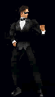
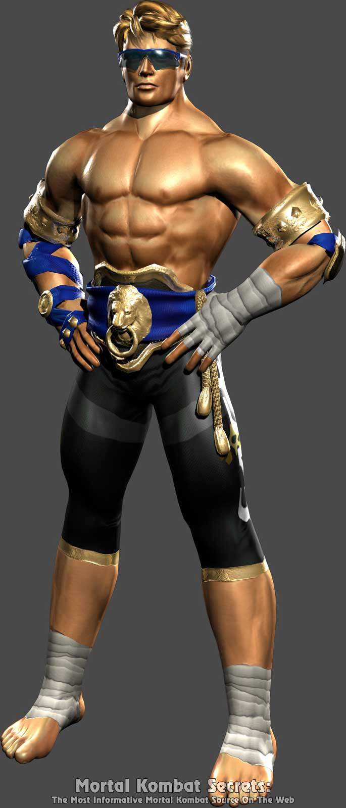
Johnny Cage...
I don't know if this was intentional, but a few designs in this game do feel oddly nostalgic (by the standards of 2002) despite the attempts at revamping everyone's looks. Take Johnny for instance. His
MKII color scheme is maintained, but he's looking a little closer to
MK1 with the shorter pants (with the name "Cage" on the side of one of the legs, a nice touch) and bindings around the ankles and wrists. He's even got a sash of sorts again. Of course, he's also got a slew of new bells and whistles: arm bracelets, additional blue wrapping, and that honking lion door knocker champion belt. This kitschy Hollywood Muay Thai look would probably suck if it wasn't Johnny Cage wearing it. Since it's Johnny Cage, I'm willing to go easy on it, but I would maybe remove the door knocker belt or some of the additional wrapping. One or the other. It's a serviceable redesign, albeit one that could've maybe used some streamlining.
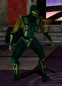
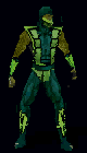
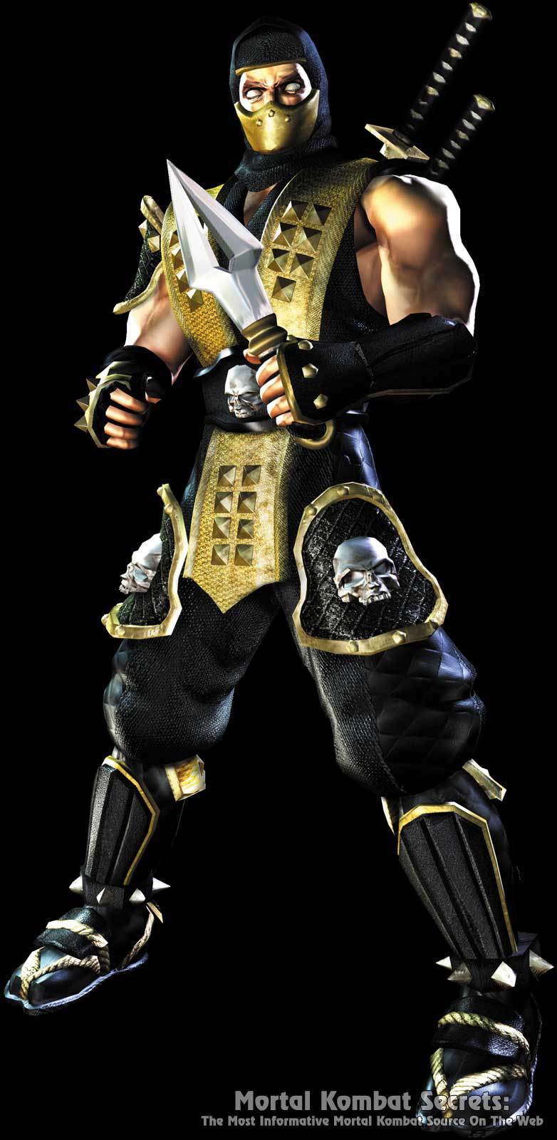
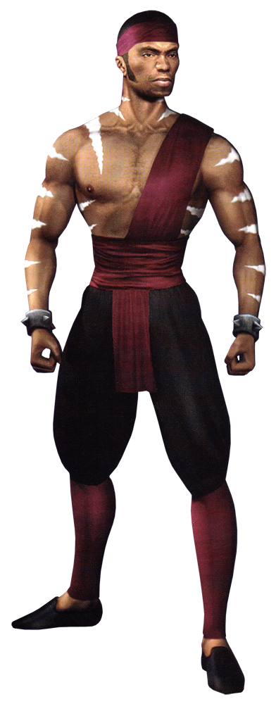
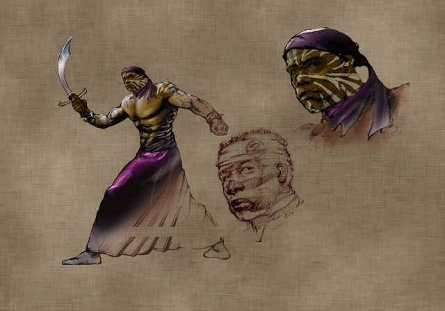
Scorpion...
Osu 16 Bit mused that Scorpion and Sub-Zero are always recognizable despite being as susceptible to visual retools as anyone else in this series. She's right. Even underneath all of the armor, you can still pick Scorpion out from a crowd. This time around, he's opted to go for a harder material for his tunic, contrasted with a new skull belt and matching skull thigh guards. Even his boots have gotten edgier, being adorned with spiked ankle bracelets above his tabi sandals (I didn't even know he had those until today). Interestingly, the new armor initiative doesn't seem to have extended to his mask, which appears to be made of a simple fabric with no fancy patterning. An interesting choice if there ever was one. As I alluded to earlier in the thread,
Deadly Alliance was my first real exposure to
Mortal Kombat, so this was my introduction to Scorpion. The design is edgy 2000s aesthetic to a tee and probably one of the only real examples of this game's default ninjas opting for a more steel-plated look (Cyrax being the obvious other example), the former of which was to be expected for Scorpion. The latter less so, especially for what was basically the kharacter's first wholly unique design in the series. While I think later games would execute the armored yellow ninja motif better, this is a fine first attempt.
Sub-Zero...
They're back! I do wonder how fans felt being suddenly greeted with the return of Kuai Liang's suspenders. Excuse me,
Grandmaster Kuai Liang's suspenders. The real-life time gap between entries four and five was accompanied by an in-universe time gap where relative peace reigned. Sub-Zero has reformed the Lin Kuei into a force for good and I guess he decided to pull rank by presiding over them in a modified version of the outfit he wore while he was specifically trying to get away from them. Honestly, I think this is a great design. The ice arms (first featured in Sub-Zero's alternate skins from
MK4) are a nice touch and contrast with the black forearm bindings. Midway even fixed my biggest problem with the kostume's counterpart from
MK3 (the crotch patch) by just adding a loincloth to the pants, and the whole thing just looks better now that they don't have to worry about it being a constructed kostume made with a limited prop budget. I would've personally added more blue squares to the straps like its predecessor outfit boasted, but this is a prime example of how to retool a divisive look.
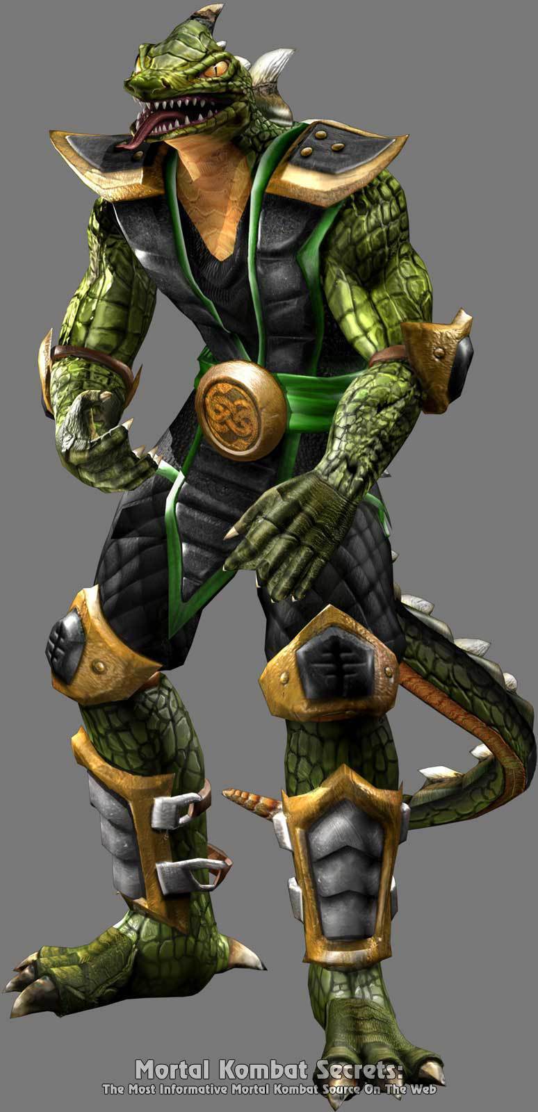
Reptile...
Speaking of divisive looks, let's talk about Reptile. I'll be upfront: I think this -- both as a kostume and as a general rendition of the lizard form -- is better than his look in
MK4. I'm generally of the opinion that if Reptile has to be visibly non-human, then you may as well commit to it. Based on concept sketches I've seen over the years, Reptile's new look here (explained in-universe as further devolution due to isolation from his kin) was based off of a proposed kharacter named Tiamat who also boasted a more bestial lizardlike appearance than the other Zaterrans we'd seen up to this point. Reptile's always had interesting lore about him, and this design does at least provide foreshadowing for his role in
Deception. As for the kostume itself, I actually like it a lot. Midway wisely decided to treat green as an accent color since Reptile's scales already provide a lot of green on their own, and opted to complement it with black and gold on the ninja uniform. Honestly, I'd argue Reptile's a little
too well-dressed for someone losing the last vestiges of his sanity and spending half of his story in this game wandering about the Outworld wastelands. His alt kostume (which does resemble Tiamat's proposed design) probably fits the depraved wasteland warrior Midway wanted to convey, but the default kostume is just a good look, lizard or no lizard.
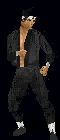
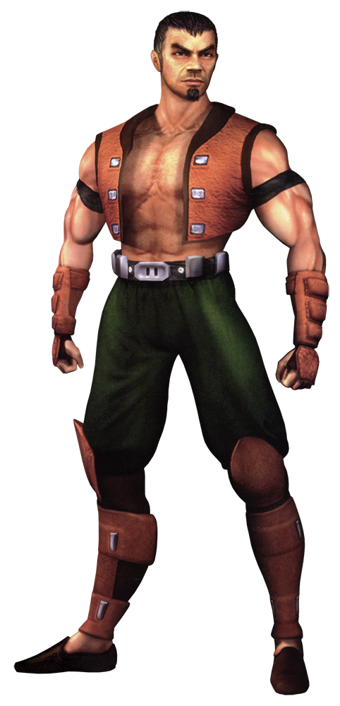
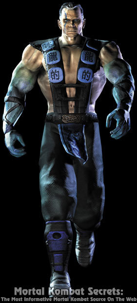
Kano...
Kano's transformation into Trevor Goddard reaches the mainline series, and I'd say he got one of the better redesigns among the returning veterans. The traffic light bandolier is sadly gone here (though featured in an alt kostume harkening back to
MK1 Kano) and replaced with an open vest and a hairy chest. It's so hairy, and the graphics are so 2002. And that's not a shark-tooth necklace he's wearing by the way. That's a lock of Sonya's hair he ripped away while being kicked off a roof during the events of
MK3. Thankfully, his
MK3 color scheme is maintained via the red lining on the inside of the vest. It's a simple but effective look for a simple but effective crook like Kano.
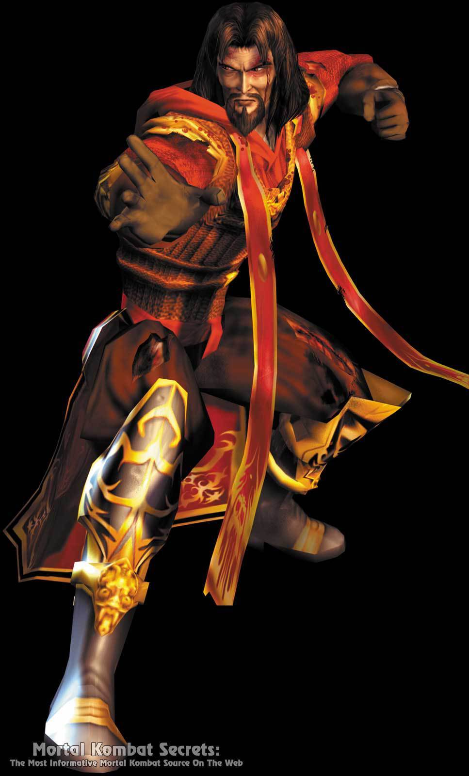
Shang Tsung...
We get to talk about one half of the titular Deadly Alliance now. After his absence in
MK4, the soul-sucking sorcerer is back with a vengeance and a wild mane of hair. He's basically
MK3 Shang if he had the fashion sense of his older counterpart and I'm perfectly fine with that. Much like Raiden, the kostume looks a little cumbersome to move around in due to all the layers involved (including a hoodie on the back of the robes and some tassels in the front that are strangely absent in the CG intro). The red, orange, brown, and gold color scheme works quite well even if I usually associated Shang Tsung with darker colors, and I dig the patterning on his boots. All around, it's a welcome return to his evil wizard days with a contemporary twist.
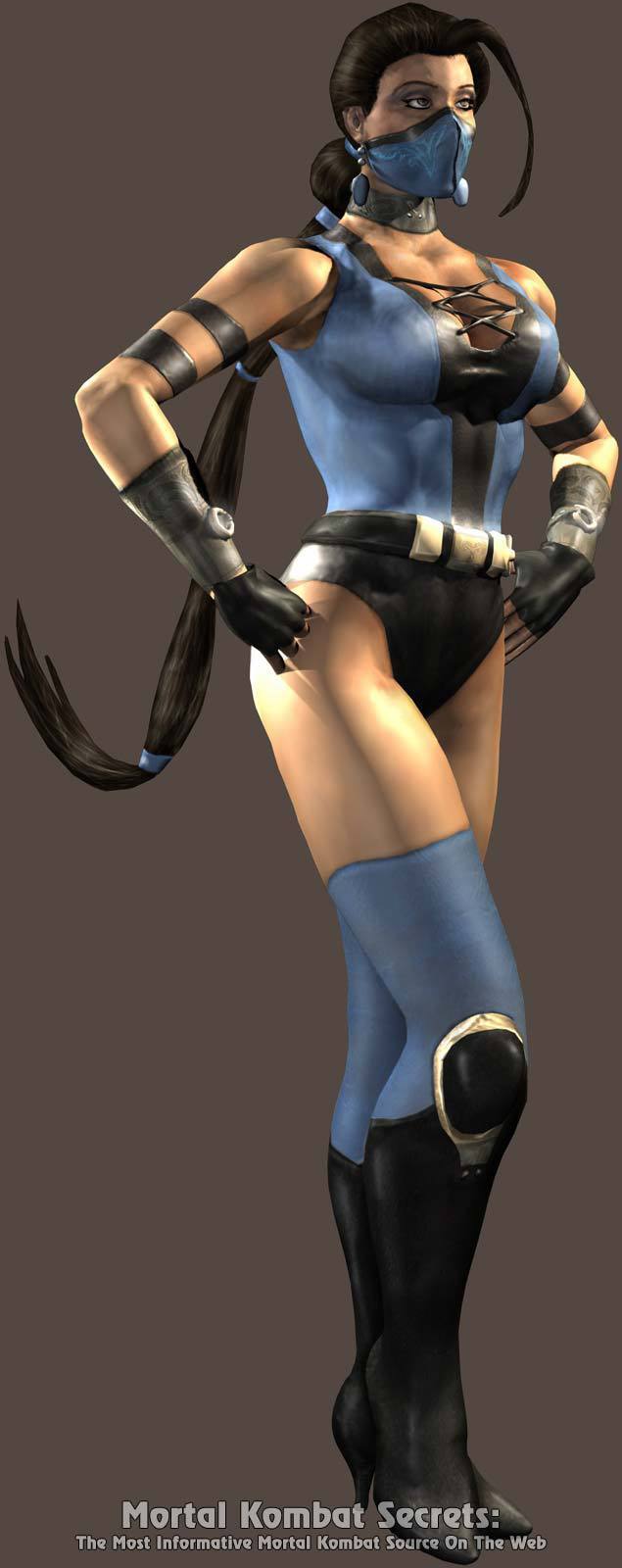
Kitana...
I'd say that this is a surprisingly conservative redesign, but that's possibly because this was originally meant as an alternate kostume for a comparatively more out-there look. This is in notable contrast to Sub-Zero and Kung Lao, who kept their more untraditional looks as their defaults for this game. For whatever reason, the devs swapped the kostumes around and this one is what we got on the kharacter select screen. It's a nice mix of the
MKII and
UMK3 outfits, and in a reversal of what happened with Sonya and Sareena (and would later be demonstrated with Jade and Mileena) is ironically enough probably less risqué than what she wore previously. The almost grayer shade of blue works well, and I like the two-tone look of her new boots and mask. Shout-out to the extremely long braid she's got going on. One of the strongest designs of the 2002-08 run in my humble opinion.
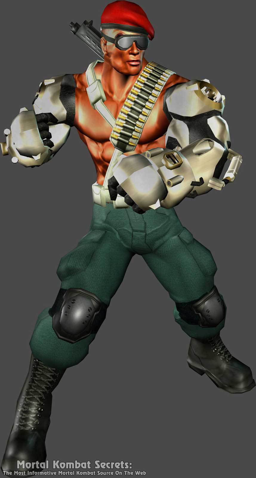
Jax...
Hmm. This is an odd one for me. When I first saw Jax as a child, I thought he was the coolest guy on the roster. I also thought he was wearing sunglasses and not goggles. Yes, those are goggles he's wearing. They're presumably protective eyewear for the heavy-duty firearm he wields now, but it's a choice that definitely made me tilt my head when I first noticed. I actually do like most of this design: the bandolier, the green and red contrast between the pants and beret, the kneepads. The goggles just look a bit odd. Really, my biggest issue is with the arms. It's been several years since
MK4 so I'd expect Jax to upgrade them for future threats and they are probably closer to how bionic sleeves would look in the real world circa 2002, but they come off as a little overdesigned due to all the segmenting of the metal plating. You guys remember that RoboSapien toy that got popular in the 2000s? That's what the arms remind me of. Truth be told, I think they look better in-game (they almost come off as more white than their actual silver in the render above).
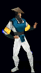
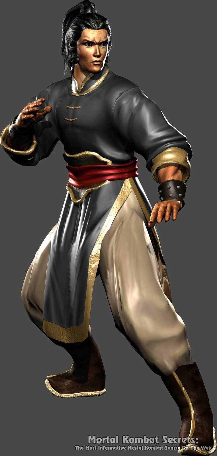
Kung Lao...
Now this is an interesting one. Much like Kitana, it seems Kung Lao also got his intended default kostume swapped around during the prerelease period. Unlike Kitana, his new default is in deliberate contrast to his established look. Honestly, I kind of think it works better for where Kung Lao was at this point in the series. As revealed in
Mortal Kombat Gold, he had faked his death and retired to a quiet life to refocus himself on Shaolin teachings before all that nonsense with Shinnok and Goro got his attention. Now, he's presumably had time to resume a civilian's life for several more years until Liu Kang's death calls him back into action, so this more grounded outfit works. I imagine this is probably closer to what actual Shaolin monks would wear in real life, with some possible video game liberties taken. The gold trim around the uniform and boots complements the red sash and greenish-gray hàn fú(?) well. His hair has grown out in the interim as well, which is probably why he doesn't wear his hat (which is stored on his back for when he needs to toss it). One of the more drastic redesigns, but more so because of how restrained it is rather than for any notable excess of accessories. It serves its purpose for what Kung Lao was doing at this point in the series and I respect it for that, even if his alternate/intended default would be the one to influence his designs for the next decade.
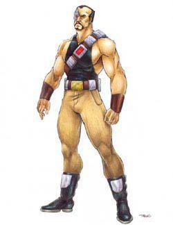
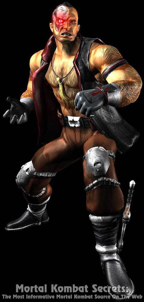
Cyrax...
His legs look like the scream canisters from
Monsters, Inc. Now that I've gotten that out of the way, I can talk about Cyrax properly. Most of the "ninja" influence has been stripped away, but he's no longer a Lin Kuei at this point, having thrown in his lot with Special Forces after they restored his memories as a human. As such, he's traded in his loincloth for metal tights. That in conjunction with the new chestplate does inadvertently give him a bikini look, but he just narrowly pulls it off. I do find it interesting that his presumed upgrades courtesy of the OWIA left him with more exposed machinery than before. His new gauntlet panels could and in canon do get damaged pretty easily, to say nothing of the tubing around his leg joints. His
MK3 and
Gold designs, by virtue of being an actual man in a suit and a 3D translation of said man in a suit respectively, ironically conveyed a more human-looking Cyrax than the game where he's already regained his human memories. I don't think that's a strike against
Deadly Alliance's rendition, just a funny observation. Anyways, Midway seems to have left his helmet unchanged from Tobias' designs, which I think was the right decision. This would be the last new design of Cyrax to keep the original head shape and his last new primary design from the Midway years.
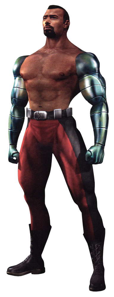
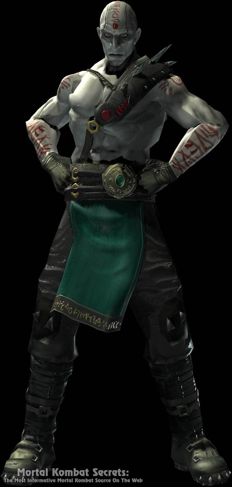
Quan Chi...
This is a case where Midway opted to operate under the assumption that less is more. I'd say it worked out quite well and gave them a chance to really make Quan Chi come into his own. He's abandoned his necromancer robes for a pair of pants and some gloves, though they did thankfully honor his old color scheme with the teal fabric adorning his pants. Going shirtless means he also gets to display all of the new tattoos he's gained in the interim. I also like that they repurposed his spikes by integrating them somewhat more subtly into the new bandolier. Keeping in line with the events of
Mythologies and
MK4, he's also got Shinnok's amulet proudly on display. Really, that amulet shows up more than Shinnok himself. Much like how Liu Kang, Raiden, and Johnny's
MKII attire would serve as the general templates for the majority of their future looks, this is for all intents and purposes
the Quan Chi design, being utilized 1:1 or modified lightly for his appearances in
Deception,
Shaolin Monks,
Armageddon,
MKvsDCU, and
MK9.
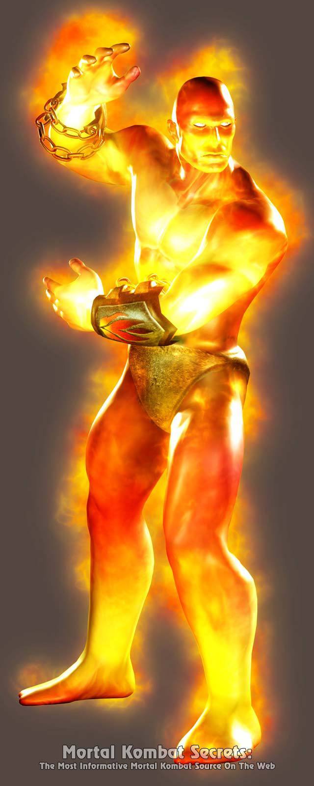
Blaze...
You see that orange guy in the background of the picture on the left? That's Blaze, formerly Torch, a minor kharacter seen on the Pit II stage in
MKII and
MK Trilogy.
Deadly Alliance would be the last game to feature standalone secret playable kharacters that were completely hidden away on the select screen, and it seems the devs wanted to revisit an earlier kharacter for one of their special secret fighters. Now Blaze has been repurposed from a fiery Liu Kang sprite into a pure fire Elemental, which means he's the Human Torch in black undies and chains. He's somewhat reminiscent of the Fire God from
Mythologies, except committing more heavily to the whole flaming naked golem look. One could argue it's generic, but I don't mind. It looks very flashy in-game as well when his skin's lighting changes with the flames around him.
That concludes our section on the playable kharacters featured in the console versions. Now a look at some of the NPKs featured in
Deadly Alliance:
Liu Kang...
Yep, it's Liu Kang from
MK3 in 3D. Not much to say other than noting that he's missing his arm bracelets.
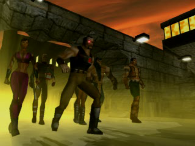
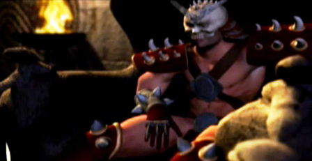
Shao Kahn...
Shao Kahn('s doppelganger) seen on the right is basically just the
MKII design brought into 3D for his brief appearance in the opening cutscene of
Deadly Alliance. The skull emblem on the chestpiece is notably missing and the spikes on the shoulder pads appear to be more numerous, but it's Shao Kahn through and through.
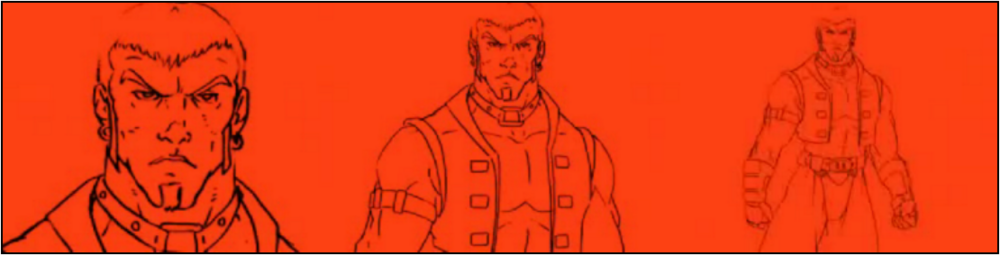
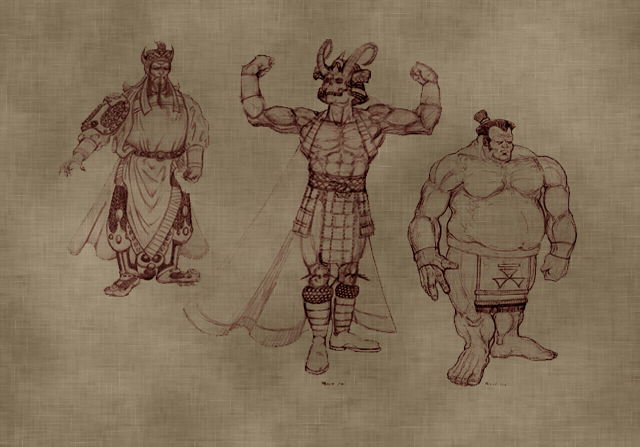
...And here's a concept sketch to show what Shao Kahn (center of the image) could've looked like if he had a bigger role, courtesy of the MK Warehouse:
This also isn't too much of a departure from what he normally wears, other than the missing center straps, and the new helmet which looks to be modeled after the skull of some Outworld beast. Or a ram.
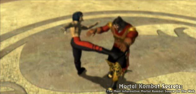
Kai...
Oh, Kai. One of the few newcomers added to
MK4 that wasn't inherited from
Mythologies or a last-minute replacement of another kharacter. You were so close to making it into
Deadly Alliance, but alas. On the right is a concept sketch for his planned appearance in
Deadly Alliance, which opted for what looks to be more of a Sherpa swordsman look. Fitting, given his Nepalese background
(EDIT: It has come to my attention that Kai may not be Nepalese, background info that I randomly took from another site that has been removed since the last time I checked said site). I'm of two minds on the stripes being applied to his face. They look nice and striking in the art, but would probably have looked like a total mess on a kharacter model. If Kai ever resurfaces, I wouldn't mind this design serving as an inspiration for a new kostume.
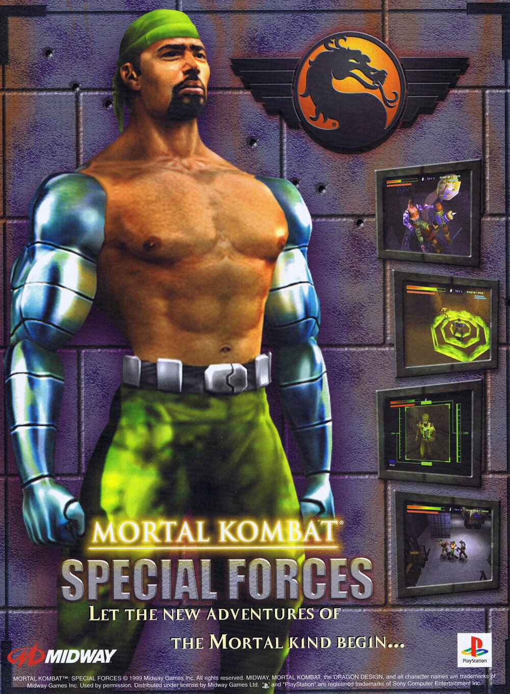
Mortal Kombat: Deadly Alliance was released on the three active major home consoles of the sixth generation, with a "port" seeing release on the Game Boy Advance within a week's time. The GBA version carried over roughly half of the fighters seen in the console release, and would receive a sister game of sorts in 2003 titled
Mortal Kombat: Tournament Edition.
Tournament Edition would retain Scorpion, Shang Tsung, and Quan Chi and feature most of the kharacters not available in the earlier GBA game. It also featured a handful of exclusive kharacters.
Mortal Kombat: Tournament Edition
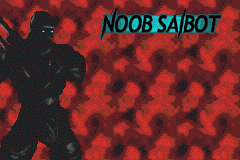
Noob Saibot...
He's Scorpion but with the color black in this game, keeping the palette swap tradition going on just a little longer. I do like that they retained the blue eyes from
MK4.
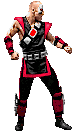
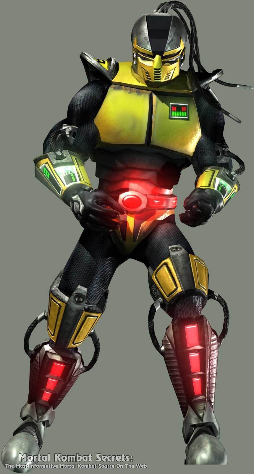
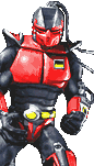
Sektor...
The Ketchup to Cyrax's Mustard also took advantage of asset reuse and adopted Cyrax's new design for his own. What I said about Cyrax largely applies to him as well.
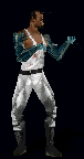
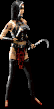
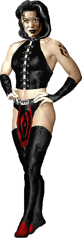
Sareena...
One of Bi-Han's allies from
Mythologies makes her playable debut here, after being passed over for a spot in
Deadly Alliance's console roster (which is presumably why she gets the fancy renders and wholly unique model compared to her recolored
TE brethren). Much like Sonya, she's been given a more fanservicey makeover -- not that her original design was particularly modest to begin with, but it still had to accommodate a real actress doing the stunts -- swapping out her corset for a bikini top. The red on her original outfit has also been swapped out for maroon accents, including on her studded gloves. I prefer the
Mythologies design, but I like the patterning and details of the
Tournament Edition design more and wouldn't have minded a composite.
...And that is about all I have to say about the redesigns for
Mortal Kombat: Deadly Alliance and
Tournament Edition. Goro shows up in Noob's ending in
TE, but he looks about the same. There were some growing pains in the transition to a different art team, but I'd say they did well enough for the first new
Mortal Kombat game since the departure of so many Midway developers, with the caveat that many of the things that would dog the series' visual identity in its later years effectively started in earnest here.
Next time, we'll look at the sixth mainline game's visual overhauls, including those for many kharacters who hadn't had a major role in years. But for now, I need to rest.