[URL unfurl="tr
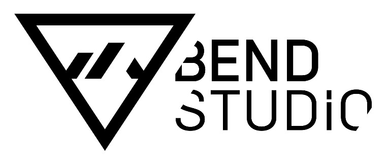
With 29 years of experience in game development, Bend Studio has had a rich legacy in video games. From the iconic Syphon Filter series to Resistance: Retribution, Uncharted: Golden Abyss, and Days Gone, we strive to provide our players with high-quality experiences that create a lasting impact. As we reflect on our past and look toward the future, we are thrilled to unveil the new Bend Studio logo to you all.
 "The wordmark and symbol were designed to be graphic and bold, so that we utilize numerous variations in colorways and stylised treatments of the symbol (exampled below), while still maintaining an identifiable brand identity. Because the Bend Studio logo is split into a symbol and a workmark, we have more flexibility with the symbol." – Shay Casey
Our new Bend Studio logo represents an abstract and modern interpretation of the studio's history, location, and lifestyle. Located at the base of the beautiful Cascade Mountains in Central Oregon, Bend provides us with a unique lifestyle where we can work in tech, but live life analog. After a day in the office, we like to plug into adventure and use our
extra life to shred the slopes at Mt. Bachelor, drag a line in the Deschutes River, or take a long hike in the wild.
"We set out to create a new identity that would be cutting-edge, abstract, and minimalist. It should feature simple, high-tech geometry but also represent the constant motion of creativity. Ideally it would be the kind of logo that is recognizable to gamers on the street without the need for a wordmark. Over time it should be easily identified as a symbol of gaming just like a certain swoosh is of sportswear.
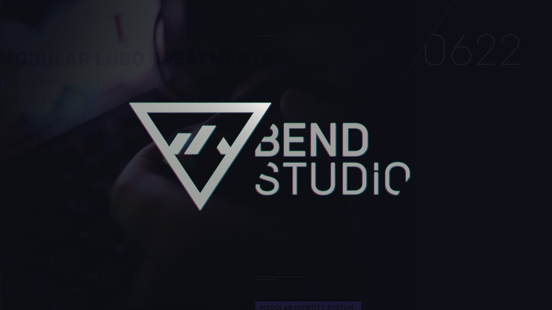
With those objectives in mind, we are illustrating Bend Studio's technical innovation with a forward directional look. The letterforms are cut to run parallel to the leading edge of the outer symbol triangle but still maintain the stability of our mid-weight non-italicized font. The Cascade icon in the center of the symbol is an abstract representation of the many mountain peaks that are the center of our lives in Central Oregon and define our skyline. Additionally, there is a small break in the "I" that represents one of the lumber mill smokestacks that speaks to Bend's history as a logging town before its current existence as an outdoor enthusiast destination."
– Shay Casey
Associate Art Director (Branding & UI)
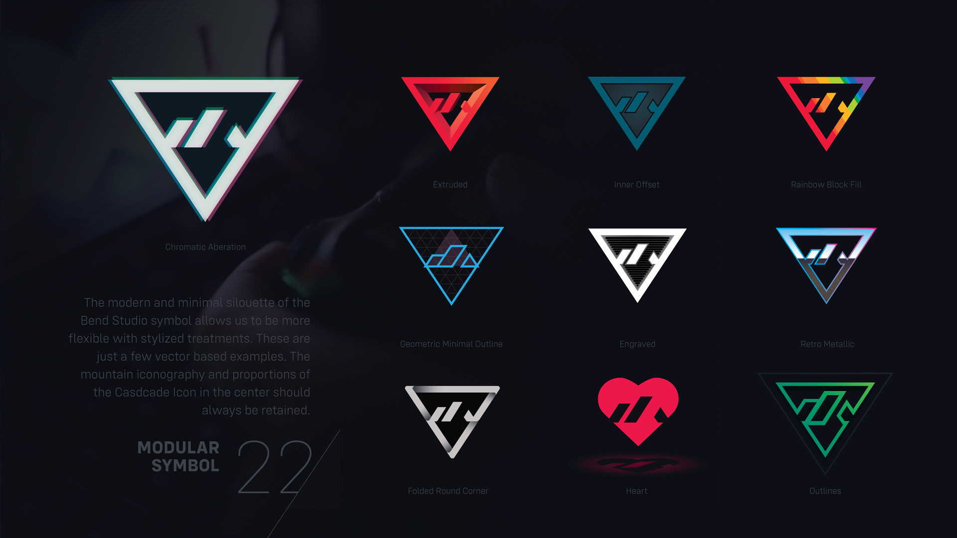 "The new logo allows us to be creative with stylised treatments. We had a lot of fun concepting the above." – Shay Casey
ue"]
https://blog.playstation.com/2022/0...d-studios-future-and-a-look-back-at-its-past/[/URL]
 blog.playstation.com