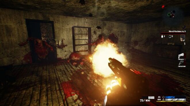
Dark Souls 1 is really rough to the eyes. Specially on 360. The sequels are great, however.
Hell no
Hell no
It's the primary reason I refuse to play the game. Everyone looks like the infected from the Last of Us. No, I don't want to play as a spore person. They just look awful.

It's ugly


You're shitting on a game's graphic design but gears of war looks like a pile of junkThat makes no sense. Marcus is the best.
What are you insinuating good sir?
I have to go with Child of Light. It was trying way way too hard to be artistic and the result was just downright ugly. I'm not really an expert when it comes to artistic design (did take a 101 class on it college) but there's just so much clashing here. From the color palette, to the strange design decisions (ex the weird character portraits) , to many of the assets seemingly clashing with each other the only common element seems to be "water color" but even that is completely broken by the obviously 3D main character. It's the only game I have ever skipped because I could not stomach the look of it.
I'm going to hell for this but I find Rayman Legends's style too busy.
I don't remember this much. I like the red on white. Easy to see players.
I find most Platinum games super ugly, outside of Transformers :/
Some parts of the Gears series are a bit fugly but it doesnt belong near this thread at allYou're shitting on a game's graphic design but gears of war looks like a pile of junk

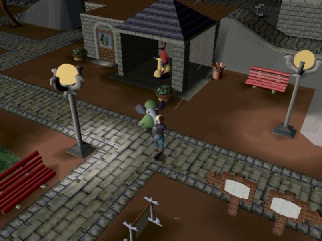
That's not gameplay tho, that's a stillAlso, although I love the game dearly, I have to give a shout out to Little Big Adventure.
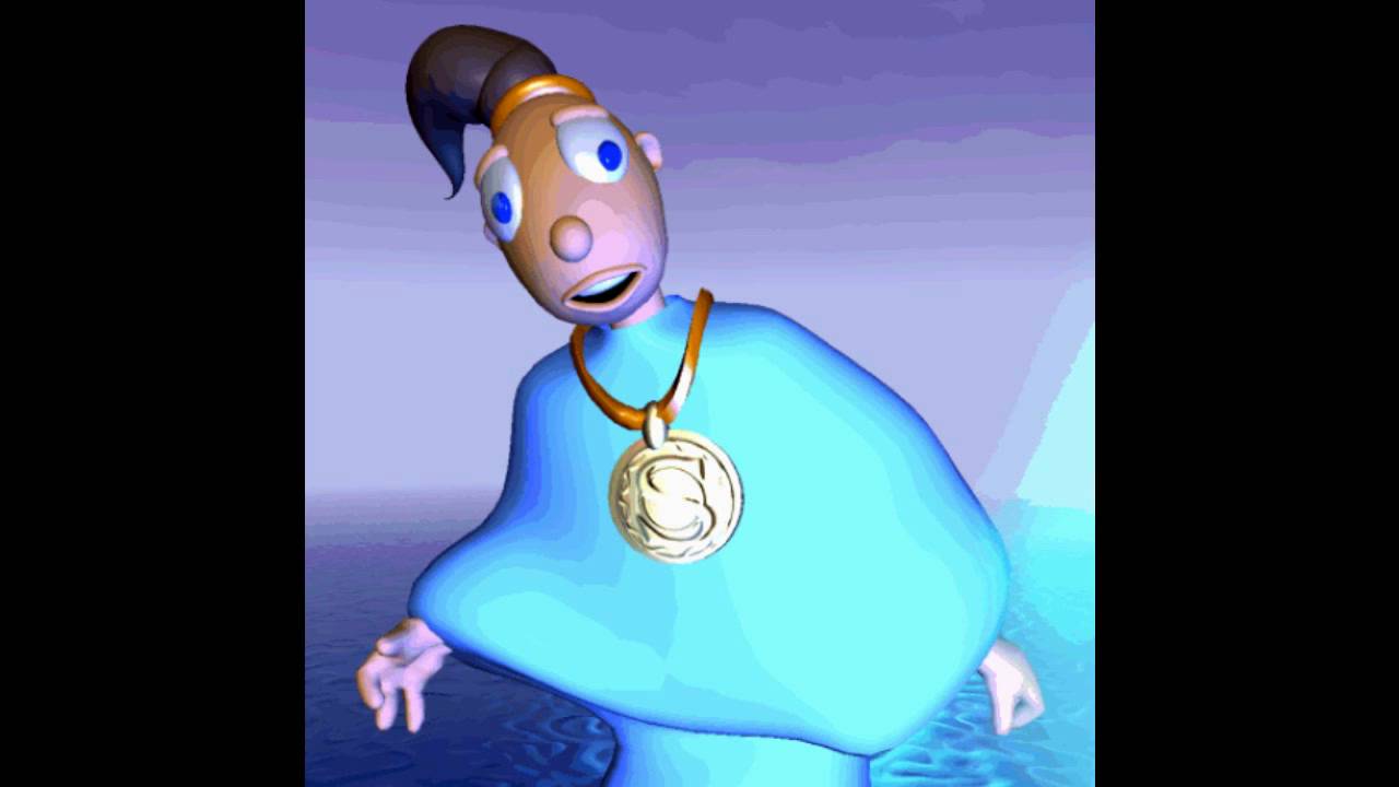
Also, although I love the game dearly, I have to give a shout out to Little Big Adventure.
Agreed with that as well. They need to hire some new environment artist and level designersI find most Platinum games super ugly, outside of Transformers :/
You're shitting on a game's graphic design but gears of war looks like a pile of junk
The art design was not its strong suit. It was sharp and clean and all that, but we're just talking about design/aesthetic. It's one of my favorites from that era, but it's not nice to look at.you shut your mouth
twinsen looked good for its time, just not the cutscenes
Say what you will about the character portrays but that first screenshot does a huge disservice to your argument. They nailed the children's book vibe so well.I have to go with Child of Light. It was trying way way too hard to be artistic and the result was just downright ugly. I'm not really an expert when it comes to artistic design (did take a 101 class on it college) but there's just so much clashing here. From the color palette, to the strange design decisions (ex the weird character portraits) , to many of the assets seemingly clashing with each other the only common element seems to be "water color" but even that is completely broken by the obviously 3D main character. It's the only game I have ever skipped because I could not stomach the look of it.
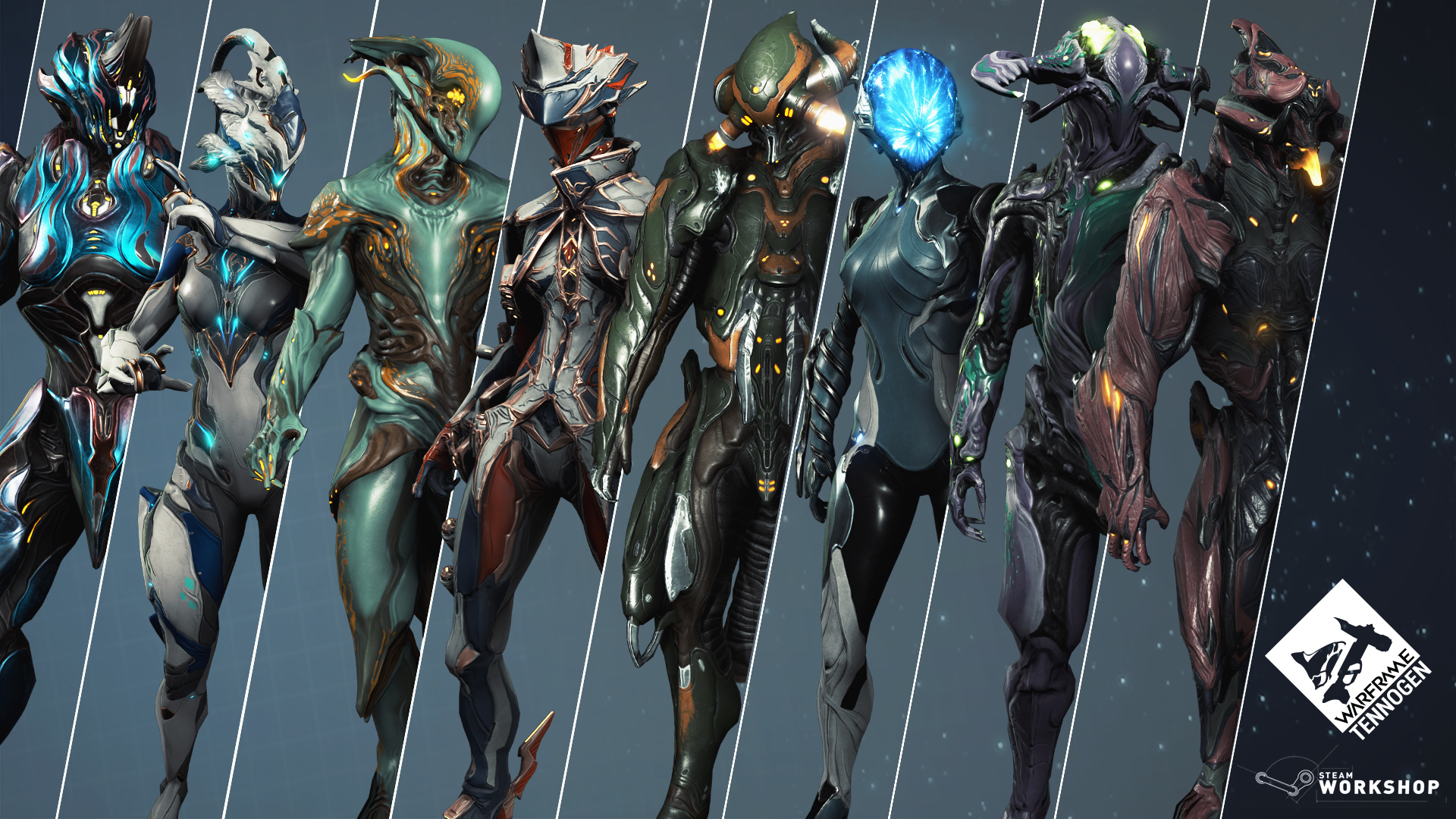
Their Granblue game looks stunning at least.Agreed with that as well. They need to hire some new environment artist and level designers
The art design was not its strong suit. It was sharp and clean and all that, but we're just talking about design/aesthetic.

Some terrible hot takes in this thread. Steamworld Heist ... Child of Light ...
i mean, you don't have to love the design of those games, but anywhere close to being "bottom tier", hell naw!
Not sure I agree, but I'll just let those screenshots speak for themselves. But again, they're very good games, so I understand the apologism.It's not the prettiest game in the world sure, but hardly one of the worst offenders, specially if you take into consideration when it released. Would even call the stylized graphics "pleasing" when you're waltzing around. Game is only 'ugly' during cutscenes
The worst


Not sure I agree, but I'll just let those screenshots speak for themselves. But again, they're very good games, so I understand the apologism.
Tropical freeze is ugly ??
Yep the game looks like a mobile ripoff. Another game that looks bad is PUBG, it's just so generic looking, even on Ultra setting on PC. Everything about the game looks bland and generic.
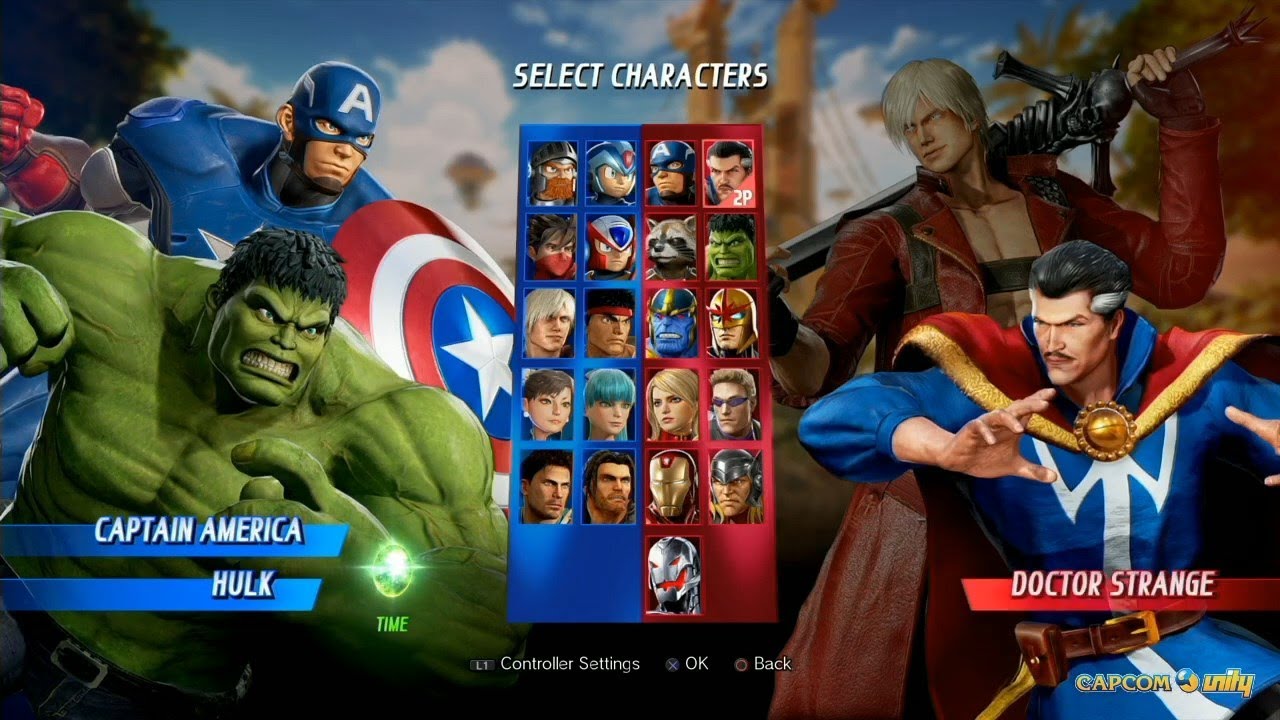
I was looking for the main menu, which is the worst offender, but yeah, this.

It's the primary reason I refuse to play the game. Everyone looks like the infected from the Last of Us. No, I don't want to play as a spore person. They just look awful.


;)