You are using an out of date browser. It may not display this or other websites correctly.
You should upgrade or use an alternative browser.
You should upgrade or use an alternative browser.
His eyes are throwing me off if I'm being honest. They're too small I guess?Amigo, the design is MUCH closer to the official game model with a few tweaks if you take a closer look.
NINTENDO HIRE THIS MAN
his face looks just so slightly off to me it feels like when you very slightly distort a face in G-mod
He's off to me too, but more like, "this is how humans in the teletubby's world" look vibes.
It's not awful, just a little wrong.
Yeah, I also really didnt like the ~SUPER REALISTIC POKEMON~ in Detective Pikachu either, they looked pretty weird to me before the release (though I really dislike realistic pokemon art so I had some bias) but in the movie they worked really well, I'll need to kinda see him hop around and wahoo in the film before I know how to feel I think.He's off to me too, but more like, "this is how humans in the teletubby's world" look vibes.
It's weird seeing anatomy beneath the sleeve. Anyway, looks fine, although not a design I'd want incorporated into the games.
Don't understand some of y'all's reaction. That is literally the art render translated to practical textures essentially.
The key part will be the motion. Marios mouth is not something I'm use to seeing forming more than 3 words at a time
The key part will be the motion. Marios mouth is not something I'm use to seeing forming more than 3 words at a time
It's weird seeing anatomy beneath the sleeve. Anyway, looks fine, although not a design I'd want incorporated into the games.
For sure, Mario's sleeves are almost always tight, the flow-y sleeve is what feels the most different to me.
It looks like, that's because of perspective. Mario looks slightly down on the camera, while moving up with his body. That's why his eyes look smaller and his mouth bigger.His eyes are throwing me off if I'm being honest. They're too small I guess?
Love how people are overreacting that he does not look right.
He looks like freakin' Mario. It's a good design considering that Mario's design itself is pretty "bland" (for a lack of better wording).
I think anything short of ripping the model directly from like, promotional renders from actual Mario games were destined to get this sort of response. I remember some people having an issue with Pikachu in the detective movie, and that one I felt was done just fine.
its the eyes that are the killer. nees more blue
It has an elbow/ closer to real life anatomy.
It looks like one of those "Make yourself into this character" things, and Chris Pratt did Mario with Brawl textures/colors.
tbf, the colors look fairly dulled in the overall pic.The teaser poster shows a much more vibrant palette.
It's noticeably different in numerous, very subtle ways.
But I don't think it's bad at all. In fact, I think it's pretty neat to see a slightly different take on the design. Like... Outside the JRPG spinoffs, Mario has looked exactly the same for like 20 years in a row. Honestly the changes are so minute that I wouldn't even call it a redesign, it's just a new interpretation.
Makes me excited to see the rest of the cast, especially Peach and DK.
He looks great. I imagine he will look even better in motion.
That said, I'm so used to Nintendo's design that even the slight changes here through me off. Not in a bad way, it's just weird to see a different Mario.
That said, I'm so used to Nintendo's design that even the slight changes here through me off. Not in a bad way, it's just weird to see a different Mario.
Jesting?
Gamers be jesting.
Could also be the material that image is printed on isn't doing any favors to the coloring. Doesn't look like high-quality paper.
Could also be the material that image is printed on isn't doing any favors to the coloring. Doesn't look like high-quality paper.
Nor is that a high quality photo, like at all lol
Yeah honestly, looks just like Mario.
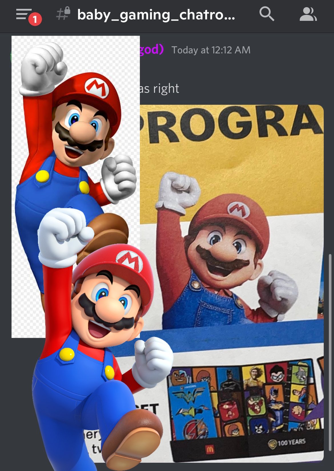
This probably lays clear at least the most noticeable differences (shoulder up). Wider face and mouth, collared shirt, more detailed overalls, more realistic shoulders/arms, smaller hands, workers gloves with the indent cut, brown mustache, realistic hair, more circular eyes, smaller 'M' on hat.
Taking everything together, the design itself is completely fine and is no bad Sonic. Just a small change from how Nintendo has typically done their Mario design. But Illumination's design is far from even a bad variance and the change to the face was probably needed for what was to be done for facial animation purposes
Last edited:
This comparison is like a lightning bolt reminder that Mario's stock render doesn't actually have the arms move the way you think they would. I thought Mario's hands looked a bit small at first but that was only because his right arm as the focal point is actually moving behind the head, almost closer to what Mario does on the box art of 3D World. It's a more "natural" posture which might be a bit awkward at first glance.
In a funny way, I feel like this Mario look reminds me a little bit more of some depictions of Mario before he made the full jump to 3D.
He has an actual elbow and there's cloth deformation, so you're forced to ponder the strange man-baby-like proportions of Mario's naked body beneath the suit?
Yes, this is it.He has an actual elbow and there's cloth deformation, so you're forced to ponder the strange man-baby-like proportions of Mario's naked body beneath the suit?
I miss his noodle arms...
I'm disappointed that I don't like it 😢. The character design was the one thing I was really expecting to have no problems at all with (was just expecting slight model changes, and more small details in a similar fashion to what they did with Odyssey) and the poster yesterday gave me a lot of hope for this movie - the environment design is brilliant. But I don't like this. The face is just slightly off. I wish I liked it. I hope it looks better in motion.