I swear, something about the Xbox brand and this forum causes some serious short circuiting.
Its still the
Xbox Series X.
The Nexus is still the actual logo for the family of devices and services, it appears on the damn box and on the console itself.
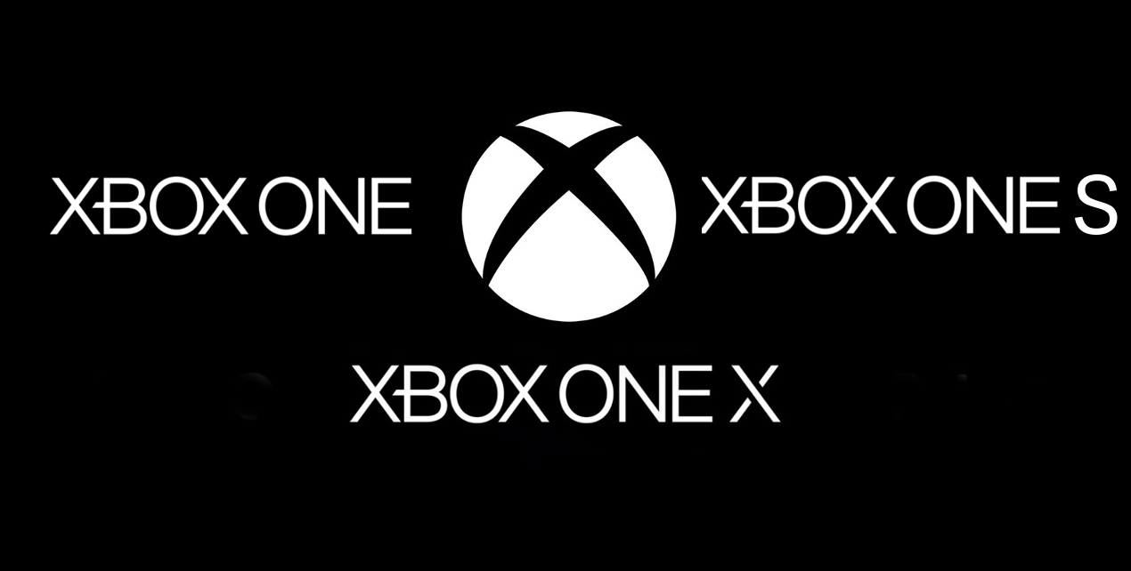
This is just a logotype just like we had logotype for the Xbox One, Xbox Live, Xbox One S, Xbox One X and Xbox 360.
Ugly?
Its literally just text and a letter...where are you even extrapulating enough information to get to its Ugly.
The font is a non offensive sanserif font....if you said boring id be fully on board.
But Ugly?
Im guessing you think the QLED logo is also ugly?
Or are logotypes only ugly if they are from Microsoft?
This is the same as the Xbox One X logo.....so this is worse than the better option?
And the Nexus isnt going anywhere, its still the Xbox family logo.
What?
Its the letter X....they reinvented the wheel?
The letter X is also on the Xbox One X....reinvented the wheel!?!?!
The Nexus logo is still the Xbox family Logo that hasnt gone away.
And the Xbox font is still there for the family of products.
But the letter X is reinventing the wheel?
Lets see MS and all their reinventing of the wheel:
OG Xbox - Super edgy first foray still learning their way.
Xbox 360 - Still remembers its from the Xbox OG but soften things up
Xbox 360 spec II - Flatten the logo as flat designs were on trend.....but again reinventing the wheel.
Xbox One - Reinvent the wheel again by flattening the logo more.
Xbox One family - Ohh man its time to really reinvent the wheel this time
G_Zero will throw a fit at how much we have redesigned the logo
And for our final trick to really fuck with them.
Lets type the word Series with a modified version of the X we used on the One X.
That will really throw everyone into a fit of rage at how much we are reinventing the wheel.
How am I supposed to take you seriously!?!
Seriously.
Sony has one more home console than MS.
The Sony font isnt as Iconic as the PS logo.
So thats bullshit.
The X nexus id argue is also damn iconic at this stage.